Misc
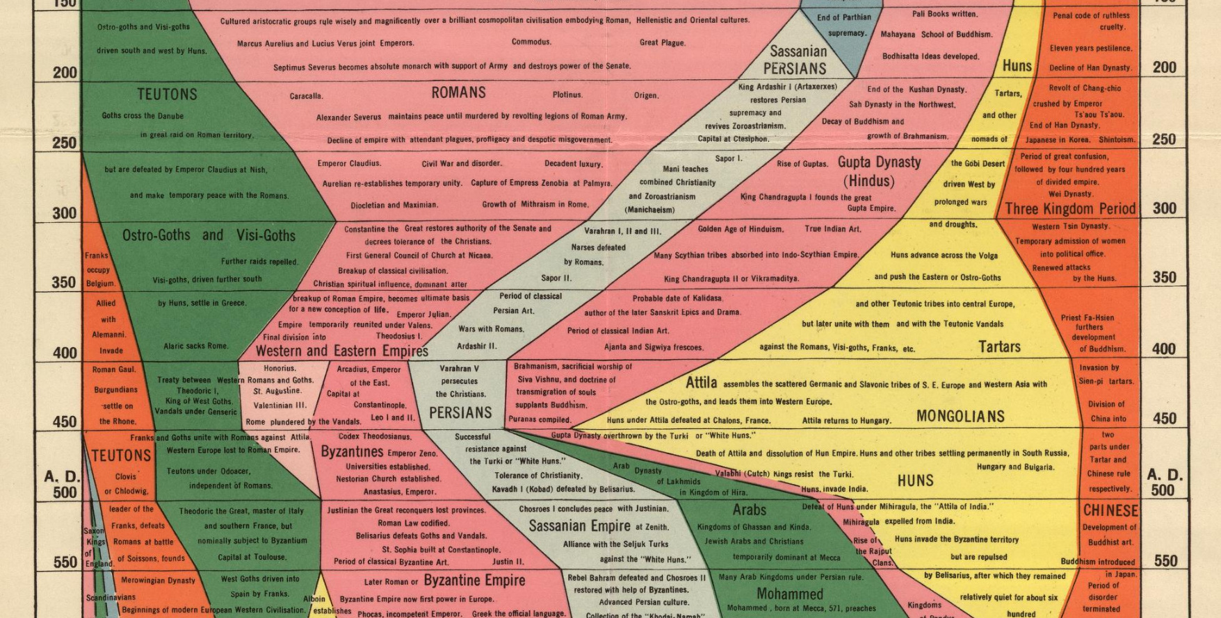
Histomap: Visualizing the 4,000 Year History of Global Power
Imagine creating a timeline of your country’s whole history stretching back to its inception.
It would be no small task, and simply weighing the relative importance of so many great people, technological achievements, and pivotal events would be a tiny miracle in itself.
While that seems like a challenge, imagine going a few steps further. Instead of a timeline for just one country, what about creating a graphical timeline showing the history of the entire world over a 4,000 year time period, all while having no access to computers or the internet?
An All-Encompassing Timeline?
Today’s infographic, created all the way back in 1931 by a man named John B. Sparks, maps the ebb and flow of global power going all the way back to 2,000 B.C. on one coherent timeline.
View a high resolution version of this graphic
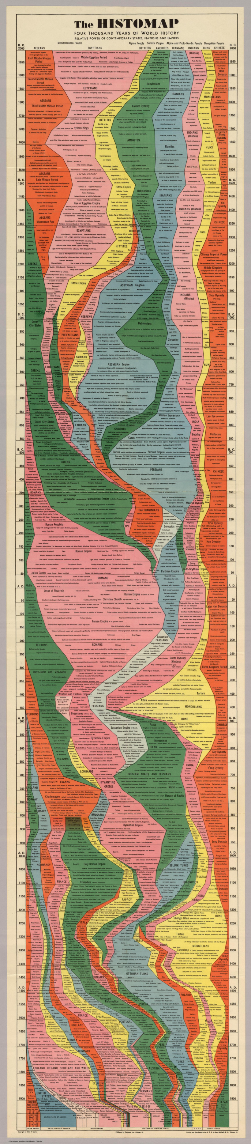
Histomap, published by Rand McNally in 1931, is an ambitious attempt at fitting a mountain of historical information onto a five-foot-long poster. The poster cost $1 at the time, which would equal approximately $18 when accounting for inflation.
Although the distribution of power is not quantitatively defined on the x-axis, it does provide a rare example of looking at historic civilizations in relative terms. While the Roman Empire takes up a lot of real estate during its Golden Age, for example, we still get a decent look at what was happening in other parts of the world during that period.
The visualization is also effective at showing the ascent and decline of various competing states, nations, and empires. Did Sparks see world history as a zero-sum exercise; a collection of nations battling one another for control over scarce territory and resources?
Timeline Caveats
Crowning a world leader at certain points in history is relatively easy, but divvying up influence or power to everyone across 4,000 years requires some creativity, and likely some guesswork, as well. Some would argue that the lack of hard data makes it impossible to draw these types of conclusions (though there have been other more quantitative approaches.)
Another obvious criticism is that the measures of influence are skewed in favor of Western powers. China’s “seam”, for example, is suspiciously thin throughout the length of the timeline. Certainly, the creator’s biases and blind spots become more apparent in the information-abundant 21st century.
Lastly, Histomap refers to various cultural and racial groups using terms that may seem rather dated to today’s viewers.
The Legacy of Histomap
John Spark’s creation is an admirable attempt at making history more approachable and entertaining. Today, we have seemingly limitless access to information, but in the 1930s an all encompassing timeline of history would have been incredibly useful and groundbreaking. Indeed, the map’s publisher characterized the piece as a useful tool for examining the correlation between different empires during points in history.

Critiques aside, work like this paved the way for the production of modern data visualizations and charts that help people better understand the world around them today.
Without a map who would attempt to study geography? –John B. Sparks
This post was first published in 2017. We have since updated it, adding in new content for 2021.


VC+
VC+: Get Our Key Takeaways From the IMF’s World Economic Outlook
A sneak preview of the exclusive VC+ Special Dispatch—your shortcut to understanding IMF’s World Economic Outlook report.

Have you read IMF’s latest World Economic Outlook yet? At a daunting 202 pages, we don’t blame you if it’s still on your to-do list.
But don’t worry, you don’t need to read the whole April release, because we’ve already done the hard work for you.
To save you time and effort, the Visual Capitalist team has compiled a visual analysis of everything you need to know from the report—and our VC+ Special Dispatch is available exclusively to VC+ members. All you need to do is log into the VC+ Archive.
If you’re not already subscribed to VC+, make sure you sign up now to access the full analysis of the IMF report, and more (we release similar deep dives every week).
For now, here’s what VC+ members get to see.
Your Shortcut to Understanding IMF’s World Economic Outlook
With long and short-term growth prospects declining for many countries around the world, this Special Dispatch offers a visual analysis of the key figures and takeaways from the IMF’s report including:
- The global decline in economic growth forecasts
- Real GDP growth and inflation forecasts for major nations in 2024
- When interest rate cuts will happen and interest rate forecasts
- How debt-to-GDP ratios have changed since 2000
- And much more!

Get the Full Breakdown in the Next VC+ Special Dispatch
VC+ members can access the full Special Dispatch by logging into the VC+ Archive, where you can also check out previous releases.
Make sure you join VC+ now to see exclusive charts and the full analysis of key takeaways from IMF’s World Economic Outlook.
Don’t miss out. Become a VC+ member today.
What You Get When You Become a VC+ Member
VC+ is Visual Capitalist’s premium subscription. As a member, you’ll get the following:
- Special Dispatches: Deep dive visual briefings on crucial reports and global trends
- Markets This Month: A snappy summary of the state of the markets and what to look out for
- The Trendline: Weekly curation of the best visualizations from across the globe
- Global Forecast Series: Our flagship annual report that covers everything you need to know related to the economy, markets, geopolitics, and the latest tech trends
- VC+ Archive: Hundreds of previously released VC+ briefings and reports that you’ve been missing out on, all in one dedicated hub
You can get all of the above, and more, by joining VC+ today.

-

 Education1 week ago
How Hard Is It to Get Into an Ivy League School?
-

 Technology2 weeks ago
Ranked: Semiconductor Companies by Industry Revenue Share
-

 Markets2 weeks ago
Ranked: The World’s Top Flight Routes, by Revenue
-

 Demographics2 weeks ago
Population Projections: The World’s 6 Largest Countries in 2075
-

 Markets2 weeks ago
The Top 10 States by Real GDP Growth in 2023
-

 Demographics2 weeks ago
The Smallest Gender Wage Gaps in OECD Countries
-

 Economy2 weeks ago
Where U.S. Inflation Hit the Hardest in March 2024
-

 Environment2 weeks ago
Top Countries By Forest Growth Since 2001