

In a rapidly changing economy, some skill sets are losing their sheen. Here are the worst college majors for finding a job.
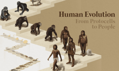

From single cells to bipedalism, humans have come a long way. Explore the fascinating journey of human evolution in this infographic.
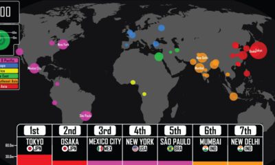

Where were the largest cities in the world throughout history? This video details the rise (and fall) of the largest cities by population from 3,000 BCE.
The current energy transition is unprecedented in both scale and speed. This infographic puts it into historical context.
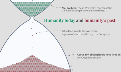

This impactful hour glass visualization shows all of humanity, including the 7% of humans who are alive today
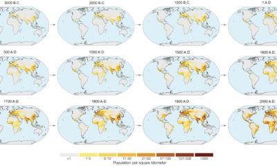

In the next year or so, humanity is expected to pass the 8 billion person milestone. These charts and maps put global population growth into context.
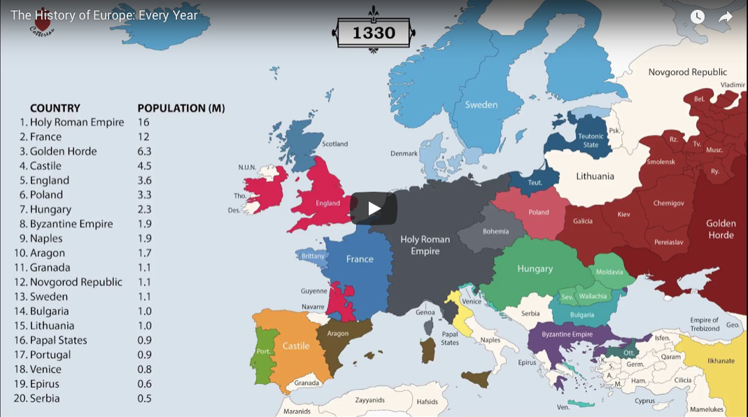
The history of Europe is breathtakingly complex, but this animation helps makes sense of 2,400 years of change on the European map.
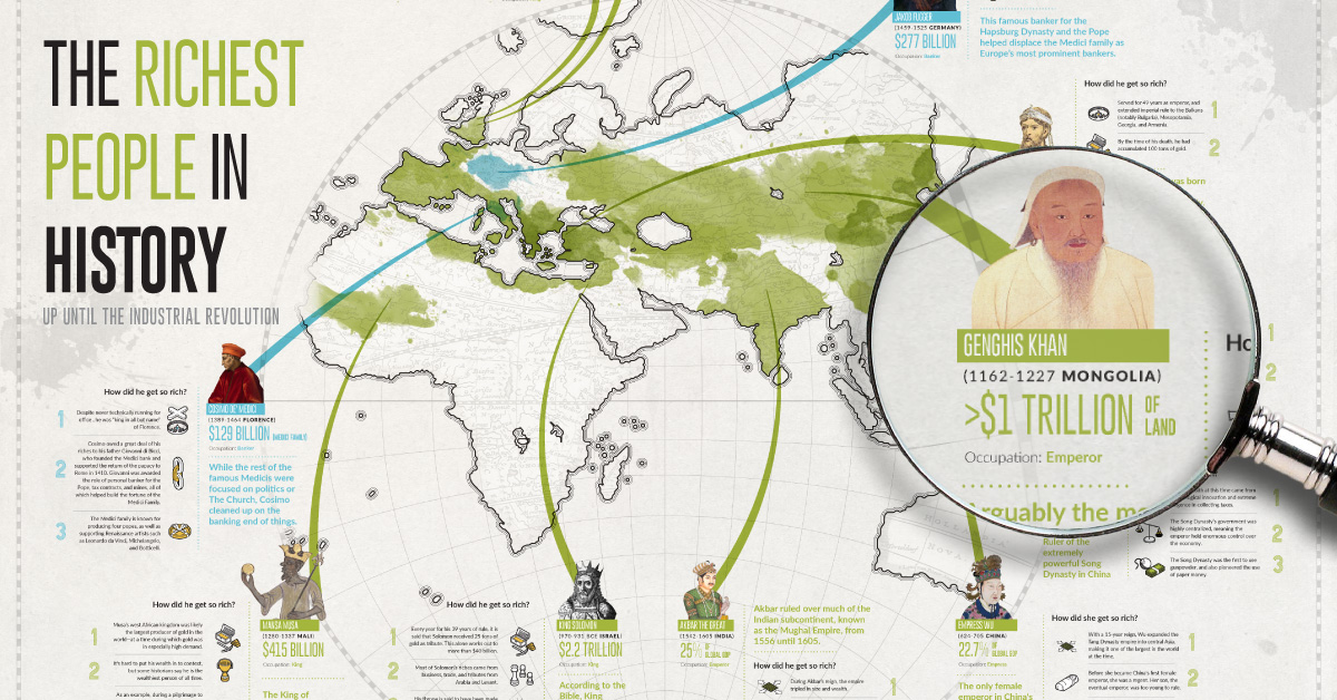
What do Augustus Caesar, Cosimo de Medici, Mansa Musa, and Genghis Khan have in common? They were some of the richest people in all of history.
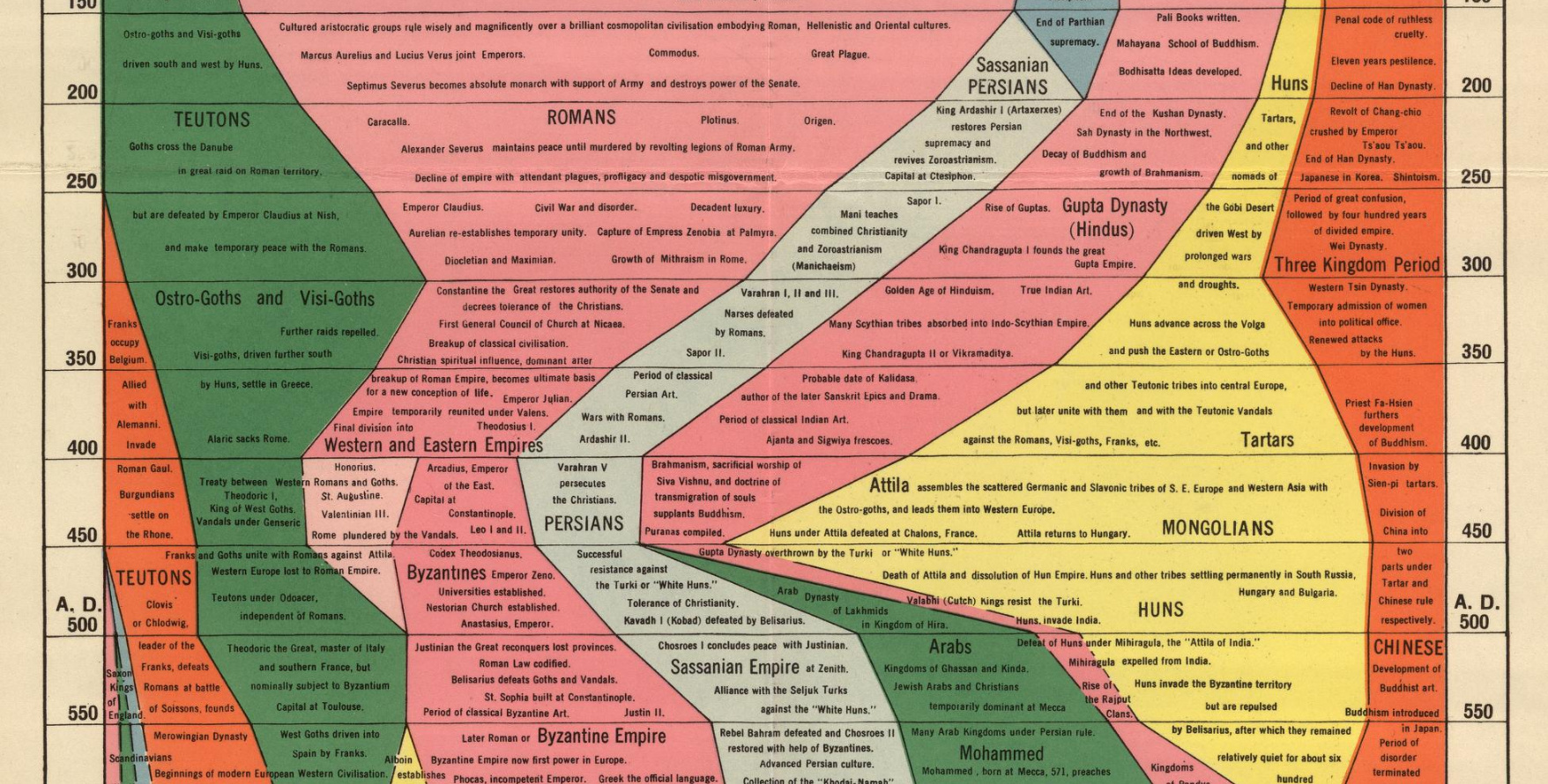
We examine an ambitious timeline that details the power of various civilizations going all the way back to 2,000 B.C.
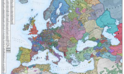

What did Europe look like in the Middle Ages? This map is a snapshot of medieval Europe back in 1444, during the rise of the Ottoman...


 Creator Program