History
How Many Humans Have Ever Lived?
Article/Editing:
How Many Humans Have Ever Lived?
In 2022, the world will likely hit a momentous milestone—a population of eight billion.
Of course, this dramatic increase in the world’s human population is a relatively new phenomenon. For many thousands of years, there were fewer people roaming the Earth than would live in a mid-sized city today.
But this does raise an interesting question, though: over the long arc of human history, how many people have ever lived?
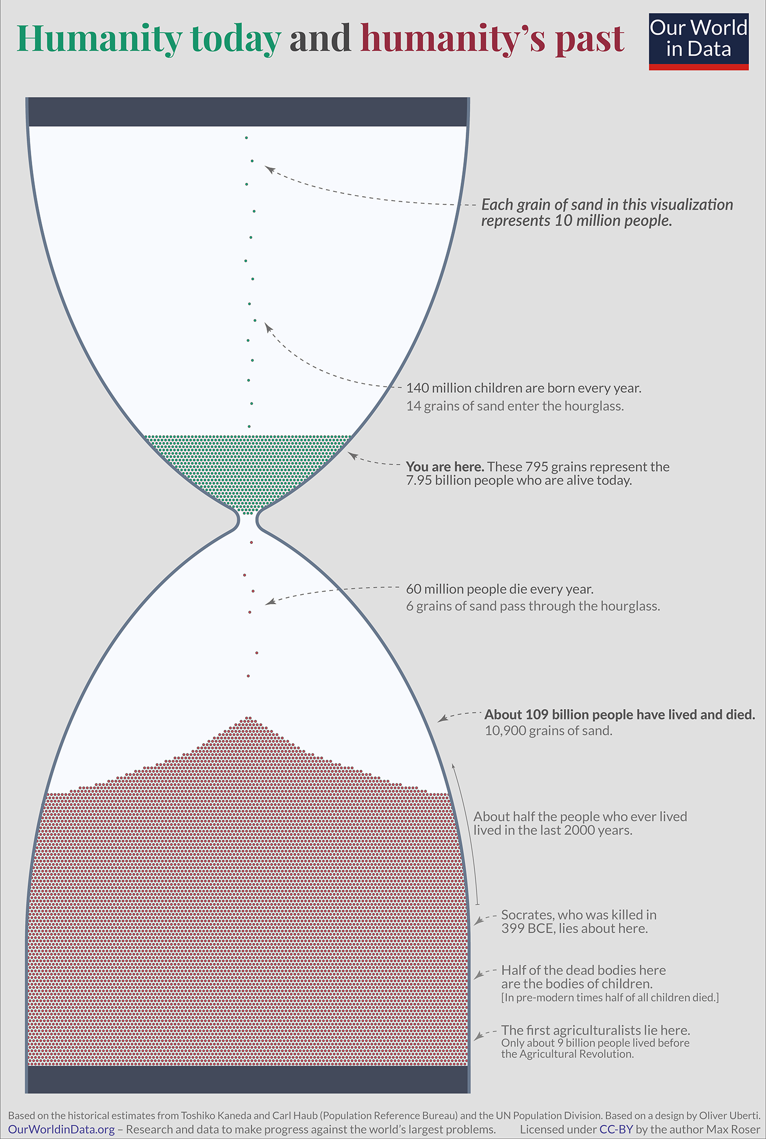
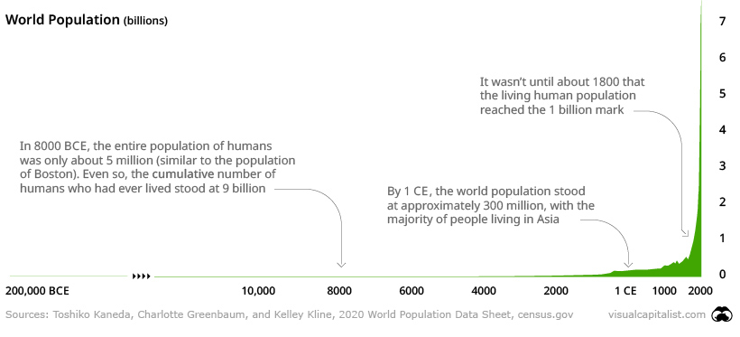
The unique and powerful visualization above, from the team at Our World in Data, highlights how many humans have ever lived, and how much of humanity is currently alive today.
Quantifying Our Ancestors
How many humans came before us? This is the question demographers like Toshiko Kaneda and Carl Haub have attempted to answer.
Quantifying all of humanity requires a firm starting date for when humans became, well, human. Evolution is a gradual process, so figuring out the start date for humankind is no easy task. For the purposes of this exercise, however, the two demographers used 190,000 BCE as the cutoff.
There are two opposing points to consider when thinking about prehistoric humans:
- Around the chosen start date, the global cohort of humans was quite small—perhaps as low as only 30,000 individuals.
- Before the modern era, lifespans were much shorter, so long stretches of time can actually influence numbers drastically.
With this context and timeframe in mind, the demographers estimate that 109 billion people have lived and died over the course of 192,000 years. If we add the number of people alive today, we get 117 billion humans that have ever lived.
This means that for every person alive today, there are approximately 14 people who are no longer with us.
It is these 109 billion people we have to thank for the civilization that we live in. The languages we speak, the food we cook, the music we enjoy, the tools we use – what we know we learned from them. –Max Roser, Our World in Data
How Much of Humanity is Currently Alive Today?
When considering that 7% of all humans who have ever lived are alive today, especially when measuring across more than a thousand centuries, it’s remarkable that such a large portion of humans are currently living.
If we chart the recent global population explosion though, it begins to make sense.
Looking at the chart above, it’s hard to predict which path humanity will go down in the future, and how that will affect future population growth.
It was only in 2007 that the majority of humans began to live in cities, and in 2018 that the majority gained access to the internet. While we’ll never meet the 109 billion humans who laid the foundation for our modern societies, we’ve never been more connected as a species.
What will we do with our time in the top of the hour glass?
As noted on the graphic, this is an updated adaptation of a 2013 visualization by Oliver Uberti.

This article was published as a part of Visual Capitalist's Creator Program, which features data-driven visuals from some of our favorite Creators around the world.


population
Vintage Viz: World Cities With 1 Million Residents (1800–1930)
From someone born in the 19th century, in the midst of historic population growth, comes this vintage visualization showing world cities growing ever bigger.
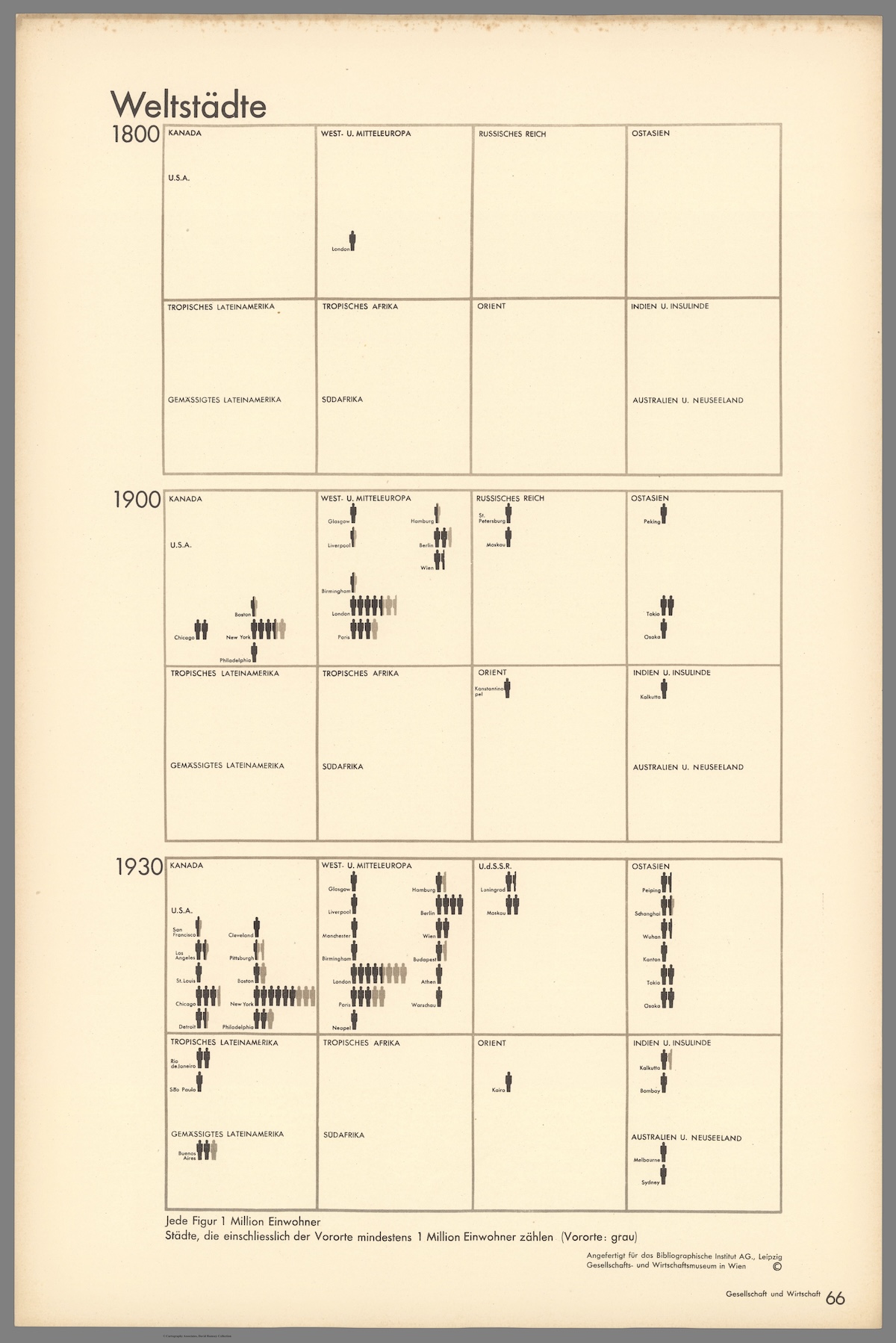
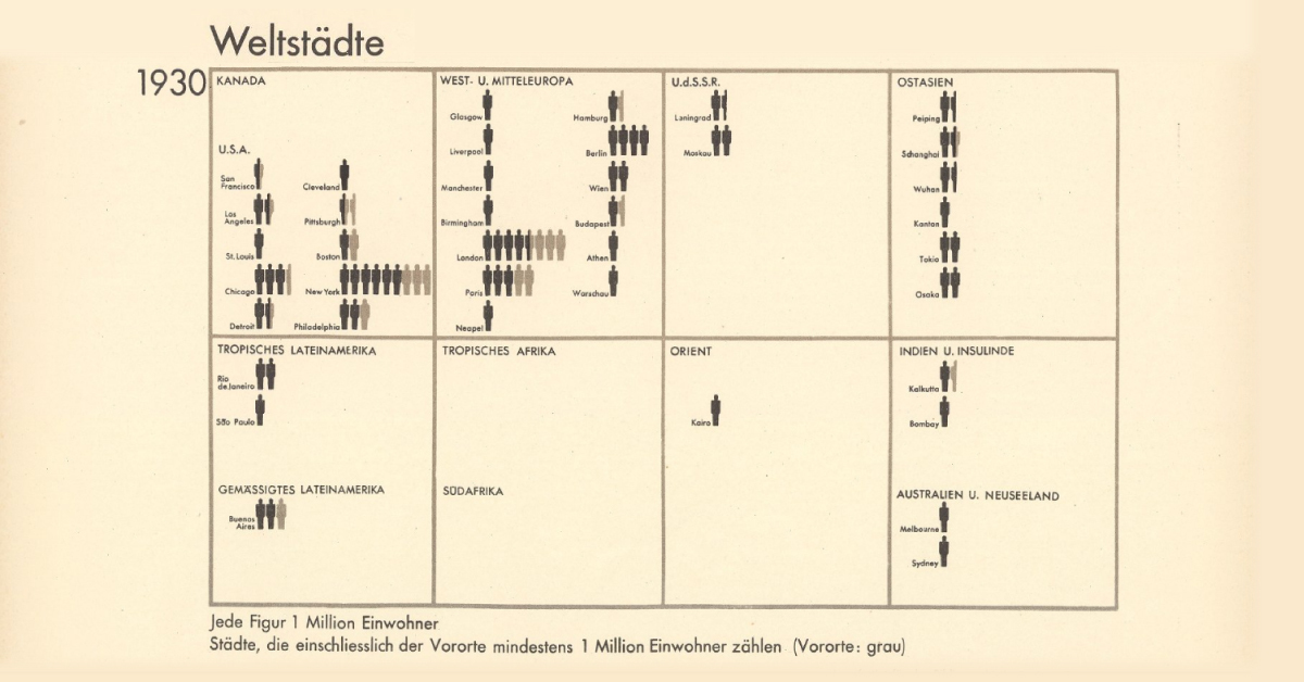
World Cities With At Least 1 Million Residents (1800–1930)
This chart is the latest in our Vintage Viz series, which presents historical visualizations along with the context needed to understand them.
The explosive world population boom in the last 300 years is common knowledge today. Much and more has been written about how and why it happened, why it was unusual, and how the specter of a declining population for the first time in three centuries could impact human society.
However, equally compelling, is how people in the past—those living in the midst of the early waves of this boom—were fascinated by what they were witnessing.
Evidence of this comes from today’s vintage visualization, denoting the increasing number of world cities with at least one million inhabitants through the years.
The above pictogram was made by Austrian philosopher and sociologist Otto Neurath (1882–1945), found in his book, Society and Economy, published in 1930.
World Population Doubles Between 1800 and 1930
In 1800, the world population crossed 1 billion for the first time ever.
In the next 130 years, it doubled past 2 billion.
The Second Agricultural Revolution, characterized by massive land and labor productivity, grew agricultural output more than the population and is one of the key drivers of this population growth.
And in the pictogram above, where one silhouette indicates one million inhabitants, this exponential population growth becomes far more vivid.
In 1800, for example, according to the creator’s estimates, only London had at least million residents. A century later, 15 cities now boasted of the same number. Then, three decades hence, 37 cities across the world had one million inhabitants.
| Year | Cities with One Million Residents |
|---|---|
| 1800 | 1 |
| 1900 | 15 |
| 1930 | 37 |
Importantly, the data above is based on the creator’s estimates from a century ago, and does not include Beijing (then referred to as Peking in English) in 1800. Historians now agree that the city had more than a million residents, and was the largest city in the world at the time.
Another phenomenon becoming increasingly apparent is growing urbanization—food surplus frees up large sections of the population from agriculture, driving specialization in other skills and trade, in turn leading to congregations in urban centers.
Other visualizations in the same book covered migration, Indigenous peoples, labor, religion, trade, and natural resources, reflecting the creator’s interest in the social life of individuals and their well-being.
Who Was Otto Neurath and What is His Legacy?
This vintage visualization might seem incredibly simple, simplistic even, considering how we map out population data today. But the creator Otto Neurath, and his wife Marie, were pioneers in the field of visual communication.
One of their notable achievements was the creation of the Vienna Method of pictorial statistics, which aimed to represent statistical information in a visually accessible way—the forerunner to modern-day infographics.
The Neuraths believed in using clear and simple visual language to convey complex information to a broad audience, an approach that laid the foundation for modern information design.
They fled Austria during the rise of the Nazi regime and spent their later years in various countries, including the UK. Otto Neurath’s influence on graphic design, visual communication, and the philosophy of language has endured, and his legacy is still recognized in these fields today.

-

 Wealth6 days ago
Charted: Which City Has the Most Billionaires in 2024?
-

 Mining2 weeks ago
Gold vs. S&P 500: Which Has Grown More Over Five Years?
-

 Uranium2 weeks ago
The World’s Biggest Nuclear Energy Producers
-

 Misc2 weeks ago
How Hard Is It to Get Into an Ivy League School?
-

 Debt2 weeks ago
How Debt-to-GDP Ratios Have Changed Since 2000
-

 Culture2 weeks ago
The Highest Earning Athletes in Seven Professional Sports
-

 Science2 weeks ago
Visualizing the Average Lifespans of Mammals
-

 Brands1 week ago
How Tech Logos Have Evolved Over Time