


Data, Information
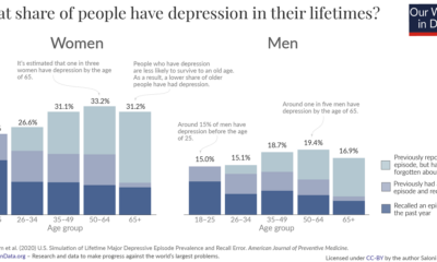

These graphics reveal how many people get depression over the course of their lives, broken down by age and sex.
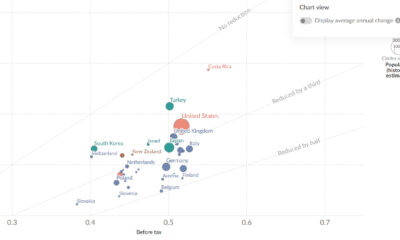

This chart shows how taxes offset income inequality by country, revealing differences in living standards around the world.
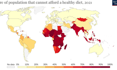

The wash of red in Africa, South Asia, and Southeast Asia indicates the regions where food unaffordability is at its peak.
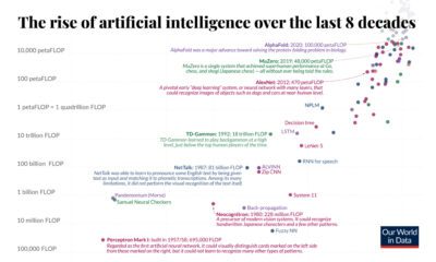

In eight decades, artificial intelligence has moved from purview of science fiction to reality. Here’s a quick history of AI computation.
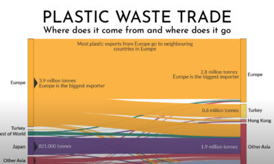

Which countries are responsible for exporting the world's plastic waste? This graphic shows the flow of global plastic waste through exports and imports.
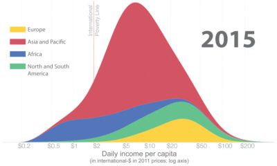

How has global income distribution changed over history? Below, we show three distinct periods since the Industrial Revolution.
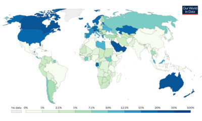

Immigrants account for 3.5% of the global population, but where are they more or less prevalent? This map shows immigration by country.
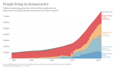

Are political democracies on the decline? This graphic shows the global composition of political regimes over 200 years.
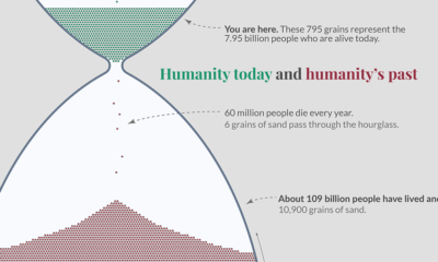

This impactful hour glass visualization shows all of humanity, including the 7% of humans who are alive today
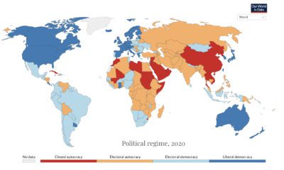

Only 93 countries enjoy a basic level of democratic rights as of 2020. Find out how this has changed in 200 years.