Demographics
The World Population in 2100, by Country


The World Population in 2100, by Country
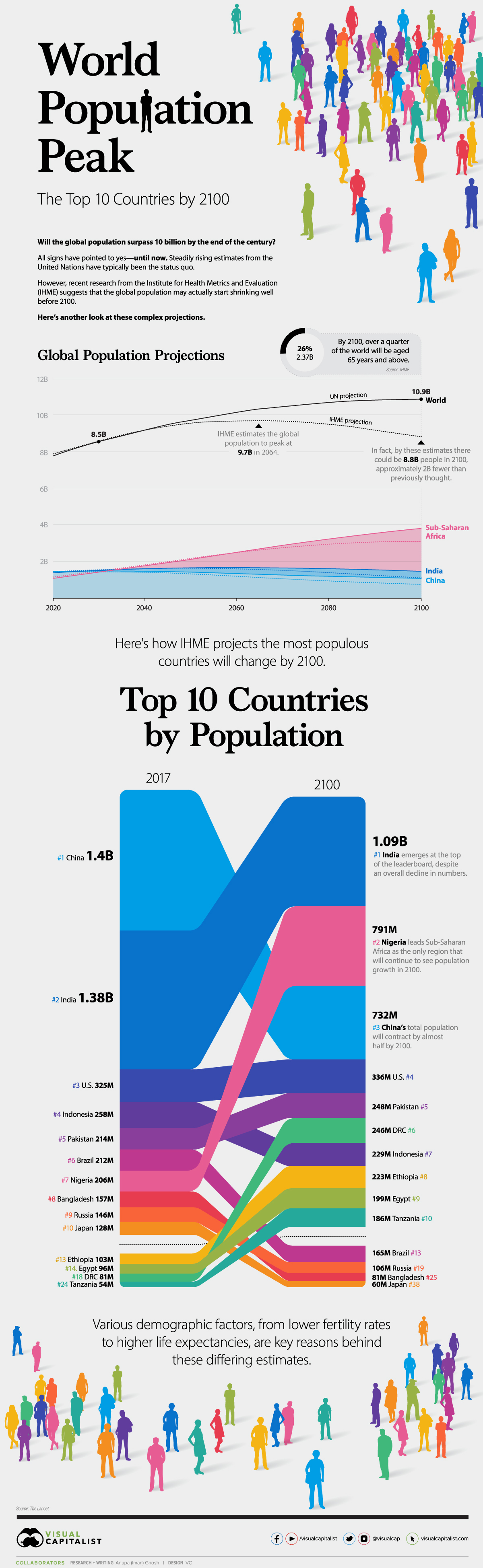
In 2015, the United Nations predicted that the global population could surpass 11 billion by the end of the century.
Last year, the UN revised these estimates, but the numbers it came up with were still well above 10 billion. These regular projections from the UN have been the status quo—until now.
Plenty of signs have pointed to there being a population plateau, but recent research from the Institute for Health Metrics and Evaluation (IHME), published in The Lancet, suggests that the number of people on this planet may actually start to shrink well before the year 2100.
Here’s a closer look at these complex projections.
UN vs. IHME Population Estimates
According to the UN, the world population is set to steadily rise over the years:
- 2030: 8.5 billion
- 2050: 9.7 billion
- 2100: 10.9 billion
In contrast, IHME paints a different picture. It projects the population to actually peak at 9.7 billion in 2064. Following this trajectory, there could be 8.8 billion people in 2100, approximately 2 billion fewer than previously thought.
Various demographic factors are behind these differences—higher life expectancies, migration rates, and lower fertility rates. For this last factor, independent drivers including contraceptive access and higher educational attainment were also considered.
A shifting age structure is also a key aspect of this transition. By 2100, over a quarter of the world or nearly 2.37 billion will be aged 65 years and above.
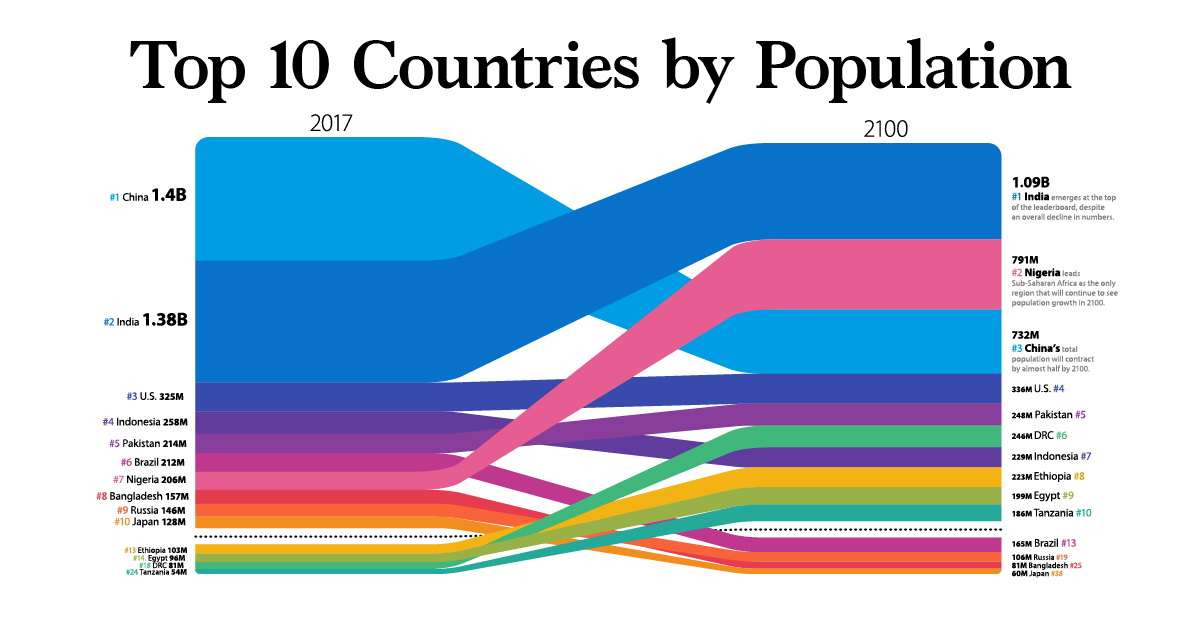
The Most Populous Countries in 2100
Amid all these demographic sea changes, which countries will come out on top?
Despite an overall decline in numbers to 1.09 billion people in 2100, India moves up from second to first place on the population leaderboard.
| Rank | Country | Population (2017) | Rank | Country | Population (2100E) |
|---|---|---|---|---|---|
| #1 | 🇨🇳 China | 1.4B | #1 | 🇮🇳 India | 1.09B |
| #2 | 🇮🇳 India | 1.38B | #2 | 🇳🇬 Nigeria | 791M |
| #3 | 🇺🇸 U.S. | 325M | #3 | 🇨🇳 China | 732M |
| #4 | 🇮🇩 Indonesia | 258M | #4 | 🇺🇸 U.S. | 336M |
| #5 | 🇵🇰 Pakistan | 214M | #5 | 🇵🇰 Pakistan | 248M |
| #6 | 🇧🇷 Brazil | 212M | #6 | 🇨🇩 DR Congo | 246M |
| #7 | 🇳🇬 Nigeria | 206M | #7 | 🇮🇩 Indonesia | 229M |
| #8 | 🇧🇩 Bangladesh | 157M | #8 | 🇪🇹 Ethiopia | 223M |
| #9 | 🇷🇺 Russia | 146M | #9 | 🇪🇬 Egypt | 199M |
| #10 | 🇯🇵 Japan | 128M | #10 | 🇹🇿 Tanzania | 186M |
The populations of both India and China will begin to contract after the mid-century—and it’s predicted that China’s total population will drop by almost half to 732 million by 2100.
Led by Nigeria, Sub-Saharan Africa is the only region that will continue to see growth by century’s end. In fact, four of the top 10 countries in the world in terms of population count will be located in Sub-Saharan Africa.
Tightly Packed Together
One final thing to consider is how population density may look in 2100, with many more people clustered in the same areas. For example, Nigeria is dealing with a land area nearly 11 times smaller than the U.S.—but it will have more than double the population.
| Country | 2100 Pop. | Area (Millions, km²/mi²) | Population Density per km² (mi²) |
|---|---|---|---|
| 🇳🇬 Nigeria | 791M | 0.92M km² (0.36M mi²) | 856.3 (2217.7) |
| 🇮🇳 India | 1.09B | 3.29M km² (1.27M mi²) | 331.6 (858.8) |
| 🇵🇰 Pakistan | 248M | 0.88M km² (0.34M mi²) | 281.2 (728.3) |
| 🇪🇹 Ethiopia | 223M | 1.10M km² (0.42M mi²) | 202.7 (531.0) |
| 🇪🇬 Egypt | 199M | 1.01M km² (0.39M mi²) | 197.0 (510.1) |
| 🇹🇿 Tanzania | 186M | 0.95M km² (0.37M mi²) | 196.3 (508.5) |
| 🇮🇩 Indonesia | 229M | 1.90M km² (0.74M mi²) | 120.2 (311.4) |
| 🇨🇩 DR Congo | 246M | 2.35M km² (0.91M mi²) | 104.9 (271.7) |
| 🇨🇳 China | 732M | 9.60M km² (3.70M mi²) | 76.3 (197.8) |
| 🇺🇸 U.S. | 336M | 9.83M km² (3.80M mi²) | 34.2 (88.5) |
Regardless of how the future population count shakes out, it’s clear that these heavyweight countries will undergo significant transformation in the coming decades.


Demographics
The Countries That Have Become Sadder Since 2010
Tracking Gallup survey data for more than a decade reveals some countries are witnessing big happiness declines, reflecting their shifting socio-economic conditions.


The Countries That Have Become Sadder Since 2010
This was originally posted on our Voronoi app. Download the app for free on iOS or Android and discover incredible data-driven charts from a variety of trusted sources.
Can happiness be quantified?
Some approaches that try to answer this question make a distinction between two differing components of happiness: a daily experience part, and a more general life evaluation (which includes how people think about their life as a whole).
The World Happiness Report—first launched in 2012—has been making a serious go at quantifying happiness, by examining Gallup poll data that asks respondents in nearly every country to evaluate their life on a 0–10 scale. From this they extrapolate a single “happiness score” out of 10 to compare how happy (or unhappy) countries are.
More than a decade later, the 2024 World Happiness Report continues the mission. Its latest findings also include how some countries have become sadder in the intervening years.
Which Countries Have Become Unhappier Since 2010?
Afghanistan is the unhappiest country in the world right now, and is also 60% unhappier than over a decade ago, indicating how much life has worsened since 2010.
In 2021, the Taliban officially returned to power in Afghanistan, after nearly two decades of American occupation in the country. The Islamic fundamentalist group has made life harder, especially for women, who are restricted from pursuing higher education, travel, and work.
On a broader scale, the Afghan economy has suffered post-Taliban takeover, with various consequent effects: mass unemployment, a drop in income, malnutrition, and a crumbling healthcare system.
| Rank | Country | Happiness Score Loss (2010–24) | 2024 Happiness Score (out of 10) |
|---|---|---|---|
| 1 | 🇦🇫 Afghanistan | -2.6 | 1.7 |
| 2 | 🇱🇧 Lebanon | -2.3 | 2.7 |
| 3 | 🇯🇴 Jordan | -1.5 | 4.2 |
| 4 | 🇻🇪 Venezuela | -1.3 | 5.6 |
| 5 | 🇲🇼 Malawi | -1.2 | 3.4 |
| 6 | 🇿🇲 Zambia | -1.2 | 3.5 |
| 7 | 🇧🇼 Botswana | -1.2 | 3.4 |
| 8 | 🇾🇪 Yemen | -1.0 | 3.6 |
| 9 | 🇪🇬 Egypt | -1.0 | 4.0 |
| 10 | 🇮🇳 India | -0.9 | 4.1 |
| 11 | 🇧🇩 Bangladesh | -0.9 | 3.9 |
| 12 | 🇨🇩 DRC | -0.7 | 3.3 |
| 13 | 🇹🇳 Tunisia | -0.7 | 4.4 |
| 14 | 🇨🇦 Canada | -0.6 | 6.9 |
| 15 | 🇺🇸 U.S. | -0.6 | 6.7 |
| 16 | 🇨🇴 Colombia | -0.5 | 5.7 |
| 17 | 🇵🇦 Panama | -0.5 | 6.4 |
| 18 | 🇵🇰 Pakistan | -0.5 | 4.7 |
| 19 | 🇿🇼 Zimbabwe | -0.5 | 3.3 |
| 20 | 🇮🇪 Ireland | -0.5 | 6.8 |
| N/A | 🌍 World | +0.1 | 5.5 |
Nine countries in total saw their happiness score drop by a full point or more, on the 0–10 scale.
Noticeably, many of them have seen years of social and economic upheaval. Lebanon, for example, has been grappling with decades of corruption, and a severe liquidity crisis since 2019 that has resulted in a banking system collapse, sending poverty levels skyrocketing.
In Jordan, unprecedented population growth—from refugees leaving Iraq and Syria—has aggravated unemployment rates. A somewhat abrupt change in the line of succession has also raised concerns about political stability in the country.

-

 Mining1 week ago
Gold vs. S&P 500: Which Has Grown More Over Five Years?
-

 Markets2 weeks ago
Ranked: The Most Valuable Housing Markets in America
-

 Money2 weeks ago
Which States Have the Highest Minimum Wage in America?
-

 AI2 weeks ago
Ranked: Semiconductor Companies by Industry Revenue Share
-

 Markets2 weeks ago
Ranked: The World’s Top Flight Routes, by Revenue
-

 Countries2 weeks ago
Population Projections: The World’s 6 Largest Countries in 2075
-

 Markets2 weeks ago
The Top 10 States by Real GDP Growth in 2023
-

 Demographics2 weeks ago
The Smallest Gender Wage Gaps in OECD Countries