Money
Here’s How Reserve Currencies Have Evolved Over 120 Years
Article/Editing:
Here’s How Reserve Currencies Have Evolved Over 120 Years
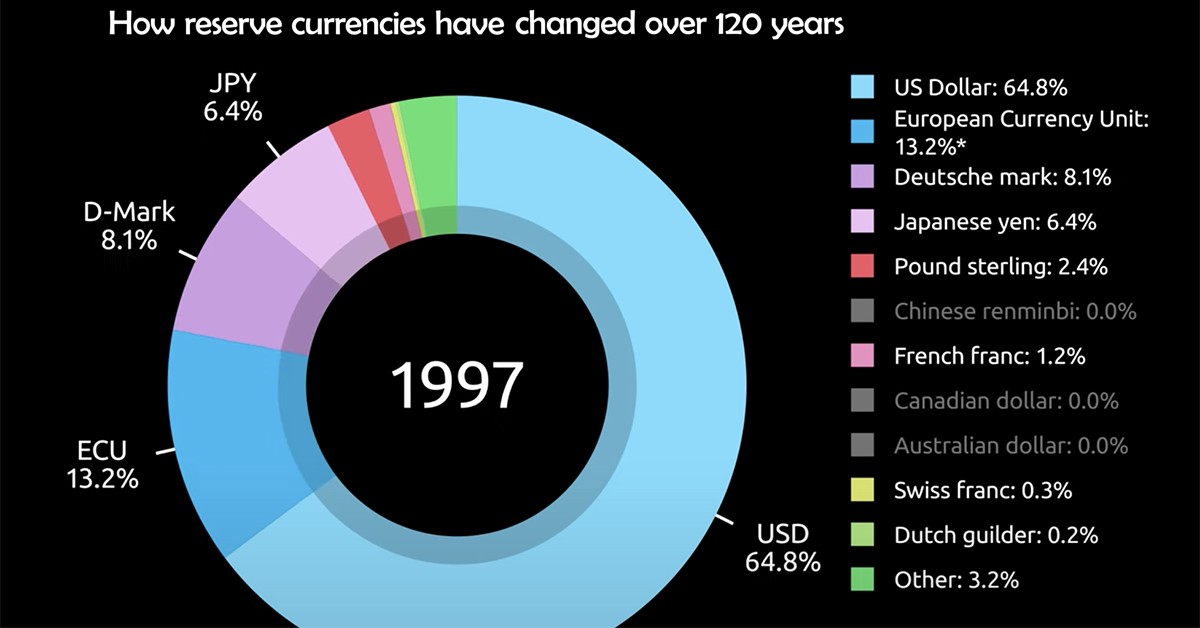
Over the last 120 years, the popularity of different reserve currencies have ebbed and flowed, reflecting the shifting fortunes of leading global economies.
For example, in the year 1900, the U.S. dollar and pound sterling made up 0% and 62% of global reserves respectively. But fast forward to 2020, and the pound now represents just 4.7% of global currency reserves, while the U.S. dollar stands at nearly 60%.
Today’s motion graphic from James Eagle looks at the year-over-year change in currency reserves as a portion of total reserves, spread across 120 years.
| Currency | 1900 | 1920 | 1940 | 1960 | 1980 | 2000 | 2020 |
|---|---|---|---|---|---|---|---|
| U.S. Dollar | 0.0% | 28.4% | 27.9% | 61.7% | 57.9% | 71.2% | 59.0% |
| Euro | 0.0% | 0.0% | 0.0% | 0.0% | 17.5% | 18.5% | 21.2% |
| Deutsche mark | 14.7% | 4.2% | 0.0% | 0.0% | 12.9% | 0.0% | 0.0% |
| Japanese yen | 0.0% | 0.0% | 0.0% | 0.0% | 3.9% | 5.8% | 6.0% |
| Pound sterling | 62.0% | 57.3% | 68.9% | 35.1% | 2.4% | 2.7% | 4.7% |
| Chinese renminbi | 0.0% | 0.0% | 0.0% | 0.0% | 0.0% | 0.0% | 2.3% |
| French franc | 17.5% | 6.2% | 2.1% | 1.3% | 1.0% | 0.0% | 0.0% |
| Canadian dollar | 0.0% | 0.0% | 0.0% | 0.0% | 0.0% | 0.0% | 2.1% |
| Australian dollar | 0.0% | 0.0% | 0.0% | 0.0% | 0.0% | 0.0% | 1.8% |
| Swiss franc | 0.0% | 0.0% | 0.8% | 0.3% | 2.2% | 0.3% | 0.2% |
| Dutch guilder | 0.0% | 3.9% | 0.3% | 0.1% | 0.9% | 0.0% | 0.0% |
| Other | 5.7% | 0.0% | 0.0% | 1.6% | 1.3% | 1.5% | 2.7% |
What is a Reserve Currency?
A reserve currency is a large quantity of currency held in “reserve” by monetary authorities like central banks.
Currencies are often held in reserve in preparation for investments and transactions, among other things. Our vast global trade system, which is approaching $20 trillion in value, means plenty of currencies are always needed in reserve. In fact, an estimated $5 trillion in currency swaps hands every single day.
Here are some reasons that currency reserves are held:
- Exchange rate stability for the domestic currency
- To ensures liquidity in times of crisis
- To diversify central bank portfolios, which can reduce risk and improve credit ratings
- More than 65 countries peg their currencies to the U.S. dollar
- Five U.S. territories and a number of sovereign countries, such as Ecuador and Panama, use it as an official currency of exchange
- Around 90% of all Forex trading involves the U.S. dollar
All things equal, countries benefit economically from greater demand for their respective currencies.
The Rise and Fall of Reserve Currencies
Some economists argue that the demand for currencies in the long run revolves around the economic relevance of a country. In general, the larger and more powerful a nation’s economy is, the greater the network effect, and the more interlinked they are to the global economy. Thus, the greater demand there is to hold their currency in reserve.
The last 120 years of currency reserve data shows some support for this claim. For example, Japan’s economy hit a peak in terms of its relative share of global GDP in the early 1990s, just before the effects of the Lost Decade were felt. Subsequently, their peak as a reserve currency was around the same horizon, at 9.4% in 1990.
America’s Era of Dominance
Due to the economic strength of the United States in the post-WWII era, the dollar is what economists call a vehicle currency.
This means many non-dollar economies still choose to engage in international transactions using the dollar. These smaller and less accepted currencies are often converted to U.S. dollars before proceeding with any business or trade dealings. This is why, although Asian economies tend to have neighboring states as their top trade partners, they still engage in a massive portion of these transactions with the U.S. greenback as the currency of choice.
Here are some facts that further exemplify the strength and power of the U.S. dollar:
Additionally, the dollar is often seen as a haven in times of extreme uncertainty and tumult. Given its status as the world’s reserve currency, it can be perceived as less risky and can withstand economic shock to a greater degree relative to other currencies.
New Challengers to the Dollar
In the not too distant past, the U.S. displaced the UK economically and as the world’s reserve currency. Today, the U.S. economy is showing signs of slowing down, based on GDP growth.
China is on the rise, having already displaced the U.S. as the EU’s top trade partner. With projections for China to overtake the U.S. as the world’s largest economy before 2030 in nominal terms, could a new global reserve currency emerge?

This article was published as a part of Visual Capitalist's Creator Program, which features data-driven visuals from some of our favorite Creators around the world.


Money
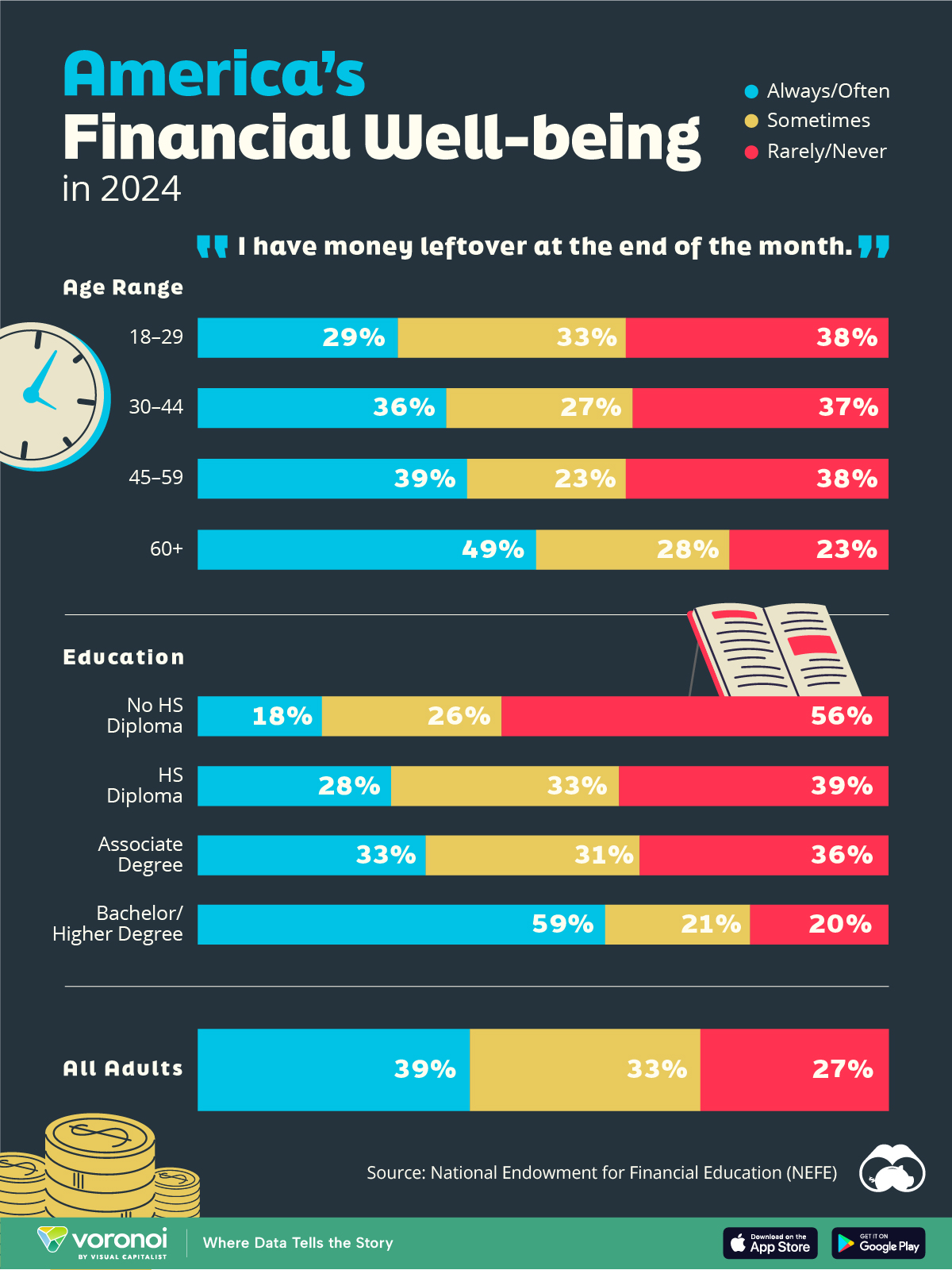
Charted: Who Has Savings in This Economy?
Older, better-educated adults are winning the savings game, reveals a January survey by the National Opinion Research Center at the University of Chicago.
Who Has Savings in This Economy?
This was originally posted on our Voronoi app. Download the app for free on iOS or Android and discover incredible data-driven charts from a variety of trusted sources.
Two full years of inflation have taken their toll on American households. In 2023, the country’s collective credit card debt crossed $1 trillion for the first time. So who is managing to save money in the current economic environment?
We visualize the percentage of respondents to the statement “I have money leftover at the end of the month” categorized by age and education qualifications. Data is sourced from a National Endowment for Financial Education (NEFE) report, published last month.
The survey for NEFE was conducted from January 12-14, 2024, by the National Opinion Research Center at the University of Chicago. It involved 1,222 adults aged 18+ and aimed to be representative of the U.S. population.
Older Americans Save More Than Their Younger Counterparts
General trends from this dataset indicate that as respondents get older, a higher percentage of them are able to save.
| Age | Always/Often | Sometimes | Rarely/Never |
|---|---|---|---|
| 18–29 | 29% | 33% | 38% |
| 30–44 | 36% | 27% | 37% |
| 45–59 | 39% | 23% | 38% |
| Above 60 | 49% | 28% | 23% |
| All Adults | 39% | 33% | 27% |
Note: Percentages are rounded and may not sum to 100.
Perhaps not surprisingly, those aged 60+ are the age group with the highest percentage saying they have leftover money at the end of the month. This age group spent the most time making peak earnings in their careers, are more likely to have investments, and are more likely to have paid off major expenses like a mortgage or raising a family.
The Impact of Higher Education on Earnings and Savings
Based on this survey, higher education dramatically improves one’s ability to save. Shown in the table below, those with a bachelor’s degree or higher are three times more likely to have leftover money than those without a high school diploma.
| Education | Always/Often | Sometimes | Rarely/Never |
|---|---|---|---|
| No HS Diploma | 18% | 26% | 56% |
| HS Diploma | 28% | 33% | 39% |
| Associate Degree | 33% | 31% | 36% |
| Bachelor/Higher Degree | 59% | 21% | 20% |
| All Adults | 39% | 33% | 27% |
Note: Percentages are rounded and may not sum to 100.
As the Bureau of Labor Statistics notes, earnings improve with every level of education completed.
For example, those with a high school diploma made 25% more than those without in 2022. And as the qualifications increase, the effects keep stacking.
Meanwhile, a Federal Reserve study also found that those with more education tended to make financial decisions that contributed to building wealth, of which the first step is to save.

-

 Markets1 week ago
U.S. Debt Interest Payments Reach $1 Trillion
-

 Business2 weeks ago
Charted: Big Four Market Share by S&P 500 Audits
-

 Real Estate2 weeks ago
Ranked: The Most Valuable Housing Markets in America
-

 Money2 weeks ago
Which States Have the Highest Minimum Wage in America?
-

 AI2 weeks ago
Ranked: Semiconductor Companies by Industry Revenue Share
-

 Markets2 weeks ago
Ranked: The World’s Top Flight Routes, by Revenue
-

 Demographics2 weeks ago
Population Projections: The World’s 6 Largest Countries in 2075
-

 Markets2 weeks ago
The Top 10 States by Real GDP Growth in 2023