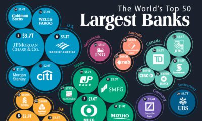
Markets
The World’s Biggest Real Estate Bubbles in 2021


Ranked: The World’s Biggest Real Estate Bubbles in 2021
Identifying real estate bubbles is a tricky business. After all, even though many of us “know a bubble when we see it”, we don’t have tangible proof of a bubble until it actually bursts.
And by then, it’s too late.
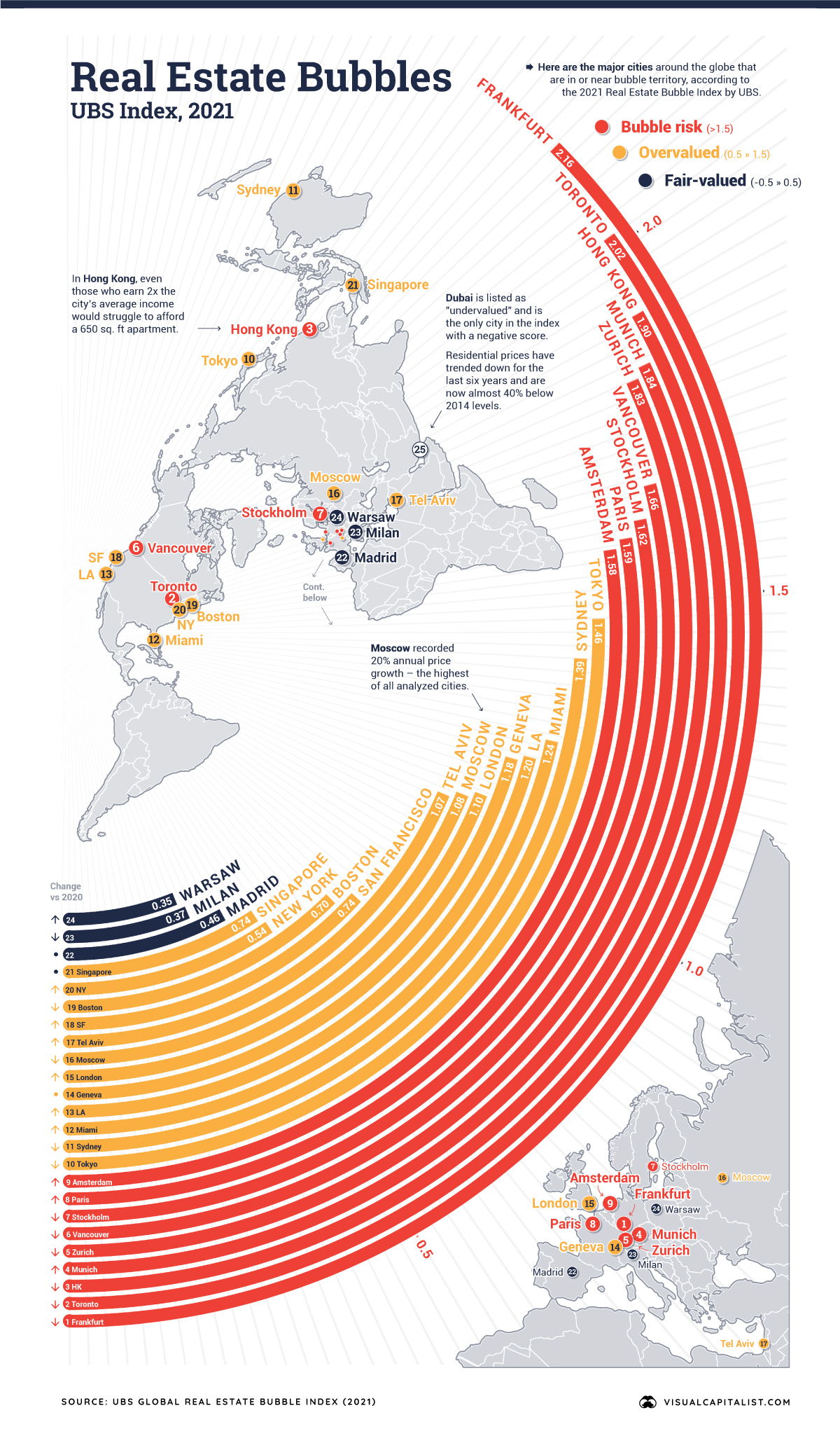
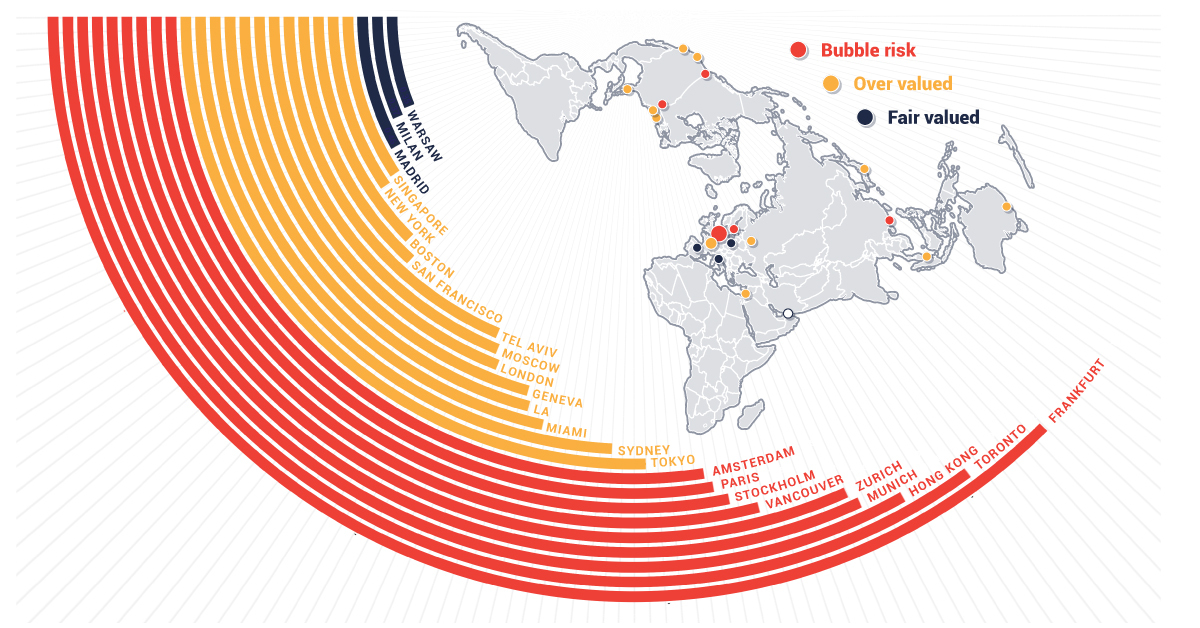
The map above, based on data from the Real Estate Bubble Index by UBS, serves as an early warning system, evaluating 25 global cities and scoring them based on their bubble risk.
Reading the Signs
Bubbles are hard to distinguish in real-time as investors must judge whether a market’s pricing accurately reflects what will happen in the future. Even so, there are some signs to watch out for.
As one example, a decoupling of prices from local incomes and rents is a common red flag. As well, imbalances in the real economy, such as excessive construction activity and lending can signal a bubble in the making.
With this in mind, which global markets are exhibiting the most bubble risk?
The Geography of Real Estate Bubbles
Europe is home to a number of cities that have extreme bubble risk, with Frankfurt topping the list this year. Germany’s financial hub has seen real home prices rise by 10% per year on average since 2016—the highest rate of all cities evaluated.
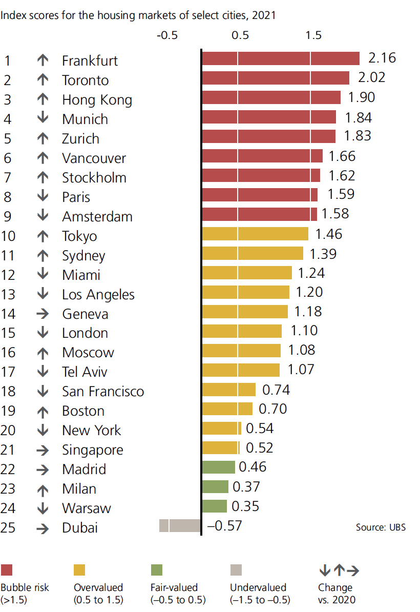
Two Canadian cities also find themselves in bubble territory: Toronto and Vancouver. In the former, nearly 30% of purchases in 2021 went to buyers with multiple properties, showing that real estate investment is alive and well. Despite efforts to cool down these hot urban markets, Canadian markets have rebounded and continued their march upward. In fact, over the past three decades, residential home prices in Canada grew at the fastest rates in the G7.
Despite civil unrest and unease over new policies, Hong Kong still has the second highest score in this index. Meanwhile, Dubai is listed as “undervalued” and is the only city in the index with a negative score. Residential prices have trended down for the past six years and are now down nearly 40% from 2014 levels.
Note: The Real Estate Bubble Index does not currently include cities in Mainland China.
Trending Ever Upward
Overheated markets are nothing new, though the COVID-19 pandemic has changed the dynamic of real estate markets.
For years, house price appreciation in city centers was all but guaranteed as construction boomed and people were eager to live an urban lifestyle. Remote work options and office downsizing is changing the value equation for many, and as a result, housing prices in non-urban areas increased faster than in cities for the first time since the 1990s.
Even so, these changing priorities haven’t deflated the real estate market in the world’s global cities. Below are growth rates for 2021 so far, and how that compares to the last five years.
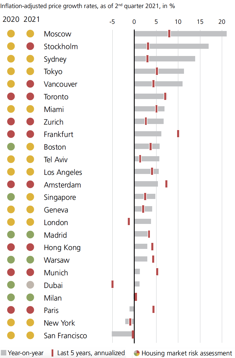
Overall, prices have been trending upward almost everywhere. All but four of the cities above—Milan, Paris, New York, and San Francisco—have had positive growth year-on-year.
Even as real estate bubbles continue to grow, there is an element of uncertainty. Debt-to-income ratios continue to rise, and lending standards, which were relaxed during the pandemic, are tightening once again. Add in the societal shifts occurring right now, and predicting the future of these markets becomes more difficult.
In the short term, we may see what UBS calls “the era of urban outperformance” come to an end.


Markets
U.S. Debt Interest Payments Reach $1 Trillion
U.S. debt interest payments have surged past the $1 trillion dollar mark, amid high interest rates and an ever-expanding debt burden.


U.S. Debt Interest Payments Reach $1 Trillion
This was originally posted on our Voronoi app. Download the app for free on iOS or Android and discover incredible data-driven charts from a variety of trusted sources.
The cost of paying for America’s national debt crossed the $1 trillion dollar mark in 2023, driven by high interest rates and a record $34 trillion mountain of debt.
Over the last decade, U.S. debt interest payments have more than doubled amid vast government spending during the pandemic crisis. As debt payments continue to soar, the Congressional Budget Office (CBO) reported that debt servicing costs surpassed defense spending for the first time ever this year.
This graphic shows the sharp rise in U.S. debt payments, based on data from the Federal Reserve.
A $1 Trillion Interest Bill, and Growing
Below, we show how U.S. debt interest payments have risen at a faster pace than at another time in modern history:
| Date | Interest Payments | U.S. National Debt |
|---|---|---|
| 2023 | $1.0T | $34.0T |
| 2022 | $830B | $31.4T |
| 2021 | $612B | $29.6T |
| 2020 | $518B | $27.7T |
| 2019 | $564B | $23.2T |
| 2018 | $571B | $22.0T |
| 2017 | $493B | $20.5T |
| 2016 | $460B | $20.0T |
| 2015 | $435B | $18.9T |
| 2014 | $442B | $18.1T |
| 2013 | $425B | $17.2T |
| 2012 | $417B | $16.4T |
| 2011 | $433B | $15.2T |
| 2010 | $400B | $14.0T |
| 2009 | $354B | $12.3T |
| 2008 | $380B | $10.7T |
| 2007 | $414B | $9.2T |
| 2006 | $387B | $8.7T |
| 2005 | $355B | $8.2T |
| 2004 | $318B | $7.6T |
| 2003 | $294B | $7.0T |
| 2002 | $298B | $6.4T |
| 2001 | $318B | $5.9T |
| 2000 | $353B | $5.7T |
| 1999 | $353B | $5.8T |
| 1998 | $360B | $5.6T |
| 1997 | $368B | $5.5T |
| 1996 | $362B | $5.3T |
| 1995 | $357B | $5.0T |
| 1994 | $334B | $4.8T |
| 1993 | $311B | $4.5T |
| 1992 | $306B | $4.2T |
| 1991 | $308B | $3.8T |
| 1990 | $298B | $3.4T |
| 1989 | $275B | $3.0T |
| 1988 | $254B | $2.7T |
| 1987 | $240B | $2.4T |
| 1986 | $225B | $2.2T |
| 1985 | $219B | $1.9T |
| 1984 | $205B | $1.7T |
| 1983 | $176B | $1.4T |
| 1982 | $157B | $1.2T |
| 1981 | $142B | $1.0T |
| 1980 | $113B | $930.2B |
| 1979 | $96B | $845.1B |
| 1978 | $84B | $789.2B |
| 1977 | $69B | $718.9B |
| 1976 | $61B | $653.5B |
| 1975 | $55B | $576.6B |
| 1974 | $50B | $492.7B |
| 1973 | $45B | $469.1B |
| 1972 | $39B | $448.5B |
| 1971 | $36B | $424.1B |
| 1970 | $35B | $389.2B |
| 1969 | $30B | $368.2B |
| 1968 | $25B | $358.0B |
| 1967 | $23B | $344.7B |
| 1966 | $21B | $329.3B |
Interest payments represent seasonally adjusted annual rate at the end of Q4.
At current rates, the U.S. national debt is growing by a remarkable $1 trillion about every 100 days, equal to roughly $3.6 trillion per year.
As the national debt has ballooned, debt payments even exceeded Medicaid outlays in 2023—one of the government’s largest expenditures. On average, the U.S. spent more than $2 billion per day on interest costs last year. Going further, the U.S. government is projected to spend a historic $12.4 trillion on interest payments over the next decade, averaging about $37,100 per American.
Exacerbating matters is that the U.S. is running a steep deficit, which stood at $1.1 trillion for the first six months of fiscal 2024. This has accelerated due to the 43% increase in debt servicing costs along with a $31 billion dollar increase in defense spending from a year earlier. Additionally, a $30 billion increase in funding for the Federal Deposit Insurance Corporation in light of the regional banking crisis last year was a major contributor to the deficit increase.
Overall, the CBO forecasts that roughly 75% of the federal deficit’s increase will be due to interest costs by 2034.

-

 Maps2 weeks ago
Mapped: Average Wages Across Europe
-

 Money1 week ago
Which States Have the Highest Minimum Wage in America?
-

 Real Estate1 week ago
Ranked: The Most Valuable Housing Markets in America
-

 Markets1 week ago
Charted: Big Four Market Share by S&P 500 Audits
-

 AI1 week ago
The Stock Performance of U.S. Chipmakers So Far in 2024
-

 Automotive1 week ago
Almost Every EV Stock is Down After Q1 2024
-

 Money2 weeks ago
Where Does One U.S. Tax Dollar Go?
-

 Green2 weeks ago
Ranked: Top Countries by Total Forest Loss Since 2001