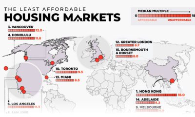

This map examines middle-income housing market affordability across eight major countries, highlighting some of the least affordable cities.
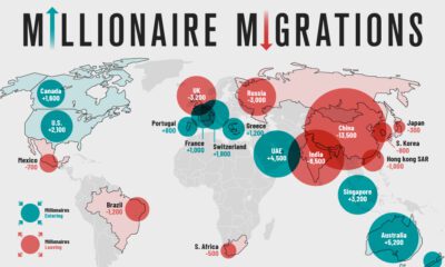

Where do the world's wealthiest people want to live? This map tracks the migration of the world's High Net Worth Individuals (HNWIs).


Considering factors like the cost of investment and number of locations, this graphic breaks down the best franchises in the U.S.
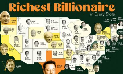

Who are the wealthiest people in the United States? This map breaks down the richest billionaires in U.S. states.
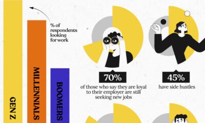

Gen Z job seekers are far more active than older generations, consistently looking for new work while already employed.
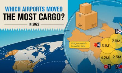

Cargo that moves through airports represents the value of around 35% of world trade. These hubs move the most cargo globally.
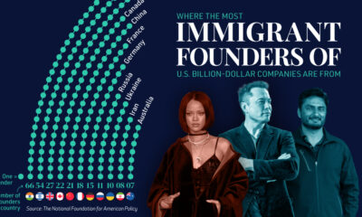

The majority of billion-dollar startups in the U.S. have at least one immigrant founder. Here is where those founders are from.
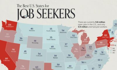

On average, there are 75 workers available for every 100 job openings across the country. Here's how it varies by state.
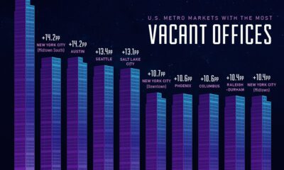

This visual showcases the top ten U.S. downtown areas with the fastest growing rate of vacant offices from the pre-pandemic era to 2023.
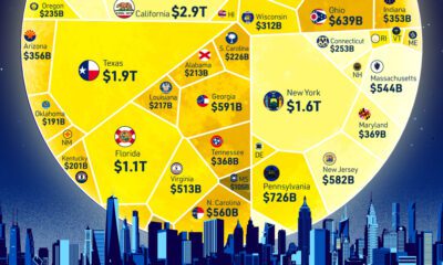

How does each state contribute to America's overall GDP? This visualization breaks down the U.S. economy by state.
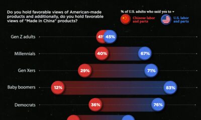

Around 70% of U.S. adults claim to prefer 'made in America' products. This chart breaks down the demographics of patriotic purchases.
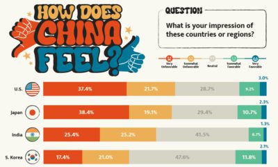

What is the Chinese public's view of world powers? This visual breaks down Chinese sentiment towards other countries.
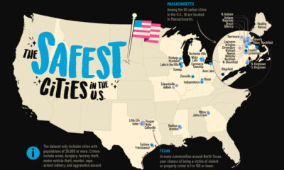

How safe is small town America? This map reveals the safest cities in the U.S. in terms of the total crime rate per every 1,000 residents.
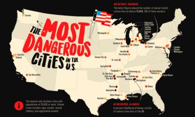

This map shows the most dangerous cities in the U.S. in terms of the violent crime rate per 1,000 residents.
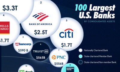

In this visual we showcase the relative size of the 100 largest U.S. banks in terms of consolidated assets.


There's more to consider than the price tag when purchasing a house. This ranking reveals the most affordable U.S. cities for home buyers.

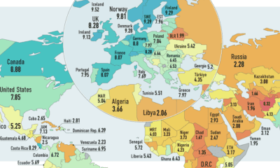
How free are people to control their own labor, property, and finances? This map reveals the state of economic freedom globally.
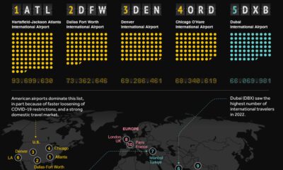

From Dubai to Charles de Gaulle, this visual ranks the world's busiest airports in terms of passenger count.

How many countries globally are true democracies? This map showcases the state of democracy in every country worldwide.
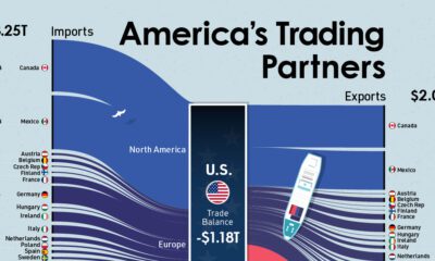

Who are the biggest trading partners of the U.S.? This visual showcases the trade balances between the U.S. and its trading partners.
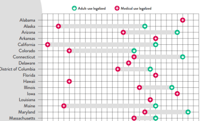

At the federal level, cannabis is illegal, but state laws differ. This graphic looks at the timelines of cannabis legislation in the U.S.
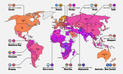

Where do the happiest people on earth live? This map is a snapshot of the world's most (and least) happy countries in 2023.
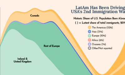

The U.S. is built on immigration and this chart shows how Latin America has been one of the biggest drivers of U.S. immigration in the last...


In this visual, we've ranked the top U.S. metropolitan areas in terms of their GDP. How does your city rank?

From New York to Damascus, this infographic uses EIU cost of living data to rank the world's most and least expensive cities to live in


A train transporting a number of potentially dangerous chemicals derailed near the Ohio–Pennsylvania border. This infographic explains what happened
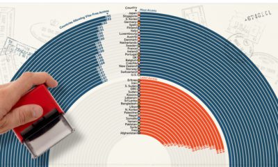

How strong is your passport? This ranking showcases the most and least powerful passports based on their ease of access to countries globally.
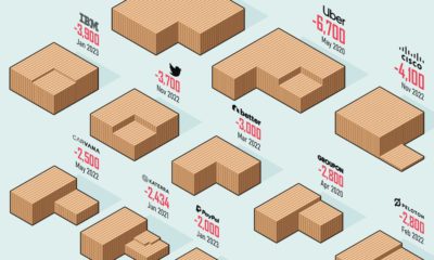

How bad are the current layoffs in the tech sector? This visual reveals the 20 biggest tech layoffs since the start of the pandemic.
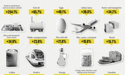

How has inflation impacted everyday goods like milk, flour, or fuel? This chart shows the annual change in the price of basic daily goods.
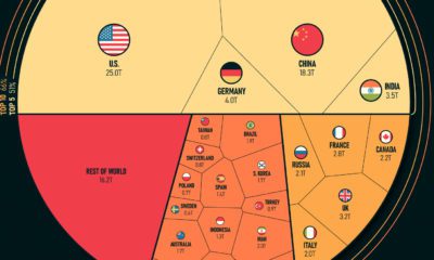

Just five countries make up more than half of the global economy. The top 25 countries make up a staggering 84% of the world's GDP.
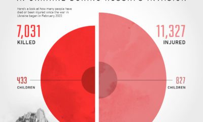

Using data from the UN, this chart shows civilian death toll figures resulting from Russia's invasion of Ukraine.
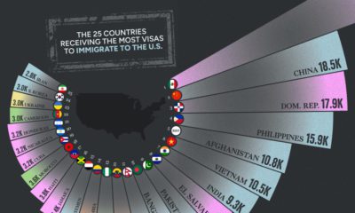

Every year, there are hundreds of thousands of U.S. immigration visas issued by the government. See which countries receive the most in this visualization.
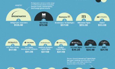

This annual ranking shows the world's largest hedge funds, which collectively hold an estimated $45 trillion in assets under management.


How can you tell a fake $100 bill from a real one? In this visual we break down the anatomy and security features of American money.
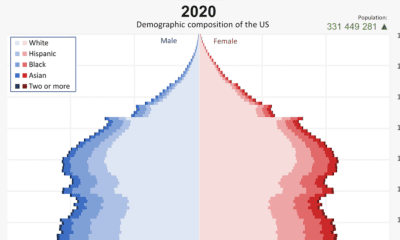

From 1901 to 2020, the U.S. population has changed significantly. This video reveals the change in America's demographics over 100+ years.
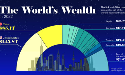

This visualization breaks down how household wealth is distributed around the world. Just 10 countries now account for 75% of total household wealth.
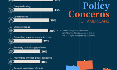

As the world's superpower, the U.S. has major influence in world events. Which foreign policy concerns stand out for Americans?
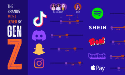

Which brands win the most with Gen Z compared to older generations? From TikTok to Capri Sun, this ranking looks at Gen Z's favorite brands.
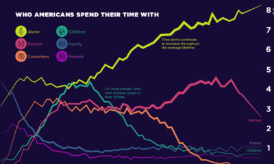

Social connections evolve throughout our lifetimes. Here we chart how much time Americans spend with others, and who that time is spent with.
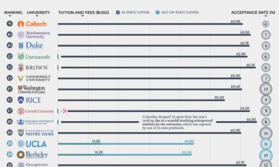

What are the 50 best universities in America? From Harvard (#3) to The Ohio State University (#49), where does your school rank?
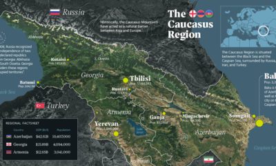

There has been intermittent fighting in the Caucasus region for decades. But what is the area like beyond the conflict? This map takes a look.
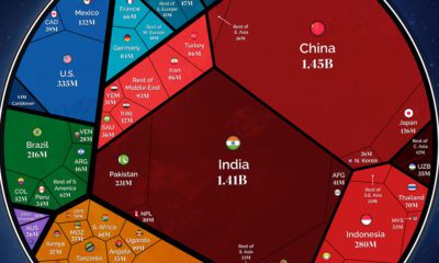

Our population will soon reach a new milestone—8 billion. These visualizations show where all those people are distributed around the world
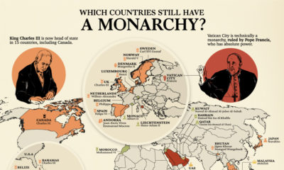

Beyond the 15 nations under the British monarchy, 28 other countries still have a ruling monarch. Here's a look at the world's monarchies.
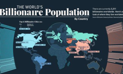

Collectively, worldwide billionaire wealth is nearly $12 trillion. This map breaks down where these 3,311 billionaires live around the globe.
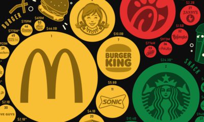

America has hundreds of options for quick and convenient food. But which fast food brands are the most popular, in terms of sales?
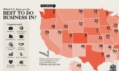

Looking to start a business? This map reveals America's best states to do business in, analyzing everything from workforce to infrastructure.
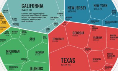

U.S. goods imports were worth $2.8T in 2021. From east coast to west, this visualization breaks down imports on a state-by-state basis
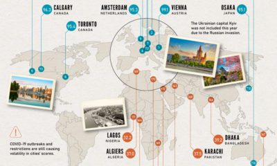

Which cities rank as the best places to live worldwide? This map reveals the world's most and least livable cities.
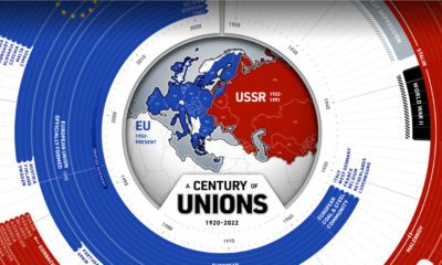

This year marks 100 years since the birth of the Soviet Union. How have countries in and near Europe aligned themselves over the last century?
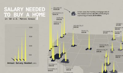

Is owning a home still realistic? This map lays out the salary you'd need to buy a home in 50 different U.S. metro areas.


 Creator Program