Money
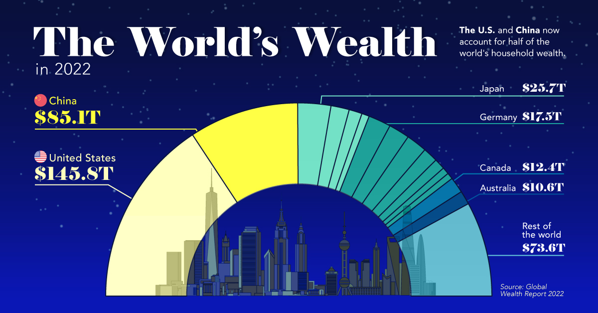
The U.S. and China Account for Half the World’s Household Wealth
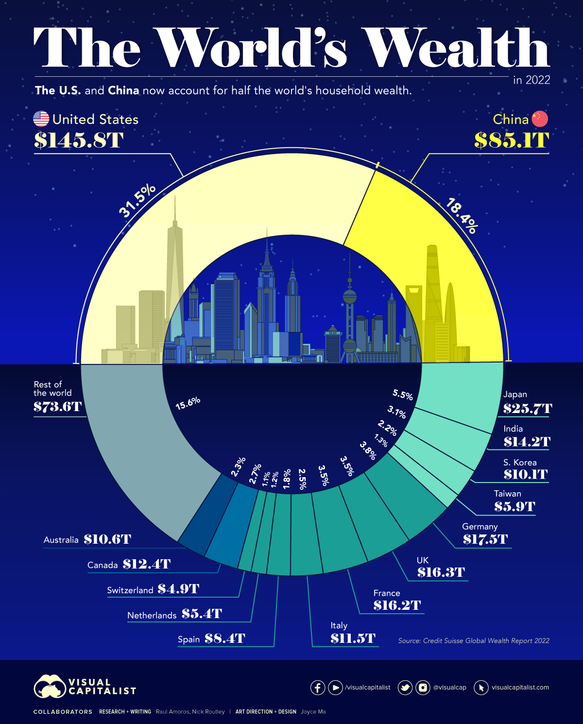


The U.S. and China Account for Half the World’s Household Wealth
Measures like GDP are commonly used to understand the overall wealth and size of the economy. While looking at economic output on an annual basis is useful, there are other metrics to consider when evaluating the wealth of a nation.
Household wealth statistics reveal which country’s citizens are accruing the highest level of money and assets worldwide.
This visual utilizes data from Credit Suisse’s annual Global Wealth Report to break down the latest estimates for household wealth by country.
Household Wealth, by Country
Here’s how the world’s $463 trillion in household wealth is distributed:
| Rank | Country | Household Wealth (2022) | % of World Total |
|---|---|---|---|
| #1 | 🇺🇸 United States | $145.8T | 31.5% |
| #2 | 🇨🇳 China | $85.1T | 18.4% |
| #3 | 🇯🇵 Japan | $25.7T | 5.5% |
| #4 | 🇩🇪 Germany | $17.5T | 3.8% |
| #5 | 🇬🇧 United Kingdom | $16.3T | 3.5% |
| #6 | 🇫🇷 France | $16.2T | 3.5% |
| #7 | 🇮🇳 India | $14.2T | 3.1% |
| #8 | 🇨🇦 Canada | $12.4T | 2.7% |
| #9 | 🇮🇹 Italy | $11.5T | 2.5% |
| #10 | 🇦🇺 Australia | $10.6T | 2.3% |
| #11 | 🇰🇷 South Korea | $10.1T | 2.2% |
| #12 | 🇪🇸 Spain | $8.4T | 1.8% |
| #13 | 🇹🇼 Taiwan | $5.9T | 1.3% |
| #14 | 🇳🇱 Netherlands | $5.4T | 1.2% |
| #15 | 🇨🇭 Switzerland | $4.9T | 1.1% |
| Rest of World | $73.6T | 15.6% | |
| Total: | $463.6T | 100.0% |
As the table above demonstrates, global household wealth is far from being distributed equally.
Country-Level Wealth Concentration
Much of global wealth is concentrated in the biggest economies, with households in China and the U.S. combining to make up half of all personal wealth in the world. This differs slightly from using GDP as a measure, where the U.S. and China make up 24% and 19% of the world economy in nominal terms, respectively.
Today, just 10 countries account for 75% of total household wealth.
One of the biggest changes in recent years is the rise of wealth in China. A decade ago, China’s citizens were estimated to hold just 9% of the world’s wealth. That figure has now more than doubled, while median wealth in the country has skyrocketed from $3,111 to $26,752 between 2000 and 2021.
A Regional Look at Household Wealth
From a regional standpoint, wealth is equally split three ways, between North America, Asia, and everywhere else.
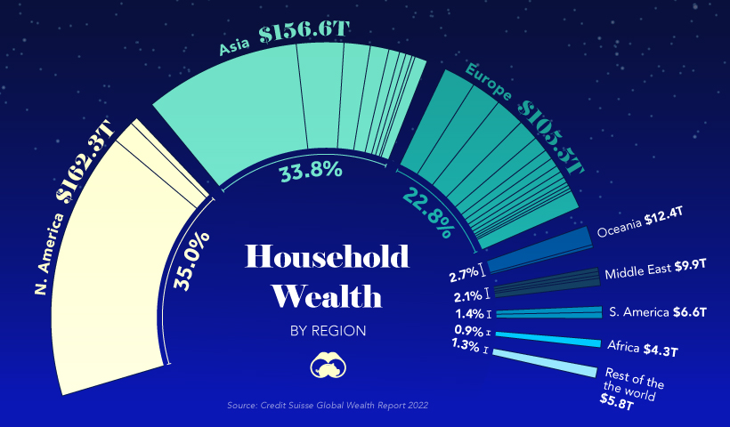
In just one decade, Europe’s share of household wealth dropped by eight percentage points, which is due, in part, to the economic momentum of China.
Surprisingly, the regions of Africa, South America, Oceania, and the Middle East combine only for about 11% of the world’s total household wealth.
Where does this data come from?
Source: Global Wealth Report by Credit Suisse
Data note: There is no straightforward way of estimating household wealth in various countries, so the report utilizes three main measures including: a country’s average level of wealth, the patterns of a country’s wealth holdings, and Forbes list of billionaires.


Money
Charted: Which City Has the Most Billionaires in 2024?
Just two countries account for half of the top 20 cities with the most billionaires. And the majority of the other half are found in Asia.


Charted: Which Country Has the Most Billionaires in 2024?
This was originally posted on our Voronoi app. Download the app for free on iOS or Android and discover incredible data-driven charts from a variety of trusted sources.
Some cities seem to attract the rich. Take New York City for example, which has 340,000 high-net-worth residents with investable assets of more than $1 million.
But there’s a vast difference between being a millionaire and a billionaire. So where do the richest of them all live?
Using data from the Hurun Global Rich List 2024, we rank the top 20 cities with the highest number of billionaires in 2024.
A caveat to these rich lists: sources often vary on figures and exact rankings. For example, in last year’s reports, Forbes had New York as the city with the most billionaires, while the Hurun Global Rich List placed Beijing at the top spot.
Ranked: Top 20 Cities with the Most Billionaires in 2024
The Chinese economy’s doldrums over the course of the past year have affected its ultra-wealthy residents in key cities.
Beijing, the city with the most billionaires in 2023, has not only ceded its spot to New York, but has dropped to #4, overtaken by London and Mumbai.
| Rank | City | Billionaires | Rank Change YoY |
|---|---|---|---|
| 1 | 🇺🇸 New York | 119 | +1 |
| 2 | 🇬🇧 London | 97 | +3 |
| 3 | 🇮🇳 Mumbai | 92 | +4 |
| 4 | 🇨🇳 Beijing | 91 | -3 |
| 5 | 🇨🇳 Shanghai | 87 | -2 |
| 6 | 🇨🇳 Shenzhen | 84 | -2 |
| 7 | 🇭🇰 Hong Kong | 65 | -1 |
| 8 | 🇷🇺 Moscow | 59 | No Change |
| 9 | 🇮🇳 New Delhi | 57 | +6 |
| 10 | 🇺🇸 San Francisco | 52 | No Change |
| 11 | 🇹🇭 Bangkok | 49 | +2 |
| 12 | 🇹🇼 Taipei | 45 | +2 |
| 13 | 🇫🇷 Paris | 44 | -2 |
| 14 | 🇨🇳 Hangzhou | 43 | -5 |
| 15 | 🇸🇬 Singapore | 42 | New to Top 20 |
| 16 | 🇨🇳 Guangzhou | 39 | -4 |
| 17T | 🇮🇩 Jakarta | 37 | +1 |
| 17T | 🇧🇷 Sao Paulo | 37 | No Change |
| 19T | 🇺🇸 Los Angeles | 31 | No Change |
| 19T | 🇰🇷 Seoul | 31 | -3 |
In fact all Chinese cities on the top 20 list have lost billionaires between 2023–24. Consequently, they’ve all lost ranking spots as well, with Hangzhou seeing the biggest slide (-5) in the top 20.
Where China lost, all other Asian cities—except Seoul—in the top 20 have gained ranks. Indian cities lead the way, with New Delhi (+6) and Mumbai (+3) having climbed the most.
At a country level, China and the U.S combine to make up half of the cities in the top 20. They are also home to about half of the world’s 3,200 billionaire population.
In other news of note: Hurun officially counts Taylor Swift as a billionaire, estimating her net worth at $1.2 billion.

-

 Debt1 week ago
How Debt-to-GDP Ratios Have Changed Since 2000
-

 Markets2 weeks ago
Ranked: The World’s Top Flight Routes, by Revenue
-

 Countries2 weeks ago
Population Projections: The World’s 6 Largest Countries in 2075
-

 Markets2 weeks ago
The Top 10 States by Real GDP Growth in 2023
-

 Demographics2 weeks ago
The Smallest Gender Wage Gaps in OECD Countries
-

 United States2 weeks ago
Where U.S. Inflation Hit the Hardest in March 2024
-

 Green2 weeks ago
Top Countries By Forest Growth Since 2001
-

 United States2 weeks ago
Ranked: The Largest U.S. Corporations by Number of Employees