Demographics
Ranked: The Most and Least Livable Cities in 2022
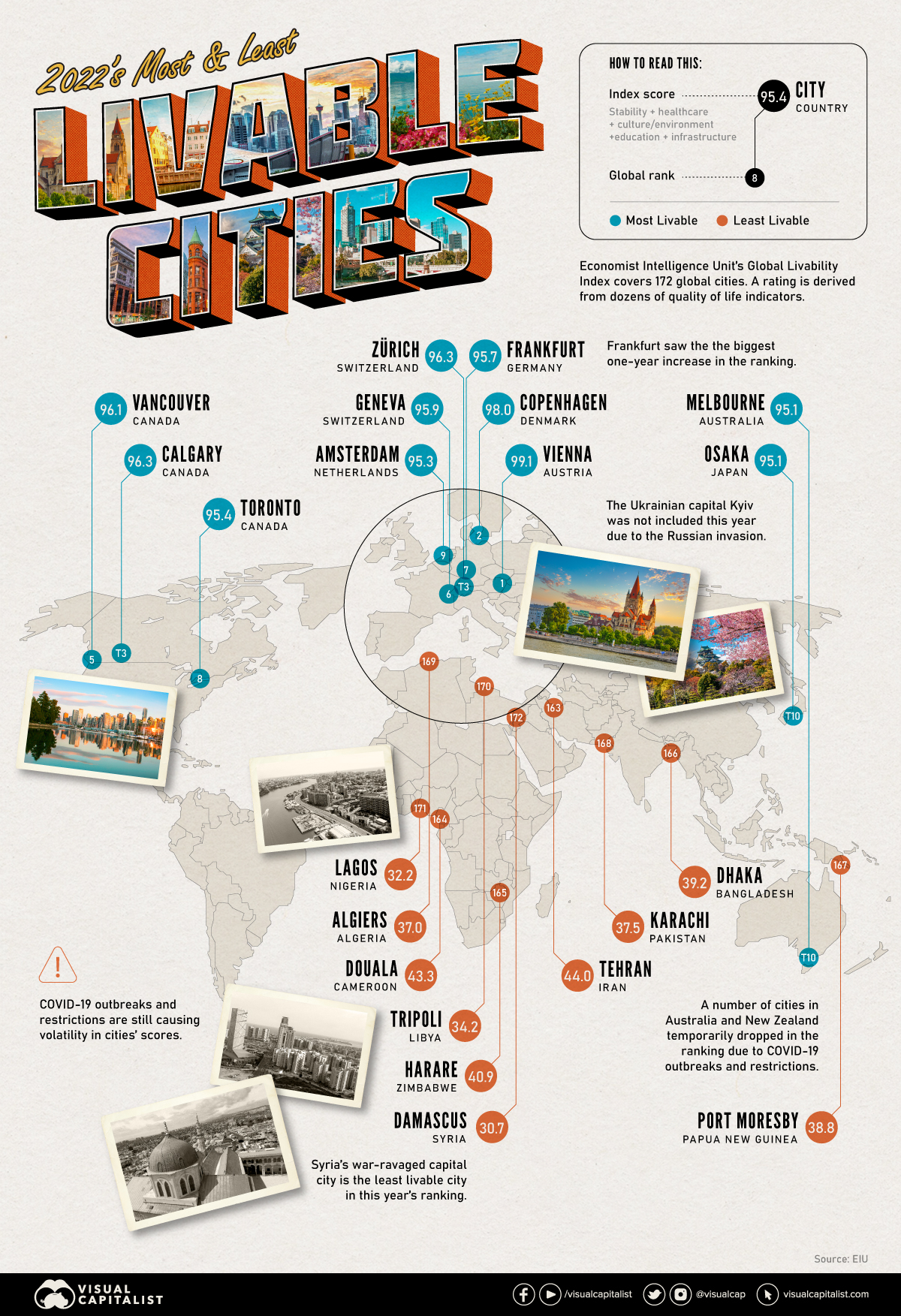
Ranked: The Most and Least Livable Cities in 2022
Pandemic restrictions changed the livability of many urban centers worldwide as cultural sites were shuttered, restaurant dining was restricted, and local economies faced the consequences. But as cities worldwide return to the status quo, many of these urban centers have become desirable places to live yet again.
This map uses annual rankings from the Economist Intelligence Unit (EIU) to show the world’s most livable cities, measuring different categories including: stability, healthcare, culture and environment, education, and infrastructure.
A Quick Note on Methodology
The ranking attempts to assess which cities across the globe provide the best living conditions, by assigning a score on 30 quantitative and qualitative measures across the five categories with the following weightings:
- Healthcare (20%)
- Culture & Environment (25%)
- Stability (25%)
- Education (10%)
- Infrastructure (20%)
Of the 30 factors within these categories, the qualitative ones are assigned as acceptable, tolerable, uncomfortable, undesirable, or intolerable by a team of expert analysts. Quantitative measures are given a score based on a number of external data points. Everything is then weighted to provide a score between 1-100, with 100 being the ideal.
Ranked: The 10 Most Livable Cities
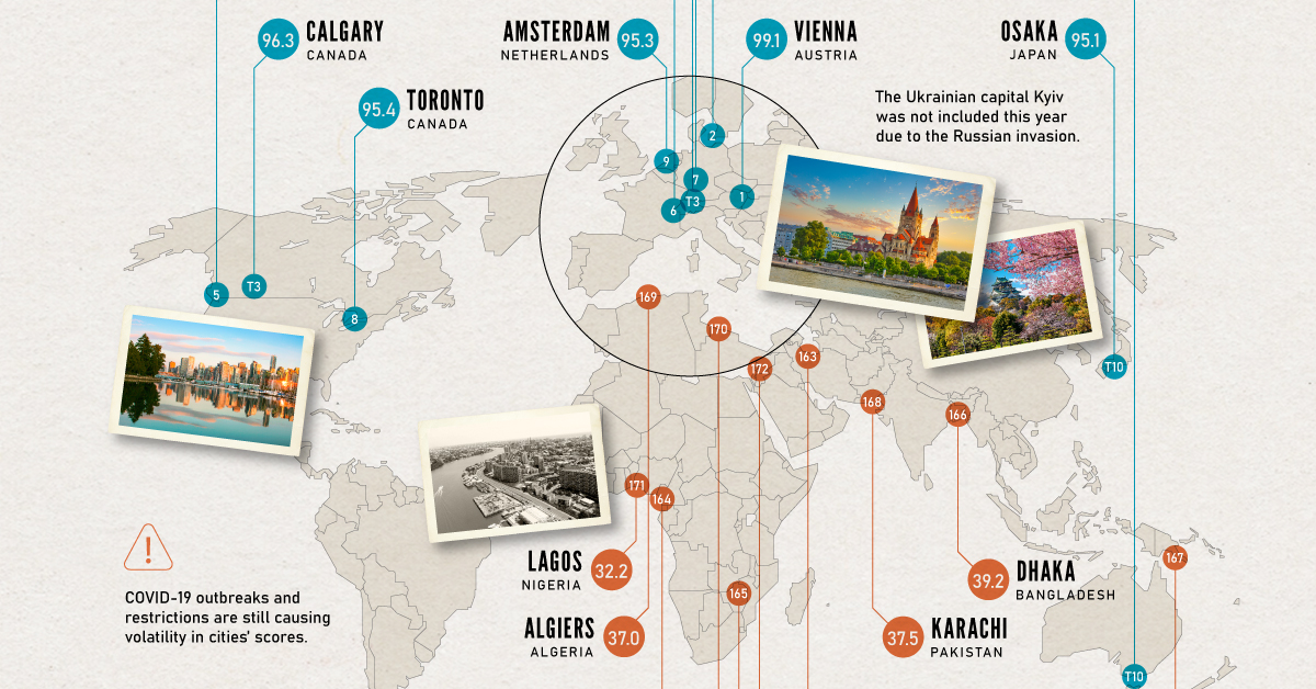
Of the 172 cities included in the rankings, many of the most livable cities can be found in Europe. However, three of the top 10 are located in Canada: Vancouver, Calgary, and Toronto.
Vienna has been ranked number one many times, most recently in 2019. According to the EIU, the Austrian capital only fell out of the top slot during the pandemic years because its famous museums and restaurants were shuttered.
| Rank | City | Country | Score |
|---|---|---|---|
| #1 | Vienna | 🇦🇹 Austria | 99.1 |
| #2 | Copenhagen | 🇩🇰 Denmark | 98.0 |
| #3 | Zurich | 🇨🇭 Switzerland | 96.3 |
| #3 | Calgary | 🇨🇦 Canada | 96.3 |
| #5 | Vancouver | 🇨🇦 Canada | 96.1 |
| #6 | Geneva | 🇨🇭 Switzerland | 95.9 |
| #7 | Frankfurt | 🇩🇪 Germany | 95.7 |
| #8 | Toronto | 🇨🇦 Canada | 95.4 |
| #9 | Amsterdam | 🇳🇱 Netherlands | 95.3 |
| #10 | Osaka | 🇯🇵 Japan | 95.1 |
| #10 | Melbourne | 🇦🇺 Australia | 95.1 |
Only one Asian city, Osaka, makes the top 10 list, tying with Melbourne for 10th place. Notably, not a single U.S. city is found in the top ranks.
Editor’s note: Two cities tie for both the #3 and #10 ranks, meaning that the “top 10” list actually includes 12 cities.
Ranked: The 10 Least Livable Cities
Some of the least livable cities in the world are located across Africa and Central Asia.
| Rank | City | Country | Score |
|---|---|---|---|
| #163 | Tehran | 🇮🇷 Iran | 44.0 |
| #164 | Douala | 🇨🇲 Cameroon | 43.3 |
| #165 | Harare | 🇿🇼 Zimbabwe | 40.9 |
| #166 | Dhaka | 🇧🇩 Bangladesh | 39.2 |
| #167 | Port Moresby | 🇵🇬 Papua New Guinea | 38.8 |
| #168 | Karachi | 🇵🇰 Pakistan | 37.5 |
| #169 | Algiers | 🇩🇿 Algeria | 37.0 |
| #170 | Tripoli | 🇱🇾 Libya | 34.2 |
| #171 | Lagos | 🇳🇬 Nigeria | 32.2 |
| #172 | Damascus | 🇸🇾 Syria | 30.7 |
Many of the least livable cities are within conflict zones, contributing to the low ratings. However, these regions are also home to some of the world’s fastest growing cities, presenting many opportunities for ambitious residents.
The Biggest Changes in Ranking
Let’s take a look at the cities that moved up the global rankings most dramatically compared to last year’s data.
Moving Up: The 10 Most Improved Cities
| City | Country | Overall Rank | Rank Change |
|---|---|---|---|
| Frankfurt | 🇩🇪 Germany | #7 | +32 |
| Hamburg | 🇩🇪 Germany | #16 | +31 |
| Dusseldorf | 🇩🇪 Germany | #22 | +28 |
| London | 🇬🇧 UK | #33 | +27 |
| Manchester | 🇬🇧 UK | #28 | +26 |
| Paris | 🇫🇷 France | #19 | +23 |
| Brussels | 🇧🇪 Belgium | #24 | +22 |
| Amsterdam | 🇳🇱 Netherlands | #9 | +21 |
| Athens | 🇬🇷 Greece | #73 | +19 |
| Los Angeles | 🇺🇸 US | #37 | +18 |
Here’s a look at the cities that fell the most in the rankings since last year’s report.
Moving Down: The 10 Cities That Tumbled
| City | Country | Overall Rank | Rank Change |
|---|---|---|---|
| Wellington | 🇳🇿 New Zealand | #50 | -46 |
| Auckland | 🇳🇿 New Zealand | #34 | -33 |
| Adelaide | 🇦🇺 Australia | #30 | -27 |
| Perth | 🇦🇺 Australia | #32 | -26 |
| Houston | 🇺🇸 US | #56 | -25 |
| Reykjavik | 🇮🇸 Iceland | #48 | -25 |
| Madrid | 🇪🇸 Spain | #43 | -24 |
| Taipei | 🇹🇼 Taiwan | #53 | -20 |
| Barcelona | 🇪🇸 Spain | #35 | -19 |
| Brisbane | 🇦🇺 Australia | #27 | -17 |
According to the report, a number of cities in New Zealand and Australia temporarily dropped in the ranking due to COVID-19 restrictions.
It’s also worth noting that some Eastern European cities moved down in the rankings because of their close proximity to the war in Ukraine. Finally, Kyiv was not included in this year’s report because of the conflict.
Urbanization and Livability
As of 2021, around 57% of the world’s population lives in urban centers and projections show that people worldwide will continue to move into cities.
While there are more amenities in urban areas, the pandemic revealed many issues with urbanization and the concentration of large populations. The stress on healthcare systems is felt most intensely in cities and restrictions on public outings are some of the first measures to be introduced in the face of a global health crisis.
Now with the cost of living rising, cities may face pressures on their quality of life, and governments may be forced to cut spending on public services. Regardless, people worldwide continue to see the benefits of city living—it’s projected that over two-thirds of the global population will live in cities by 2050.


Demographics
The Countries That Have Become Sadder Since 2010
Tracking Gallup survey data for more than a decade reveals some countries are witnessing big happiness declines, reflecting their shifting socio-economic conditions.


The Countries That Have Become Sadder Since 2010
This was originally posted on our Voronoi app. Download the app for free on iOS or Android and discover incredible data-driven charts from a variety of trusted sources.
Can happiness be quantified?
Some approaches that try to answer this question make a distinction between two differing components of happiness: a daily experience part, and a more general life evaluation (which includes how people think about their life as a whole).
The World Happiness Report—first launched in 2012—has been making a serious go at quantifying happiness, by examining Gallup poll data that asks respondents in nearly every country to evaluate their life on a 0–10 scale. From this they extrapolate a single “happiness score” out of 10 to compare how happy (or unhappy) countries are.
More than a decade later, the 2024 World Happiness Report continues the mission. Its latest findings also include how some countries have become sadder in the intervening years.
Which Countries Have Become Unhappier Since 2010?
Afghanistan is the unhappiest country in the world right now, and is also 60% unhappier than over a decade ago, indicating how much life has worsened since 2010.
In 2021, the Taliban officially returned to power in Afghanistan, after nearly two decades of American occupation in the country. The Islamic fundamentalist group has made life harder, especially for women, who are restricted from pursuing higher education, travel, and work.
On a broader scale, the Afghan economy has suffered post-Taliban takeover, with various consequent effects: mass unemployment, a drop in income, malnutrition, and a crumbling healthcare system.
| Rank | Country | Happiness Score Loss (2010–24) | 2024 Happiness Score (out of 10) |
|---|---|---|---|
| 1 | 🇦🇫 Afghanistan | -2.6 | 1.7 |
| 2 | 🇱🇧 Lebanon | -2.3 | 2.7 |
| 3 | 🇯🇴 Jordan | -1.5 | 4.2 |
| 4 | 🇻🇪 Venezuela | -1.3 | 5.6 |
| 5 | 🇲🇼 Malawi | -1.2 | 3.4 |
| 6 | 🇿🇲 Zambia | -1.2 | 3.5 |
| 7 | 🇧🇼 Botswana | -1.2 | 3.4 |
| 8 | 🇾🇪 Yemen | -1.0 | 3.6 |
| 9 | 🇪🇬 Egypt | -1.0 | 4.0 |
| 10 | 🇮🇳 India | -0.9 | 4.1 |
| 11 | 🇧🇩 Bangladesh | -0.9 | 3.9 |
| 12 | 🇨🇩 DRC | -0.7 | 3.3 |
| 13 | 🇹🇳 Tunisia | -0.7 | 4.4 |
| 14 | 🇨🇦 Canada | -0.6 | 6.9 |
| 15 | 🇺🇸 U.S. | -0.6 | 6.7 |
| 16 | 🇨🇴 Colombia | -0.5 | 5.7 |
| 17 | 🇵🇦 Panama | -0.5 | 6.4 |
| 18 | 🇵🇰 Pakistan | -0.5 | 4.7 |
| 19 | 🇿🇼 Zimbabwe | -0.5 | 3.3 |
| 20 | 🇮🇪 Ireland | -0.5 | 6.8 |
| N/A | 🌍 World | +0.1 | 5.5 |
Nine countries in total saw their happiness score drop by a full point or more, on the 0–10 scale.
Noticeably, many of them have seen years of social and economic upheaval. Lebanon, for example, has been grappling with decades of corruption, and a severe liquidity crisis since 2019 that has resulted in a banking system collapse, sending poverty levels skyrocketing.
In Jordan, unprecedented population growth—from refugees leaving Iraq and Syria—has aggravated unemployment rates. A somewhat abrupt change in the line of succession has also raised concerns about political stability in the country.

-

 Education1 week ago
How Hard Is It to Get Into an Ivy League School?
-

 Technology2 weeks ago
Ranked: Semiconductor Companies by Industry Revenue Share
-

 Markets2 weeks ago
Ranked: The World’s Top Flight Routes, by Revenue
-

 Demographics2 weeks ago
Population Projections: The World’s 6 Largest Countries in 2075
-

 Markets2 weeks ago
The Top 10 States by Real GDP Growth in 2023
-

 Demographics2 weeks ago
The Smallest Gender Wage Gaps in OECD Countries
-

 Economy2 weeks ago
Where U.S. Inflation Hit the Hardest in March 2024
-

 Green2 weeks ago
Top Countries By Forest Growth Since 2001