

From athletes and musicians to actors and celebrity personalities, here are the top 10 most followed people on Instagram.
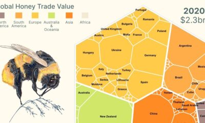

This infographic breaks down global honey exports and shows the power of Mānuka honey exports from New Zealand.
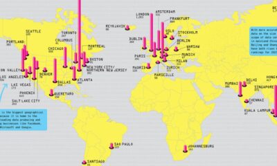

Where does the internet live? This graphic highlights the biggest data center markets in the world by electricity consumption.
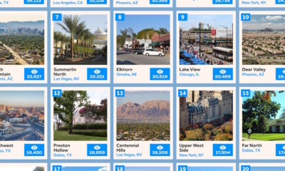

This infographic ranks the 20 most popular neighborhoods in the U.S. for homebuyers based on search interest.
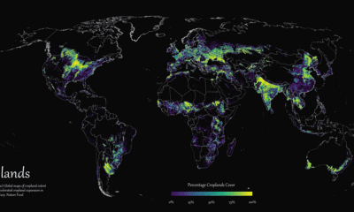

Where are the world's croplands located? This detailed map highlights the world’s cropland cover as of 2019.
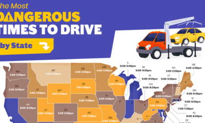

When is the most dangerous time to drive on American roads? We break down the data by hour, day, month, and state.
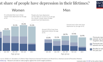

These graphics reveal how many people get depression over the course of their lives, broken down by age and sex.
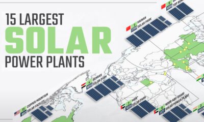

Solar power has grown rapidly over the last decade, and so have solar plants. This map shows the world's 15 largest solar power plants.
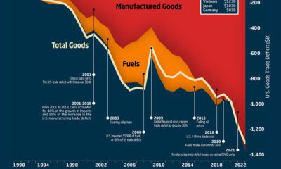

This graphic the U.S. trade deficit growth since 1990, and how manufactured goods and fuels factor in over the last three decades.


What are Gen Z's favorite brands? Here are the top 5 brands for apparel, footwear, and handbags, according to U.S. teens in September 2023.
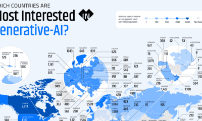

These graphics highlight interest in generative AI by country, covering interest in text, image, video, or audio generation.
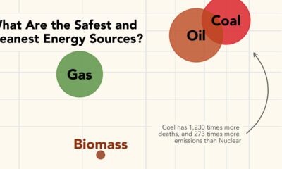

What are the safest energy sources? This graphic shows both GHG emissions and accidental deaths caused by different energy sources.
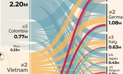

Which countries export, and import, the most coffee? This visual highlights the global coffee trade by export flows in 2019.
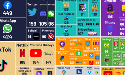

What are the world's most popular apps? This graphic visualizes the most downloaded apps, grouped together by different categories.
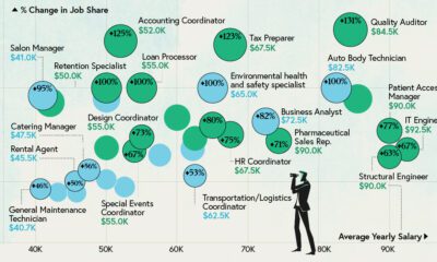

Some jobs need a degree, while others don’t. Here are the top 20 most sought-after entry level jobs with and without a degree.
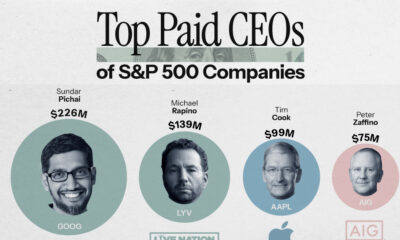

This graphic reveals the top 20 highest paid CEOs in the S&P 500 from Sundar Pichai to Jamie Dimon.
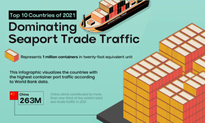

This infographic highlights the countries with the highest container traffic across their ports, thus dominating seaport trade in 2021.
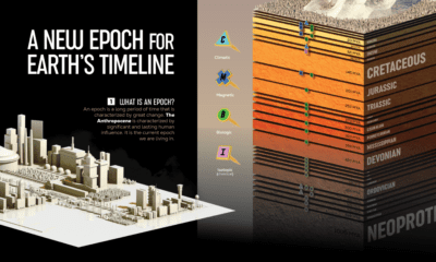

We visualize Earth’s history through the geological timeline to reveal the planet’s many epochs, including the Anthropocene.
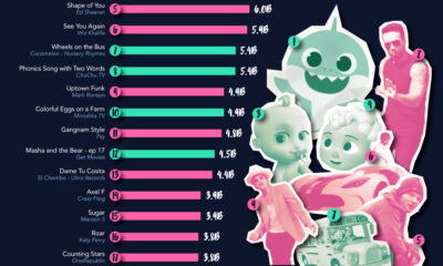

This chart highlights the rising demand for kid-focused content and videos through the top 20 most-viewed videos.
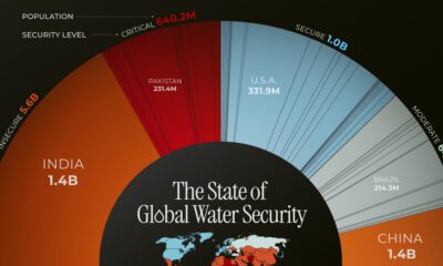

This chart highlights the different countries, and the number of people, facing water security issues around the world.
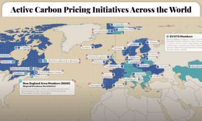

This graphic maps the 70 active carbon pricing initiatives worldwide, their established price of carbon, and the global emissions they cover.
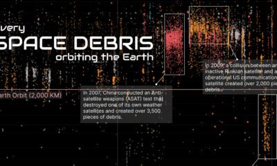

This visual breaks down just how much space debris is currently orbiting the Earth, and the nations responsible for it.
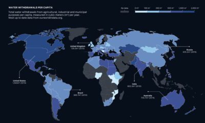

How much water do we have, and which countries use the most? This visual breaks down global water distribution and withdrawals by countries.
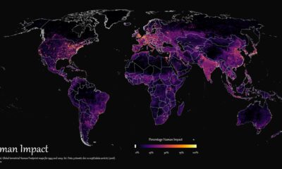

How far has humanity spread, and where haven't we gone? This graphic maps the extent of humanity’s impact on the world from 1993 to 2009.
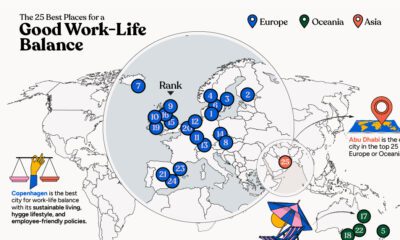

In this infographic, we explore which cities around the world excel in prioritizing work–life balance.


How do you visualize trade? These 9 graphics on the topic are the shortlist winners of our inaugural Creator Program Challenge.
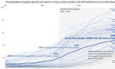

This graphic visualizes the world’s aging population, showing data for every country and territory around the world.
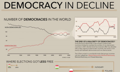

How many democracies does the world have? This visual shows the change since 1945 and the top nations becoming more (and less) democratic.
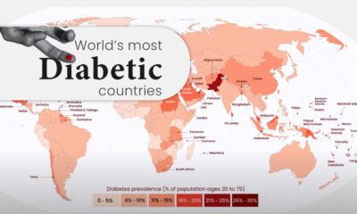

Diabetes affects millions of people around the world, but the spread isn't equal. This map highlights diabetes rates by country in 2021.
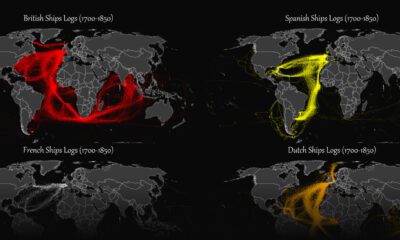

This map plots the colonial shipping lanes used by the British, the French, the Spanish, and the Dutch in the 18th and 19th centuries.
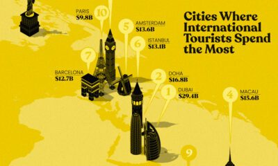

This infographic highlights the 10 cities where international travelers spend the most. In 2022, Dubai took top spot.
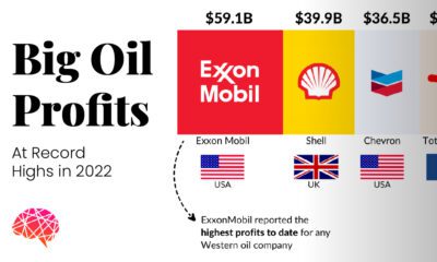

This visual highlights the five big oil companies that doubled their individual profits and earned a cumulative profit of over $200 billion in 2022.
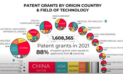

Which countries, and technologies, are being granted the most new patents? This graphic visualizes patent grants by country of origin.
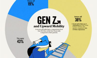

Despite the looming uncertainty, members of Gen Z maintains an optimistic outlook about their financial future
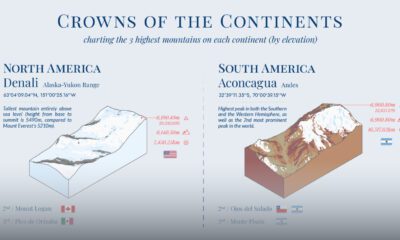

What are the highest mountains in different parts of the world? This visual maps the three tallest mountains by elevation in each continent.
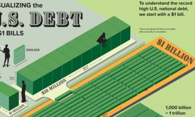

Can you picture what $31.4 trillion looks like? This graphic stacks up $1 bills to visualize U.S. debt in physical form.
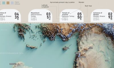

This graphic features the ancient seven wonders of the world that captivated people for thousands of years.
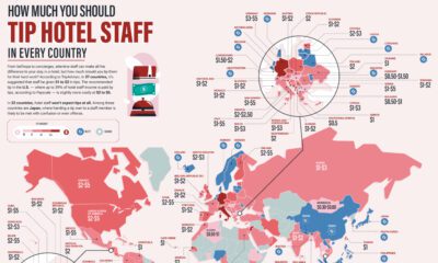

How much should you tip in each country for a restaurant, or a hotel? These maps show average tips in restaurants, hotels, and taxis.
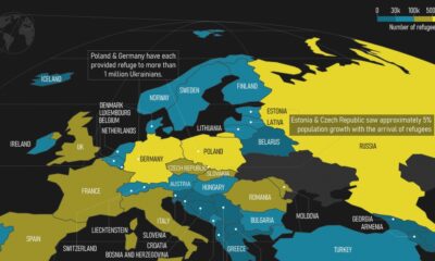

This map highlights European countries that became refugee destinations for Ukrainians who fled from the Russo-Ukrainian war.
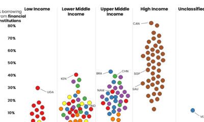

These graphics shed light on which people borrow money from financial institutions, and which rely on friends and family for monetary help.
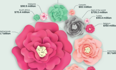

This graphic highlights global flower bouquet sales in 2021 and how a few countries dominate the entire flower export market.
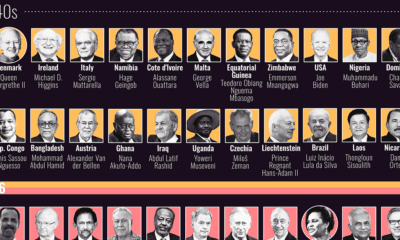

This graphic visualizes the ages of every country’s head of state, and compares them with the median population of their respective states.
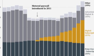

This graphic tracks the New York Times’ revenue streams over the past two decades, identifying its transition from advertising to subscription-reliant.
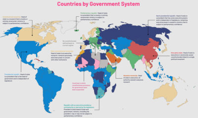

The political regimes of the world's countries have changed over centuries. This map charts the nine government systems that rule the world today.
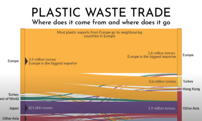

Which countries are responsible for exporting the world's plastic waste? This graphic shows the flow of global plastic waste through exports and imports.
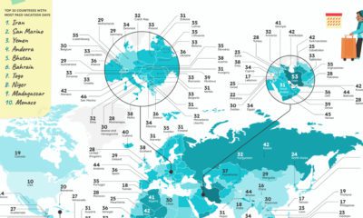

Which countries have the most vacation days, or the most public holidays? These graphics reveal how many paid vacation days each country mandates.
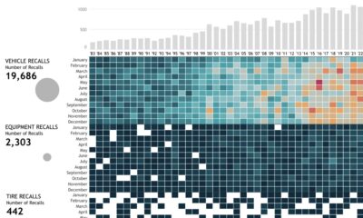

This interactive graphic visualizes U.S. automobile recalls over the past 40 years by type, company, components, and the number of people impacted.
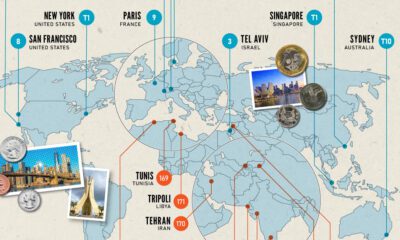

From New York to Damascus, this infographic uses EIU cost of living data to rank the world's most and least expensive cities to live in
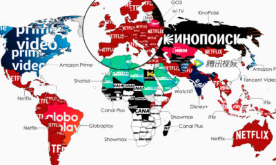

What is the top streaming service in each country? This map highlights the streaming services with the highest subscribers in 134 countries.
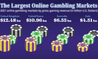

Which countries have the biggest online gambling markets? This graphic highlights the countries earning the highest gross revenues from online gambling.


 Creator Program