Visual Capitalist
Visualizing Trade: The 2023 Creator Program Challenge Shortlist
What can you visualize when it comes to ‘International Trade’? That was the assignment given for the first ever Creator Program Challenge.
The challenge was part of the Visual Capitalist Creator Program, established in 2022 to showcase the world’s best data storytellers in one place. Creators from around the world were tasked with creating a mobile-optimized data visualization on international trade.
We received both complex and diverse graphics on topics ranging from agricultural trade flows and the semiconductor supply chain to the demand for pearls and diamonds. As seen below, the quality of entries is impressive, revealing that there are many talented data creators among us.
The Shortlist
Here are the nine entries that were selected as shortlist winners.
The winning entry will be selected during our inaugural Creator Con event on Wednesday, with the winner earning a US$2,000 cash prize.
Click on any entry below to see the full version of the visualization!
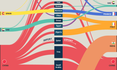
“Out of Africa” by Sebastian Gräff
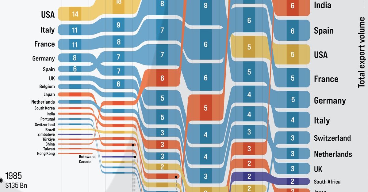
About 25 years ago, the top export destinations for African countries were the United States, Italy, France, and Germany. But since then, this trend has noticeably changed.
In this graphic, Sebastian Gräff tracks the growing dominance of China, U.A.E, and India in this arena. It also vividly highlights the rise in regional trade within African borders.
“Mānuka Honey” by Edit Gyenge
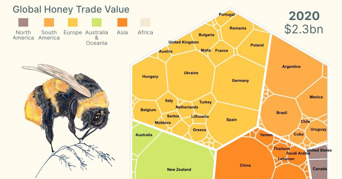
Did you know that the honey export industry is worth billions? And though it is not the largest honey exporter by volume, New Zealand’s sought-after and expensive Mānuka honey puts it far ahead of other countries in export value.
In this visualization, Edit Gyenge uses the vibrant colors of beehives and their striking hexangular patterns to delve further into honey trade, and those importing honey from New Zealand.
“Where Does the U.S. Import Its Food From?” by Julie Peasley
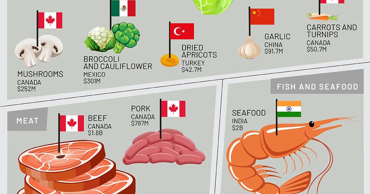
The world’s largest economy has long been celebrated as an agricultural powerhouse. Yet the U.S. also relies on a web of international trade to supplement its domestic harvests and consumption needs.
This data visualization by Julie Peasley highlights the country’s largest source of different food imports, from Canadian red meat and fish, to Mexican and Chilean fruits and vegetables.
“Mapping the Global Distribution of Natural Resources” by Arijit Gupta
Every corner of the world harbors abundant natural resources. These minerals, trees, animals, and even water aren’t just prized possessions, but also trade commodities, worth billions of dollars to both the regions they’re from and the regions that desire them.
In this visual, Arijit Gupta breaks down the natural resource exports across 10 geographical regions. He also highlights the top natural resource exported from each region.
“Made in China” by Truman Du
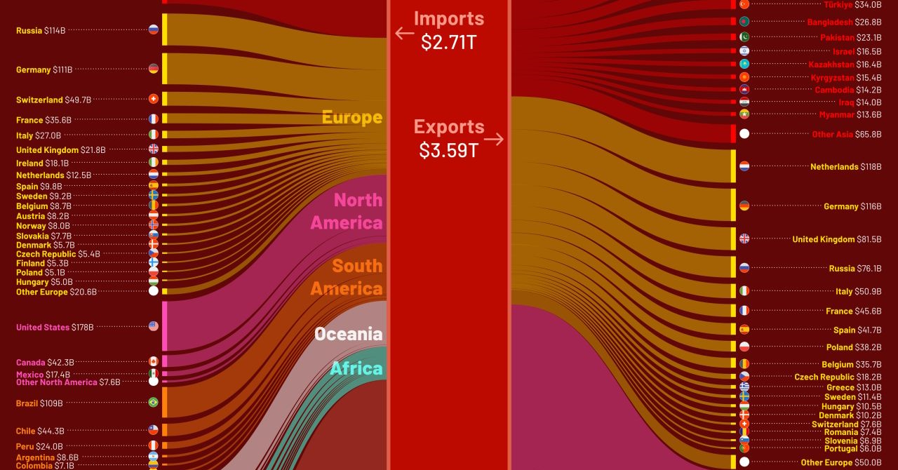
In 2022, China took the world by surprise when it announced its $878 billion trade surplus. With its production of technology and materials still booming, its exports brought $3.59 trillion into its economy.
And the biggest recipient of these exports was the U.S. In this graphic, Truman Du highlights the distribution of imports from nations across the world into China in 2022, as well as the country’s global exports.
“Agricultural Trade Flows” by Julie Peasley
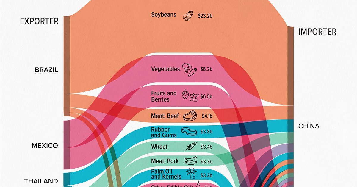
Did you know that soybeans had the largest agricultural trade flow between two countries in 2020? China imported $23.2 billion of soybeans from Brazil, almost three times that of the next largest agricultural trade—vegetables from Mexico to the U.S.
This second shortlisted visual from Julie Peasley highlights the 40 largest trade flows of agricultural products between countries in 2020, ranked by dollar value.
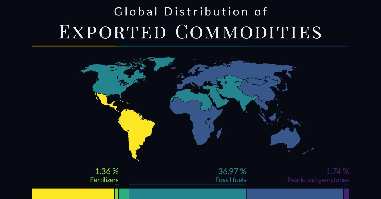
“Global Value of Traded Commodities” by Winifred Amase
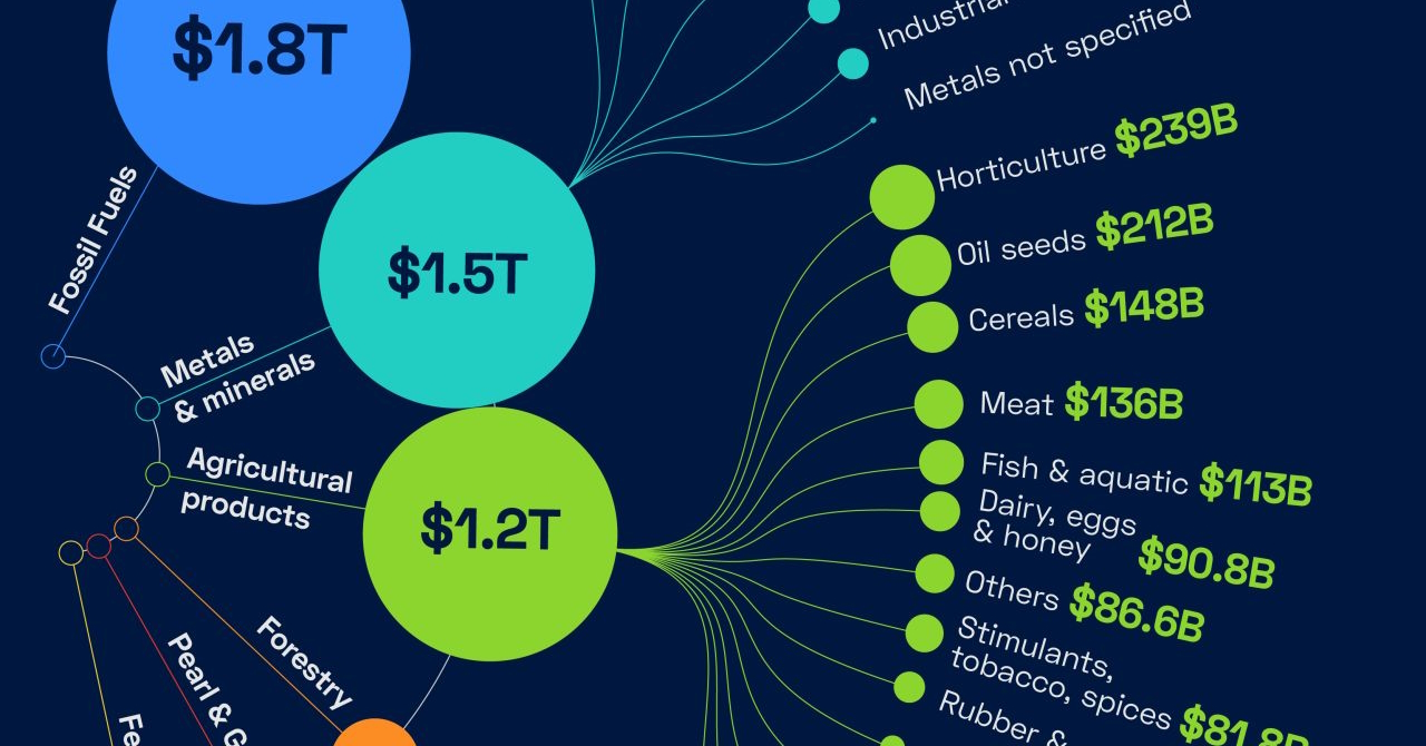
The global commodity trade sees trillions of dollars worth of goods shipped across the globe, from fuels and metals to grain and groceries.
In this graphic, Winifred Amase highlights the global value of every commodity traded in the global market in 2020. While fossil fuels like oil were traded for trillions of dollars, oil seeds were valued at $212 billion. Even $1.2 billion of water was traded across borders.
“Antarctica Imports & Exports” by Ivan Wong
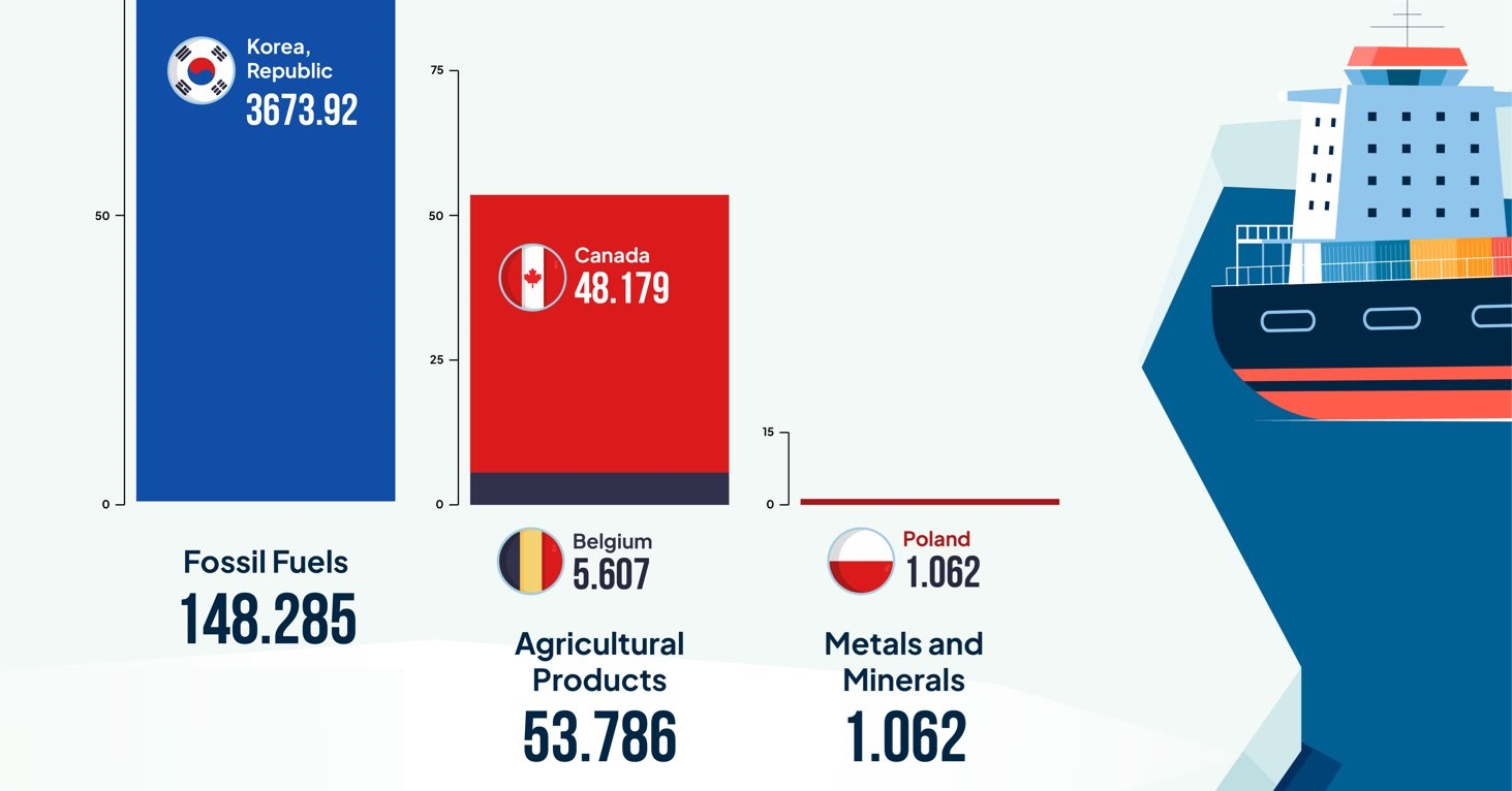
The southernmost continent of Antarctica is known by many for its frozen land and glaciers, or for hosting the largest waddles of emperor penguins. Its population consists of visiting researchers, varying from 1,100 in the harsh winters to around 4,400 during the relatively milder summers.
And yet, countries reported millions of dollars worth of imports and exports to the frozen continent in 2020. In this data story, Ivan Wong helps visualize the Antarctic demand for fossil fuels as well as agricultural and forestry products, and the countries providing them.
“The Global Trade Flow of Coffee Beans” by Airi (Iris) Ryu
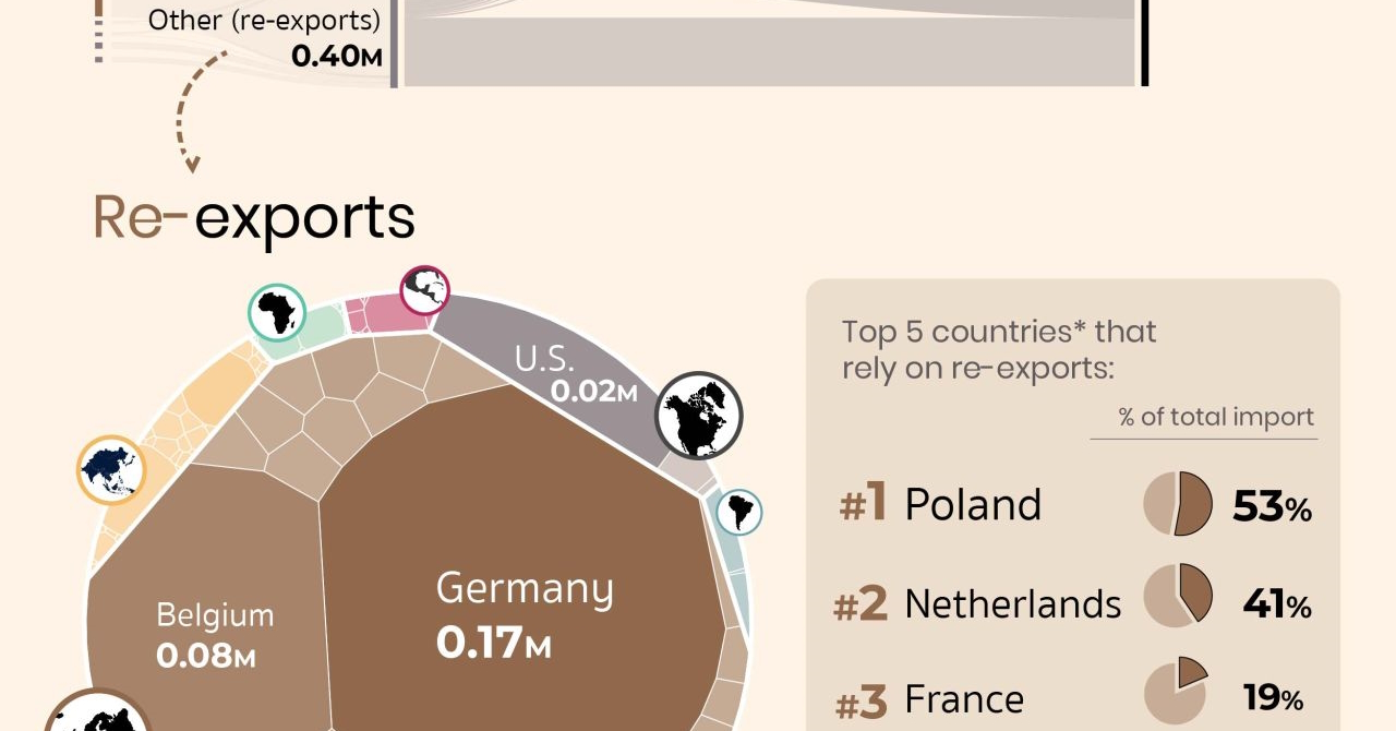
Coffee is one of the most consumed beverages in the world. And yet, most of the production of the world’s coffee comes from a select few countries.
Brazilian coffee, Colombian coffee, and Vietnamese Coffee are the most consumed coffees in the world, while 68% of the global coffee exports go to North America and Europe.
In this graphic, coffee lover and creator Airi Ryu visualizes this global coffee trade, highlighting the nations that export (and re-export) coffee and where it ends up.
Winners Announced at the Data Creator Con
At our upcoming inaugural Data Creator Con on June 14th, the winners from the shortlist will be announced live by the Visual Capitalist team.
This virtual event will bring us and the best data storytellers together in one place, to celebrate the community and help make a bigger impact on the world. The theme this year is ‘Mobilizing the Future of Data Storytelling’ and explores how the next generation of data creators are adapting to an increasingly mobile-first world.
If you’d still like to attend the event and see some of the keynotes, panels, winners, and a sneak peak of the upcoming VC App, click here for registration details.


VC+
VC+: Get Our Key Takeaways From the IMF’s World Economic Outlook
A sneak preview of the exclusive VC+ Special Dispatch—your shortcut to understanding IMF’s World Economic Outlook report.

Have you read IMF’s latest World Economic Outlook yet? At a daunting 202 pages, we don’t blame you if it’s still on your to-do list.
But don’t worry, you don’t need to read the whole April release, because we’ve already done the hard work for you.
To save you time and effort, the Visual Capitalist team has compiled a visual analysis of everything you need to know from the report—and our VC+ Special Dispatch is available exclusively to VC+ members. All you need to do is log into the VC+ Archive.
If you’re not already subscribed to VC+, make sure you sign up now to access the full analysis of the IMF report, and more (we release similar deep dives every week).
For now, here’s what VC+ members get to see.
Your Shortcut to Understanding IMF’s World Economic Outlook
With long and short-term growth prospects declining for many countries around the world, this Special Dispatch offers a visual analysis of the key figures and takeaways from the IMF’s report including:
- The global decline in economic growth forecasts
- Real GDP growth and inflation forecasts for major nations in 2024
- When interest rate cuts will happen and interest rate forecasts
- How debt-to-GDP ratios have changed since 2000
- And much more!

Get the Full Breakdown in the Next VC+ Special Dispatch
VC+ members can access the full Special Dispatch by logging into the VC+ Archive, where you can also check out previous releases.
Make sure you join VC+ now to see exclusive charts and the full analysis of key takeaways from IMF’s World Economic Outlook.
Don’t miss out. Become a VC+ member today.
What You Get When You Become a VC+ Member
VC+ is Visual Capitalist’s premium subscription. As a member, you’ll get the following:
- Special Dispatches: Deep dive visual briefings on crucial reports and global trends
- Markets This Month: A snappy summary of the state of the markets and what to look out for
- The Trendline: Weekly curation of the best visualizations from across the globe
- Global Forecast Series: Our flagship annual report that covers everything you need to know related to the economy, markets, geopolitics, and the latest tech trends
- VC+ Archive: Hundreds of previously released VC+ briefings and reports that you’ve been missing out on, all in one dedicated hub
You can get all of the above, and more, by joining VC+ today.

-

 Education1 week ago
How Hard Is It to Get Into an Ivy League School?
-

 Technology2 weeks ago
Ranked: Semiconductor Companies by Industry Revenue Share
-

 Markets2 weeks ago
Ranked: The World’s Top Flight Routes, by Revenue
-

 Demographics2 weeks ago
Population Projections: The World’s 6 Largest Countries in 2075
-

 Markets2 weeks ago
The Top 10 States by Real GDP Growth in 2023
-

 Demographics2 weeks ago
The Smallest Gender Wage Gaps in OECD Countries
-

 Economy2 weeks ago
Where U.S. Inflation Hit the Hardest in March 2024
-

 Green2 weeks ago
Top Countries By Forest Growth Since 2001