

Rising geopolitical tensions are shaping the future of international trade, but what is the effect on trading among G7 and BRICS countries?
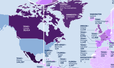

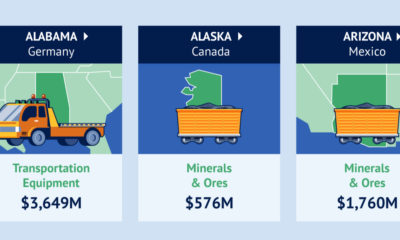
This map identifies the biggest U.S. export markets by state, showing the top partner of each country by value of goods imported.

Canada is the top destination for products from 21 states.
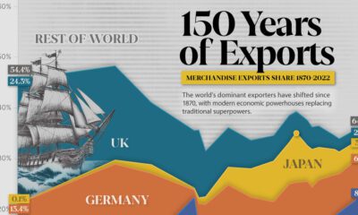

Today, China dominates the trade market, accounting for almost 15% of all merchandise.
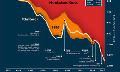

This graphic the U.S. trade deficit growth since 1990, and how manufactured goods and fuels factor in over the last three decades.
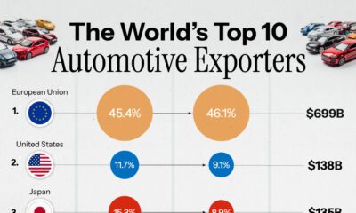

Data from the World Trade Organization highlights the world's 10 largest automotive exporters in 2022.
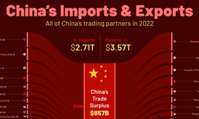

China trades with more than 200 countries globally. Here's how China's trade partners break down by import and export destinations.
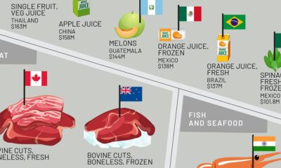

This infographic shows the top exporting countries for U.S. food imports, ranging from exotic fruits to meat, oils, spices, and more.
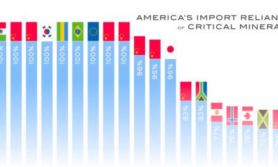

The U.S. is heavily reliant on imports for many critical minerals. How import-dependent is the U.S. for each one, and on which country?
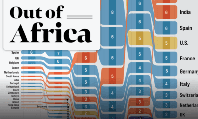

In 2020 the African continent exported nearly $378 billion worth of goods. Here are the top destinations for 25 years of Africa’s exports.


 Creator Program