Visual Capitalist
Calling All Data Storytellers to Enter our Creator Program Challenge
The Visual Capitalist Creator Program was established in 2022 to showcase the world’s best data storytellers in one place. To date, we’ve published over 65 creators from 16 different countries whose work has been viewed over 25 million times.
Now’s the chance for data storytellers to be part of the program in a new way.
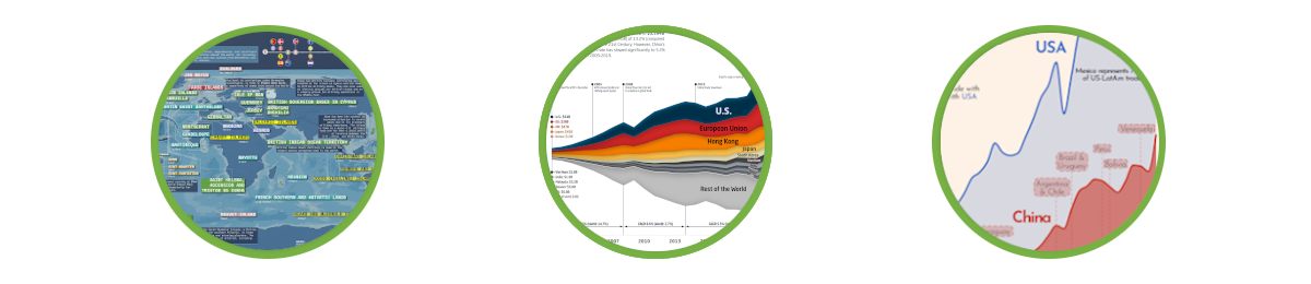
We’re launching our first-ever Creator Program Challenge where we set you the task of producing an original data visualization on a particular theme. This round’s theme is focused on the subject of ‘International Trade’.
Not only will the winner become a published member of the Creator Program, we’ll add the title ‘Creator Program Ambassador’ to their bio and give them a cash prize of $2,000 (and more!).
Find out more below, get creating and submit your entry or entries by May 31st. We can’t wait to see them!
How It Works
To enter the Creator Program Challenge, the rules are simple:
- Create a mobile-optimized data visualization (see below section for reference guide) in English relating to ‘International Trade’
- Use The Atlas of Economic Complexity and/or resourcetrade.earth as suggested sources
- Share your entry on Twitter, Instagram or LinkedIn, tagging Visual Capitalist’s account with the hashtags #CreatorProgramChallenge and #InternationalTrade before May 31st
Method of Selection
Visual Capitalist will select shortlist winners by assessing the skills from all eligible entries on June 7th, 2023 and finalists will be announced during the Data Creator Con in June (more details coming soon).
Please note that visualizations will be accessed against our reference guide for mobile design and include the following components:
- Dimensions 1200 x 2134 px (9:16 ratio suggested for main visualization)
- Minimum font size
- 21pt for sources and footnotes
- 26pt for blubs
- Looser leading (4pts or greater compared to font size)
- Font choices (Sans serif for body copy and minimum regular weight recommended)
- Accessible color (Use accessible palettes when possible)
If you’re selected, we’ll notify you by Twitter, Instagram or LinkedIn to provide further information on next steps.
The Prizes
- 1st Place – Published as Editor’s Choice on Visual Capitalist, $2,000 USD, Creator Program Ambassador status, and a free VC+ annual subscription
- 2nd Place – Published on Visual Capitalist’s website with Creator Program Ambassador status, $1,000 USD and a free VC+ annual subscription
- Shortlist – All shortlisted entries will receive a free VC+ annual subscription and be included in a dedicated site post on Visual Capitalist showcasing a gallery of qualifying work
Interested to learn more about the Creator Program Challenge? Click the button below for the full details.


VC+
VC+: Get Our Key Takeaways From the IMF’s World Economic Outlook
A sneak preview of the exclusive VC+ Special Dispatch—your shortcut to understanding IMF’s World Economic Outlook report.

Have you read IMF’s latest World Economic Outlook yet? At a daunting 202 pages, we don’t blame you if it’s still on your to-do list.
But don’t worry, you don’t need to read the whole April release, because we’ve already done the hard work for you.
To save you time and effort, the Visual Capitalist team has compiled a visual analysis of everything you need to know from the report—and our upcoming VC+ Special Dispatch will be available exclusively to VC+ members on Thursday, April 25th.
If you’re not already subscribed to VC+, make sure you sign up now to receive the full analysis of the IMF report, and more (we release similar deep dives every week).
For now, here’s what VC+ members can expect to receive.
Your Shortcut to Understanding IMF’s World Economic Outlook
With long and short-term growth prospects declining for many countries around the world, this Special Dispatch offers a visual analysis of the key figures and takeaways from the IMF’s report including:
- The global decline in economic growth forecasts
- Real GDP growth and inflation forecasts for major nations in 2024
- When interest rate cuts will happen and interest rate forecasts
- How debt-to-GDP ratios have changed since 2000
- And much more!

Get the Full Breakdown in the Next VC+ Special Dispatch
VC+ members will receive the full Special Dispatch on Thursday, April 25th.
Make sure you join VC+ now to receive exclusive charts and the full analysis of key takeaways from IMF’s World Economic Outlook.
Don’t miss out. Become a VC+ member today.
What You Get When You Become a VC+ Member
VC+ is Visual Capitalist’s premium subscription. As a member, you’ll get the following:
- Special Dispatches: Deep dive visual briefings on crucial reports and global trends
- Markets This Month: A snappy summary of the state of the markets and what to look out for
- The Trendline: Weekly curation of the best visualizations from across the globe
- Global Forecast Series: Our flagship annual report that covers everything you need to know related to the economy, markets, geopolitics, and the latest tech trends
- VC+ Archive: Hundreds of previously released VC+ briefings and reports that you’ve been missing out on, all in one dedicated hub
You can get all of the above, and more, by joining VC+ today.

-

 Maps1 week ago
The Largest Earthquakes in the New York Area (1970-2024)
-

 Money2 weeks ago
Where Does One U.S. Tax Dollar Go?
-

 Automotive2 weeks ago
Almost Every EV Stock is Down After Q1 2024
-

 AI2 weeks ago
The Stock Performance of U.S. Chipmakers So Far in 2024
-

 Markets2 weeks ago
Charted: Big Four Market Share by S&P 500 Audits
-

 Real Estate2 weeks ago
Ranked: The Most Valuable Housing Markets in America
-

 Money2 weeks ago
Which States Have the Highest Minimum Wage in America?
-

 AI2 weeks ago
Ranked: Semiconductor Companies by Industry Revenue Share