Visual Capitalist
The 23 Top Data Visualizations on Visual Capitalist in 2023
Even compared to the volatile years in the past, 2023 has been one of uncertainty. Our top data visualizations helped to make sense of the world in some way.
Throughout the year, we’ve utilized our strengths in art and data to help millions understand global markers, economic indicators, and a multitude of interesting topics. We revisited classics including The World Economy in One Chart and the Cities with the Most Millionaires. We saw incredible work from the wider data-viz community through our Creator Program, and launched our new data visualization platform Voronoi for smartphones.
After hundreds of maps, charts, infographics, videos, and more, we’ve finally arrived at our 10th annual list of our best in data visuals. This year, we’ve selected the 23 pieces that sparked the most interest, conversations, and awe. Here are our top data visualizations of 2023.
Economics & Markets: Top Data Visualizations
These graphics cover the “business” of the world, from global economics and markets to key industries and companies.
Editor’s note: Click on any preview below to see the full-sized version of a visualization.
#1
Visualized: The U.S. $20 Trillion Economy by State
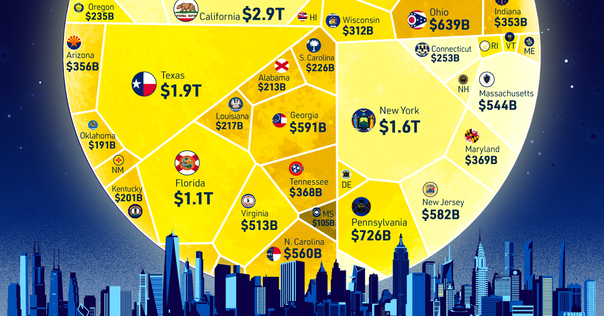
The U.S. is the world’s largest economy, but breaking it down shows just how much economic power individual states have.
Texas, for example, has an economy comparable to major powers like South Korea and Russia. This chart shows the GDP contributions of each state in 2022, as well as highlighting personal income per capita.
#2
The 50 Most Valuable Companies in the World in 2023
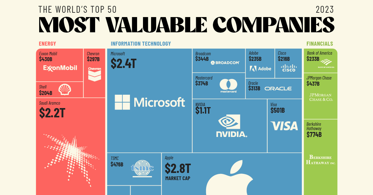
It’s no surprise that the U.S. has most of the world’s largest companies by market capitalization on this list.
That said, 19 of the world’s 50 most valuable companies in August 2023 were from outside the U.S. These include Saudi oil giant Saudi Aramco, Taiwanese chip producer TSMC, Danish pharmaceutical Novo Nordisk, and French luxury conglomerate LVMH.
#3 VORONOI
Visualizing the Number of Costco Stores, by Country

American retailer Costco is best known for its unique warehouse stores, bulk packaging, and high-quality goods ranging from electronics to groceries.
After establishing itself as a retail giant in the U.S., Canada, and Mexico, Costco has increasingly gone international, with a split of 591 domestic stores and 268 international stores as of August 2023. Its latest expansions? China, Sweden, and New Zealand.
First released on our mobile app Voronoi, this was one of our most interesting visualization concepts of the year.
#4 ADVISOR
Visualizing Every Company on the S&P 500 Index
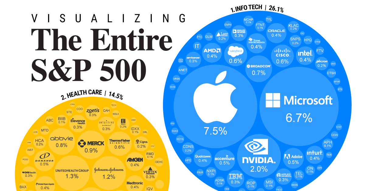
Circling back to companies, many people are familiar with tech giants like Apple, Microsoft, and Amazon, but not necessarily how much weight they carry in today’s markets.
Look no further than the S&P 500, the index covering the largest public U.S. companies by market capitalization. Breaking down the index by every company and sector illustrates how American capital markets have shaped up in recent years.
#5 ELEMENTS
Visualizing the World’s Largest Lithium Producers
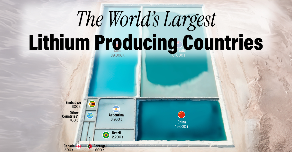
A lot of governments, mining companies, and automakers have their sights set on lithium. Thanks to the growing power of lithium batteries, the metal has become essential for being a key component in electric vehicle manufacturing and the clean energy market as a whole.
This graphic shows both the countries leading lithium production today, and the ones with the largest estimated reserves of lithium for tomorrow.
#6 SPONSORED
World Risk Poll: How Long Can People Survive Without Income?

If you suddenly have to survive without income, how long could you do it? Whether its from a natural disaster or an economic shock, financial security varies not just from person to person, but country to country. This ranking highlights countries whose respondents said they could cover their basic needs, both for the longest and shortest length of time.
#7
Visualizing 1 Billion Square Feet of Empty Office Space

The COVID-19 pandemic changed the world, but its impact on cities and work may be one of its longest lasting legacies. By forcing many companies to transition to work-from-home models, entire buildings of office space have been left empty.
Three years since the onset of the pandemic, 963 million square feet of office space sat empty in the United States. This piece shows just how much office real estate is sitting unused in America, and discusses the effects being felt by the companies and banks that own it.
#8
Infographic: The Longest Lasting Cars, in Miles
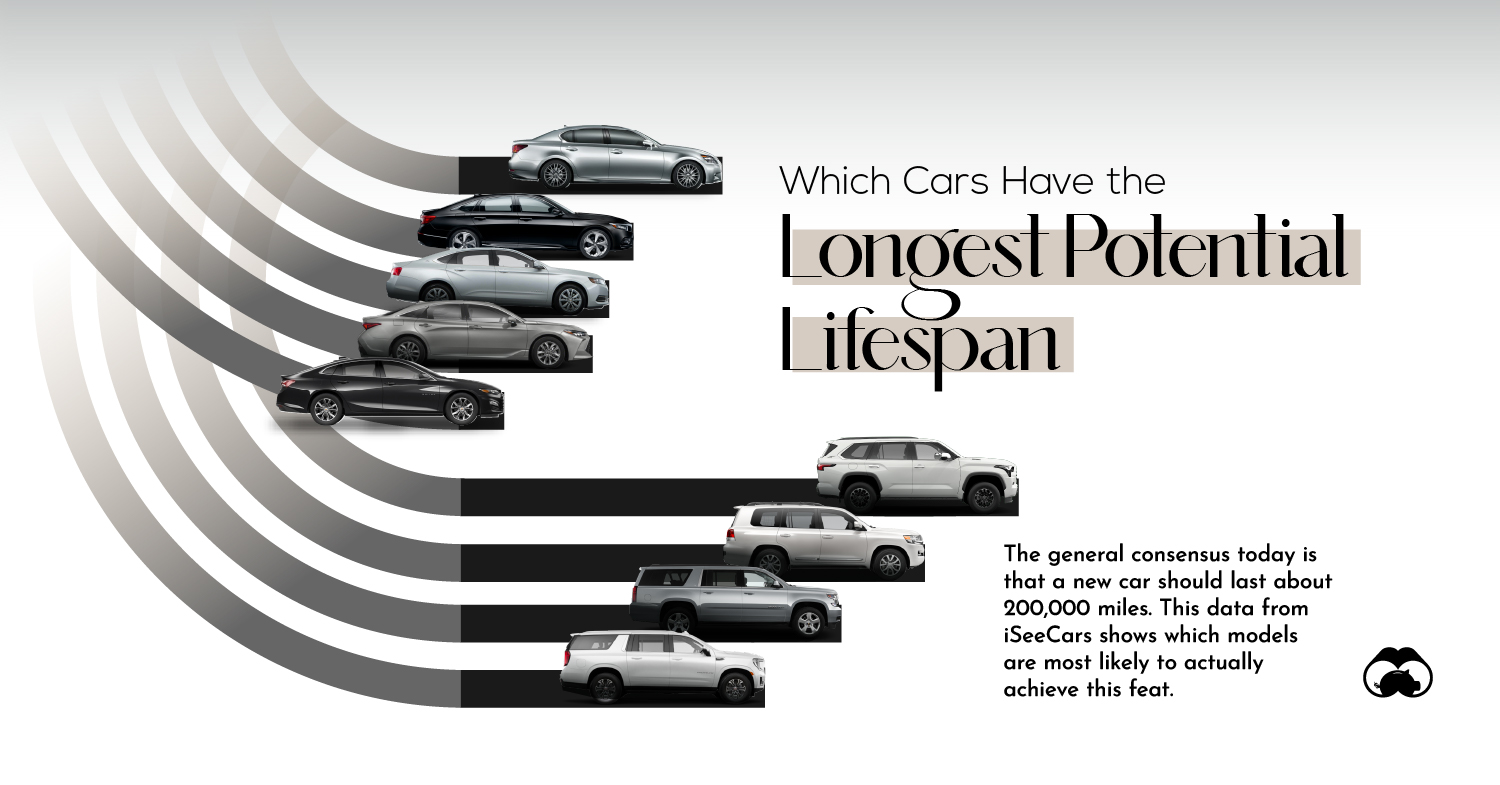
Automakers compete on many factors: The price, size, looks, and gas mileage of a vehicle all play a role in which a consumer will choose.
When you’re constantly on the road, one of the most important factors is longevity. After all, many well-built cars are expected to last hundreds of thousands of miles. Which cars, trucks, and SUVs last the longest?
#9 ELEMENTS
Ranked: The U.S. Banks With the Most Uninsured Deposits
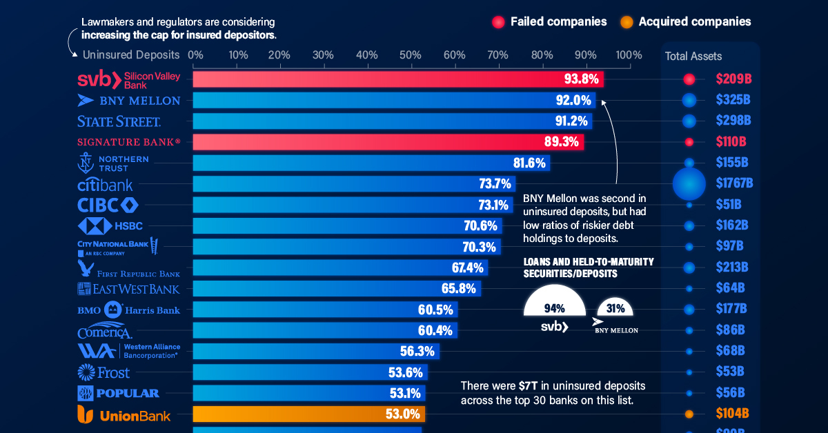
Back in March, Silicon Valley Bank (SVB) went from a preeminent financier for startups to being seized by regulators almost overnight. Its collapse was joined a few days later by Signature Bank, and by First Republic Bank in May, with more than $500 billion in nominal holdings across the three at the time of their failures. These were the U.S. banks with the most uninsured deposits back in April.
Earth & People: Top Data Visualizations
These graphics cover the world itself, from breaking down news and politics to understanding demographics and climate impacts.
#10
Map Explainer: The Gaza Strip
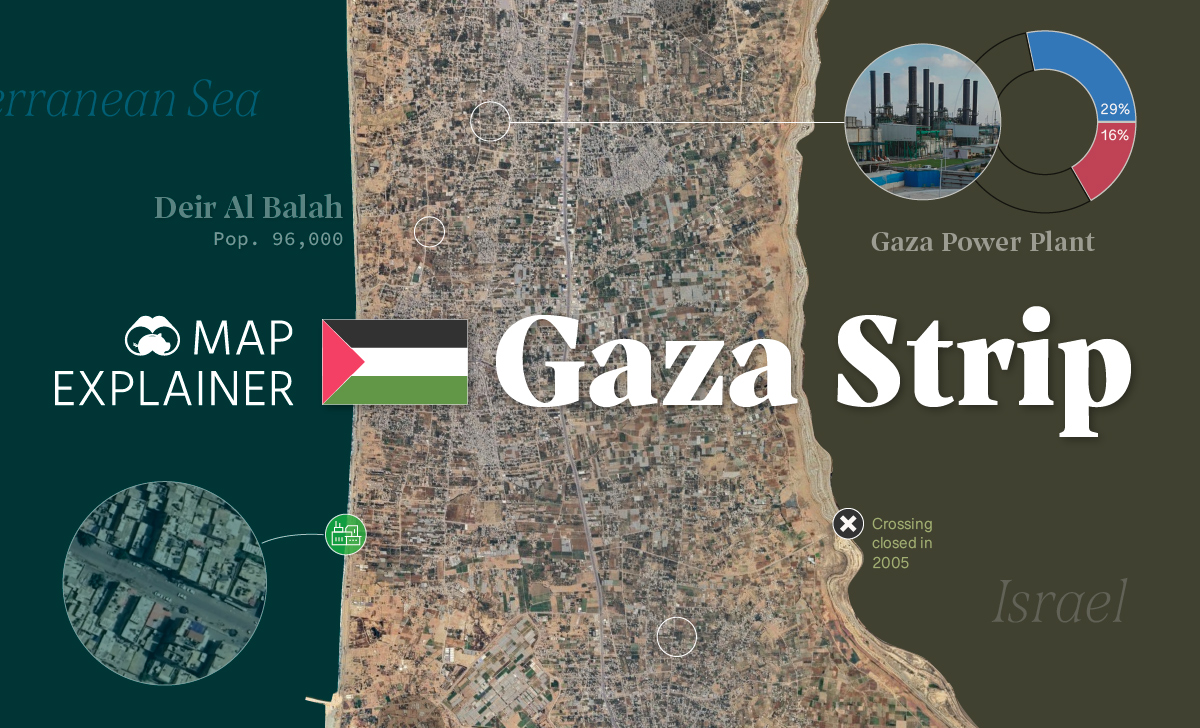
When Hamas launched a surprise attack on Israel from the Gaza Strip on October 7th, global focus centered squarely on the conflict. In the days that followed, Israel’s military cleared the country of remaining militants, began extensive bombardment of targets in the Gaza Strip, and launched a large scale ground invasion on October 27th.
Our Map Explainer examines the Palestinian territory, covering demographics, infrastructure, border situations, and more.
#11 CREATOR PROGRAM
Visualizing Population Density Patterns in Six Countries

From the sparse and widespread Canada to the coastal clusters of Italy, this series of maps from Terence Teo detail the population density of six countries. 3D spikes denote where people live, with higher spikes equaling more people.
#12 VORONOI
Visualizing All the World’s Carbon Emissions by Country
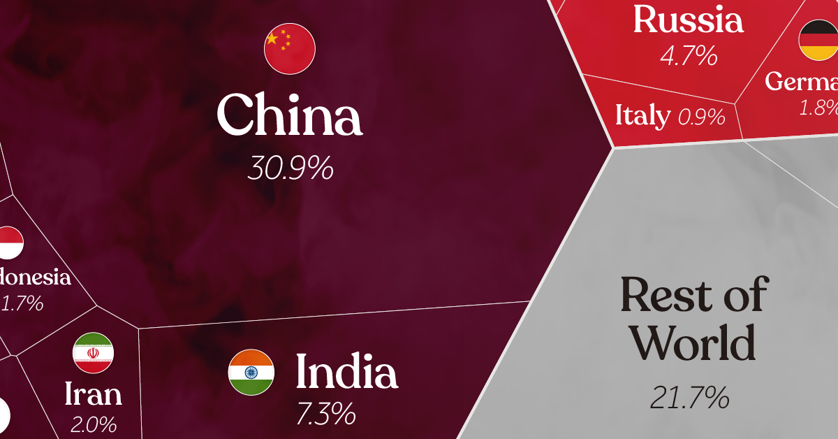
In 2021, our world saw an estimated 36.8 billion metric tons of carbon dioxide equivalent emitted into the atmosphere. In our exploration above, we examine how those emissions break down by source country, with China, the U.S., and India accounting for 52% alone.
But the picture changes when you look at emissions of countries per capita and by income group. All three of these visuals were first visible on our newly launched app Voronoi.
#13
Visualizing the American Workforce as 100 People

60% of the estimated 333 million people in the U.S. are employed in various jobs, positions, and sectors of the country’s economy. By reimagining the workforce as only 100 people, we’re able to easily compare which jobs and sectors employ more Americans than others.
#14
Visualizing the Biomass of All the World’s Mammals
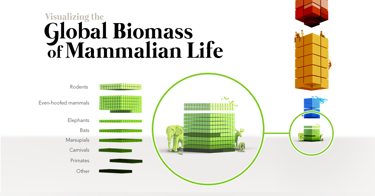
Life on Earth stretches far beyond humans, encompassing different kinds of animals, plants, fungi, and other organisms. It can be hard to fathom just how many different kinds of life we have, let alone compare them, but this visual accomplishes exactly that.
Thanks to new research, we’re able to examine how all of Earth’s mammals—including humans—compare by biomass. It turns out that there are a lot more of us than there are of most other mammals by weight (except for cows).
#15
Map Explainer: Sudan
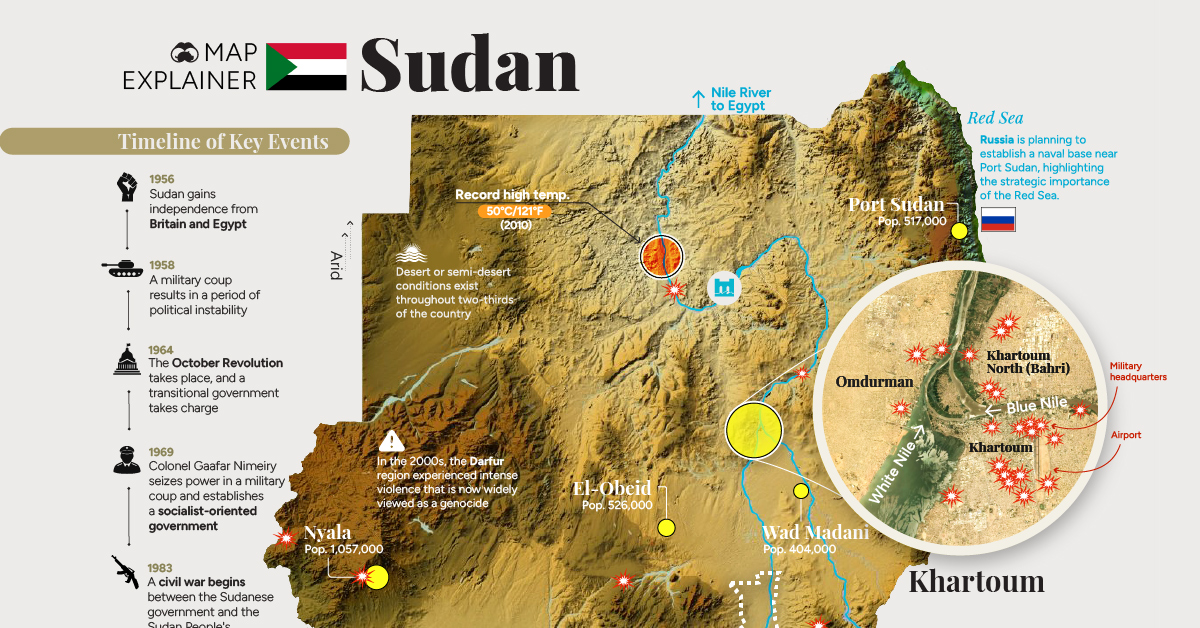
Back in April, global news shifted towards the African nation of Sudan as war broke out between the country’s rival military factions. Even though the headlines have died down, the war still continues as of December.
Fighting was focused around the capital of Khartoum and in the Darfur region, which is no stranger to internationally-recognized violence and crisis. Our map explainer examines how the war escalated across Sudan’s geography and the timeline of events.
#16 DECARBONIZATION
Visualized: Global CO2 Emissions Through Time (1950–2022)
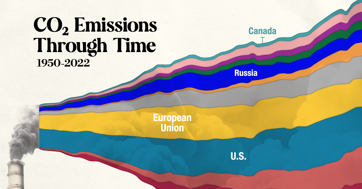
Examining carbon emissions in the present day, as we did a few spots above, is important for recognizing how climate change is being fueled today.
But emissions have been rapidly accumulating for decades, and examining the historical contributions of countries is just as vital for understanding how the world’s climate has ended up at its current tipping point.
#17 CREATOR PROGRAM
Visualized: The Head of State of Each Country, By Age and Generation
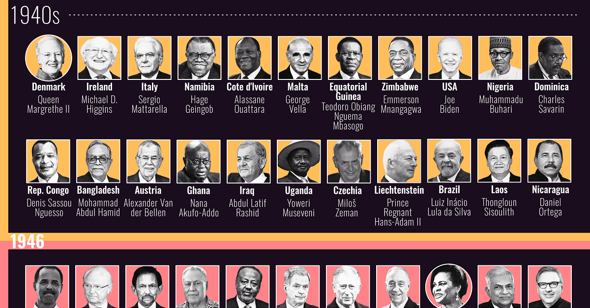
It is no small feat to track the heads of state of 192 nations around the world. But this impressive visual from Edit Gyenge managed the task, showing the most powerful (or ceremonial) figurehead in each country and their names, ages, and generations as of March 2023.
#18 SPONSORED
Video Game Engagement, by Generation

Speaking of generations, each age bracket interacts with the world in noticeably different ways, especially when it comes to media. One medium that shows the stark difference in consumption between cohorts like Gen Alphas (born in 2010 or later) and Baby Boomers (born from 1946 to 1964) is video games—some play, others watch or engage in different ways.
#19
Visualizing the Odds of Dying from Various Accidents

The average American 4000x less likely to win the Powerball lottery jackpot than they are to be struck by lightning in their lifetime, and that’s the accident with the lowest odds. Others causes of death in the U.S., like sunstroke or choking, have way higher odds, but none come close to the likelihood of being in a fatal vehicle accident.
#20 CREATOR PROGRAM
Mapped: The Ancient Seven Wonders of the World
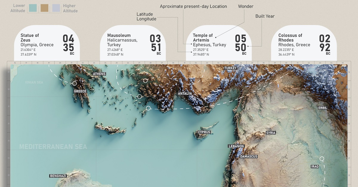
Can you name the ancient seven wonders of the world, and highlight the one still standing? What about pointing out their historic locations on a modern day map?
This infographic by Pranav Gavali tracks the original ancient seven wonders, their features, and how many years they lasted before being destroyed.
#21
Which Countries are the Most Polarized?
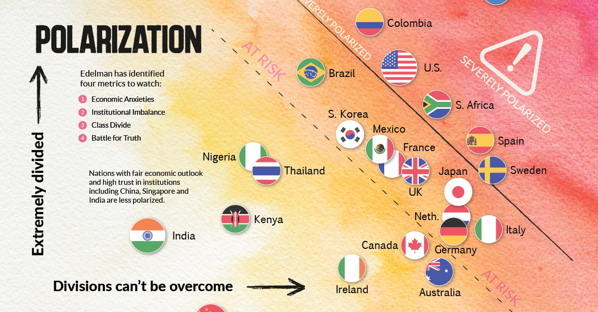
If you feel like many topics of conversation are becoming increasingly contentious, or that you’re finding it harder to interact with other people of different classes, jobs, or even races, you’re likely experiencing the increasing polarization being seen in the world today.
Is society truly becoming more polarized? This chart shows how different countries compare when we attempt to quantify polarization.
#22 CREATOR PROGRAM
Visualized: Air Quality and Pollution in 50 Capital Cities
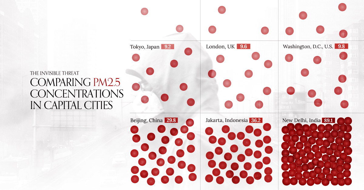
What is clean air? Unless you’re in a remote location on Earth, there’s a good chance that the air around you has at least trace amounts of pollutants, with the most commonly measured known as PM2.5 (fine particulate matter with a diameter of 2.5 microns or less).
According to WHO safety guideline, annual PM2.5 levels above 5 micrograms per cubic meter in cities can lead to potential health risks for residents. This graphic from Planet Anomaly highlights just how many major capitals in the world are on the unsafe side, and how polluted they are.
#23
Interactive Map: The World as 1,000 People
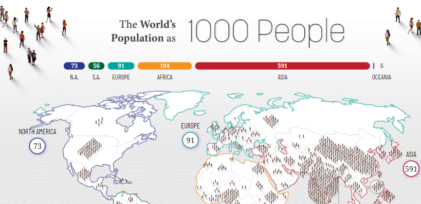
Last but far from least is this interactive map of the global population, which has grown to 8.05 billion as of July 2023. How do the world’s regions and countries compare by population if we reimagine the world with only 1,000 people? The answer: some countries number in the 100s, while a few disappear completely.
Like what you see in this roundup of the top data visualizations of 2023? Join our free email list and get a new visualization in your mailbox every day.


VC+
VC+: Get Our Key Takeaways From the IMF’s World Economic Outlook
A sneak preview of the exclusive VC+ Special Dispatch—your shortcut to understanding IMF’s World Economic Outlook report.

Have you read IMF’s latest World Economic Outlook yet? At a daunting 202 pages, we don’t blame you if it’s still on your to-do list.
But don’t worry, you don’t need to read the whole April release, because we’ve already done the hard work for you.
To save you time and effort, the Visual Capitalist team has compiled a visual analysis of everything you need to know from the report—and our VC+ Special Dispatch is available exclusively to VC+ members. All you need to do is log into the VC+ Archive.
If you’re not already subscribed to VC+, make sure you sign up now to access the full analysis of the IMF report, and more (we release similar deep dives every week).
For now, here’s what VC+ members get to see.
Your Shortcut to Understanding IMF’s World Economic Outlook
With long and short-term growth prospects declining for many countries around the world, this Special Dispatch offers a visual analysis of the key figures and takeaways from the IMF’s report including:
- The global decline in economic growth forecasts
- Real GDP growth and inflation forecasts for major nations in 2024
- When interest rate cuts will happen and interest rate forecasts
- How debt-to-GDP ratios have changed since 2000
- And much more!

Get the Full Breakdown in the Next VC+ Special Dispatch
VC+ members can access the full Special Dispatch by logging into the VC+ Archive, where you can also check out previous releases.
Make sure you join VC+ now to see exclusive charts and the full analysis of key takeaways from IMF’s World Economic Outlook.
Don’t miss out. Become a VC+ member today.
What You Get When You Become a VC+ Member
VC+ is Visual Capitalist’s premium subscription. As a member, you’ll get the following:
- Special Dispatches: Deep dive visual briefings on crucial reports and global trends
- Markets This Month: A snappy summary of the state of the markets and what to look out for
- The Trendline: Weekly curation of the best visualizations from across the globe
- Global Forecast Series: Our flagship annual report that covers everything you need to know related to the economy, markets, geopolitics, and the latest tech trends
- VC+ Archive: Hundreds of previously released VC+ briefings and reports that you’ve been missing out on, all in one dedicated hub
You can get all of the above, and more, by joining VC+ today.

-

 Education1 week ago
How Hard Is It to Get Into an Ivy League School?
-

 Technology2 weeks ago
Ranked: Semiconductor Companies by Industry Revenue Share
-

 Markets2 weeks ago
Ranked: The World’s Top Flight Routes, by Revenue
-

 Demographics2 weeks ago
Population Projections: The World’s 6 Largest Countries in 2075
-

 Markets2 weeks ago
The Top 10 States by Real GDP Growth in 2023
-

 Demographics2 weeks ago
The Smallest Gender Wage Gaps in OECD Countries
-

 Economy2 weeks ago
Where U.S. Inflation Hit the Hardest in March 2024
-

 Green2 weeks ago
Top Countries By Forest Growth Since 2001