

We visualize Asia’s population patterns to see where 4.6 billion people, or two-thirds of the world’s population, actually live.


The top three economic powerhouses of Africa contribute more than one-third to the African economy. We rank the nations of the world's second-largest continent by 2024...


To offer perspective on the population of U.S. states, this map compares them to countries that share similar population sizes.
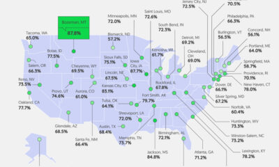

Good pay can help manage first-job worries. We visualize how geography affects entry-level pay across the U.S.


What were the top data visualizations on Visual Capitalist in 2023? We highlight the best charts, maps, and infographics from the year.
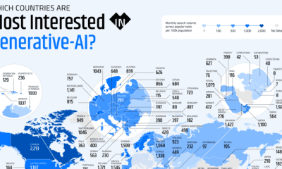

These graphics highlight interest in generative AI by country, covering interest in text, image, video, or audio generation.
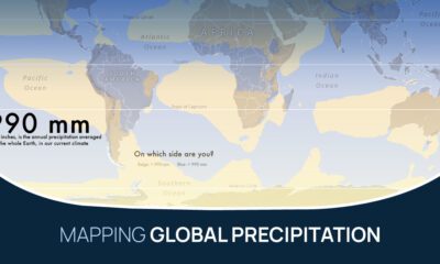

What does the global precipitation map look like if we split it in two, one half with below average rainfall and the other above?


This infographic shows the net minimum wage across 67 countries, as of January 2023. A breakdown by U.S. state is also included.
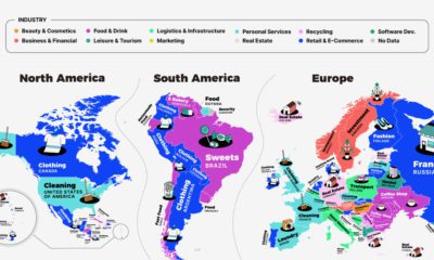

This series of maps shows a regional breakdown of the most popular types of businesses people want to start, based on online search results.
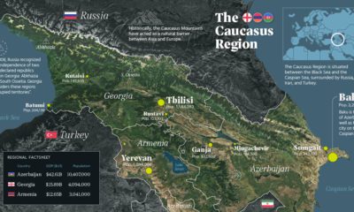

There has been intermittent fighting in the Caucasus region for decades. But what is the area like beyond the conflict? This map takes a look.


 Creator Program