

How do you visualize trade? These 9 graphics on the topic are the shortlist winners of our inaugural Creator Program Challenge.

Introducing the first challenge hosted by Visual Capitalist’s Creator Program! This is your chance to show-off your skills, impress the VC Editorial team, and win prizes.

Now, you can explore even more data-driven visualizations from the global talent in our newly launched Creator Program.


VC Elements is a brand new channel brought to you by Visual Capitalist which uses data-driven visuals to bridge the gap between the global trends shaping our...


Use the powerful infographics, charts, and data visualizations created by Visual Capitalist to anchor your next story, publication, or report.

Here's a sneak preview of features that VC+ members will get in their inbox in January 2020.
A countdown of our top infographics from 2019, including some of our most viewed graphics and other hand-picked entries from our staff.

A countdown of our top infographics from the last year, including some of our most viewed graphics as well as other hand-picked entries from our staff.
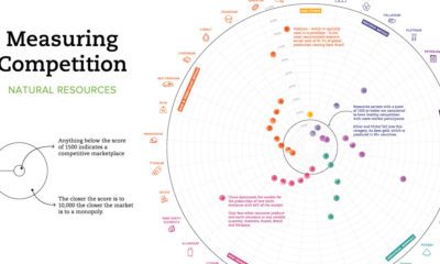

Which resource markets have healthy levels of competition, and which are more monopolistic? This chart shows the global level of competition for 33 minerals.
We count down our favorite infographics and charts from the year, including many you may not have seen before. Catch some of our best work in...


