
We round up the most popular, most discussed, and most liked visualizations of the month on Voronoi, our new and free data storytelling platform.


How do you visualize trade? These 9 graphics on the topic are the shortlist winners of our inaugural Creator Program Challenge.
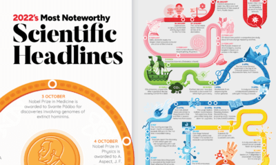

Join us as we look back at some of the most exciting, inspiring, and biggest science stories that made headlines in 2022.

In this ninth edition of our yearly round-up, we highlight visualizations that broke new ground in design and data-driven reporting.

New VC+ subscribers get access to a special gift: a roundup of our best ever visualizations around population.
A countdown of our top infographics from 2019, including some of our most viewed graphics and other hand-picked entries from our staff.

A countdown of our top infographics from the last year, including some of our most viewed graphics as well as other hand-picked entries from our staff.
We roundup the best infographics, charts, and data visualizations that were posted over the year. Don't miss Visual Capitalist's Top Infographics of 2016!


