Visual Capitalist
Introducing Voronoi: Waitlist Now Open!
At Visual Capitalist we’re on a mission to ‘make the world’s information more accessible’ and our new app, Voronoi, is the next step on that journey.
We’re excited to announce that Voronoi is launching soon and we’re opening up the waitlist for people to get priority access.

On Voronoi you’ll see work from Visual Capitalist published first, along with visualizations from the world’s best data storytellers. Covering not just business, tech and finance, but every topic you’re interested in.
Sign up to the waitlist now to be one of the first to use it.
You’ll also get the chance to claim your perfect username before someone else takes it!
What’s Different About Voronoi?
Voronoi is the place where the world’s most curious people make, discover, and share data-driven stories that explain the world. A platform that’s purpose-built for data visualizations and the exceptional creators that produce them.
You’re able to create custom feeds of the topics you like, see the data source and file for every visual and engage with a community of like-minded people.
Why Is It Called Voronoi?
Voronoi (pronounced vo-roh-noy) is a type of data visualization named after a Ukrainian mathematician and one that we’ve adapted at Visual Capitalist to make some of our most successful visuals like ‘The World’s Population at 8 Billion‘ or ‘Visualizing the $105 Trillion World Economy in One Chart‘. It’s a tribute to the science and art of data storytelling.
When Will Voronoi Launch?
We’re busy testing the app now as part of our ‘beta’ phase. We anticipate that Voronoi will be available on both iOS and Android this November 2023. Those on the waitlist will be the first to hear when we launch.


Best of
Best Visualizations of April on the Voronoi App
We round up the most popular, most discussed, and most liked visualizations of the month on Voronoi, our new data storytelling platform.
At the end of 2023, we publicly launched Voronoi, our free new data discovery app!
The initial response from both users and creators has been incredible. We now have millions of in-app views, and there are already more than 1,000 interesting visualizations to discover, many of which will never be published on Visual Capitalist.
For that reason, we’ve chosen to highlight some of the most popular visualizations and creators from April in this roundup. To see them and many others, make sure to download the app!
Let’s take a look at a popular creator worth highlighting, as well as the most viewed, most discussed, and most liked posts of the month.
POPULAR CREATOR
Our World in Data
Visual Capitalist isn’t the only creator on the Voronoi app.
Instead, it features incredible data-driven charts and stories from many of the world’s best data sources, like Our World in Data.
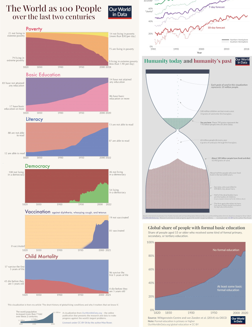
Our World in Data is one of the world’s most important public repositories of data online, covering a wide range of subjects on economics, demographics, history, health, and more.
On Voronoi, you can find a growing collection of visuals from Our World in Data, showing:
- Why weather forecasts are getting better over time
- Expected growth of the global population until the year 2100
- All of the humans that have ever lived, quantified
- Global poverty charted from 1977 until today
We highly recommend following Our World in Data on the app!
![]() View all of Our World in Data’s visuals on Voronoi today.
View all of Our World in Data’s visuals on Voronoi today.
MOST VIEWED
Mapped: Average Salaries in Europe
Europe is economically diverse.
Yes, the cost of living can be cheaper or more expensive depending where you go, but so are average wages:
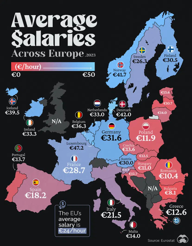
This visualization from Visual Capitalist resonated with our viewership this past month, garnering more views than any other visual published in April.
![]() Get the data behind this visual on Voronoi today.
Get the data behind this visual on Voronoi today.
MOST DISCUSSED
The Carbon Footprint of Travel
The most commented on visualization from Visual Capitalist showed the carbon footprints of many different common travel options.
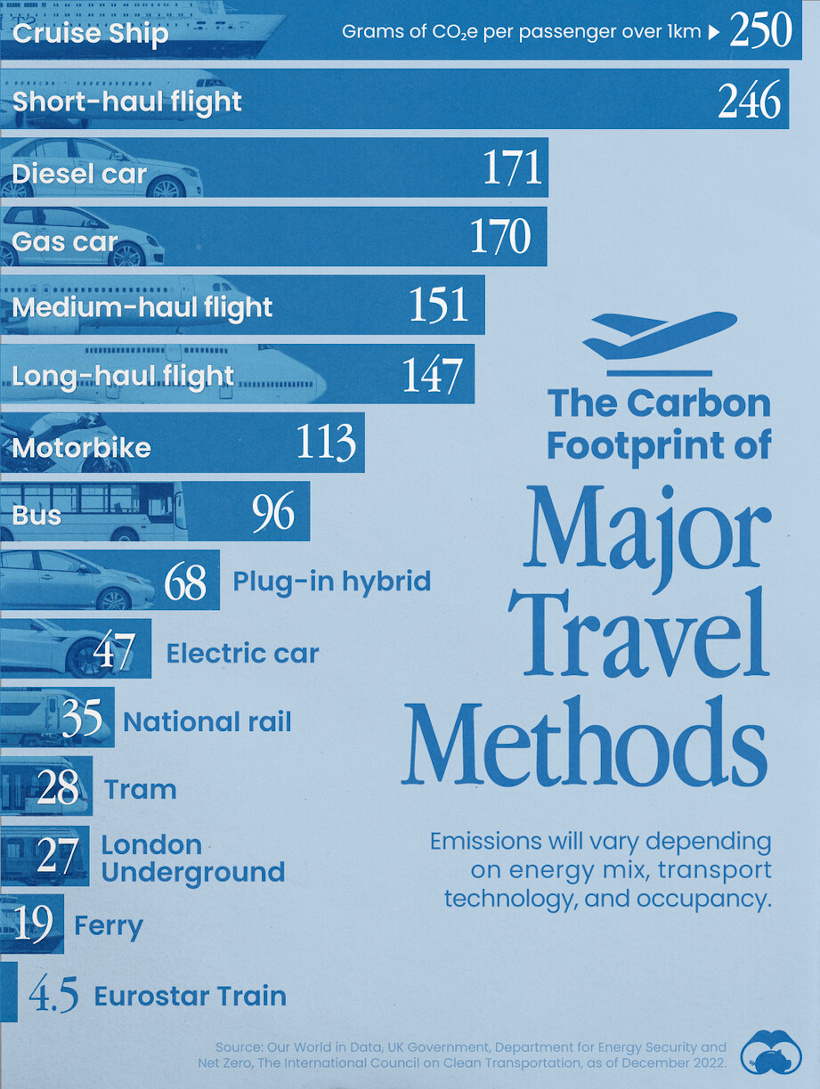
Interestingly, the most carbon-intensive form of transportation is cruise ships, and after that falls short-haul flights, gas-powered cars, and other options.
Commenting users wondered about ethanol-powered vehicles, which were not in the data set. They also asked how adding (or subtracting) passengers would affect the data.
![]() To join the conversation, download Voronoi today.
To join the conversation, download Voronoi today.
MOST LIKED
The Jobs Most Impacted by Artificial Intelligence
The most liked visual on Voronoi in April came from Visual Capitalist, showing the job departments that are most likely to be impacted by AI.
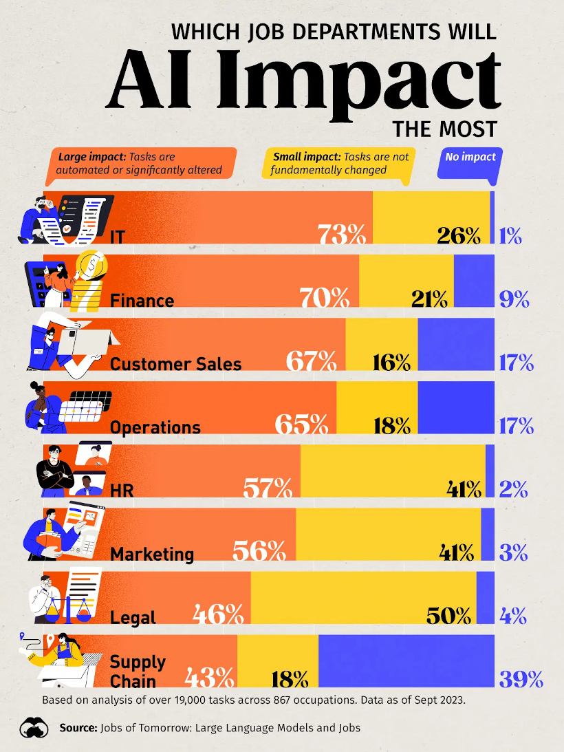
The data comes from an analysis of over 19,000 tasks across 867 occupations, and has IT and finance as the occupation areas most likely to be affected.
![]() Get the data behind this visual on Voronoi today.
Get the data behind this visual on Voronoi today.
-

 Demographics7 days ago
The Countries That Have Become Sadder Since 2010
-

 Green2 weeks ago
Ranked: The Countries With the Most Air Pollution in 2023
-

 Green2 weeks ago
Ranking the Top 15 Countries by Carbon Tax Revenue
-

 Markets2 weeks ago
U.S. Debt Interest Payments Reach $1 Trillion
-

 Mining2 weeks ago
Gold vs. S&P 500: Which Has Grown More Over Five Years?
-

 Energy2 weeks ago
The World’s Biggest Nuclear Energy Producers
-

 Misc2 weeks ago
How Hard Is It to Get Into an Ivy League School?
-

 Debt2 weeks ago
How Debt-to-GDP Ratios Have Changed Since 2000