

How do you visualize trade? These 9 graphics on the topic are the shortlist winners of our inaugural Creator Program Challenge.
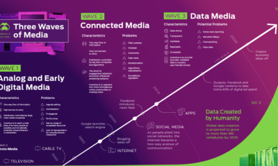

Media and information delivery is transforming at an increasing pace. Here's why the future will be more data-driven, transparent, and verifiable.
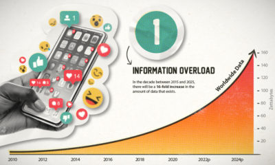

This era of data abundance should be propelling humankind forward, but valuable insights are often lost in the noise. Data storytelling holds the key.
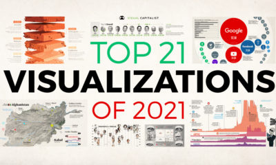

In this eighth edition of our yearly round-up, we highlight visualizations that broke new ground in design and data-driven reporting.
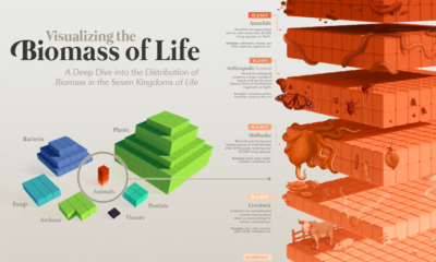

Our planet supports nearly 8.7 million species. We break down the total composition of the living world in terms of its biomass.
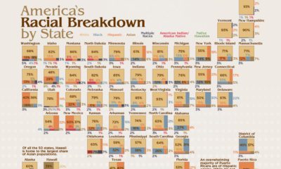

America is a cultural mosaic—nearly 40% identify as a visible minority today. Here we break down the U.S. population by race by state.

In a complex world, the combined forces of data and visual communication take on new importance. See our top 20 visualizations for 2020.
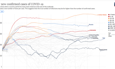

This continuously updated chart provides a more complete look at the efficacy of COVID-19 containment strategies.
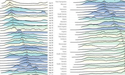

These charts and maps show the evolution of COVID-19's spread in the United States, by organizing data based on peak case and death dates.
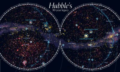

For 30 years, the Hubble Space telescope has been our eye into outer space. This stunning map looks at 550,000 observations made between 1990-2019.


