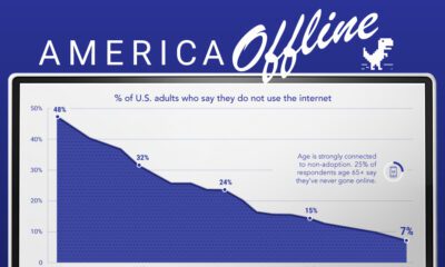

Internet adoption is widespread in the U.S. In fact, only 7% of Americans do not use the internet. Who are these non-adopters?

This graphic looks at the revenue of the world’s top carmakers and compares them to the GDP of 196 countries worldwide.
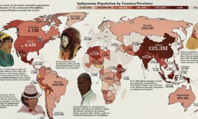

This map by shows the population distribution of the roughly 476 million Indigenous groups around the world.
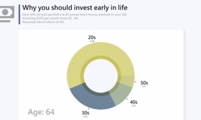

This animation highlights the benefits of investing early on in life by showing how much of your total earnings come from your early years.
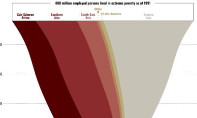

This graphic shows the regional breakdown of the world’s working poor, and how this demographic has changed since 1995.
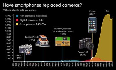

Have smartphones fully replaced cameras? This video charts 70 years of camera sales and how smartphones have affected the market.
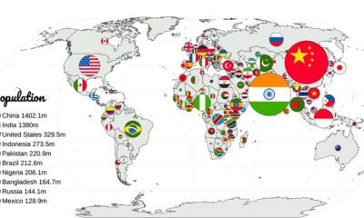

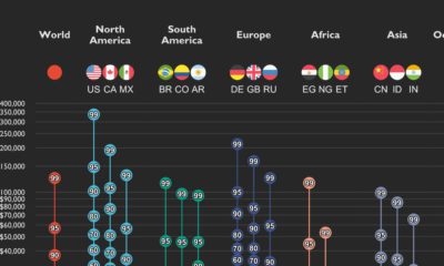
Which countries have the largest populations, or the highest GDP? This animation compares countries based on 20 different metrics.
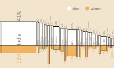

This graphic shows what percentage of men versus women are smokers in the 50 most populous countries worldwide.
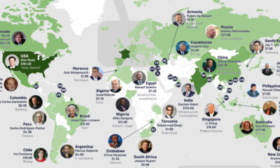

Of the 195 officially recognized countries worldwide, only 76 are home to billionaires. Here are the richest billionaires from those countries.
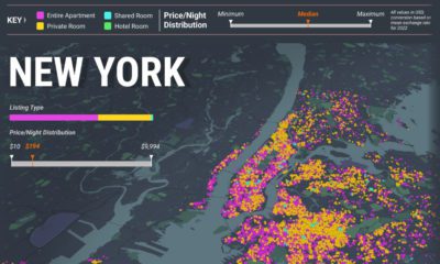

How expansive has the Airbnb landscape become? Here’s a look at every active Airbnb listing in New York, London, and Paris in Sept 2022.
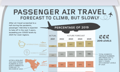

COVID-19 hit the air travel industry hard. But passenger traffic is slowly recovering, and by 2025, things are expected to return to 'normal.'
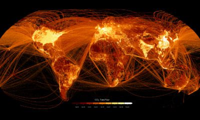

This graphic maps out carbon emissions around the world and where they come from, using data from the European Commission.
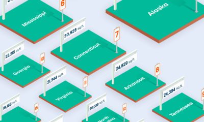

Lot sizes in the U.S. are shrinking compared to a few decades ago. Here’s a look at the median lot size in every U.S. state.

This graphic shows income distributions in 16 different countries around the world, using data from the World Inequality Database.
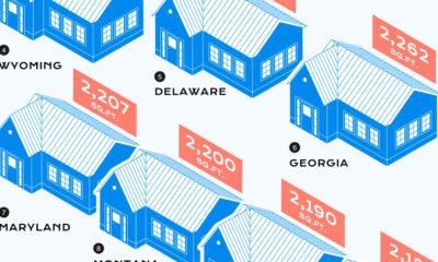

Over the last century, the median home size in the U.S. has skyrocketed. Here’s a look at which states have the biggest and smallest homes.
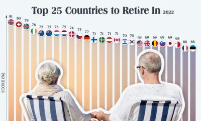

Which countries are the best equipped to support their aging population? This graphic show the best countries to retire in around the world.
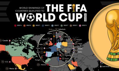

This graphic shows the 32 teams that will be playing in the 2022 FIFA World Cup, and breaks down the groups and each team's World Ranking
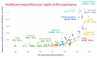

This graphic looks at average life expectancies in countries around the world, compared to each country's healthcare spending per capita.
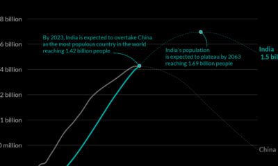

India's population growth is happening faster than predicted. The country will overtake China as the world’s most populated country in 2023.
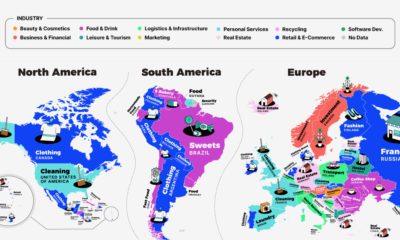

This series of maps shows a regional breakdown of the most popular types of businesses people want to start, based on online search results.
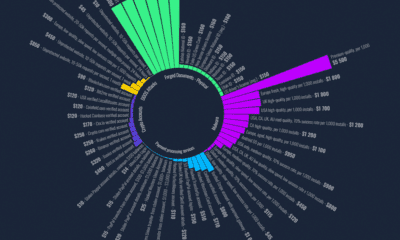

This chart looks at some of the common items that are sold on the Dark Web, and how much they sold for on average in 2022.
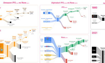

See the financials of major companies like Amazon and Tesla visualized, comparing their first year post-IPO with the most recent numbers.
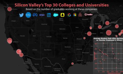

This graphic shows the top feeder schools to Silicon Valley, based on employee data from 12 different companies, including Twitter and Meta.
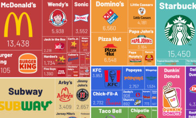

Here’s a look at the most popular fast food chains in the U.S., based on their number of stores as of 2021.
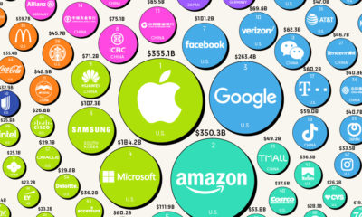

A strong brand is extremely lucrative when leveraged properly. Here's a look at the most valuable brands in 2022, according to Brand Finance.
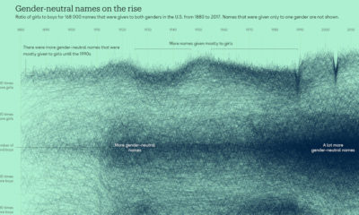

In the last three decades, gender-neutral names have become more common across the U.S., particularly for boys.
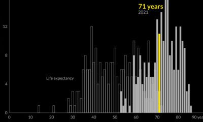

Global life expectancy has been increasing worldwide over the last 70 years. But how does the picture break down by region and by sex?
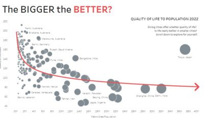

Are big cities all they’re cracked up to be? These interactive charts about population size question whether bigger always equals better.
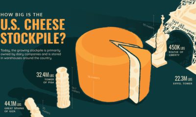

The U.S. has 1.5 billion pounds of cheese in cold storage across the country—around $3.4 billion worth of cheese.
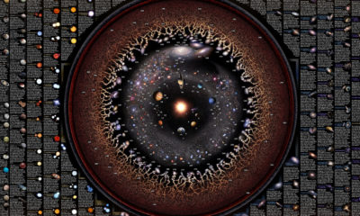

This detailed map highlights 200+ celestial objects that astronomers have discovered about our universe and provides facts about each one.

This chart shows the growth of mobile device subscriptions since 1990, around the world and in select countries.
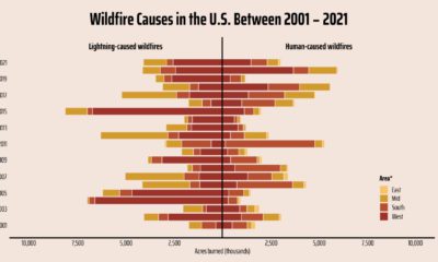

Here’s a look at the damage done across the U.S. by lightning-caused wild fires compared to human-caused fires.
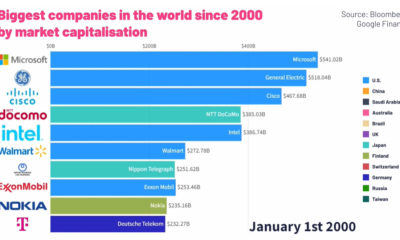

This animated graphic provides a breakdown of the world’s top ten largest public companies from 2000 to 2022.


What major stories have captured the world's attention over the years? This graphic highlights the top trending Google searches since 2001.
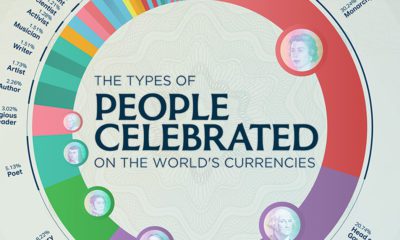

What types of people are celebrated on our money? Here's a look at the various occupations that are featured on international currencies.
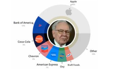

This video shows 30 years of Warren Buffett's investments, showing what his holding company, Berkshire Hathaway, has invested in since 1994.
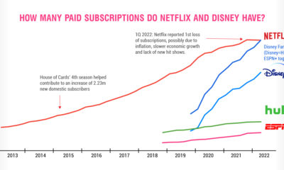

Netflix is a pioneer in video streaming, but Disney's empire is gaining subscribers fast, and giving Netflix a run for its money.
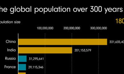

This animated video shows how much the population has grown over the last three centuries, and which regions have driven this growth.
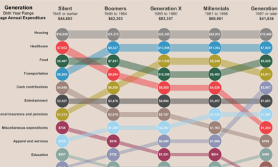

This interactive graphic shows a breakdown of how average Americans spend their money, and how expenses vary across generations.
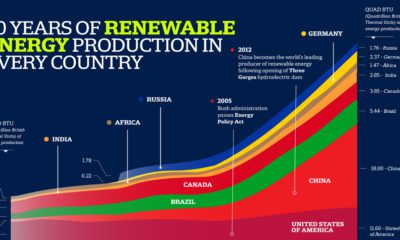

Here's a snapshot of global energy production, and which countries have produced the most fossil fuels, nuclear, and renewable energy since 1980.
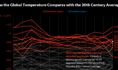

Here's a look at 140 years of global surface temperatures, highlighting the ten coldest and warmest years since 1880.
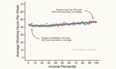

This graphic shows the average working hours between higher and lower-income groups in America, based on income percentile.
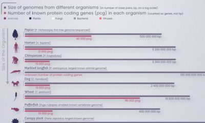

All living things have a genetic system made up of DNA. This graphic explores the basics of DNA composition and structure.
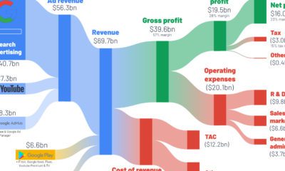

How do the big tech giants make their money? This series of graphics shows a breakdown of big tech revenue, using Q2 2022 income statements.
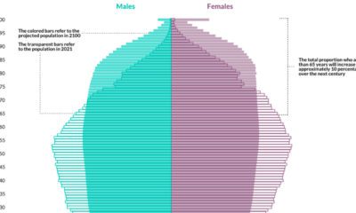

The EU's population is aging rapidly. By 2100, more than 30% of the region’s population is expected to be 65 or older.
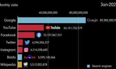

This video shows the evolution of the internet, highlighting the most popular websites from 1993 until 2022.
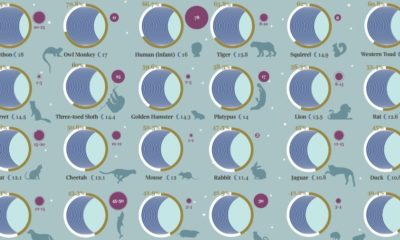

How much does a Koala sleep on average? What about an Elephant? This graphic compares the sleep patterns of 40 different animals.
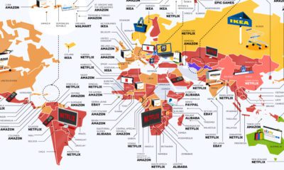

From Netflix to IKEA, this map of the world highlights the most searched for consumer brands around the world.
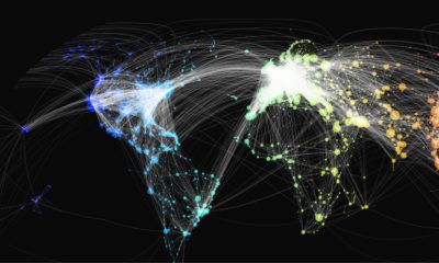

This map shows over 65,000 of the world’s flight paths and the various airports that each route connects, using data from Open Flights.
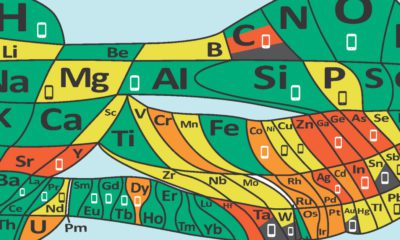

90 different elements form the building blocks for everything on Earth. Some are being used up, and soon could be endangered.


 Creator Program