Demographics
Charted: The Working Hours of Americans at Different Income Levels
Article/Editing:
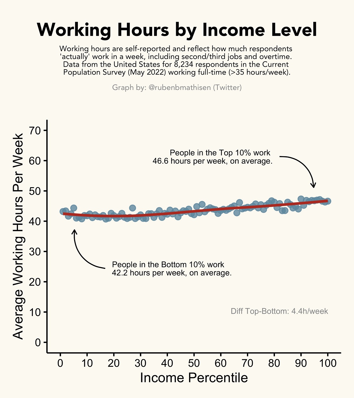
The Actual Working Hours of Different Income Levels
Do you really need to work 100-hour weeks for success?
In 2021, America’s top 10% of income earners made at least $129,181 a year—more than double the average individual income across the country.
When looking at differences between income groups, there are many preconceived notions about the work involved. But what are the actual average working hours for different income groups?
This graphic by Ruben Berge Mathisen uses the latest U.S. Census data to show the average working hours of Americans at different income levels.
Comparing Average Work Weeks
The data used for this graphic comes from the U.S. Census Bureau’s May 2022 Current Population Survey, which surveys more than 8,000 Americans from various socioeconomic backgrounds.
Importantly, the data reflects the average work hours that respondents in each income percentile “actually” work each week, and not what’s on their contract. This also includes overtime, other jobs, or side gigs.
According to the survey data, America’s top 10% income percentile works 4.4 hours more each week than those in the bottom 10%. And in surveys across other countries, though with hundreds of respondents instead of thousands, the discrepancy was similar:
Do the rich really work longer hours than the poor?
The graph below plots data from 27 countries.
On average, the Top 10% actually works ~1 hour less per week than the Bottom 10%, among full-time workers. Working hours are usually pretty similar though.#dataviz pic.twitter.com/Ue23VweJ9C
— Ruben Mathisen (@rubenbmathisen) August 7, 2022
While both income and wealth gaps are generally widening globally, it’s interesting to see that higher earners aren’t necessarily working more hours to achieve their increasingly larger salaries.
In fact, the top 10% in the 27 countries shown in the graphic are actually working around 1 hour less each week than the bottom 10%, at least among full-time workers.
Zooming Out: Average Working Hours per Country
Similarities arise when comparing average working hours across different countries. For starters, people living in poorer countries typically work longer hours.
According to Our World in Data, the average worker in Cambodia works about 9.4 hours a day, while in Switzerland, people work an average of 6 hours a day.
While many factors contribute to this discrepancy in working hours, one large factor cited is tech innovation, or things like physical machines, processes, and systems that make work more efficient and productive. This allows wealthier countries (and industries) to increase their output without putting in as many hours.
For example, from 1948 to 2011, farm production per hour in the U.S. became 16x more productive, thanks to innovations like improved machinery, better fertilizers, and more efficient land management systems.

This article was published as a part of Visual Capitalist's Creator Program, which features data-driven visuals from some of our favorite Creators around the world.


Demographics
The Smallest Gender Wage Gaps in OECD Countries
Which OECD countries have the smallest gender wage gaps? We look at the 10 countries with gaps lower than the average.
The Smallest Gender Pay Gaps in OECD Countries
This was originally posted on our Voronoi app. Download the app for free on iOS or Android and discover incredible data-driven charts from a variety of trusted sources.
Among the 38 member countries in the Organization for Economic Cooperation and Development (OECD), several have made significant strides in addressing income inequality between men and women.
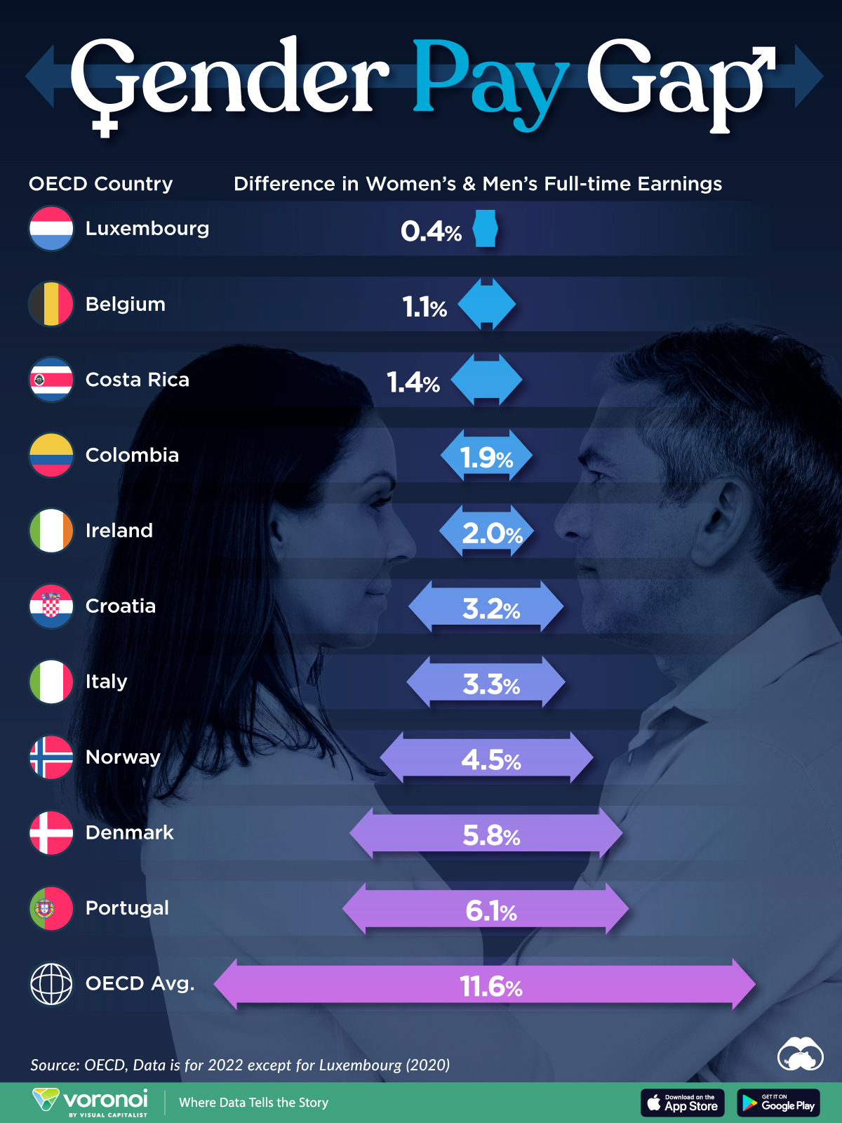
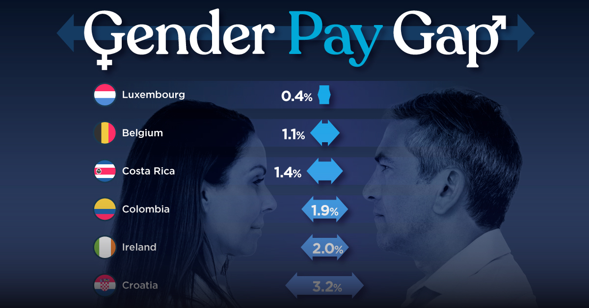
In this graphic we’ve ranked the OECD countries with the 10 smallest gender pay gaps, using the latest data from the OECD for 2022.
The gender pay gap is calculated as the difference between median full-time earnings for men and women divided by the median full-time earnings of men.
Which Countries Have the Smallest Gender Pay Gaps?
Luxembourg’s gender pay gap is the lowest among OECD members at only 0.4%—well below the OECD average of 11.6%.
| Rank | Country | Percentage Difference in Men's & Women's Full-time Earnings |
|---|---|---|
| 1 | 🇱🇺 Luxembourg | 0.4% |
| 2 | 🇧🇪 Belgium | 1.1% |
| 3 | 🇨🇷 Costa Rica | 1.4% |
| 4 | 🇨🇴 Colombia | 1.9% |
| 5 | 🇮🇪 Ireland | 2.0% |
| 6 | 🇭🇷 Croatia | 3.2% |
| 7 | 🇮🇹 Italy | 3.3% |
| 8 | 🇳🇴 Norway | 4.5% |
| 9 | 🇩🇰 Denmark | 5.8% |
| 10 | 🇵🇹 Portugal | 6.1% |
| OECD Average | 11.6% |
Notably, eight of the top 10 countries with the smallest gender pay gaps are located in Europe, as labor equality laws designed to target gender differences have begun to pay off.
The two other countries that made the list were Costa Rica (1.4%) and Colombia (1.9%), which came in third and fourth place, respectively.
How Did Luxembourg (Nearly) Eliminate its Gender Wage Gap?
Luxembourg’s virtually-non-existent gender wage gap in 2020 can be traced back to its diligent efforts to prioritize equal pay. Since 2016, firms that have not complied with the Labor Code’s equal pay laws have been subjected to penalizing fines ranging from €251 to €25,000.
Higher female education rates also contribute to the diminishing pay gap, with Luxembourg tied for first in the educational attainment rankings of the World Economic Forum’s Global Gender Gap Index Report for 2023.
See More Graphics about Demographics and Money
While these 10 countries are well below the OECD’s average gender pay gap of 11.6%, many OECD member countries including the U.S. are significantly above the average. To see the full list of the top 10 OECD countries with the largest gender pay gaps, check out this visualization.

-

 Maps2 weeks ago
Mapped: Average Wages Across Europe
-

 Money1 week ago
Which States Have the Highest Minimum Wage in America?
-

 Real Estate1 week ago
Ranked: The Most Valuable Housing Markets in America
-

 Markets1 week ago
Charted: Big Four Market Share by S&P 500 Audits
-

 AI1 week ago
The Stock Performance of U.S. Chipmakers So Far in 2024
-

 Automotive2 weeks ago
Almost Every EV Stock is Down After Q1 2024
-

 Money2 weeks ago
Where Does One U.S. Tax Dollar Go?
-

 Green2 weeks ago
Ranked: Top Countries by Total Forest Loss Since 2001