Misc
Visualized: The Top Feeder Schools into Silicon Valley
Article/Editing:
var divElement = document.getElementById(‘viz1665755752039’); var vizElement = divElement.getElementsByTagName(‘object’)[0]; vizElement.style.width=’1200px’;vizElement.style.height=’1627px’; var scriptElement = document.createElement(‘script’); scriptElement.src = ‘https://public.tableau.com/javascripts/api/viz_v1.js’; vizElement.parentNode.insertBefore(scriptElement, vizElement);
Open the large interactive version here
Open the large interactive version here
Visualized: The Top Feeder Schools into Silicon Valley
Silicon Valley is one of the largest and most prominent tech hubs in the world. It accounts for about one-third of America’s national investment capital and it houses the headquarters of over 30 companies in the Fortune 1000.
Given its world-class reputation, it’s the dream of many tech workers to land a job in a Silicon Valley company. But what’s the best route for getting there?
While there is certainly no clear-cut path, one way to try and answer this question is by looking at the universities and colleges that Silicon Valley employees graduate from.
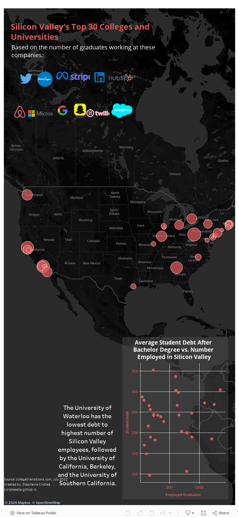
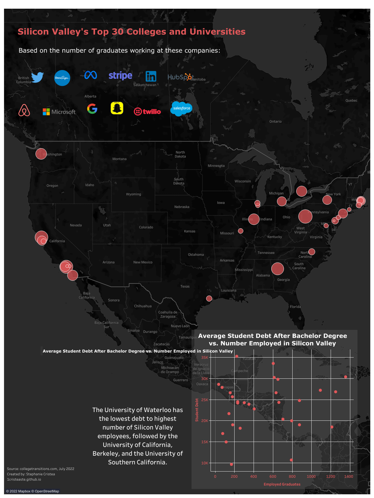
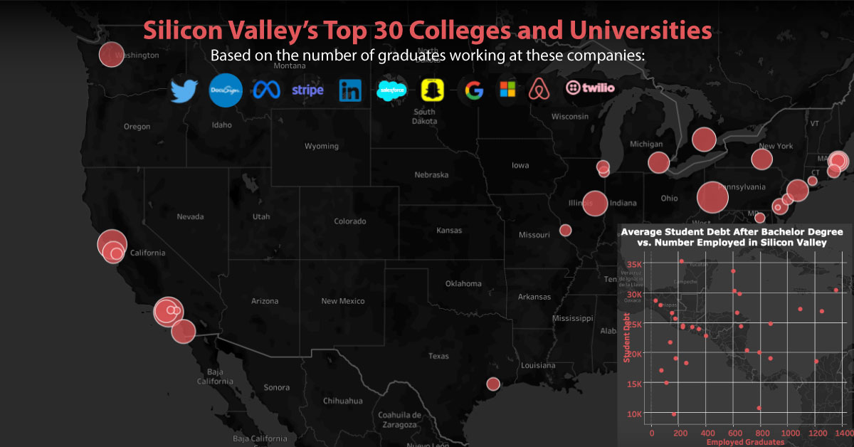
This interactive map by Stephanie Cristea shows the top feeder schools to some of the largest companies in Silicon Valley.
A Look at The Top 30 Schools
The data for this graphic comes from a study by College Transitions, which looks at the top feeder schools for 12 different companies with employees in Silicon Valley, including Twitter, Alphabet, DocuSign, Meta, and eight other large businesses.
Using publicly available data from LinkedIn, the study looked at more than 70,000 entry level engineers and IT employees at these 12 different companies, and identified where they received their undergraduate degree.
Here are the findings of the top 30 feeder schools across all 12 companies:
| Rank (Total) | Institution | # Employed | Top Employer |
|---|---|---|---|
| 1 | Carnegie Mellon University | 1,356 | |
| 2 | University of Southern California | 1,252 | |
| 3 | University of California, Berkeley | 1,212 | |
| 4 | Georgia Institute of Technology | 1,094 | Microsoft |
| 5 | University of Illinois at Urbana-Champaign | 877 | |
| 6 | University of Washington | 876 | Microsoft |
| 7 | University of California, San Diego | 795 | |
| 8 | University of Waterloo | 793 | |
| 9 | University of California, Los Angeles | 704 | |
| 10 | Stanford University | 661 | |
| 11 | Columbia University | 651 | |
| 12 | University of Michigan | 632 | |
| 13 | Cornell University | 612 | |
| 14 | Northeastern University | 604 | |
| 15 | University of Texas at Austin | 578 | |
| 16 | University of California, Irvine | 482 | |
| 17 | San Jose State University | 470 | |
| 18 | Purdue University | 469 | Microsoft |
| 19 | University of Toronto | 466 | |
| 20 | New York University | 464 | |
| 21 | Massachusetts Institute of Technology | 405 | |
| 22 | University of Pennsylvania | 352 | |
| 23 | University of California, Davis | 333 | |
| 24 | North Carolina State University | 329 | |
| 25 | University of Maryland | 309 | |
| 26 | Duke University | 304 | |
| 27 | Harvard University | 260 | |
| 28 | University of Wisconsin, Madison | 249 | |
| 29 | University of Virginia | 244 | Microsoft |
| 30 | Brown University | 236 |
While this research is far from exhaustive, it provides a glimpse of where 12 of the largest companies in Silicon Valley source their talent, and what it takes to make it into the big leagues.
Adjusted Proportional Rankings
Next, let’s look at the ranking after being adjusted proportionally for each school’s undergraduate enrollment numbers (so smaller schools can be fairly represented in the data):
| Rank (Adjusted) | Institution | # Employed | Top Employer |
|---|---|---|---|
| 1 | Carnegie Mellon University | 1356 | |
| 2 | Columbia University | 651 | |
| 3 | Stanford University | 661 | |
| 4 | Massachusetts Institute of Technology | 405 | |
| 5 | California Institute of Technology | 78 | |
| 6 | Harvey Mudd College | 72 | |
| 7 | Georgia Institute of Technology | 1094 | Microsoft |
| 8 | University of Southern California | 1252 | |
| 9 | Rice University | 235 | |
| 10 | Harvard University | 260 | |
| 11 | Duke University | 304 | |
| 12 | Cornell University | 612 | |
| 13 | Northeastern University | 604 | |
| 14 | University of California, Berkeley | 1212 | |
| 15 | University of Pennsylvania | 352 | |
| 16 | Princeton University | 170 | |
| 17 | Brown University | 236 | |
| 18 | Santa Clara University | 180 | |
| 19 | Northwestern University | 226 | |
| 20 | University of Illinois Urbana-Champaign | 877 | |
| 21 | Swarthmore College | 36 | |
| 22 | University of California San Diego | 795 | |
| 23 | University of Washington | 876 | Microsoft |
| 24 | Yale University | 115 | |
| 25 | Washington University in St. Louis | 183 | |
| 26 | Johns Hopkins University | 143 | |
| 27 | University of Chicago | 156 | |
| 28 | University of California, Los Angeles | 704 | |
| 29 | University of Waterloo | 793 | |
| 30 | University of Michigan | 632 |
Interestingly, when looking at the adjusted figures, only two of the top 10 feeder schools are Ivy League institutions: Columbia, which comes second on the list, and Harvard, which just makes the cut at number 10.
Carnegie Mellon takes first place, with over 1,300 hired graduates across all 12 companies. While the Pittsburgh-based university is not an Ivy League school, it still has a great reputation—in a recent study by U.S. News & World Report, it ranked as one of the best universities in America.
Even with its excellent reputation, Carnegie Mellon’s acceptance rate is relatively high at 17%, especially when compared to its Ivy League counterparts like Columbia (6%) and Harvard (4%).
It’s worth mentioning that, while Ivy League didn’t dominate the top 10 list, all eight schools made it into the top 30. So, while this data shows that Silicon Valley isn’t exclusively hiring from Ivy League schools, it does indicate that these prestigious institutions have a seat at the table.

This article was published as a part of Visual Capitalist's Creator Program, which features data-driven visuals from some of our favorite Creators around the world.


VC+
VC+: Get Our Key Takeaways From the IMF’s World Economic Outlook
A sneak preview of the exclusive VC+ Special Dispatch—your shortcut to understanding IMF’s World Economic Outlook report.

Have you read IMF’s latest World Economic Outlook yet? At a daunting 202 pages, we don’t blame you if it’s still on your to-do list.
But don’t worry, you don’t need to read the whole April release, because we’ve already done the hard work for you.
To save you time and effort, the Visual Capitalist team has compiled a visual analysis of everything you need to know from the report—and our VC+ Special Dispatch is available exclusively to VC+ members. All you need to do is log into the VC+ Archive.
If you’re not already subscribed to VC+, make sure you sign up now to access the full analysis of the IMF report, and more (we release similar deep dives every week).
For now, here’s what VC+ members get to see.
Your Shortcut to Understanding IMF’s World Economic Outlook
With long and short-term growth prospects declining for many countries around the world, this Special Dispatch offers a visual analysis of the key figures and takeaways from the IMF’s report including:
- The global decline in economic growth forecasts
- Real GDP growth and inflation forecasts for major nations in 2024
- When interest rate cuts will happen and interest rate forecasts
- How debt-to-GDP ratios have changed since 2000
- And much more!

Get the Full Breakdown in the Next VC+ Special Dispatch
VC+ members can access the full Special Dispatch by logging into the VC+ Archive, where you can also check out previous releases.
Make sure you join VC+ now to see exclusive charts and the full analysis of key takeaways from IMF’s World Economic Outlook.
Don’t miss out. Become a VC+ member today.
What You Get When You Become a VC+ Member
VC+ is Visual Capitalist’s premium subscription. As a member, you’ll get the following:
- Special Dispatches: Deep dive visual briefings on crucial reports and global trends
- Markets This Month: A snappy summary of the state of the markets and what to look out for
- The Trendline: Weekly curation of the best visualizations from across the globe
- Global Forecast Series: Our flagship annual report that covers everything you need to know related to the economy, markets, geopolitics, and the latest tech trends
- VC+ Archive: Hundreds of previously released VC+ briefings and reports that you’ve been missing out on, all in one dedicated hub
You can get all of the above, and more, by joining VC+ today.

-

 Education1 week ago
How Hard Is It to Get Into an Ivy League School?
-

 Technology2 weeks ago
Ranked: Semiconductor Companies by Industry Revenue Share
-

 Markets2 weeks ago
Ranked: The World’s Top Flight Routes, by Revenue
-

 Countries2 weeks ago
Population Projections: The World’s 6 Largest Countries in 2075
-

 Markets2 weeks ago
The Top 10 States by Real GDP Growth in 2023
-

 Demographics2 weeks ago
The Smallest Gender Wage Gaps in OECD Countries
-

 United States2 weeks ago
Where U.S. Inflation Hit the Hardest in March 2024
-

 Green2 weeks ago
Top Countries By Forest Growth Since 2001