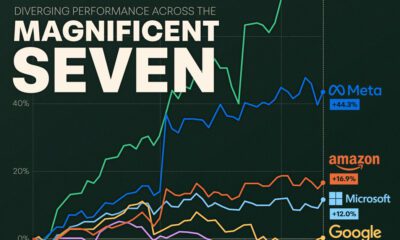

We visualize the recent performance of the Magnificent Seven stocks, uncovering a clear divergence between the group's top and bottom names.
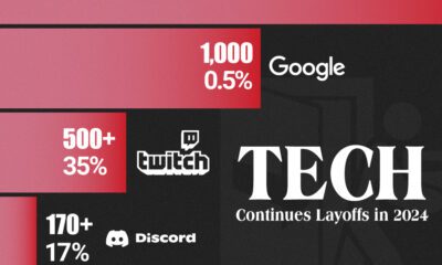

We visualize some of the bigger tech layoffs in the year so far, from video game software provider Unity to big tech bastion Google.
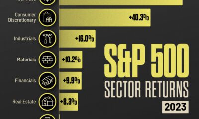

Companies benefitting from the AI train and strong retail demand helped their individual S&P 500 sector performance in 2023.
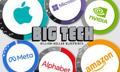

Thanks to the ubiquity of their products and services, these Big Tech companies have revenues bigger than many national GDPs.
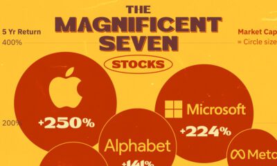

FAANG is dead… meet the 'Magnificent Seven' stocks that now make up over 25% of the S&P 500.
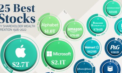

Accounting for just 0.1% of all public U.S. stocks, these companies have created nearly a third of all shareholder wealth since 1926.
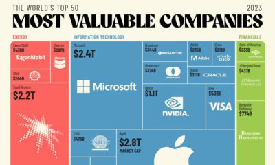

The world's 50 most valuable companies represent over $25 trillion in market cap. We break this massive figure down by company and sector.
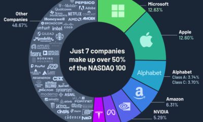

Just seven companies make up over 50% of the Nasdaq 100 by weight, and most of them are from the technology sector.
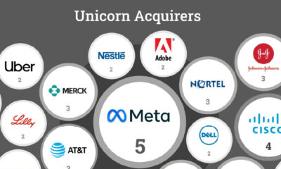

Roughly 30% of unicorns making an exit get acquired. But which companies have made the most U.S. unicorn acquisitions in the last 25 years?
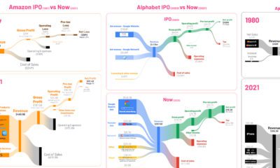

See the financials of major companies like Amazon and Tesla visualized, comparing their first year post-IPO with the most recent numbers.


 Creator Program