Environment
Animation: Visualizing 140 Years of Global Surface Temperatures
Article/Editing:
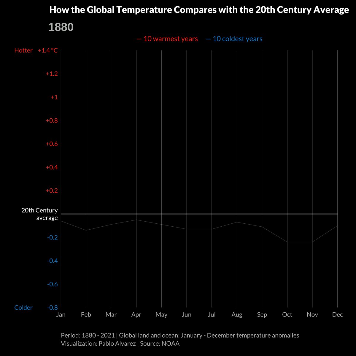
Animated: 140 Years of Global Surface Temperatures
For hundreds of years, Earth’s average surface temperature has been steadily increasing. And over the last decade, this global heating appears to have intensified.
Since 1880, the global average temperature has risen by an average of 0.08°C (0.14°F) every 10 years, according to the National Oceanic and Atmospheric Administration (NOAA).
But since 1981, warming has been occurring at more than twice that rate, by about 0.18°C (0.32°F) per decade.
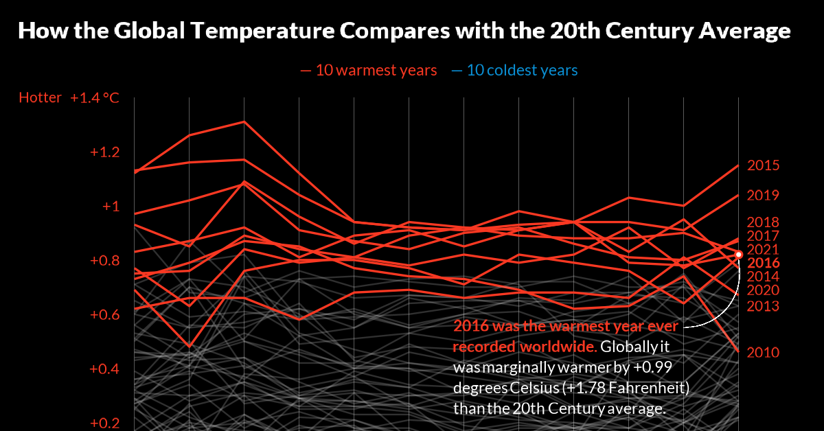
This graphic by Pablo Alvarez shows 140 years of global surface temperatures, highlighting the 10 coldest and warmest years from 1880-2021 using data from NOAA.
Global Surface Temperatures Over Time
Over the last century and a half, there have been fluctuations in global surface temperatures, with some of the coolest years on record occurring in the late 19th century and early 20th century.
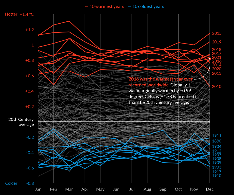
However, the last two decades have seen unprecedented warming, with the 10 warmest years on record all occurring within the last 20 years. Here’s a look at the 10 hottest years since 1800, and how they compared to the 20th century average:
The 10 Warmest Years
| Rank | Year | Deviation from 20th Century Avg. (°C) |
|---|---|---|
| #1 | 2016 | +0.99 |
| #2 | 2020 | +0.97 |
| #3 | 2019 | +0.94 |
| #4 | 2015 | +0.93 |
| #5 | 2017 | +0.9 |
| #6 | 2018 | +0.82 |
| #7 | 2014 | +0.74 |
| #8 | 2010 | +0.72 |
| #9 | 2013 | +0.67 |
| #10 | 2005 | +0.66 |
As of this article’s publication, the warmest year on record was 2016, when temperatures were +0.99°C (1.78°F) above the 20th century average. After 2016, the second warmest year was 2020, when surface temperatures reached +0.97°C (1.75°F) higher than the previous century’s average.
What Factors Impact Earth’s Climate?
There are a number of natural factors that influence global surface temperatures, including phenomena such as:
- Volcanic activity
- Changes in the Earth’s orbit
- Shifts in ocean currents
However, scientists believe that our current rate of warming has been undoubtedly caused by human influence, especially because of our carbon and other greenhouse gas (GHG) emissions.
According to the most recent report by the Intergovernmental Panel on Climate Change (IPCC), “observed increases in well-mixed greenhouse gas (GHG) concentrations since around 1750 are unequivocally caused by human activities.”
In other words, while Earth’s surface temperature naturally fluctuates over the years, our actions have undoubtedly contributed to recent changes in Earth’s climate.
What Are The Consequences?
We’re already seeing the impact of this warming, as the world struggles with extreme climate events like droughts, heatwaves, floods, and an influx of wildfires in places like Europe, the United States, and Australia.
These extreme weather patterns could become the new normal if left unchecked, which is why companies and policymakers around the world are embarking on different solutions—from targeting net zero goals to implementing technological innovations that could reduce emissions.

This article was published as a part of Visual Capitalist's Creator Program, which features data-driven visuals from some of our favorite Creators around the world.


Green
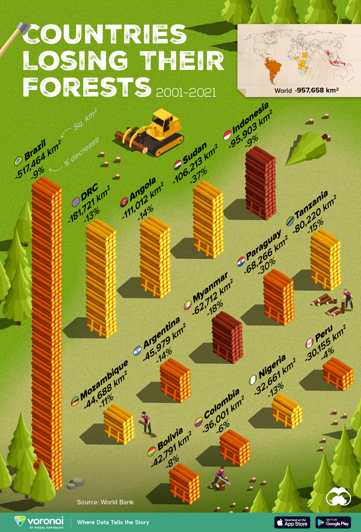
Ranked: Top Countries by Total Forest Loss Since 2001
The country with the most forest loss since 2001 lost as much forest cover as the next four countries combined.
Ranked: Top Countries By Total Forest Loss Since 2001
This was originally posted on our Voronoi app. Download the app for free on iOS or Android and discover incredible data-driven charts from a variety of trusted sources.
Forests are critical natural resources, often caught in the crosshairs of economic development. Thanks to expanding human settlement, agriculture, and industry, the world lost nearly 1 million square kilometers (km²) of forest cover since 2001.
But where has most of this deforestation occurred?
We rank the countries by the total decrease in their forest area between 2001 and 2021, measured in square kilometers along with their percentage decrease for context. All of this data was sourced from the World Bank.
A caveat to this data: countries are ranked by total forest loss, so countries with the largest forests feature predominantly on this list.
Which Country Has Lost the Most Forests (2001-2021)?
Brazil has lost more than half a million square kilometers of forest in the last two decades. Agricultural expansion for beef and soy production alongside mining and infrastructure growth are the primary drivers behind this large scale deforestation.
This has also caused periodic fires in the Amazon rainforest, drawing repeated alarm from around the world. In fact, Brazil has lost as much forest cover as the next four countries combined.
The table below lists the countries included in this graphic, as well as several others further down the ranking.
| Rank | Country | Region | 2001–21 Change (in km2) | % of Forest Loss |
|---|---|---|---|---|
| 1 | 🇧🇷 Brazil | South America | -517,464 | -9% |
| 2 | 🇨🇩 DRC | Africa | -181,721 | -13% |
| 3 | 🇦🇴 Angola | Africa | -111,012 | -14% |
| 4 | 🇸🇩 Sudan | Africa | -106,213 | -37% |
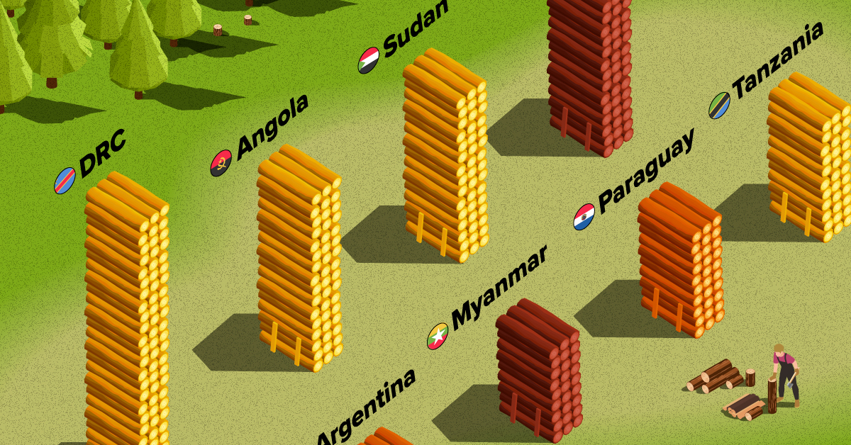
| 5 | 🇮🇩 Indonesia | Asia | -95,903 | -9% |
| 6 | 🇹🇿 Tanzania | Africa | -80,220 | -15% |
| 7 | 🇵🇾 Paraguay | South America | -68,266 | -30% |
| 8 | 🇲🇲 Myanmar | Asia | -62,712 | -18% |
| 9 | 🇦🇷 Argentina | South America | -45,979 | -14% |
| 10 | 🇲🇿 Mozambique | Africa | -44,688 | -11% |
| 11 | 🇧🇴 Bolivia | South America | -42,791 | -8% |
| 12 | 🇨🇴 Colombia | South America | -36,001 | -6% |
| 13 | 🇳🇬 Nigeria | Africa | -32,661 | -13% |
| 14 | 🇵🇪 Peru | South America | -30,155 | -4% |
| 15 | 🇰🇭 Cambodia | Asia | -28,491 | -26% |
| 16 | 🇻🇪 Venezuela | South America | -28,130 | -6% |
| 17 | 🇲🇽 Mexico | North America | -26,732 | -4% |
| 18 | 🇿🇲 Zambia | Africa | -23,924 | -5% |
| 19 | 🇧🇼 Botswana | Africa | -23,660 | -14% |
| 20 | 🇨🇮 Cote d'Ivoire | Africa | -22,577 | -45% |
What is quickly apparent is how most of the countries on this list are from Africa and South America. A study found a correlation where developing economies tend to have higher deforestation rates than advanced economies. Former colonies have also experienced more forest loss than those that were not colonized.
In Asia, Indonesia’s burgeoning palm oil industry is a key driver to deforestation, though efforts are now being made to reverse its impact. Meanwhile, Cambodia experienced rapid clear-cutting for its growing rubber plantations and timber industry.
Finally, Myanmar has long contended with illegal logging, but the country’s ongoing civil war is styming conversation efforts.

-

 Science1 week ago
Visualizing the Average Lifespans of Mammals
-

 Demographics2 weeks ago
The Smallest Gender Wage Gaps in OECD Countries
-

 United States2 weeks ago
Where U.S. Inflation Hit the Hardest in March 2024
-

 Green2 weeks ago
Top Countries By Forest Growth Since 2001
-

 United States2 weeks ago
Ranked: The Largest U.S. Corporations by Number of Employees
-

 Maps2 weeks ago
The Largest Earthquakes in the New York Area (1970-2024)
-

 Green2 weeks ago
Ranked: The Countries With the Most Air Pollution in 2023
-

 Green2 weeks ago
Ranking the Top 15 Countries by Carbon Tax Revenue