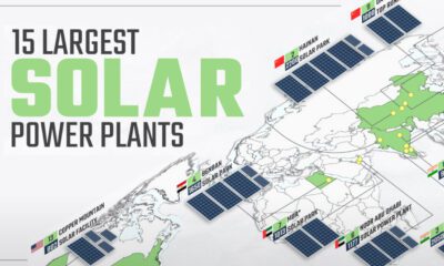

Solar power has grown rapidly over the last decade, and so have solar plants. This map shows the world's 15 largest solar power plants.
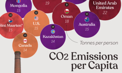

Which countries rank the highest in per capita carbon emissions, and how do they impact the world's total carbon emissions?
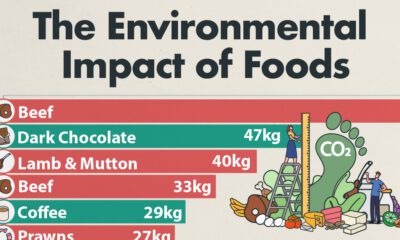

Which foods are linked with high CO2 emissions and high water use? We look at the environmental impacts of food production in this chart.
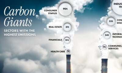

Comparing average Scope 1 emission intensities by sector according to an analysis done by S&P Global Inc.
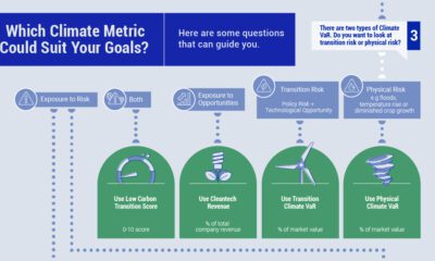

When selecting climate metrics, it is important to consider your purpose, the applicability and acceptability of the climate strategy, and the availability of historical data.
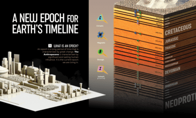

We visualize Earth’s history through the geological timeline to reveal the planet’s many epochs, including the Anthropocene.
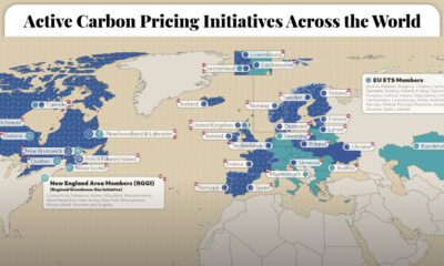

This graphic maps the 70 active carbon pricing initiatives worldwide, their established price of carbon, and the global emissions they cover.
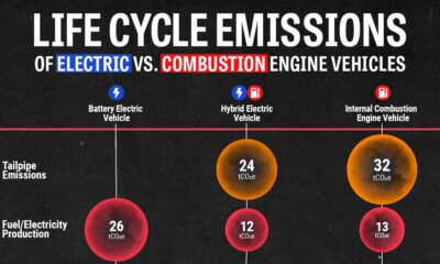

We look at carbon emissions of electric, hybrid, and combustion engine vehicles through an analysis of their life cycle emissions.
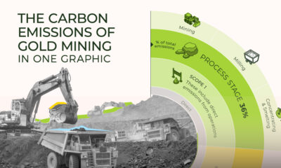

Gold has a long history as a precious metal, but just how many carbon emissions does mining it contribute to?
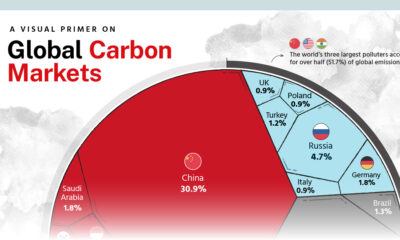

We highlight key findings from the Hinrich Foundation’s latest report on carbon markets, produced in partnership with Visual Capitalist.


 Creator Program