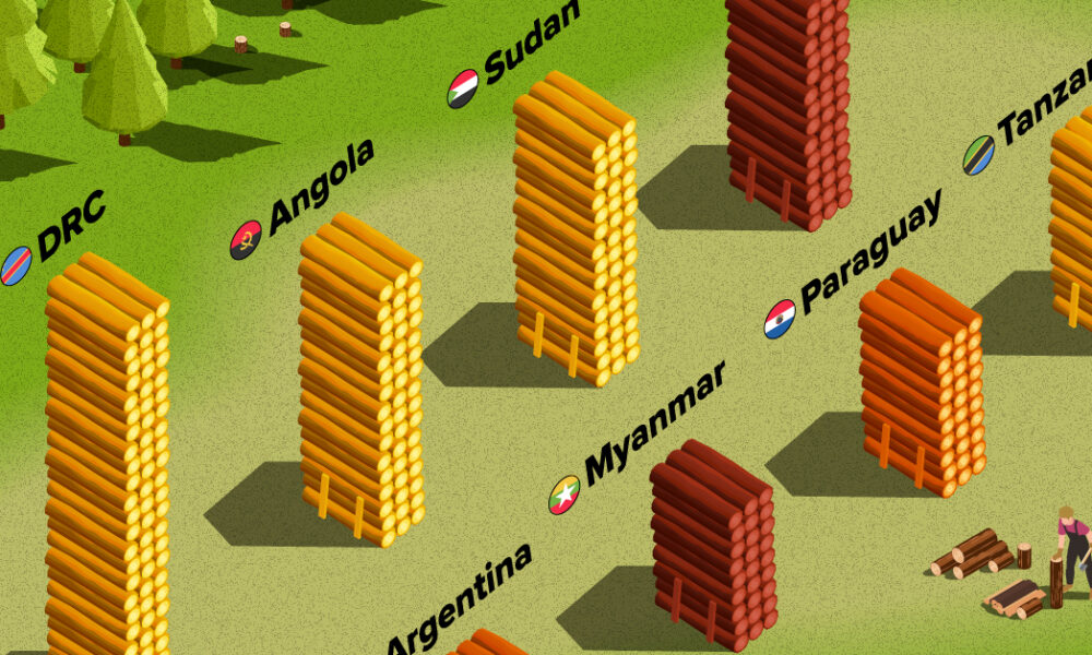
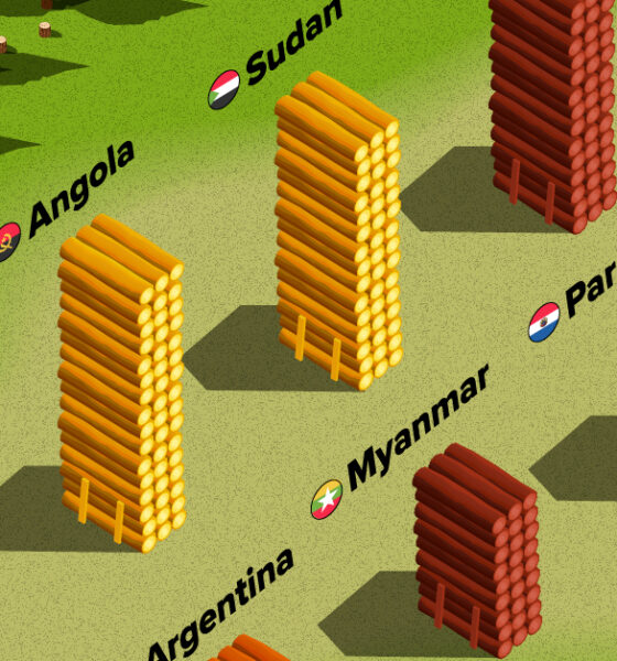
The country with the most forest loss since 2001 lost as much forest cover as the next four countries combined.
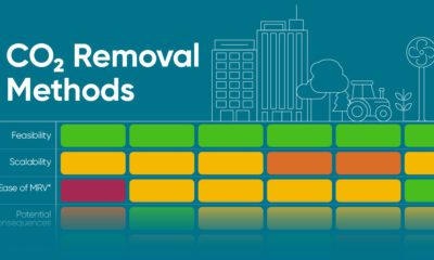

Here's how carbon dioxide removal methods could help us meet net-zero targets and and stabilize the climate.
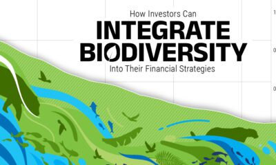

Despite contributing over half of global GDP, biodiversity is under severe pressure, and key species and ecosystems continue to be lost.
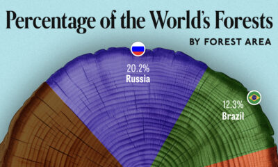

We visualize which countries have the biggest share of world forests by area—and while country size plays a factor, so too, does the environment.
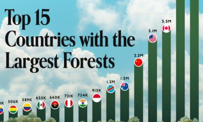

Together, the top five countries with the largest forests account for more than half of the world’s entire forest cover.
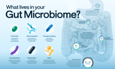

The human gut microbiome contains a world of microbes. We look at the the bacteria that deeply affect our health and well-being.
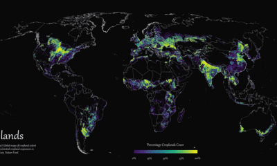

Where are the world's croplands located? This detailed map highlights the world’s cropland cover as of 2019.
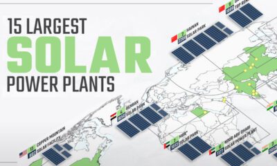

Solar power has grown rapidly over the last decade, and so have solar plants. This map shows the world's 15 largest solar power plants.
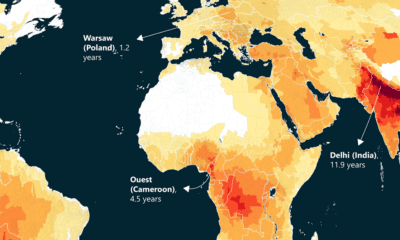

This world map of life expectancy gains shows how much longer people could potentially live by reducing pollution.
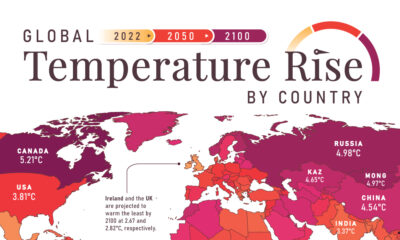

In this set of three maps, we show the global temperature rise on a national level for 2022, 2050, and 2100 based on an analysis by...


 Creator Program