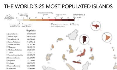

The most populated islands of the earth are teeming hubs of human activity, a far cry from the remote paradises in popular imaginations.
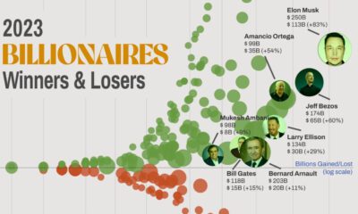

Billionaire wealth soared in 2023, but not everyone shared in these gains. This graphic shows how fortunes changed over last year.
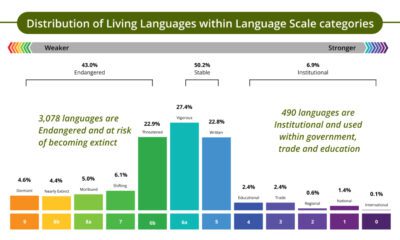

Today, 43% of the world's living languages are endangered. This graphic shows the state of all living languages around the world.
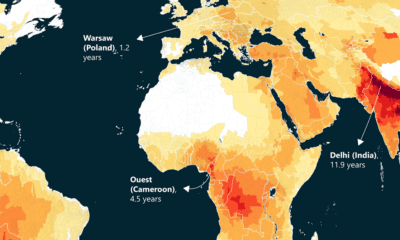

This world map of life expectancy gains shows how much longer people could potentially live by reducing pollution.
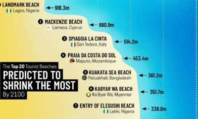

Sandy beaches make up over one-third of the world's coastline, yet nearly half of them could disappear by 2100.
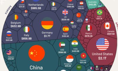

We visualize nearly $25 trillion of global exports by country, showing you the top exporting nations and the data behind it all.
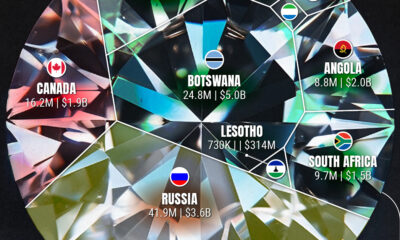

Who are the leaders in rough diamond production and how much is their diamond output worth?
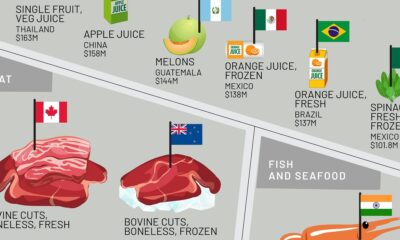

This infographic shows the top exporting countries for U.S. food imports, ranging from exotic fruits to meat, oils, spices, and more.
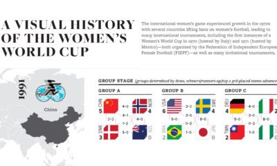

From only 12 teams to 32 teams and record-breaking attendance in 2023: This graphic charts the Women's World Cup's growth since 1991.
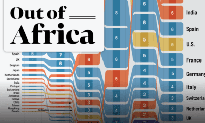

In 2020 the African continent exported nearly $378 billion worth of goods. Here are the top destinations for 25 years of Africa’s exports.


 Creator Program