Misc
Charted: Gender-Neutral Names in America
Article/Editing:
Charted: Gender-Neutral Names in America
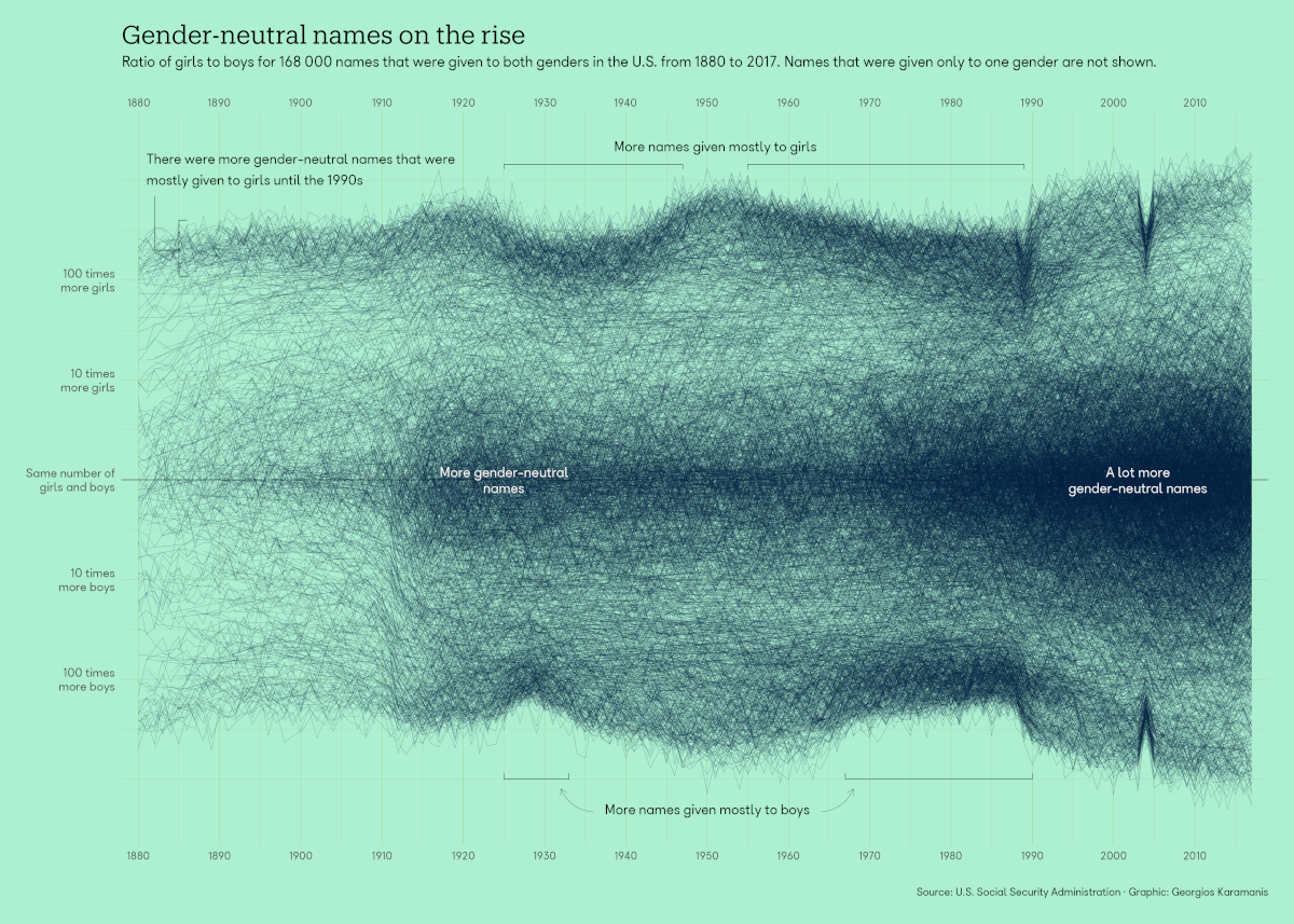
Over the course of the last three decades, gender-neutral names have become more common across the United States.
This graphic by Georgios Karamanis uses data from the U.S. Social Security Administration to show over 168,000 names, and how the ratio of boys versus girls with each of those names has changed since 1880.
The data examines names that have been given to both genders, so any gender-specific names have been excluded from the dataset.
And it looks like after initially becoming more common in the early 20th century, gender-neutral names became more common after 1990. As an example, here’s a look at the top gender-neutral names in the U.S. in 2017:
| U.S. Baby Names (2017) | Female | Male |
|---|---|---|
| Gentry | 109 | 110 |
| Ryen | 31 | 31 |
| Kayce | 23 | 23 |
| Kyri | 19 | 19 |
| Cashmere | 17 | 17 |
| Safari | 15 | 15 |
| Gemini | 14 | 14 |
| Munachimso | 14 | 14 |
| Elis | 12 | 12 |
| Iremide | 12 | 12 |
| Ziyan | 12 | 12 |
| Yarel | 11 | 11 |
| Kimoni | 10 | 10 |
| Roe | 10 | 10 |
| Autry | 9 | 9 |
| Kelyn | 9 | 9 |
| Kitt | 9 | 9 |
| Romie | 9 | 9 |
| Ekko | 8 | 8 |
| Jojo | 8 | 8 |
| Majestic | 8 | 8 |
| Bevin | 7 | 7 |
| Jerzey | 7 | 7 |
| Victorious | 7 | 7 |
| Aidynn | 6 | 6 |
| Biak | 6 | 6 |
| Cobie | 6 | 6 |
| Dhani | 6 | 6 |
| Jayln | 6 | 6 |
| Jem | 6 | 6 |
| Jessee | 6 | 6 |
| Kastyn | 6 | 6 |
| Maxie | 6 | 6 |
| Shaden | 6 | 6 |
| Tobie | 6 | 6 |
| Ase | 5 | 5 |
| Azeriah | 5 | 5 |
| Cameo | 5 | 5 |
| Choice | 5 | 5 |
| Chosyn | 5 | 5 |
| Ellyot | 5 | 5 |
| Hyland | 5 | 5 |
| Iretomiwa | 5 | 5 |
| Jeylani | 5 | 5 |
| Kahri | 5 | 5 |
| Kaysyn | 5 | 5 |
| Kharsyn | 5 | 5 |
| Kiko | 5 | 5 |
| Kindred | 5 | 5 |
| Landy | 5 | 5 |
| Lyrix | 5 | 5 |
| Ngozi | 5 | 5 |
| Yohanan | 5 | 5 |
| Zaryn | 5 | 5 |
| Zhen | 5 | 5 |

This article was published as a part of Visual Capitalist's Creator Program, which features data-driven visuals from some of our favorite Creators around the world.


VC+
VC+: Get Our Key Takeaways From the IMF’s World Economic Outlook
A sneak preview of the exclusive VC+ Special Dispatch—your shortcut to understanding IMF’s World Economic Outlook report.

Have you read IMF’s latest World Economic Outlook yet? At a daunting 202 pages, we don’t blame you if it’s still on your to-do list.
But don’t worry, you don’t need to read the whole April release, because we’ve already done the hard work for you.
To save you time and effort, the Visual Capitalist team has compiled a visual analysis of everything you need to know from the report—and our upcoming VC+ Special Dispatch will be available exclusively to VC+ members on Thursday, April 25th.
If you’re not already subscribed to VC+, make sure you sign up now to receive the full analysis of the IMF report, and more (we release similar deep dives every week).
For now, here’s what VC+ members can expect to receive.
Your Shortcut to Understanding IMF’s World Economic Outlook
With long and short-term growth prospects declining for many countries around the world, this Special Dispatch offers a visual analysis of the key figures and takeaways from the IMF’s report including:
- The global decline in economic growth forecasts
- Real GDP growth and inflation forecasts for major nations in 2024
- When interest rate cuts will happen and interest rate forecasts
- How debt-to-GDP ratios have changed since 2000
- And much more!

Get the Full Breakdown in the Next VC+ Special Dispatch
VC+ members will receive the full Special Dispatch on Thursday, April 25th.
Make sure you join VC+ now to receive exclusive charts and the full analysis of key takeaways from IMF’s World Economic Outlook.
Don’t miss out. Become a VC+ member today.
What You Get When You Become a VC+ Member
VC+ is Visual Capitalist’s premium subscription. As a member, you’ll get the following:
- Special Dispatches: Deep dive visual briefings on crucial reports and global trends
- Markets This Month: A snappy summary of the state of the markets and what to look out for
- The Trendline: Weekly curation of the best visualizations from across the globe
- Global Forecast Series: Our flagship annual report that covers everything you need to know related to the economy, markets, geopolitics, and the latest tech trends
- VC+ Archive: Hundreds of previously released VC+ briefings and reports that you’ve been missing out on, all in one dedicated hub
You can get all of the above, and more, by joining VC+ today.

-

 Markets1 week ago
U.S. Debt Interest Payments Reach $1 Trillion
-

 Business2 weeks ago
Charted: Big Four Market Share by S&P 500 Audits
-

 Real Estate2 weeks ago
Ranked: The Most Valuable Housing Markets in America
-

 Money2 weeks ago
Which States Have the Highest Minimum Wage in America?
-

 AI2 weeks ago
Ranked: Semiconductor Companies by Industry Revenue Share
-

 Markets2 weeks ago
Ranked: The World’s Top Flight Routes, by Revenue
-

 Demographics2 weeks ago
Population Projections: The World’s 6 Largest Countries in 2075
-

 Markets2 weeks ago
The Top 10 States by Real GDP Growth in 2023