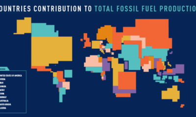

These four animated cartograms show the nations leading the world in fossil fuel production, in terms of oil, gas, coal, and total hydrocarbons.
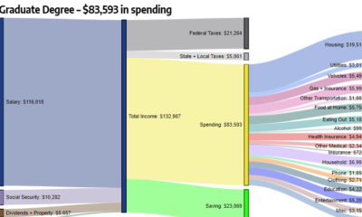

How do different types of education (high school, bachelor's degree, etc.) correspond to level of income and household expenditures?
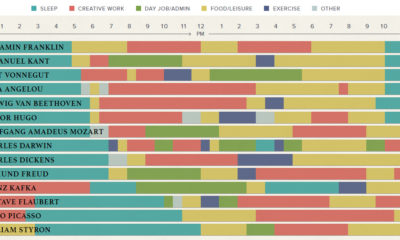

The eclectic daily routines that inspired the world's most famous creative people to produce their best and most original work.
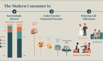

We all have a stereotypical image of the average consumer - but is it an accurate one? Meet the modern consumer, and what it means for...
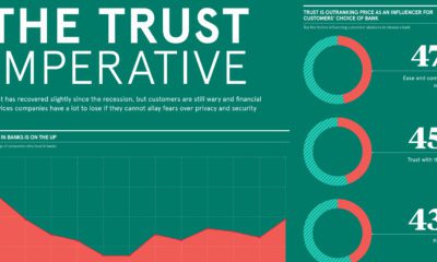

In the digital age, the issue of trust is emerging as the game-changing factor in how consumers choose financial services brands.
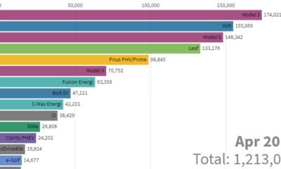

This stunning animation visualizes the last nine years of U.S. electric vehicle sales. We also look at who will lead the race in the coming years.


The cannabis edibles market is one of the most exciting growth segments for legal sales, but a variety of concerns remain, especially for beverages.
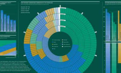

Summing up the differences in how generations approach work, including on topics such as communication, motivation, and employer loyalty.
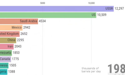

View how the ranking of the world's largest producers of crude oil changes over a 50 year period, from the Cold War until today.
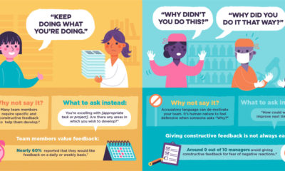

Here are 11 common phrases that managers should avoid saying to their teams, and what they should replace them with to get a better result.
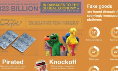

Every year, the global economy loses over $300 billion from the sale of counterfeit goods. Here are the problems created by this, and why they matter.


No one likes to lose money, even if you have billions to spare. See how the world's most elite investors - like Ray Dalio - are...
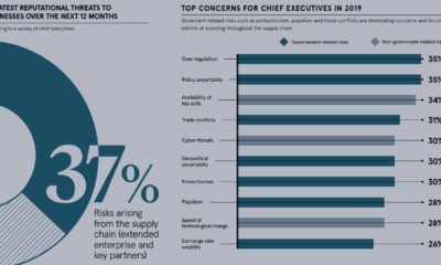

It takes decades to earn a reputation, and just one mistake to ruin it. Here's what business leaders see as the biggest reputational risks.
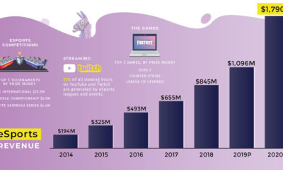

Everything you need to know about the eSports Boom, including the sector's rapid growth, massive prize pools, and the most valuable eSports companies today.

This simple map visualization will change how you think about global population, and how people are distributed throughout the planet.
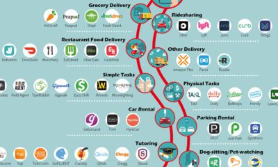

You're likely familiar with companies like Uber, Airbnb, and Craigslist, but here are 100+ other apps that help make the gig economy possible.
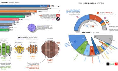

Breaking down the world's 326 unicorns - privately-held startups valued at over $1 billion - by country, sector, and valuation.
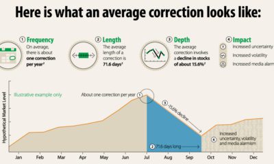

Why do stock market corrections happen, and how often does a market correction turn into a bear market? This infographic breaks it all down.
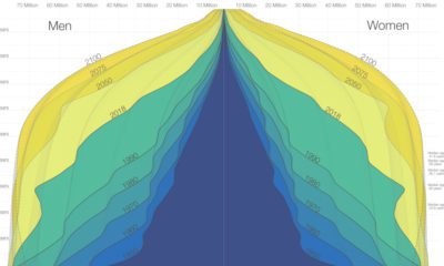

The world is in the midst of a notable demographic transition. Here's how the world population pyramid will change as we close in on the year...
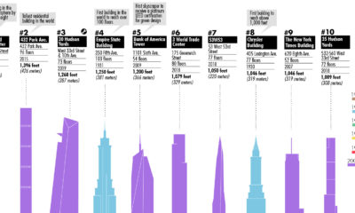

This visualization plots out the tallest buildings in New York City, as well as a few in the pipeline that will change the Big Apple's skyline...
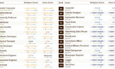

Not all jobs are created equal - see this list of 100 common careers ranked based on income, stress levels, growth potential, and other factors.
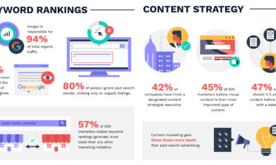

This massive infographic uses 100+ marketing stats to highlight the tactics that are working in modern-day digital universe.
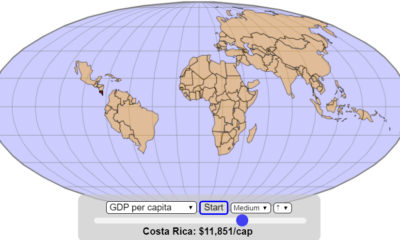

How does the world map change if it gets assembled based on the size of economies, in ascending order of GDP or GDP per capita?
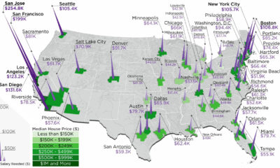

The annual salary needed to buy a home in the U.S. ranges from $38k to $255k, depending on the metropolitan area you are looking in.

How do countries around the world compare in terms of age? This compelling visualization shows the median age for every country in the world.

Under the current global financial system, billions of people do not have access to quality assets. Here's how decentralized finance is changing that.
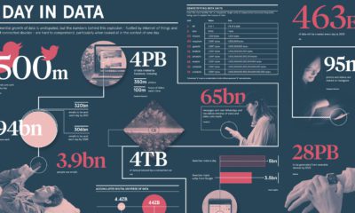

By 2020, there will be 40x more bytes of data than there are stars in the observable universe. See how much data gets added to the...
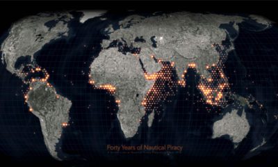

Ever since humans first sailed the high seas, piracy has been a dangerous risk. See instances of modern piracy on this detailed map.
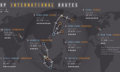

Flying can get you almost anywhere, but often people are journeying between two popular destinations. Here we map the busiest air routes globally.
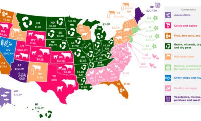

Which agricultural commodity is the most important to each state's economy? This infographic breaks it all down, based on data from the USDA.


The AI revolution is shaping the future of business. Learn about the history of AI, as well as the numbers and projections around its potential impact.
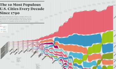

How has the list of the most populous U.S. cities changed over time? This infographic shows the top 10 cities of every decade since the year...
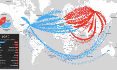

This intense animation plots data on nearly 70 years of arms sales, to compare the influence of the two superpowers from the Cold War to modern...
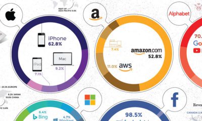

Collectively, the Big Five tech giants combine for revenues of $802 billion, which is bigger than Saudi Arabia's economy. Here's how it breaks down.
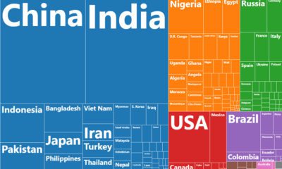

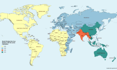
This chart resizes the world's countries based on population, while organizing them based on region. See where all 7.5 billion people live.
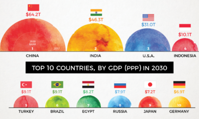

By 2030, the complexion of the global economy could look very different. This animation shows how the world's biggest economies will change over time.
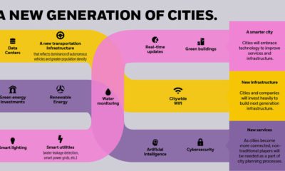

By 2050, there will be 2.5 billion more people living in cities than today. How is rapid urbanization set to impact investors and the global economy?v
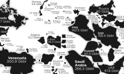

See the countries with the most oil reserves on this map, which resizes each country based on how many barrels of oil are contained in its...
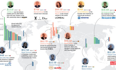

Where do the world's top billionaires live, and how has this distribution changed over time? We take a look at the top 50 billionaires .
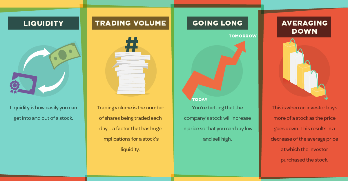
Getting a grasp on the market can be a daunting task for new investors, but this infographic is an easy first step to help in understanding...
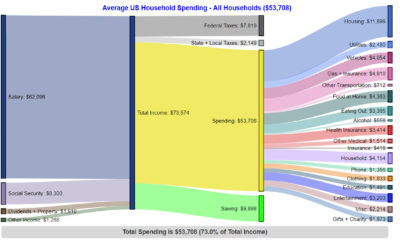

These charts break down how Americans get their income, as well as where that money goes, based on different income groups.
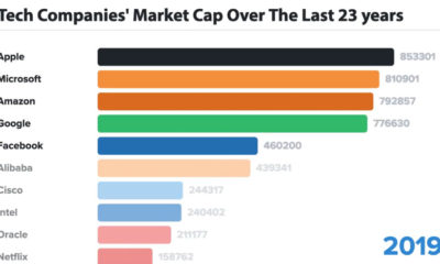

In business, the only constant is change - and for tech companies, this is even more true. Here are the biggest tech companies over 23 years.
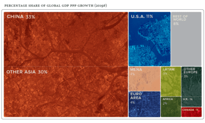

Global economics is effectively a numbers game - here are the countries and regions projected to contribute the most to global growth in 2019.
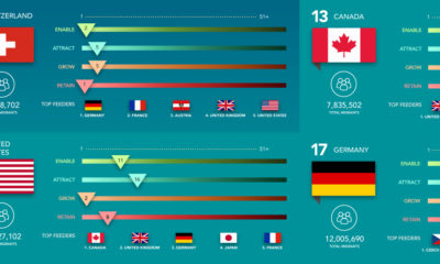

The world's most innovative companies want to get the best talent at any cost. See whether their home countries are helping or hurting their odds.


In every internet minute, there is an extraordinary amount of activity. Wrap your head around it all with this nifty infographic.
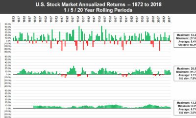

In any given year, the stock market can be a crapshoot - but over long periods of time, the U.S. market has consistently performed for investors.
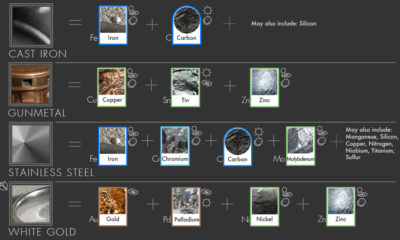

You can't find stainless steel, brass, sterling silver, or white gold on the periodic table. Learn about 20 common metal alloys, and what they are made...
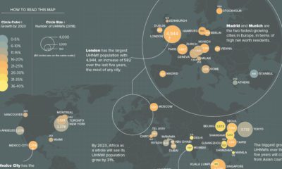

What cities are the world's ultra-rich flocking to? This map looks at ultra high net worth individual (UHNWI) growth rates in cities around the world.
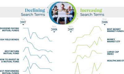

What types of investments are investors searching for? Get a unique picture of it in this infographic, which visualizes search trends between 2017 and 2018.
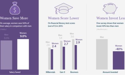

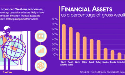
Women are better at saving money, but invest less of it - this infographic looks at the specific needs of women in investing and how to...


