Personal Finance
How Americans Make and Spend Their Money, by Education Level
Months ago, we showed you a set of data visualizations that highlighted how people make and spend their money based on income groups.
Today’s post follows a similar theme, and it visualizes differences based on education levels.
Below, we’ll tackle the breakdowns of several educational groupings, ranging from high school dropouts to those in the highest education bracket, which is defined as having achieved a master’s, professional, or doctorate degree.
Income and Spending, by Education
The data visualizations in today’s post come to us from Engaging Data and they use Sankey diagrams to display data from the Bureau of Labor Statistics (BLS) that shows income and expenditure differences between varying levels of education in America.
The four charts below will show data from the following categories:
- Less than high school graduate
- High school graduate
- Bachelor’s degree
- Master’s, professional, or doctorate degree
It should be noted that the educational level listed pertains to the person the BLS defines as the primary household member. Further, people in households can be at different ages and at different stages in their career – for example, someone with a Master’s degree could be 72 years old and collecting pension payments, and this impacts the data.
Less than High School Graduate – $28,245 in spending (98.5% of total income)
These contain an average of 2.2 people (0.7 income earners, 0.6 children, and 0.5 seniors)
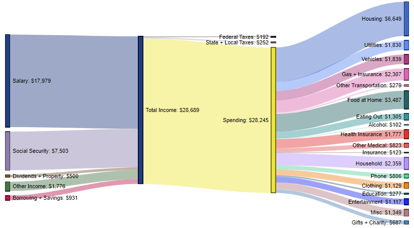
The average household in this category brings in $17,979 of salary income, as well as an additional $7,503 from social security programs.
Almost all money (98.5%) is spent, and on average these households are actually pulling money from savings (or taking out loans) to make ends meet. The biggest expenditure categories include: housing (23.5%), foot at home (12.3%), household expenses (8.4%), and gas/insurance (8.2%).
High School Graduate – $35,036 in spending (87.3% of total income)
These contain an average of 2.3 people (1.0 income earners, 0.6 children, and 0.4 seniors)
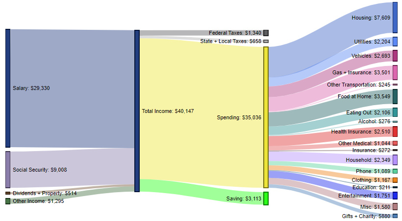
The average household here brings in $29,330 of salary, as well as $9,008 from social security.
These households spend 87.3% of their income, while putting $3,113 (7.8%) away in savings each year. The biggest expenditure categories include housing (21.7% of spending), food at home (10.1%), gas/insurance (10.0%), and vehicles (7.7%).
Bachelor’s Degree – $63,373 in spending (68.6% of total income)
These contain an average of 2.5 people (1.5 income earners, 0.6 children, and 0.4 seniors)
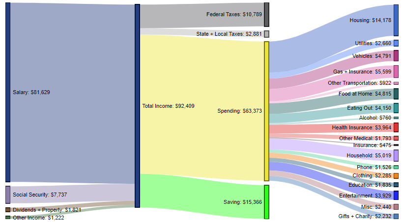
Households with at least one person with a Bachelor’s degree earn $81,629 per year in salary, as well as nearly $11,000 stemming from a combination of social security, dividends, property, and other income.
Roughly 68.6% of income is spent, with 16.6% going to savings. Top expenditures include housing (22.4%), gas/insurance (8.8%), household expenses (7.9%), and food at home (7.6%).
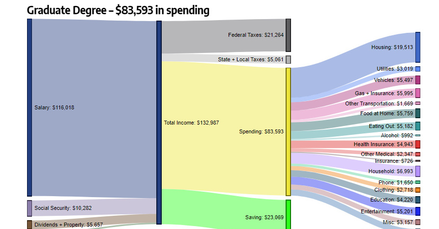
Graduate Degree – $83,593 in spending (62.9% of total income)
These contain an average of 2.6 people (1.5 income earners, 0.6 children, and 0.4 seniors)
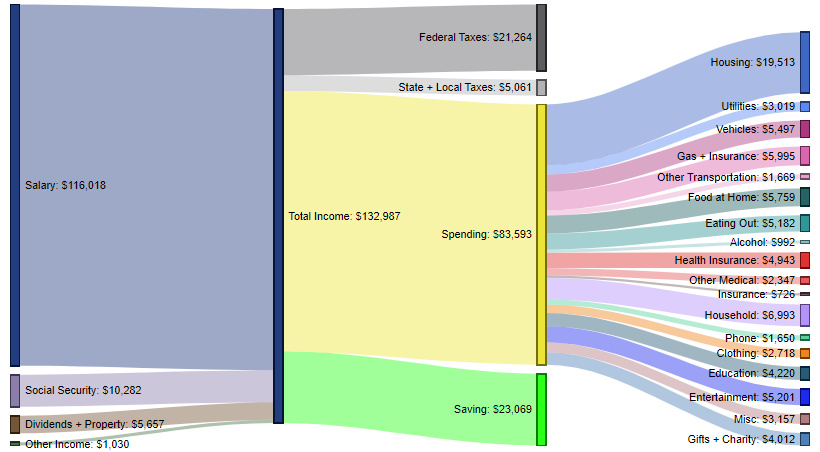
Finally, in the most educated category available, the average amount of salary coming into households is $116,018, with roughly an additional $17,000 coming in from other sources such as social security, dividends, property, and other income.
Here, 62.9% of income gets spent, and 17.3% gets put towards savings. The most significant expenditure categories are housing (23.3%), household expenses (8.4%), gas and insurance (7.2%), and food at home (6.9%).
A Changing Role for Education?
For now, there is a clear link between certain types of college degrees and higher salaries.
However, as total student debt continues to hit record highs of $1.5 trillion and as more remote educational options proliferate online, it will be interesting to see how these charts are impacted in the coming years.
By the year 2030, do you think education will still have the same strength of correlation with income levels?


Personal Finance
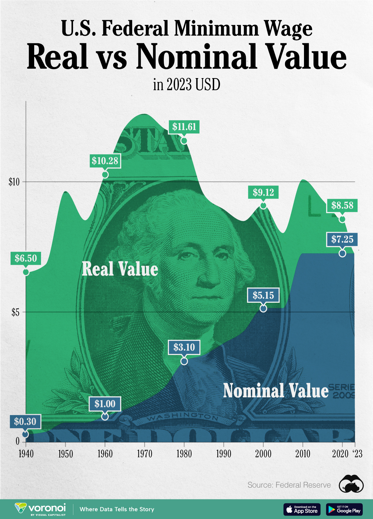
Chart: The Declining Value of the U.S. Federal Minimum Wage
This graphic compares the nominal vs. inflation-adjusted value of the U.S. minimum wage, from 1940 to 2023.
The Declining Value of the U.S. Federal Minimum Wage
This was originally posted on our Voronoi app. Download the app for free on iOS or Android and discover incredible data-driven charts from a variety of trusted sources.
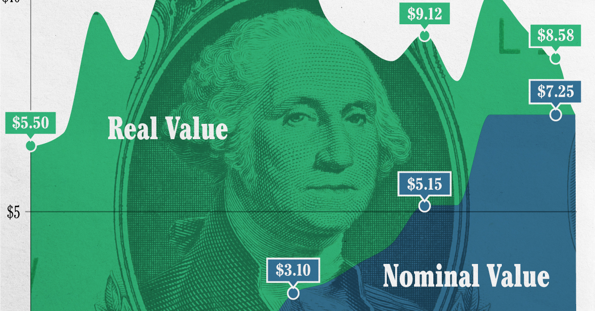
This graphic illustrates the history of the U.S. federal minimum wage using data compiled by Statista, in both nominal and real (inflation-adjusted) terms. The federal minimum wage was raised to $7.25 per hour in July 2009, where it has remained ever since.
Nominal vs. Real Value
The data we used to create this graphic can be found in the table below.
| Year | Nominal value ($/hour) | Real value ($/hour) |
|---|---|---|
| 1940 | 0.3 | 6.5 |
| 1945 | 0.4 | 6.82 |
| 1950 | 0.75 | 9.64 |
| 1955 | 0.75 | 8.52 |
| 1960 | 1 | 10.28 |
| 1965 | 1.25 | 12.08 |
| 1970 | 1.6 | 12.61 |
| 1975 | 2.1 | 12.04 |
| 1980 | 3.1 | 11.61 |
| 1985 | 3.35 | 9.51 |
| 1990 | 3.8 | 8.94 |
| 1995 | 4.25 | 8.49 |
| 2000 | 5.15 | 9.12 |
| 2005 | 5.15 | 8.03 |
| 2010 | 7.25 | 10.09 |
| 2015 | 7.25 | 9.3 |
| 2018 | 7.25 | 8.78 |
| 2019 | 7.25 | 8.61 |
| 2020 | 7.25 | 8.58 |
| 2021 | 7.25 | 8.24 |
| 2022 | 7.25 | 7.61 |
| 2023 | 7.25 | 7.25 |
What our graphic shows is how inflation has eroded the real value of the U.S. minimum wage over time, despite nominal increases.
For instance, consider the year 1960, when the federal minimum wage was $1 per hour. After accounting for inflation, this would be worth around $10.28 today!
The two lines converge at 2023 because the nominal and real value are identical in present day terms.
Many States Have Their Own Minimum Wage
According to the National Conference of State Legislatures (NCSL), 30 states and Washington, D.C. have implemented a minimum wage that is higher than $7.25.
The following states have adopted the federal minimum: Georgia, Idaho, Indiana, Iowa, Kansas, Kentucky, New Hampshire, North Carolina, North Dakota, Oklahoma, Pennsylvania, Texas, Utah, Wisconsin, and Wyoming.
Meanwhile, the states of Alabama, Louisiana, Mississippi, South Carolina, and Tennessee have no wage minimums, but have to follow the federal minimum.
How Does the U.S. Minimum Wage Rank Globally?
If you found this topic interesting, check out Mapped: Minimum Wage Around the World to see which countries have the highest minimum wage in monthly terms, as of January 2023.

-

 Debt1 week ago
How Debt-to-GDP Ratios Have Changed Since 2000
-

 Markets2 weeks ago
Ranked: The World’s Top Flight Routes, by Revenue
-

 Countries2 weeks ago
Population Projections: The World’s 6 Largest Countries in 2075
-

 Markets2 weeks ago
The Top 10 States by Real GDP Growth in 2023
-

 Demographics2 weeks ago
The Smallest Gender Wage Gaps in OECD Countries
-

 United States2 weeks ago
Where U.S. Inflation Hit the Hardest in March 2024
-

 Green2 weeks ago
Top Countries By Forest Growth Since 2001
-

 United States2 weeks ago
Ranked: The Largest U.S. Corporations by Number of Employees