Money
How Americans Make and Spend Their Money
How do you spend your hard-earned money?
Whether you are extremely frugal, or you’re known to indulge in the finer things in life, how you allocate your spending is partially a function of how much cash you have coming in the door.
Simply put, the more income a household generates, the higher the portion that can be spent on items other than the usual necessities (housing, food, clothing, etc), and the more that can be saved or invested for the future.
Earning and Spending, by Income Group
Today’s visuals come to us from Engaging Data, and they use Sankey diagrams to display data from the Bureau of Labor Statistics (BLS) that helps to paint a picture of how different household income groups make and spend their money.
We’ll show you three charts below for the following income groups:
- The Average American
- The Lowest Income Quintile (Bottom 20%)
- The Highest Income Quintile (Highest 20%)
Let’s start by taking a look at the flows of the average American household:
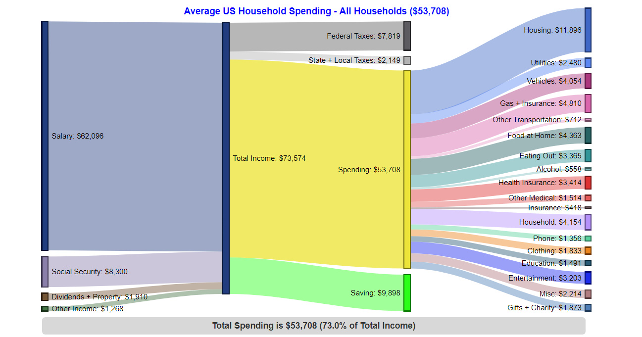
The Average American Household – $53,708 in spending (73% of total income)
The average U.S. household has 2.5 people (1.3 income earners, 0.6 children, and 0.4 seniors)
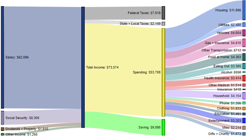
As you can see above the average household generates $73,574 of total inflows, with 84.4% of that coming from salary, and smaller portions coming from social security (11.3%), dividends and property (2.6%), and other income (1.7%).
In terms of money going out, the highest allocation goes to housing (22.1% of spending), while gas and insurance (9.0%), household (7.7%), and vehicles (7.5%) make up the next largest categories.
Interestingly, the average U.S. household also says it is saving just short of $10,000 per year.
The Bottom 20% – $25,525 in spending (100% of total income)
These contain an average of 1.6 people (0.5 income earners, 0.3 children, and 0.4 seniors)
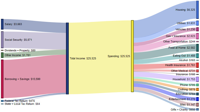
How do the inflows and outflows of the average American household compare to the lowest income quintile?
Here, the top-level statistic tells much of the story, as the poorest income group in America must spend 100% of money coming in to make ends meet. Further, cash comes in from many different sources, showing that there are fewer dependable sources of income for families to rely on.
For expenditures, this group spends the most on housing (24.8% of spending), while other top costs of living include food at home (10.1%), gas and insurance (7.9%), health insurance (6.9%), and household costs (6.9%).
The Highest 20% – $99,639 in spending (53% of total income)
These contain an average of 3.1 people (2.1 income earners, 0.8 children, and 0.2 seniors)
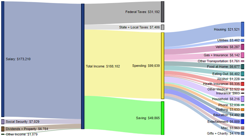
The wealthiest household segment brings in $188,102 in total income on average, with salaries (92.1%) being the top source of inflows.
This group spends just over half of its income, with top expenses being housing (21.6%), vehicles (8.3%), household costs (8.2%), gas and insurance (8.2%), and entertainment (6.9%).
The highest quintile pays just short of $40,000 in federal, state, and local taxes per year, and is also able to contribute roughly $50,000 to savings each year.
Spending Over Time
For a fascinating look at how household spending has changed over time, don’t forget to check out our previous post that charts 75 years of data on how Americans spend money.


Money
Charted: Which City Has the Most Billionaires in 2024?
Just two countries account for half of the top 20 cities with the most billionaires. And the majority of the other half are found in Asia.


Charted: Which Country Has the Most Billionaires in 2024?
This was originally posted on our Voronoi app. Download the app for free on iOS or Android and discover incredible data-driven charts from a variety of trusted sources.
Some cities seem to attract the rich. Take New York City for example, which has 340,000 high-net-worth residents with investable assets of more than $1 million.
But there’s a vast difference between being a millionaire and a billionaire. So where do the richest of them all live?
Using data from the Hurun Global Rich List 2024, we rank the top 20 cities with the highest number of billionaires in 2024.
A caveat to these rich lists: sources often vary on figures and exact rankings. For example, in last year’s reports, Forbes had New York as the city with the most billionaires, while the Hurun Global Rich List placed Beijing at the top spot.
Ranked: Top 20 Cities with the Most Billionaires in 2024
The Chinese economy’s doldrums over the course of the past year have affected its ultra-wealthy residents in key cities.
Beijing, the city with the most billionaires in 2023, has not only ceded its spot to New York, but has dropped to #4, overtaken by London and Mumbai.
| Rank | City | Billionaires | Rank Change YoY |
|---|---|---|---|
| 1 | 🇺🇸 New York | 119 | +1 |
| 2 | 🇬🇧 London | 97 | +3 |
| 3 | 🇮🇳 Mumbai | 92 | +4 |
| 4 | 🇨🇳 Beijing | 91 | -3 |
| 5 | 🇨🇳 Shanghai | 87 | -2 |
| 6 | 🇨🇳 Shenzhen | 84 | -2 |
| 7 | 🇭🇰 Hong Kong | 65 | -1 |
| 8 | 🇷🇺 Moscow | 59 | No Change |
| 9 | 🇮🇳 New Delhi | 57 | +6 |
| 10 | 🇺🇸 San Francisco | 52 | No Change |
| 11 | 🇹🇭 Bangkok | 49 | +2 |
| 12 | 🇹🇼 Taipei | 45 | +2 |
| 13 | 🇫🇷 Paris | 44 | -2 |
| 14 | 🇨🇳 Hangzhou | 43 | -5 |
| 15 | 🇸🇬 Singapore | 42 | New to Top 20 |
| 16 | 🇨🇳 Guangzhou | 39 | -4 |
| 17T | 🇮🇩 Jakarta | 37 | +1 |
| 17T | 🇧🇷 Sao Paulo | 37 | No Change |
| 19T | 🇺🇸 Los Angeles | 31 | No Change |
| 19T | 🇰🇷 Seoul | 31 | -3 |
In fact all Chinese cities on the top 20 list have lost billionaires between 2023–24. Consequently, they’ve all lost ranking spots as well, with Hangzhou seeing the biggest slide (-5) in the top 20.
Where China lost, all other Asian cities—except Seoul—in the top 20 have gained ranks. Indian cities lead the way, with New Delhi (+6) and Mumbai (+3) having climbed the most.
At a country level, China and the U.S combine to make up half of the cities in the top 20. They are also home to about half of the world’s 3,200 billionaire population.
In other news of note: Hurun officially counts Taylor Swift as a billionaire, estimating her net worth at $1.2 billion.

-

 Education1 week ago
How Hard Is It to Get Into an Ivy League School?
-

 Technology2 weeks ago
Ranked: Semiconductor Companies by Industry Revenue Share
-

 Markets2 weeks ago
Ranked: The World’s Top Flight Routes, by Revenue
-

 Demographics2 weeks ago
Population Projections: The World’s 6 Largest Countries in 2075
-

 Markets2 weeks ago
The Top 10 States by Real GDP Growth in 2023
-

 Demographics2 weeks ago
The Smallest Gender Wage Gaps in OECD Countries
-

 Economy2 weeks ago
Where U.S. Inflation Hit the Hardest in March 2024
-

 Green2 weeks ago
Top Countries By Forest Growth Since 2001