Markets
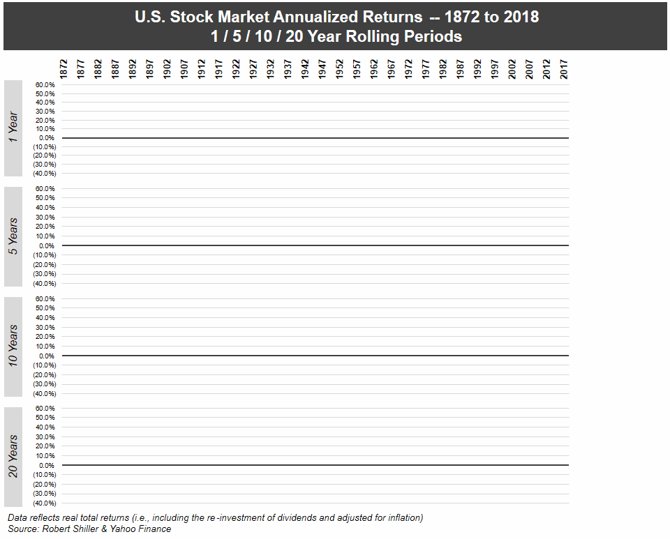
Stock Market Returns Over Different Time Periods (1872-2018)
Putting hard-earned money in the stock market can make some people nervous.
It’s well known that a correction can occur at any time, and the fear of market crashes can make even the most seasoned investors to make questionable decisions.
While it’s true that putting your money on the line is never easy, the historical record of the stock market is virtually irrefutable: U.S. markets have consistently performed over long holding periods, even going back to the 19th century.
Market Performance (1872-2018)
Today’s animation comes to us from The Measure of a Plan, and it shows the performance of the U.S. market over different rolling time horizons using annualized returns.
Note: The animation uses real total returns from the S&P Composite Index from 1872 to 1957, and then the S&P 500 Index from 1957 onwards. Data has been adjusted for reinvestment of dividends as well as inflation.
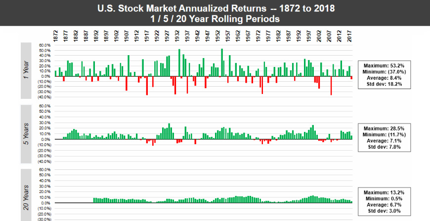
Using just one-year intervals of time, the market can be a crapshoot. Unfortunately, if you were to just choose a one-year period at random, there would be a significant chance of losing money.
However, as the timeframes get longer – the animation goes to 5-year, 10-year, and then 20-year rolling periods – the frequency of losses rapidly decreases. By the time you get to the 20-year windows, there isn’t a single instance in which the market had a negative return.
Why Time Matters
Over 146 years of data, the chance of seeing negative returns for any given year is about 31%.
That fact in itself is quite alarming, but even more important to note is the distribution of returns in those down years. As you can see in the following chart also from The Measure of a Plan, it’s not uncommon for a down year to skew in the high negatives, just as it did during the crisis of 2008:
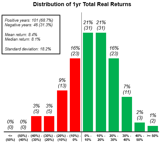
According to the data, there have been 10 individual years where the market has lost upwards of 20% – and while those off years are greatly outnumbered by the years with positive returns, it makes it clear that timeframe matters.
Past performance obviously doesn’t guarantee future results, but the historical track record in this case is quite robust.
Long-term investors can see that as long as their time horizon is measured in the decades, you can take the odds of making money in the stock market to the bank.


Investor Education
How MSCI Builds Thematic Indexes: A Step-by-Step Guide
From developing an index objective to choosing relevant stocks, this graphic breaks down how MSCI builds thematic indexes using examples.
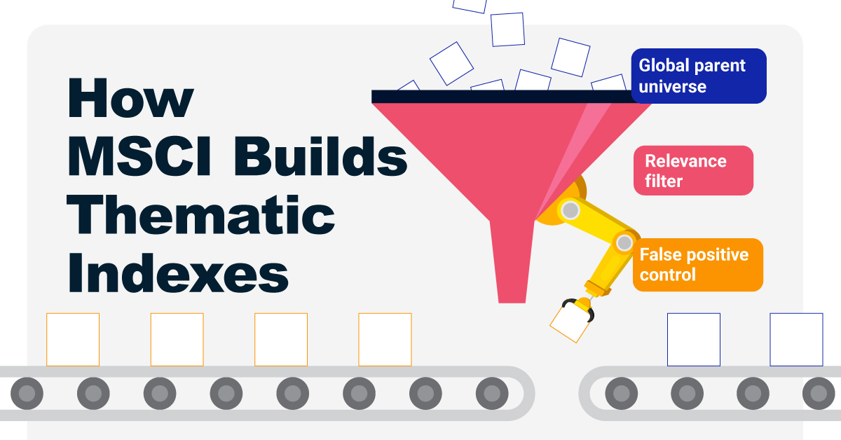
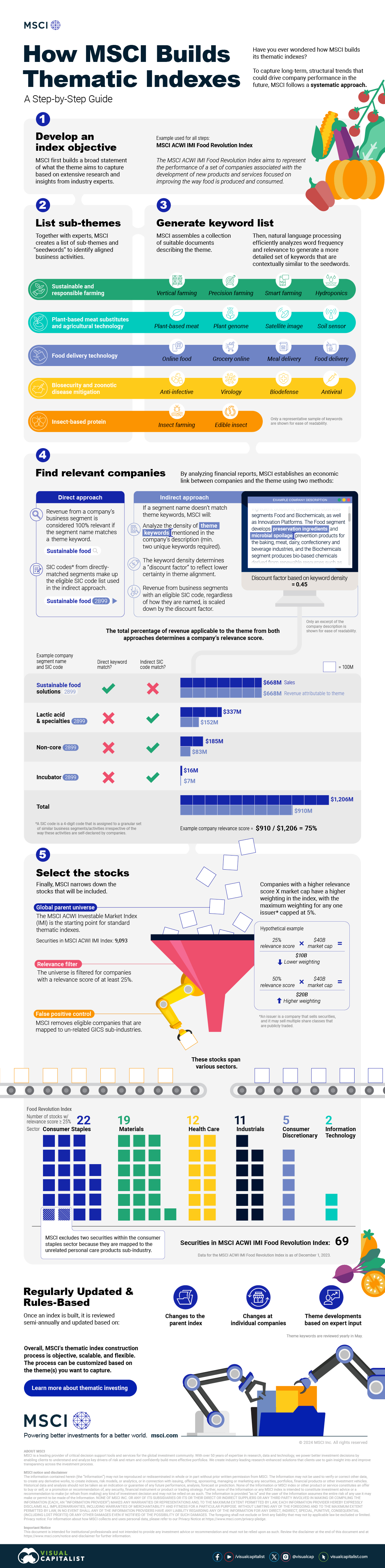
How MSCI Builds Thematic Indexes: A Step-by-Step Guide
Have you ever wondered how MSCI builds its thematic indexes?
To capture long-term, structural trends that could drive business performance in the future, the company follows a systematic approach. This graphic from MSCI breaks down each step in the process used to create its thematic indexes.
Step 1: Develop an Index Objective
MSCI first builds a broad statement of what the theme aims to capture based on extensive research and insights from industry experts.
Steps 2 and 3: List Sub-Themes, Generate Keyword List
Together with experts, MSCI creates a list of sub-themes or “seedwords” to identify aligned business activities.
The team then assembles a collection of suitable documents describing the theme. Natural language processing efficiently analyzes word frequency and relevance to generate a more detailed set of keywords contextually similar to the seedwords.
Step 4: Find Relevant Companies
By analyzing financial reports, MSCI picks companies relevant to the theme using two methods:
- Direct approach: Revenue from a company’s business segment is considered 100% relevant if the segment name matches a theme keyword. Standard Industrial Classification (SIC) codes from these directly-matched segments make up the eligible SIC code list used in the indirect approach.
- Indirect approach: If a segment name doesn’t match theme keywords, MSCI will:
- Analyze the density of theme keywords mentioned in the company’s description. A minimum of two unique keywords is required.
- The keyword density determines a “discount factor” to reflect lower certainty in theme alignment.
- Revenue from business segments with an eligible SIC code, regardless of how they are named, is scaled down by the discount factor.
The total percentage of revenue applicable to the theme from both approaches determines a company’s relevance score.
Step 5: Select the Stocks
Finally, MSCI narrows down the stocks that will be included:
- Global parent universe: The ACWI Investable Market Index (IMI) is the starting point for standard thematic indexes.
- Relevance filter: The universe is filtered for companies with a relevance score of at least 25%.
- False positive control: Eligible companies that are mapped to un-related GICS sub-industries are removed.
Companies with higher relevance scores and market caps have a higher weighting in the index, with the maximum weighting for any one issuer capped at 5%. The final selected stocks span various sectors.
MSCI Thematic Indexes: Regularly Updated and Rules-Based
Once an index is built, it is reviewed semi-annually and updated based on:
- Changes to the parent index
- Changes at individual companies
- Theme developments based on expert input
Theme keywords are reviewed yearly in May. Overall, MSCI’s thematic index construction process is objective, scalable, and flexible. The process can be customized based on the theme(s) you want to capture.
Learn more about MSCI’s thematic indexes.

-
 Investor Education5 months ago
The 20 Most Common Investing Mistakes, in One Chart
Here are the most common investing mistakes to avoid, from emotionally-driven investing to paying too much in fees.
-
 Stocks10 months ago
Visualizing BlackRock’s Top Equity Holdings
BlackRock is the world’s largest asset manager, with over $9 trillion in holdings. Here are the company’s top equity holdings.
-
 Investor Education10 months ago
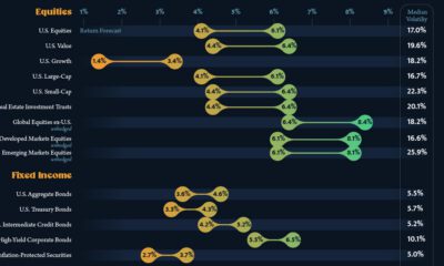
10-Year Annualized Forecasts for Major Asset Classes
This infographic visualizes 10-year annualized forecasts for both equities and fixed income using data from Vanguard.
-
 Investor Education1 year ago
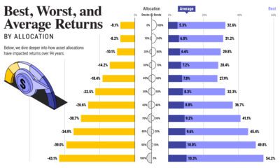
Visualizing 90 Years of Stock and Bond Portfolio Performance
How have investment returns for different portfolio allocations of stocks and bonds compared over the last 90 years?
-
 Debt2 years ago
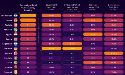
Countries with the Highest Default Risk in 2022
In this infographic, we examine new data that ranks the top 25 countries by their default risk.
-
 Markets2 years ago
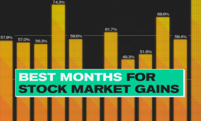
The Best Months for Stock Market Gains
This infographic analyzes over 30 years of stock market performance to identify the best and worst months for gains.

-
 Money2 weeks ago
Visualizing the Growth of $100, by Asset Class (1970-2023)
-

 Money1 week ago
Where Does One U.S. Tax Dollar Go?
-

 Green2 weeks ago
Ranked: Top Countries by Total Forest Loss Since 2001
-

 Real Estate2 weeks ago
Visualizing America’s Shortage of Affordable Homes
-

 Maps2 weeks ago
Mapped: Average Wages Across Europe
-

 Mining2 weeks ago
Charted: The Value Gap Between the Gold Price and Gold Miners
-

 Demographics2 weeks ago
Visualizing the Size of the Global Senior Population
-

 Automotive2 weeks ago
Tesla Is Once Again the World’s Best-Selling EV Company