Money
Visualizing All of the U.S. Currency in Circulation
![]() See this visualization first on the Voronoi app.
See this visualization first on the Voronoi app.
Visualizing All of the U.S. Currency in Circulation
This was originally posted on our Voronoi app. Download the app for free on iOS or Android and discover incredible data-driven charts from a variety of trusted sources.
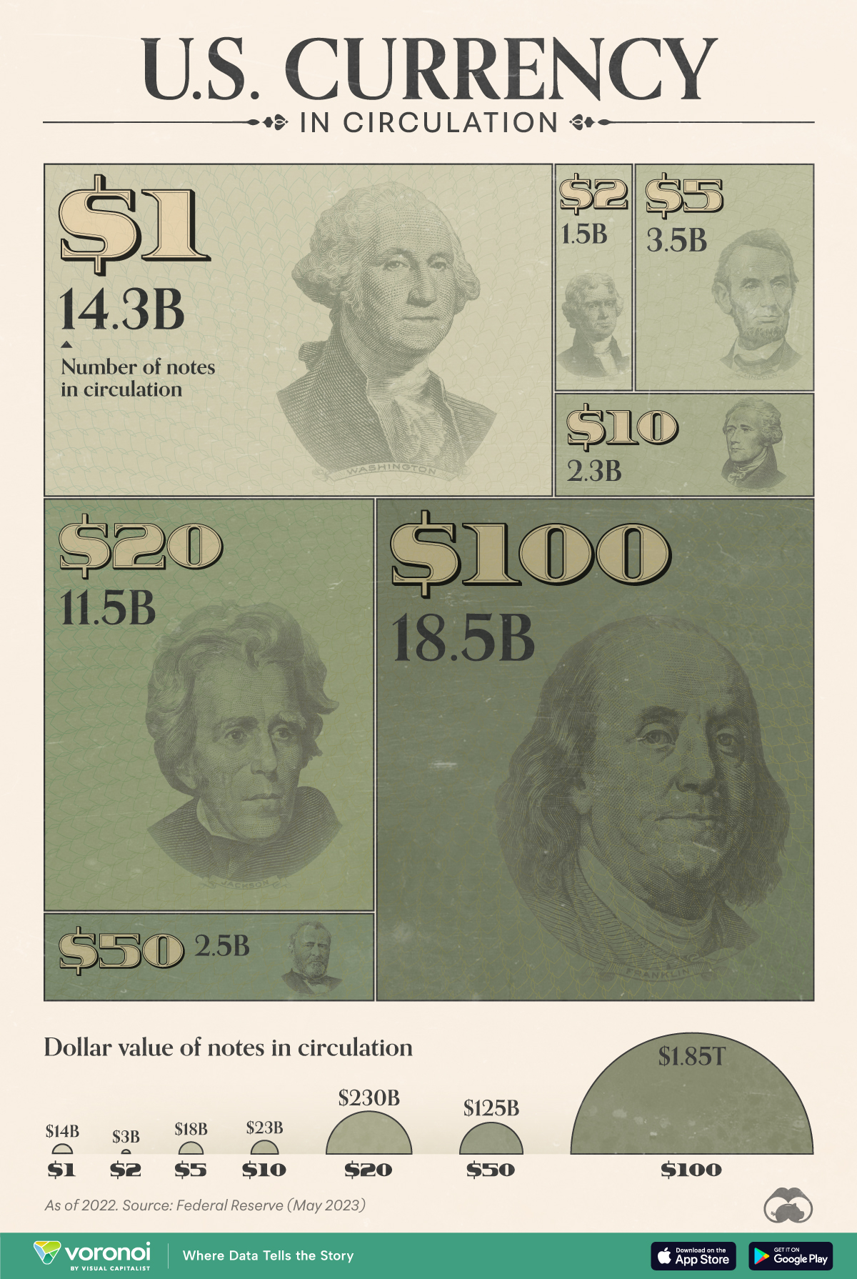
Have you ever wondered how much U.S. currency is in circulation?
Every year, the U.S. Federal Reserve submits a print order for U.S. currency to the Treasury Department’s Bureau of Engraving and Printing (BEP). The BEP will then print billions of notes in various denominations, from $1 bills to $100 bills.
In this graphic, we’ve used the latest Federal Reserve data to visualize the approximate number of bills for each denomination globally, as of Dec. 31, 2022.
Breakdown of U.S. Currency in Circulation
The following table lists all of the data we used to create the visualization above. Note that value figures were rounded for simplicity.
| Type of Bill | Number of notes in circulation (billions) | Value ($B) |
|---|---|---|
| $1 | 14.3 | $14B |
| $2 | 1.5 | $3B |
| $5 | 3.5 | $18B |
| $10 | 2.3 | $23B |
| $20 | 11.5 | $230B |
| $50 | 2.5 | $125B |
| $100 | 18.5 | $1,850B |
| $500-10,000* | 0.0004 | n/a |
*$500-10,000 bills are listed as a range, and a total circulation of 0.0004 billion. Not included in graphic.
From these numbers, we can see that $100 bills are the most common bill in circulation, even ahead of $1 bills.
One reason for this is $100 bills have a longer lifespan than smaller denominations, due to people using $100 bills less often for transactions. Some businesses may also decline $100 bills as payment.
Based on 2018 estimates from the Federal Reserve, a $100 bill has a lifespan of over 20 years, which is significantly higher than $1 bills (7 years) and $5 bills (5 years).
If you’re interested in more visualizations on the U.S. dollar, consider this animated chart which shows how the dollar overtook the British pound as the world’s most prominent reserve currency.


Money
Charted: Which City Has the Most Billionaires in 2024?
Just two countries account for half of the top 20 cities with the most billionaires. And the majority of the other half are found in Asia.


Charted: Which Country Has the Most Billionaires in 2024?
This was originally posted on our Voronoi app. Download the app for free on iOS or Android and discover incredible data-driven charts from a variety of trusted sources.
Some cities seem to attract the rich. Take New York City for example, which has 340,000 high-net-worth residents with investable assets of more than $1 million.
But there’s a vast difference between being a millionaire and a billionaire. So where do the richest of them all live?
Using data from the Hurun Global Rich List 2024, we rank the top 20 cities with the highest number of billionaires in 2024.
A caveat to these rich lists: sources often vary on figures and exact rankings. For example, in last year’s reports, Forbes had New York as the city with the most billionaires, while the Hurun Global Rich List placed Beijing at the top spot.
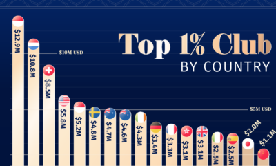
Ranked: Top 20 Cities with the Most Billionaires in 2024
The Chinese economy’s doldrums over the course of the past year have affected its ultra-wealthy residents in key cities.
Beijing, the city with the most billionaires in 2023, has not only ceded its spot to New York, but has dropped to #4, overtaken by London and Mumbai.
| Rank | City | Billionaires | Rank Change YoY |
|---|---|---|---|
| 1 | 🇺🇸 New York | 119 | +1 |
| 2 | 🇬🇧 London | 97 | +3 |
| 3 | 🇮🇳 Mumbai | 92 | +4 |
| 4 | 🇨🇳 Beijing | 91 | -3 |
| 5 | 🇨🇳 Shanghai | 87 | -2 |
| 6 | 🇨🇳 Shenzhen | 84 | -2 |
| 7 | 🇭🇰 Hong Kong | 65 | -1 |
| 8 | 🇷🇺 Moscow | 59 | No Change |
| 9 | 🇮🇳 New Delhi | 57 | +6 |
| 10 | 🇺🇸 San Francisco | 52 | No Change |
| 11 | 🇹🇭 Bangkok | 49 | +2 |
| 12 | 🇹🇼 Taipei | 45 | +2 |
| 13 | 🇫🇷 Paris | 44 | -2 |
| 14 | 🇨🇳 Hangzhou | 43 | -5 |
| 15 | 🇸🇬 Singapore | 42 | New to Top 20 |
| 16 | 🇨🇳 Guangzhou | 39 | -4 |
| 17T | 🇮🇩 Jakarta | 37 | +1 |
| 17T | 🇧🇷 Sao Paulo | 37 | No Change |
| 19T | 🇺🇸 Los Angeles | 31 | No Change |
| 19T | 🇰🇷 Seoul | 31 | -3 |
In fact all Chinese cities on the top 20 list have lost billionaires between 2023–24. Consequently, they’ve all lost ranking spots as well, with Hangzhou seeing the biggest slide (-5) in the top 20.
Where China lost, all other Asian cities—except Seoul—in the top 20 have gained ranks. Indian cities lead the way, with New Delhi (+6) and Mumbai (+3) having climbed the most.
At a country level, China and the U.S combine to make up half of the cities in the top 20. They are also home to about half of the world’s 3,200 billionaire population.
In other news of note: Hurun officially counts Taylor Swift as a billionaire, estimating her net worth at $1.2 billion.

-

 Education1 week ago
How Hard Is It to Get Into an Ivy League School?
-

 Technology2 weeks ago
Ranked: Semiconductor Companies by Industry Revenue Share
-

 Markets2 weeks ago
Ranked: The World’s Top Flight Routes, by Revenue
-

 Demographics2 weeks ago
Population Projections: The World’s 6 Largest Countries in 2075
-

 Markets2 weeks ago
The Top 10 States by Real GDP Growth in 2023
-

 Demographics2 weeks ago
The Smallest Gender Wage Gaps in OECD Countries
-

 Economy2 weeks ago
Where U.S. Inflation Hit the Hardest in March 2024
-

 Green2 weeks ago
Top Countries By Forest Growth Since 2001