

Which OECD countries have the smallest gender wage gaps? We look at the 10 countries with gaps lower than the average.
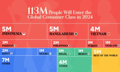

The global middle class is expected to grow by 113 million people in 2024. We visualize this growth by country and region.
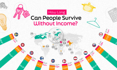

Income security is critical in resilience. In this graphic, we explore how secure people are and how long they could live without income.
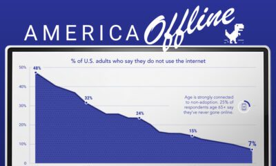

Internet adoption is widespread in the U.S. In fact, only 7% of Americans do not use the internet. Who are these non-adopters?
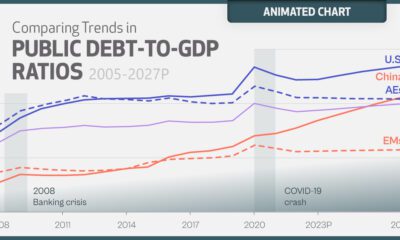

The surge in global debt poses significant risks to government balance sheets. Here's where it's projected to reach over the next five years.
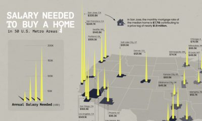

Is owning a home still realistic? This map lays out the salary you'd need to buy a home in 50 different U.S. metro areas.
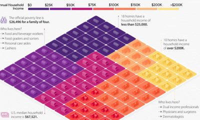

This visual breaks down U.S. household income categories as 100 homes, based on the most recent data from the U.S. Census Bureau.
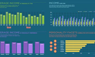

Can your Myers–Briggs personality type impact how much you make? See for yourself with this breakdown of average income for all 16 personality types.
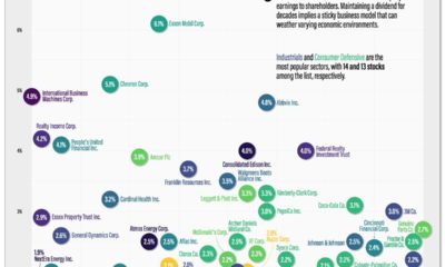

Dividend Aristocrats are stocks that have grown their dividend for at least 25 years. These stocks carry a stellar reputation in providing steady and predictable returns...
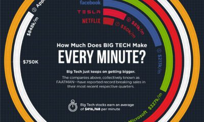

Big Tech just keeps on getting bigger. How much do the FAATMAN companies generate in revenues per minute?


