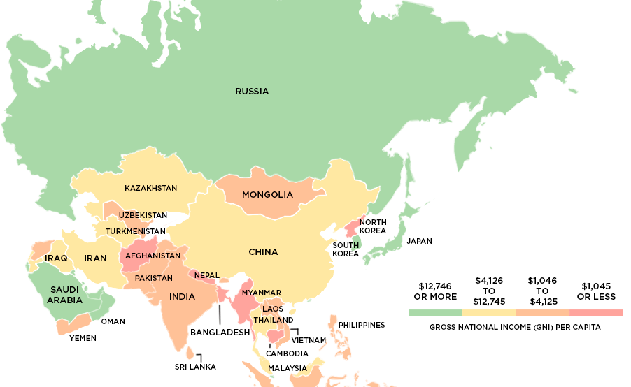
This series of maps uses data on Gross National Income (GNI) to classify the world's richest and poorest countries based on four income groups.
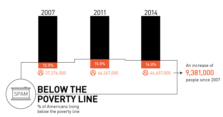
Is there really a recovery? Most recent data shows that there are 9.4 million more Americans in poverty than 2007, with growing inequality.
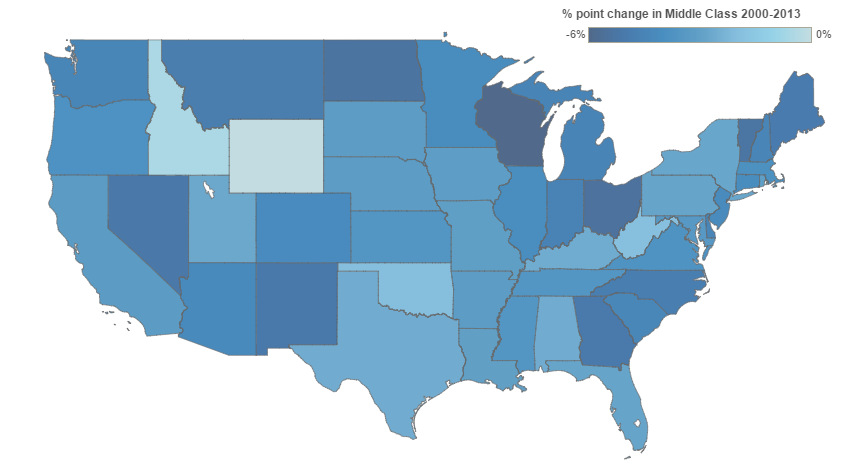
This interactive infographic shows how America's middle class has changed since 2000. Median income and % spent on housing also has changed significantly.
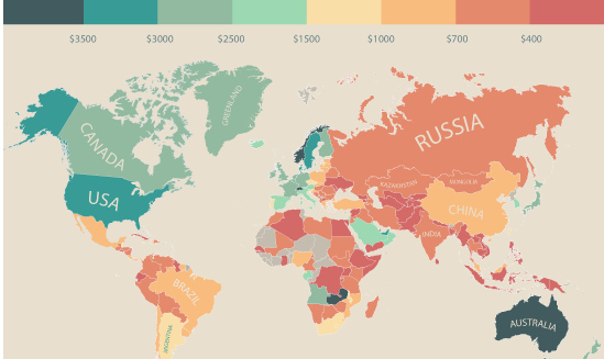
In this infographic, monthly disposable income around the world is mapped by state and country. Switzerland leads the pack with $6,301 in income per month.


