Money
Household Income Distribution in the U.S. Visualized as 100 Homes


Household Income Distribution in the U.S. Visualized as 100 Homes
Income inequality and wealth disparity have been frequent topics of conversation, even before the pandemic upended the economy.
Now, rising inflation and interest rates, and a possible recession on the horizon are bringing these societal divides into sharp focus.
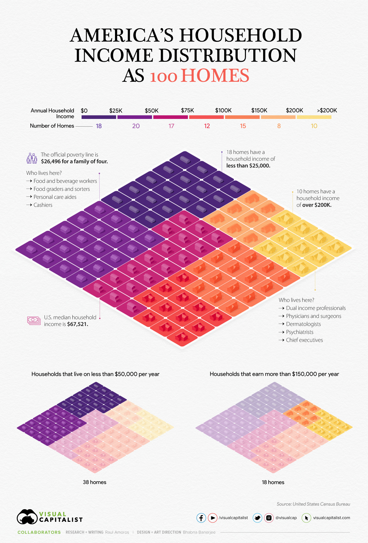
In the above visualization, U.S. households are parsed out into a neighborhood of 100 homes and then grouped by income brackets, using recent data from the U.S. Census Bureau.
The Neighborhood Breakdown
American households vary widely on their respective incomes. The largest cluster of homes, representing nearly 20% of all American households, are in the $25-$49.9k income bracket.
Here’s a look at the share of households in each income bracket and the number of homes they represent.
| Household Income | Share of Total | Number of Homes |
|---|---|---|
| Under $25K | 18.1% | 18 |
| $25K-$49.9K | 19.7% | 20 |
| $50K-$74.9K | 16.5% | 17 |
| $75K-99.9K | 12.2% | 12 |
| $100K-$149.9K | 15.3% | 15 |
| $150k-$199.9K | 8.0% | 8 |
| Over $200K | 10.3% | 10 |
In our hypothetical neighborhood, 18 of the households are in the lowest income bracket. People in this category have a wide variety of jobs, but personal care aides, cashiers, food and beverage positions are some of the most common. As a point of reference, the poverty line for a family of four currently sits at $26,496.
On the flip side, in this small community of 100 houses, 33 earn six figures and typically have at least one family member in a corporate or medical role.
The American Middle Class
The middle class in America has shrunk significantly in the past 50 years, going from 61% of adults being middle income in 1971 to 50% in 2021.
Here’s a look at the economic class breakdowns by annual household income, based on households with three people (Note: the average U.S. household has 2.6 people):
- Upper class: >$156,000
- Middle class: $52,000-$156,000
- Lower class: <$52,000
Although these definitions and conditions don’t align exactly with the buckets we use in the main houses visualization, they come pretty close.
In the neighborhood of 100 homes, 38 homes could be considered low income, while 18 are high income. Meanwhile, sitting in the $50-149.9k middle range of household income are 44 homes.
The Larger Trends
The pandemic had an extremely adverse impact on earnings and income worldwide, and the U.S. was no exception.
Median household income decreased 2.9% to $67.5k between 2019 and 2020, the first decrease since 2014. Additionally, the number of people who worked full-time jobs, year-round decreased by around 13.7 million.
That said, when looking at the longer-term trend, the median income for those considered middle class has jumped by 50% over the last five decades. Here’s a look at the median incomes in each economic class in 1970 vs. 2020:
| 1970 Median Household Income (in 2020 $) | 2020 Median Household Income | % Change | |
|---|---|---|---|
| Low Income | $20,604 | $29,963 | 45% |
| Middle Income | $59,934 | $90,131 | 50% |
| Upper Income | $130,008 | $219,572 | 69% |
With a recession highly likely to occur in the U.S., and rising inflation causing increases in the cost of basic, everyday goods, budgets may get tighter for many households in America, and incomes are likely to be impacted as well.


Money
Charted: Which City Has the Most Billionaires in 2024?
Just two countries account for half of the top 20 cities with the most billionaires. And the majority of the other half are found in Asia.


Charted: Which Country Has the Most Billionaires in 2024?
This was originally posted on our Voronoi app. Download the app for free on iOS or Android and discover incredible data-driven charts from a variety of trusted sources.
Some cities seem to attract the rich. Take New York City for example, which has 340,000 high-net-worth residents with investable assets of more than $1 million.
But there’s a vast difference between being a millionaire and a billionaire. So where do the richest of them all live?
Using data from the Hurun Global Rich List 2024, we rank the top 20 cities with the highest number of billionaires in 2024.
A caveat to these rich lists: sources often vary on figures and exact rankings. For example, in last year’s reports, Forbes had New York as the city with the most billionaires, while the Hurun Global Rich List placed Beijing at the top spot.
Ranked: Top 20 Cities with the Most Billionaires in 2024
The Chinese economy’s doldrums over the course of the past year have affected its ultra-wealthy residents in key cities.
Beijing, the city with the most billionaires in 2023, has not only ceded its spot to New York, but has dropped to #4, overtaken by London and Mumbai.
| Rank | City | Billionaires | Rank Change YoY |
|---|---|---|---|
| 1 | 🇺🇸 New York | 119 | +1 |
| 2 | 🇬🇧 London | 97 | +3 |
| 3 | 🇮🇳 Mumbai | 92 | +4 |
| 4 | 🇨🇳 Beijing | 91 | -3 |
| 5 | 🇨🇳 Shanghai | 87 | -2 |
| 6 | 🇨🇳 Shenzhen | 84 | -2 |
| 7 | 🇭🇰 Hong Kong | 65 | -1 |
| 8 | 🇷🇺 Moscow | 59 | No Change |
| 9 | 🇮🇳 New Delhi | 57 | +6 |
| 10 | 🇺🇸 San Francisco | 52 | No Change |
| 11 | 🇹🇭 Bangkok | 49 | +2 |
| 12 | 🇹🇼 Taipei | 45 | +2 |
| 13 | 🇫🇷 Paris | 44 | -2 |
| 14 | 🇨🇳 Hangzhou | 43 | -5 |
| 15 | 🇸🇬 Singapore | 42 | New to Top 20 |
| 16 | 🇨🇳 Guangzhou | 39 | -4 |
| 17T | 🇮🇩 Jakarta | 37 | +1 |
| 17T | 🇧🇷 Sao Paulo | 37 | No Change |
| 19T | 🇺🇸 Los Angeles | 31 | No Change |
| 19T | 🇰🇷 Seoul | 31 | -3 |
In fact all Chinese cities on the top 20 list have lost billionaires between 2023–24. Consequently, they’ve all lost ranking spots as well, with Hangzhou seeing the biggest slide (-5) in the top 20.
Where China lost, all other Asian cities—except Seoul—in the top 20 have gained ranks. Indian cities lead the way, with New Delhi (+6) and Mumbai (+3) having climbed the most.
At a country level, China and the U.S combine to make up half of the cities in the top 20. They are also home to about half of the world’s 3,200 billionaire population.
In other news of note: Hurun officially counts Taylor Swift as a billionaire, estimating her net worth at $1.2 billion.

-

 Debt1 week ago
How Debt-to-GDP Ratios Have Changed Since 2000
-

 Countries2 weeks ago
Population Projections: The World’s 6 Largest Countries in 2075
-

 Markets2 weeks ago
The Top 10 States by Real GDP Growth in 2023
-

 Demographics2 weeks ago
The Smallest Gender Wage Gaps in OECD Countries
-

 United States2 weeks ago
Where U.S. Inflation Hit the Hardest in March 2024
-

 Green2 weeks ago
Top Countries By Forest Growth Since 2001
-

 United States2 weeks ago
Ranked: The Largest U.S. Corporations by Number of Employees
-

 Maps2 weeks ago
The Largest Earthquakes in the New York Area (1970-2024)