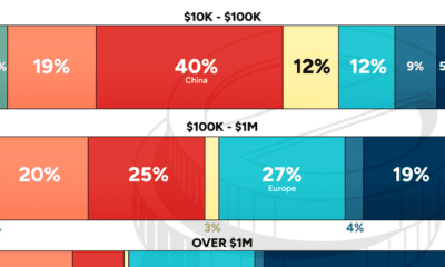

The distribution of wealth varies dramatically around the world. This graphic shows how it breaks down by wealth level in 2023.
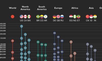

This graphic shows income distributions in 16 different countries around the world, using data from the World Inequality Database.
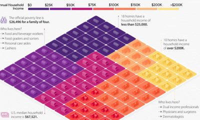

This visual breaks down U.S. household income categories as 100 homes, based on the most recent data from the U.S. Census Bureau.
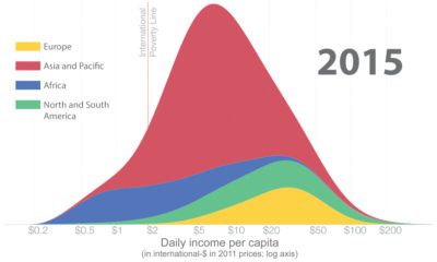

How has global income distribution changed over history? Below, we show three distinct periods since the Industrial Revolution.
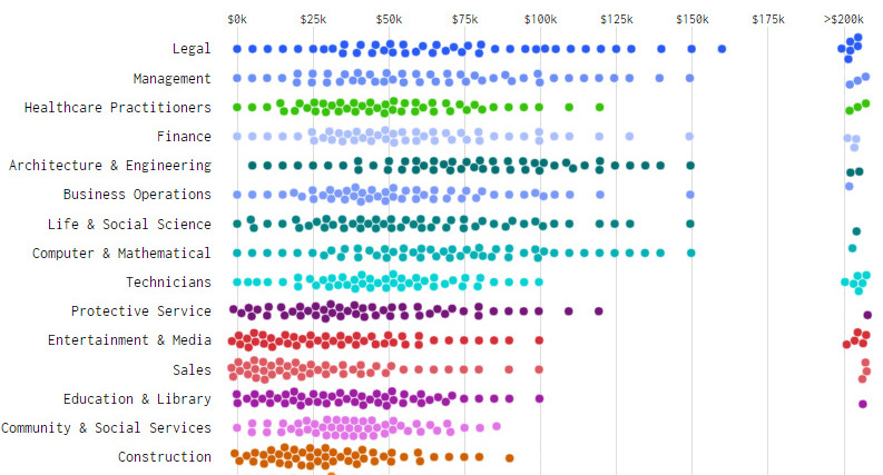
What does income distribution look like for different types of jobs - and how's it changed over time? These charts show the drastic change from 1960...


 Creator Program