Markets
Visualizing Global Income Distribution Over 200 Years
Article/Editing:
Visualizing Global Income Distribution Over 200 Years
Has the world become more unequal?
With COVID-19 disrupting societies and lower-income countries in particular, social and economic progress made over the last decade is in danger of being reversed. And with rising living costs and inflation across much of the world, experts warn that global income inequality has been exacerbated.
But the good news is that absolute incomes across many poorer countries have significantly risen over the last century of time. And though work remains, poverty levels have fallen dramatically in spite of stark inequality.
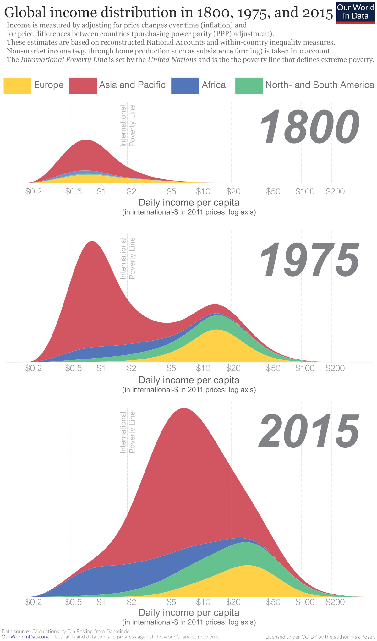
To analyze historical trends in global income distribution, this infographic from Our World in Data looks at three periods over the last two centuries. It uses economic data from 1800, 1975, and 2015 compiled by Hans and Ola Rosling.
Methodology
For global income estimates, data was gathered by country across three key variables:
- Population
- GDP per capita
- Gini coefficient, which measures income inequality by statistical distribution
Daily incomes were measured in a hypothetical “international-$” currency, equal to what a U.S. dollar would buy in America in 2011, to allow for comparable incomes across time periods and countries.
Historical Patterns in Global Income Distribution
In 1800, over 80% of the world lived in what we consider extreme poverty today.
At the time, only a small number of countries—predominantly Western European countries, Australia, Canada and the U.S.—saw meaningful economic growth. In fact, research suggests that between 1 CE and 1800 CE the majority of places around the world saw miniscule economic growth (only 0.04% annually).
By 1975, global income distribution became bimodal. Most citizens in developing countries lived below the poverty line, while most in developed countries lived above it, with incomes nearly 10 times higher on average. Post-WWII growth was unusually rapid across developed countries.
Fast forward just 40 years to 2015 and world income distribution changed again. As incomes rose faster in poorer countries than developed ones, many people were lifted out of poverty. Between 1975 and 2015, poverty declined faster than at any other time. Still, steep inequality persisted.
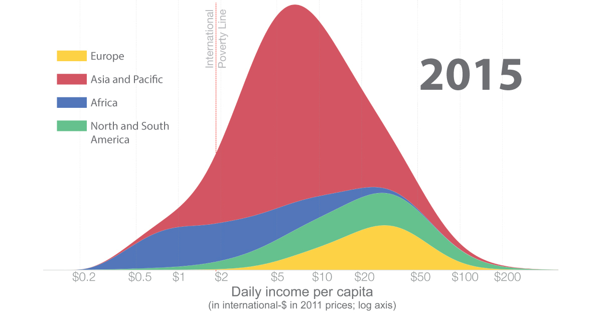
A Tale of Different Economic Outputs
Even as global income distribution has started to even out, economic output has trended in the opposite direction.
As the above interactive chart shows, GDP per capita was much more equal across regions in the 19th century, when it sat around $1,100 per capita on a global basis. Despite many people living below the poverty line during these times, the world also had less wealth to go around.
Today, the global average GDP per capita sits at close to $15,212 or about 14 times higher, but it is not as equally distributed.
At the highest end of the spectrum are Western and European countries. Strong economic growth, greater industrial output, and sufficient legal institutions have helped underpin higher GDP per capita numbers. Meanwhile, countries with the lowest average incomes have not seen the same levels of growth.
This highlights that poverty, and economic prosperity, is heavily influenced by where one lives.

This article was published as a part of Visual Capitalist's Creator Program, which features data-driven visuals from some of our favorite Creators around the world.


Economy
Economic Growth Forecasts for G7 and BRICS Countries in 2024
The IMF has released its economic growth forecasts for 2024. How do the G7 and BRICS countries compare?
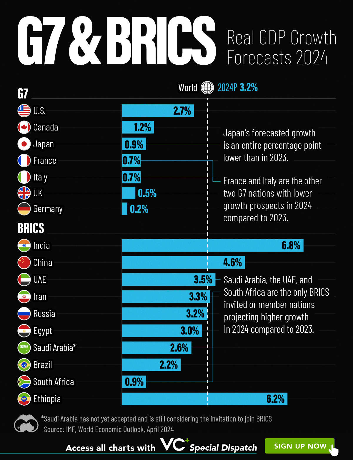
G7 & BRICS Real GDP Growth Forecasts for 2024
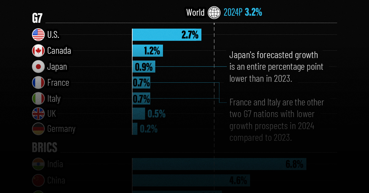
The International Monetary Fund’s (IMF) has released its real gross domestic product (GDP) growth forecasts for 2024, and while global growth is projected to stay steady at 3.2%, various major nations are seeing declining forecasts.
This chart visualizes the 2024 real GDP growth forecasts using data from the IMF’s 2024 World Economic Outlook for G7 and BRICS member nations along with Saudi Arabia, which is still considering an invitation to join the bloc.
Get the Key Insights of the IMF’s World Economic Outlook
Want a visual breakdown of the insights from the IMF’s 2024 World Economic Outlook report?
This visual is part of a special dispatch of the key takeaways exclusively for VC+ members.
Get the full dispatch of charts by signing up to VC+.
Mixed Economic Growth Prospects for Major Nations in 2024
Economic growth projections by the IMF for major nations are mixed, with the majority of G7 and BRICS countries forecasted to have slower growth in 2024 compared to 2023.
Only three BRICS-invited or member countries, Saudi Arabia, the UAE, and South Africa, have higher projected real GDP growth rates in 2024 than last year.
| Group | Country | Real GDP Growth (2023) | Real GDP Growth (2024P) |
|---|---|---|---|
| G7 | 🇺🇸 U.S. | 2.5% | 2.7% |
| G7 | 🇨🇦 Canada | 1.1% | 1.2% |
| G7 | 🇯🇵 Japan | 1.9% | 0.9% |
| G7 | 🇫🇷 France | 0.9% | 0.7% |
| G7 | 🇮🇹 Italy | 0.9% | 0.7% |
| G7 | 🇬🇧 UK | 0.1% | 0.5% |
| G7 | 🇩🇪 Germany | -0.3% | 0.2% |
| BRICS | 🇮🇳 India | 7.8% | 6.8% |
| BRICS | 🇨🇳 China | 5.2% | 4.6% |
| BRICS | 🇦🇪 UAE | 3.4% | 3.5% |
| BRICS | 🇮🇷 Iran | 4.7% | 3.3% |
| BRICS | 🇷🇺 Russia | 3.6% | 3.2% |
| BRICS | 🇪🇬 Egypt | 3.8% | 3.0% |
| BRICS-invited | 🇸🇦 Saudi Arabia | -0.8% | 2.6% |
| BRICS | 🇧🇷 Brazil | 2.9% | 2.2% |
| BRICS | 🇿🇦 South Africa | 0.6% | 0.9% |
| BRICS | 🇪🇹 Ethiopia | 7.2% | 6.2% |
| 🌍 World | 3.2% | 3.2% |
China and India are forecasted to maintain relatively high growth rates in 2024 at 4.6% and 6.8% respectively, but compared to the previous year, China is growing 0.6 percentage points slower while India is an entire percentage point slower.
On the other hand, four G7 nations are set to grow faster than last year, which includes Germany making its comeback from its negative real GDP growth of -0.3% in 2023.
Faster Growth for BRICS than G7 Nations
Despite mostly lower growth forecasts in 2024 compared to 2023, BRICS nations still have a significantly higher average growth forecast at 3.6% compared to the G7 average of 1%.
While the G7 countries’ combined GDP is around $15 trillion greater than the BRICS nations, with continued higher growth rates and the potential to add more members, BRICS looks likely to overtake the G7 in economic size within two decades.
BRICS Expansion Stutters Before October 2024 Summit
BRICS’ recent expansion has stuttered slightly, as Argentina’s newly-elected president Javier Milei declined its invitation and Saudi Arabia clarified that the country is still considering its invitation and has not joined BRICS yet.
Even with these initial growing pains, South Africa’s Foreign Minister Naledi Pandor told reporters in February that 34 different countries have submitted applications to join the growing BRICS bloc.
Any changes to the group are likely to be announced leading up to or at the 2024 BRICS summit which takes place October 22-24 in Kazan, Russia.
Get the Full Analysis of the IMF’s Outlook on VC+
This visual is part of an exclusive special dispatch for VC+ members which breaks down the key takeaways from the IMF’s 2024 World Economic Outlook.
For the full set of charts and analysis, sign up for VC+.

-

 Science1 week ago
Visualizing the Average Lifespans of Mammals
-

 Demographics2 weeks ago
The Smallest Gender Wage Gaps in OECD Countries
-

 United States2 weeks ago
Where U.S. Inflation Hit the Hardest in March 2024
-

 Green2 weeks ago
Top Countries By Forest Growth Since 2001
-

 United States2 weeks ago
Ranked: The Largest U.S. Corporations by Number of Employees
-

 Maps2 weeks ago
The Largest Earthquakes in the New York Area (1970-2024)
-

 Green2 weeks ago
Ranked: The Countries With the Most Air Pollution in 2023
-

 Green2 weeks ago
Ranking the Top 15 Countries by Carbon Tax Revenue