Demographics
How Different Generations Approach Work
View the full-size version of the infographic
How Different Generations Approach Work
View the full-size version of the infographic by clicking here
The first representatives of Generation Z have started to trickle into the workplace – and like generations before them, they are bringing a different perspective to things.
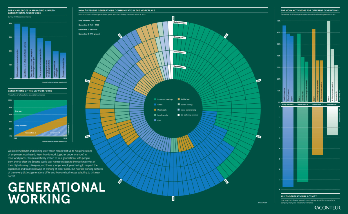
Did you know that there are now up to five generations now working under any given roof, ranging all the way from the Silent Generation (born Pre-WWII) to the aforementioned Gen Z?
Let’s see how these generational groups differ in their approaches to communication, career priorities, and company loyalty.
Generational Differences at Work
Today’s infographic comes to us from Raconteur, and it breaks down some key differences in how generational groups are thinking about the workplace.
Let’s dive deeper into the data for each category.
Communication
How people prefer to communicate is one major and obvious difference that manifests itself between generations.
While many in older generations have dabbled in new technologies and trends around communications, it’s less likely that they will internalize those methods as habits. Meanwhile, for younger folks, these newer methods (chat, texting, etc.) are what they grew up with.
Top three communication methods by generation:
- Baby Boomers:
40% of communication is in person, 35% by email, and 13% by phone - Gen X:
34% of communication is in person, 34% by email, and 13% by phone - Millennials:
33% of communication is by email, 31% is in person, and 12% by chat - Gen Z:
31% of communication is by chat, 26% is in person, and 16% by emails
Motivators
Meanwhile, the generations are divided on what motivates them in the workplace. Boomers place health insurance as an important decision factor, while younger groups view salary and pursuing a passion as being key elements to a successful career.
Three most important work motivators by generation (in order):
- Baby Boomers:
Health insurance, a boss worthy of respect, and salary - Gen X:
Salary, job security, and job challenges/excitement - Millennials:
Salary, job challenges/excitement, and ability to pursue passion - Gen Z:
Salary, ability to pursue passion, and job security
Loyalty
Finally, generational groups have varying perspectives on how long they would be willing to stay in any one role.
- Baby Boomers: 8 years
- Gen X: 7 years
- Millennials: 5 years
- Gen Z: 3 years
Given the above differences, employers will have to think clearly about how to attract and retain talent across a wide scope of generations. Further, employers will have to learn what motivates each group, as well as what makes them each feel the most comfortable in the workplace.


Demographics
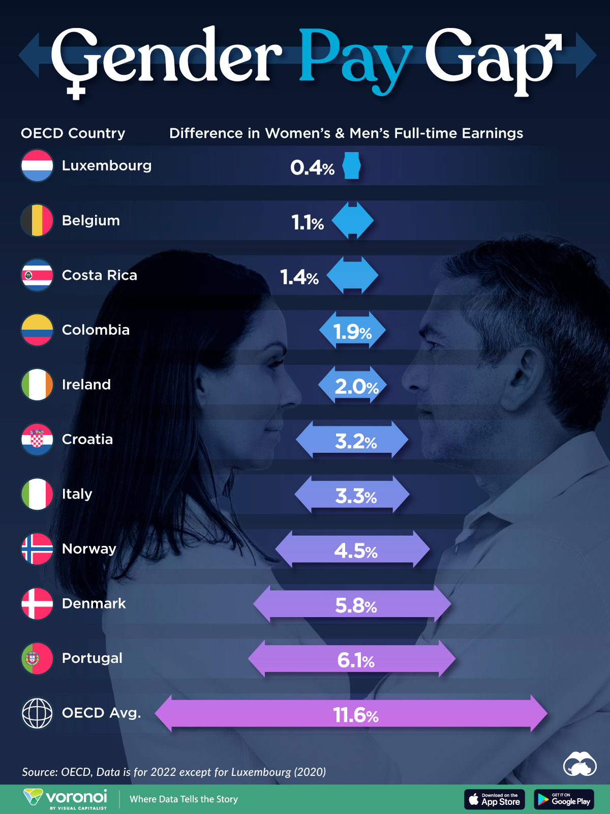
The Smallest Gender Wage Gaps in OECD Countries
Which OECD countries have the smallest gender wage gaps? We look at the 10 countries with gaps lower than the average.
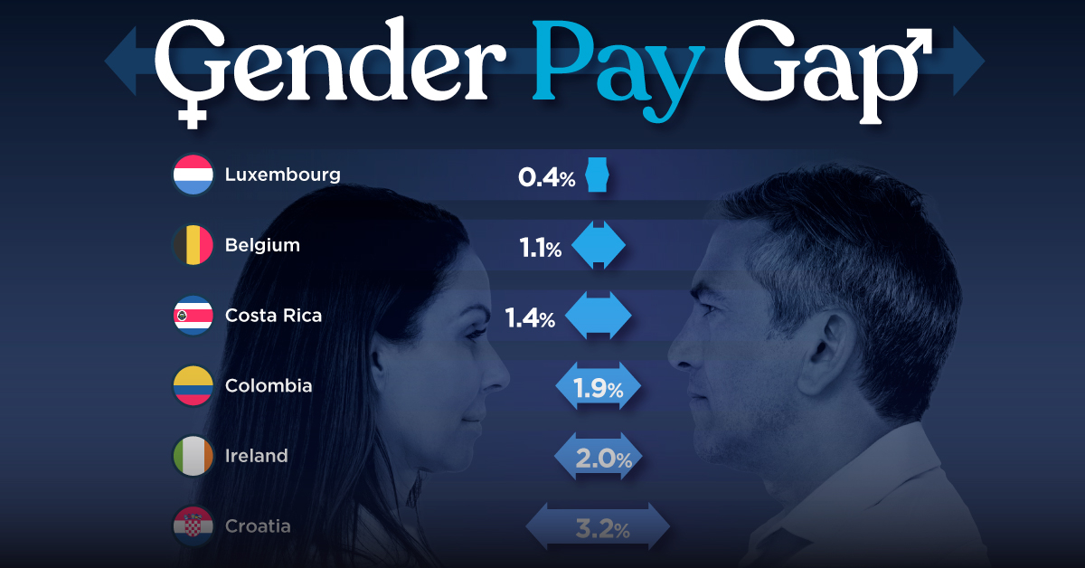
The Smallest Gender Pay Gaps in OECD Countries
This was originally posted on our Voronoi app. Download the app for free on iOS or Android and discover incredible data-driven charts from a variety of trusted sources.
Among the 38 member countries in the Organization for Economic Cooperation and Development (OECD), several have made significant strides in addressing income inequality between men and women.
In this graphic we’ve ranked the OECD countries with the 10 smallest gender pay gaps, using the latest data from the OECD for 2022.
The gender pay gap is calculated as the difference between median full-time earnings for men and women divided by the median full-time earnings of men.
Which Countries Have the Smallest Gender Pay Gaps?
Luxembourg’s gender pay gap is the lowest among OECD members at only 0.4%—well below the OECD average of 11.6%.
| Rank | Country | Percentage Difference in Men's & Women's Full-time Earnings |
|---|---|---|
| 1 | 🇱🇺 Luxembourg | 0.4% |
| 2 | 🇧🇪 Belgium | 1.1% |
| 3 | 🇨🇷 Costa Rica | 1.4% |
| 4 | 🇨🇴 Colombia | 1.9% |
| 5 | 🇮🇪 Ireland | 2.0% |
| 6 | 🇭🇷 Croatia | 3.2% |
| 7 | 🇮🇹 Italy | 3.3% |
| 8 | 🇳🇴 Norway | 4.5% |
| 9 | 🇩🇰 Denmark | 5.8% |
| 10 | 🇵🇹 Portugal | 6.1% |
| OECD Average | 11.6% |
Notably, eight of the top 10 countries with the smallest gender pay gaps are located in Europe, as labor equality laws designed to target gender differences have begun to pay off.
The two other countries that made the list were Costa Rica (1.4%) and Colombia (1.9%), which came in third and fourth place, respectively.
How Did Luxembourg (Nearly) Eliminate its Gender Wage Gap?
Luxembourg’s virtually-non-existent gender wage gap in 2020 can be traced back to its diligent efforts to prioritize equal pay. Since 2016, firms that have not complied with the Labor Code’s equal pay laws have been subjected to penalizing fines ranging from €251 to €25,000.
Higher female education rates also contribute to the diminishing pay gap, with Luxembourg tied for first in the educational attainment rankings of the World Economic Forum’s Global Gender Gap Index Report for 2023.
See More Graphics about Demographics and Money
While these 10 countries are well below the OECD’s average gender pay gap of 11.6%, many OECD member countries including the U.S. are significantly above the average. To see the full list of the top 10 OECD countries with the largest gender pay gaps, check out this visualization.

-

 Real Estate2 weeks ago
Visualizing America’s Shortage of Affordable Homes
-

 Technology1 week ago
Ranked: Semiconductor Companies by Industry Revenue Share
-

 Money1 week ago
Which States Have the Highest Minimum Wage in America?
-

 Real Estate1 week ago
Ranked: The Most Valuable Housing Markets in America
-

 Business2 weeks ago
Charted: Big Four Market Share by S&P 500 Audits
-

 AI2 weeks ago
The Stock Performance of U.S. Chipmakers So Far in 2024
-

 Misc2 weeks ago
Almost Every EV Stock is Down After Q1 2024
-

 Money2 weeks ago
Where Does One U.S. Tax Dollar Go?