

In this map, we visualize average hourly wages across a variety of European countries, based on data from Eurostat.


The 12 worst investment funds have destroyed $56 billion in shareholder wealth over the past decade, as of Dec. 2023.
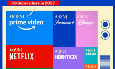

The forecasted number of U.S. subscribers on major streaming platforms in 2027 shows that Prime Video will be the most popular by a wide margin.
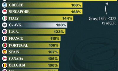

This graphic ranks government debt by country for advanced economies, using their gross debt-to-GDP ratio.
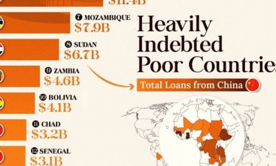

This infographic lists countries in Africa and other developing regions that received billions in loans from China.
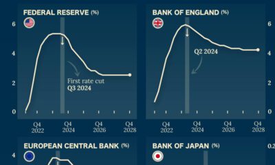

Which economies are expected to see interest rates rise, or fall? We highlight IMF forecasts for international interest rates through 2028.
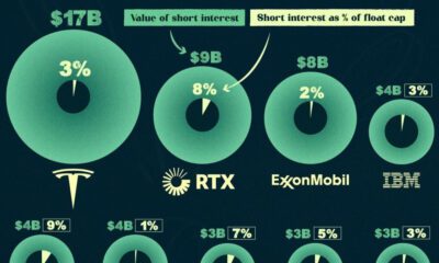

In this infographic, we list the 15 most shorted stocks in the U.S. in the Fall of 2023, ranked by the value of their short interest.
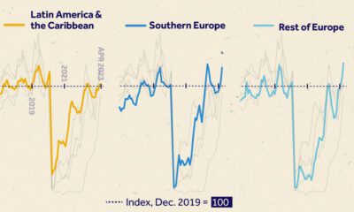

We visualize monthly foreign visitor arrivals, indexed to December 2019, indicating global tourism has all but recovered from COVID-19 disruptions.
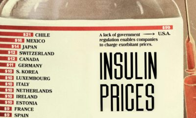

This visual highlights the cost of insulin by country, showing how much more expensive diabetes medicine is in the U.S.
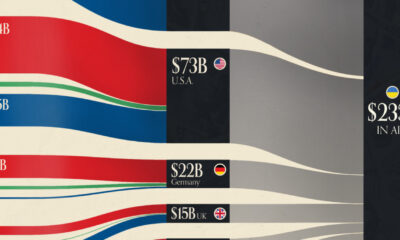

This graphic visualizes the top donors to Ukraine between January 2022, and July 2023.
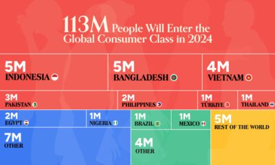

The global middle class is expected to grow by 113 million people in 2024. We visualize this growth by country and region.

What does it take to own a home in the U.S. in 2023? Here's a look at the salary needed for home ownership in the top...

Some jobs need a degree, while others don’t. Here are the top 20 most sought-after entry level jobs with and without a degree.
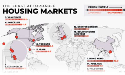

This map examines middle-income housing market affordability across eight major countries, highlighting some of the least affordable cities.
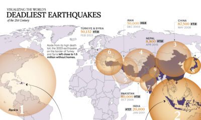

A powerful earthquake rocked Morocco on September 8, 2023, potentially killing thousands. Here are the deadliest earthquakes this century so far.
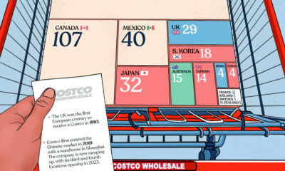

This graphic breaks down the number of Costco stores globally, providing insight into the retailer's global presence.
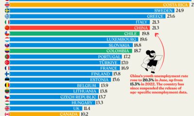

Nearly three years after COVID-19 first hit, youth unemployment in some countries, like China, has risen sharply.
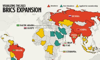

We provide a data-driven overview of how the recent BRICS expansion will grow the group’s influence and reach.
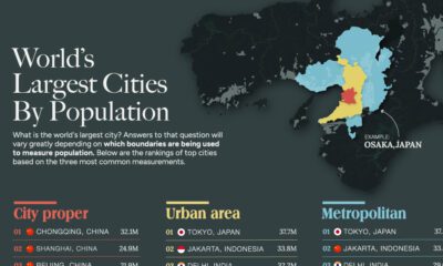

This graphic uses data taken from latest official censuses and projections to rank the largest cities by population.
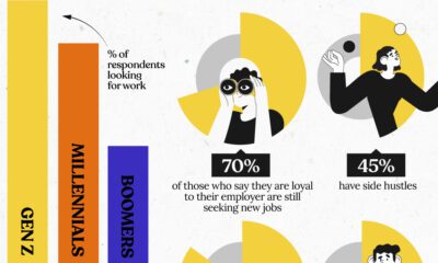

Gen Z job seekers are far more active than older generations, consistently looking for new work while already employed.
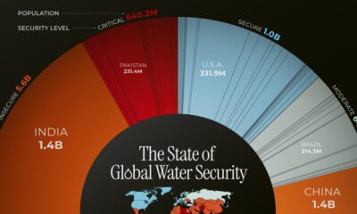

This chart highlights the different countries, and the number of people, facing water security issues around the world.
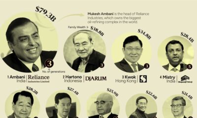

This graphic shows the 15 richest families in Asia. From energy to banking, these dynasties have built fortunes across many sectors.
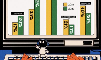

Opinions about using AI in the workplace have undergone a transformation from 2018, and so have the AI tools themselves.
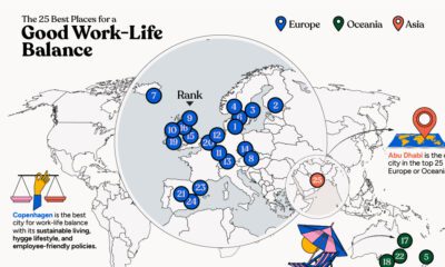

In this infographic, we explore which cities around the world excel in prioritizing work–life balance.
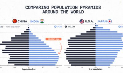

Population pyramids can show a country's demographic advantages and challenges at a glance. See how different parts of the world stack up.
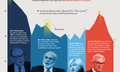

Public trust in the Federal Reserve chair has hit its lowest point in 20 years. Get the details in this infographic.
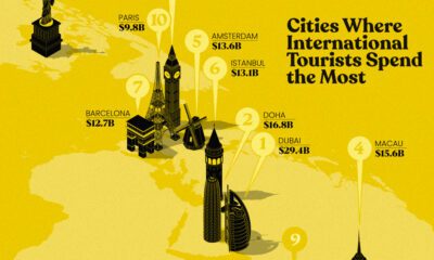

This infographic highlights the 10 cities where international travelers spend the most. In 2022, Dubai took top spot.
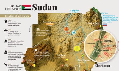

This comprehensive map explainer covers both key facts about Sudan, as well as information on the violent power struggle unfolding there
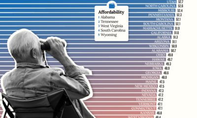

Getting ready for retirement? See which states score the highest in terms of affordability, quality of life, and health care.
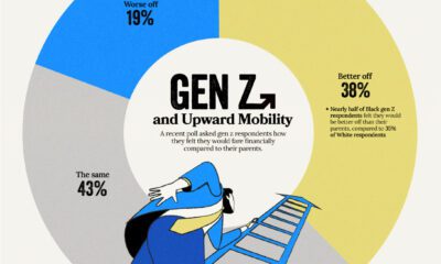

Despite the looming uncertainty, members of Gen Z maintains an optimistic outlook about their financial future


In this graphic we explore the world’s declining fertility rate over the last 60 years and the disparity in fertility rates between nations
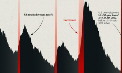

This infographic examines 50 years of data to highlight a clear visual trend: recessions are preceded by a cyclical low in unemployment.
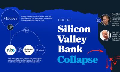

Silicon Valley Bank was shuttered by regulators becoming the largest bank to fail since the height of the Financial Crisis. What happened?
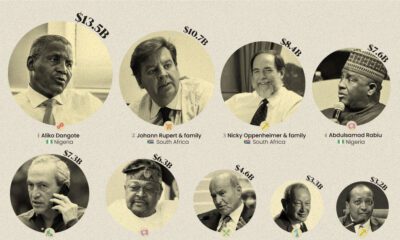

This infographic ranks the wealthiest 15 billionaires on the African continent.
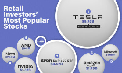

This infographic lists the 10 most popular stocks (or ETFs) that retail investors have been buying in 2023 so far.
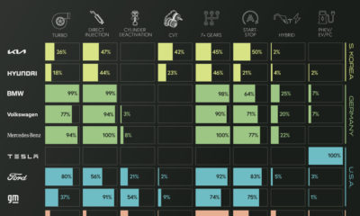

See how 14 major automakers have adopted various fuel-saving technologies in this infographic based on EPA data.
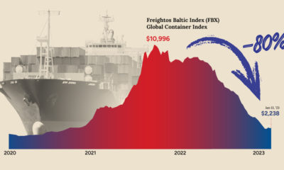

After a dramatic spike during the pandemic, shipping costs have now fallen back to Earth. What does that mean for shippers and the economy?
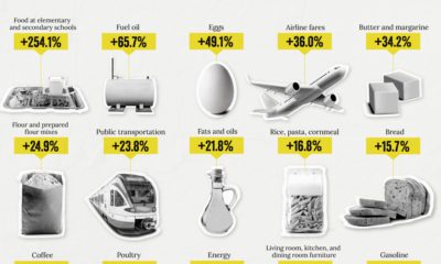

How has inflation impacted everyday goods like milk, flour, or fuel? This chart shows the annual change in the price of basic daily goods.
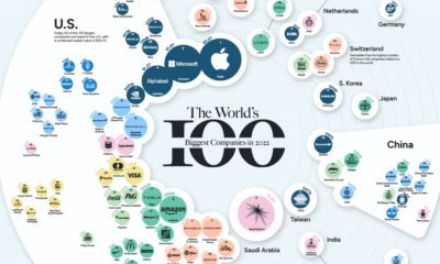

Who made it to the top? Here are the world's most valuable public companies in 2022 as the year comes to an end.
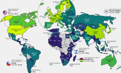

Here are the most innovative countries worldwide and the primary indicators—from patents to R&D spend—driving their breakthroughs.
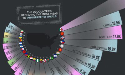

Every year, there are hundreds of thousands of U.S. immigration visas issued by the government. See which countries receive the most in this visualization.
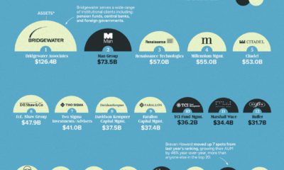

This annual ranking shows the world's largest hedge funds, which collectively hold an estimated $45 trillion in assets under management.
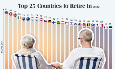

Which countries are the best equipped to support their aging population? This graphic show the best countries to retire in around the world.
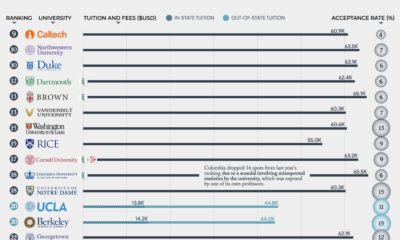

What are the 50 best universities in America? From Harvard (#3) to The Ohio State University (#49), where does your school rank?
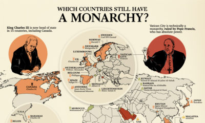

Beyond the 15 nations under the British monarchy, 28 other countries still have a ruling monarch. Here's a look at the world's monarchies.
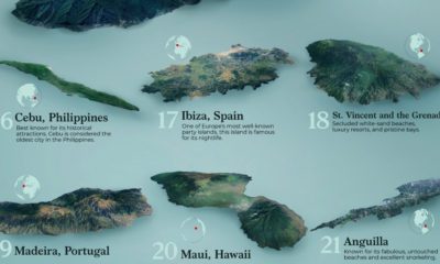

This graphic uses survey data from Travel + Leisure magazine to show the 25 best islands to visit around the world.
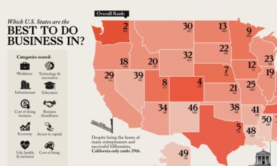

Looking to start a business? This map reveals America's best states to do business in, analyzing everything from workforce to infrastructure.
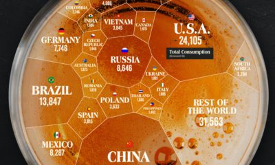

Which countries drink the most beer? China ranks number one due to its sheer size, and the Czech Republic comes out on top, per capita.
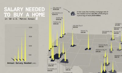

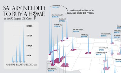
Is owning a home still realistic? This map lays out the salary you'd need to buy a home in 50 different U.S. metro areas.
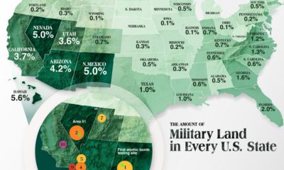

The U.S. military's real estate portfolio is valued at $749 billion. Here's a look at how much land the U.S. military controls in each state.


