Misc
Comparing Population Pyramids Around the World
Now Available, Exclusively to VC+ Members.
Dive deeper into what affects the demographics of global economies. Join VC+ to get our special dispatch!
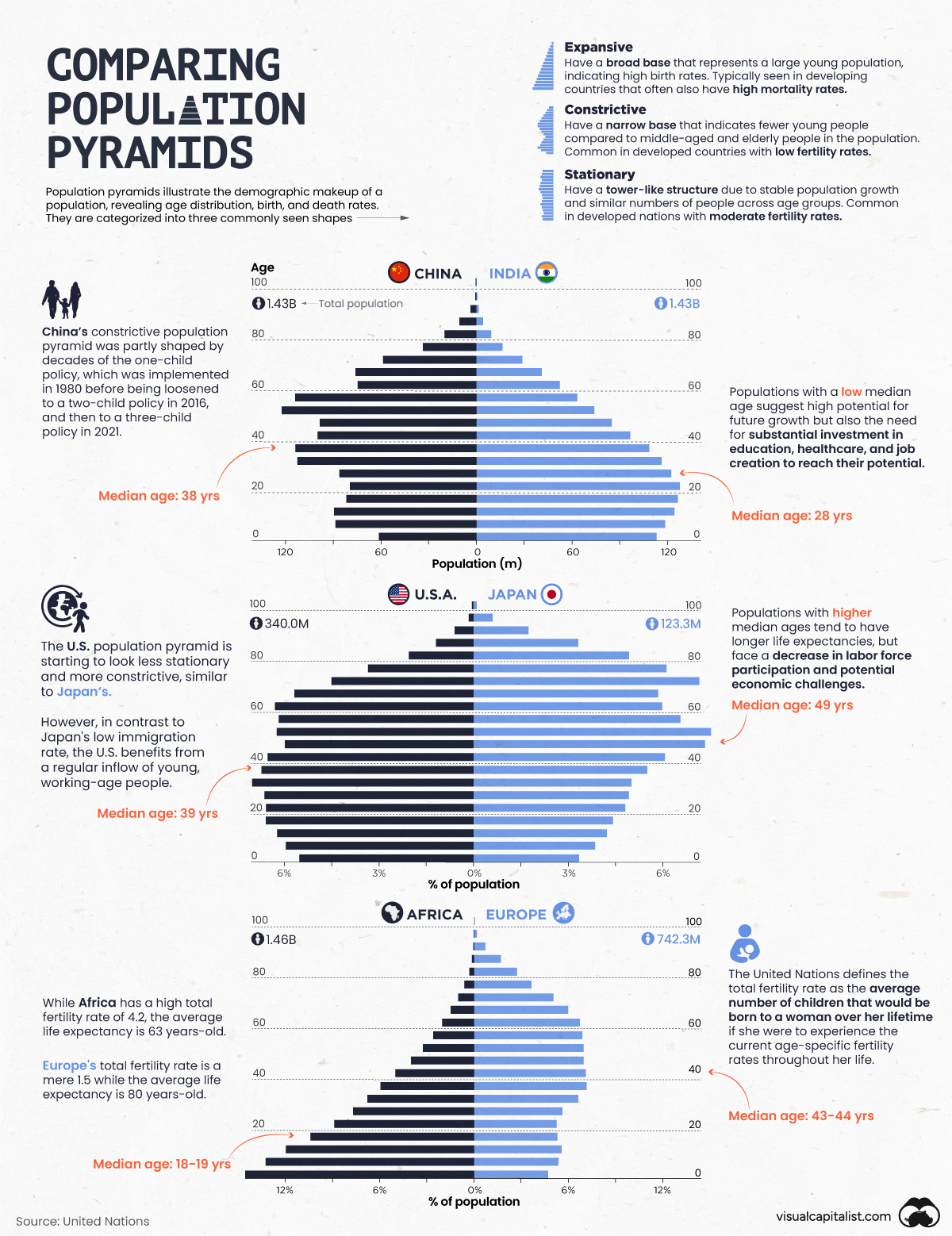
Understanding and Comparing Population Pyramids
Demographic data can reveal all kinds of insights about a population, from the country’s fertility and mortality rates to how certain events and policies have shaped the makeup of a population.
Population pyramids are one of the best ways to visualize population data, and comparing the pyramids of various countries and regions side-by-side can reveal unexpected insights and differences between groups.
This graphic uses population data from the United Nations to compare the demographics of some select nations and regions of the world, showcasing how much age distributions can vary.
Three Types of Population Pyramids
Although population pyramids can come in all shapes and sizes, most generally fall into three distinct categories:
- Expansive Pyramids: Recognized by their traditional “pyramid-like” shape with a broad base and narrow top, expansive pyramids reflect a population with a high birth rate along with a high mortality rate which is most common in developing countries.
- Constrictive Pyramids: With a narrow base and thicker middle and top sections of the pyramid, constrictive pyramids often occur in developed economies whose populations have low birth rates and long life expectancies.
- Stationary Pyramids: These pyramids showcase an evenly distributed population across age groups, often found in newly-developed countries which have stable birth and mortality rates.
Each population pyramid is essentially a visual snapshot of a nation’s current demographic breakdown, shaped by fluctuating birth and mortality rates as well as changes to immigration and social policies.
Understanding the inherent risks associated with different pyramid types can help give insight into the challenges these populations face.
The Risks of Different Population Pyramid Types
Each type of population pyramid structure has unique challenges and advantages often characterized by the country or region’s current stage of economic development.
Populations with expansive pyramids, such as the one representing the continent of Africa, have the advantage of a larger youth and working-aged population, however this advantage can be rendered null if job growth, education, and health care aren’t prioritized.
Countries with constrictive pyramids like Japan face the challenge of supporting their outsized aging population with a diminishing working-aged population. While immigration and increasing birth rates can help in both the short and long term, due to the working population being outnumbered, countries with constrictive pyramids must find ways to increase their productivity to avoid potential declines in economic growth.
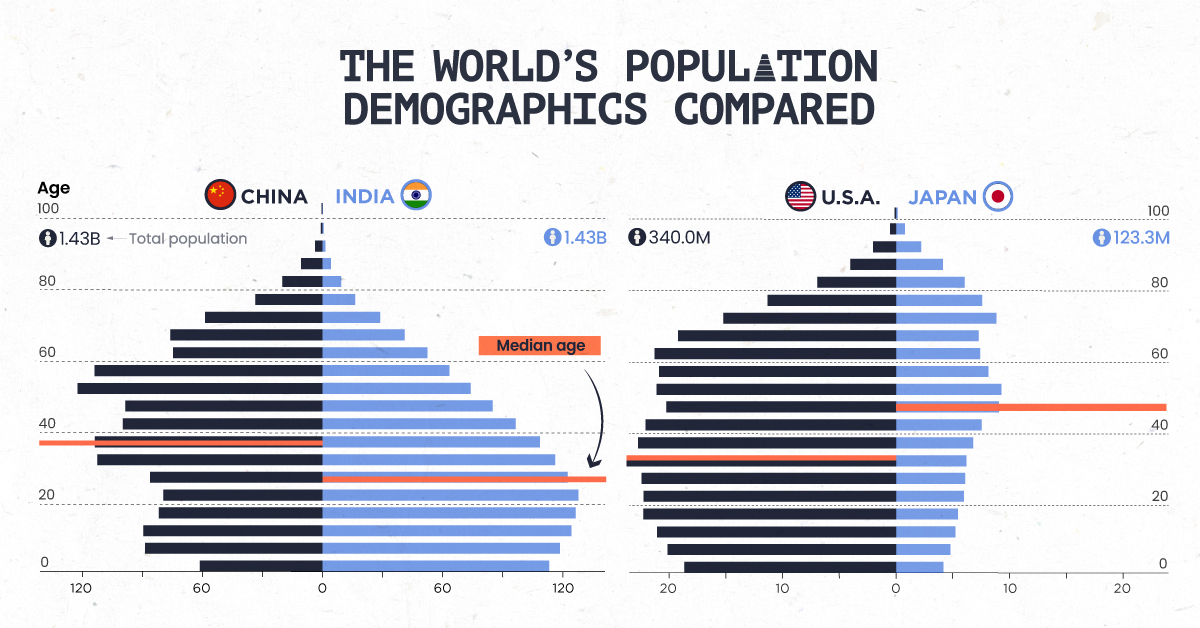
China and India’s Demographics Compared
After the world’s population reached eight billion people last year, 2023 brought a new population milestone as India overtook China as the world’s most populous country.
When you compare the two nations’ population pyramids, you can see how India’s population has a strong base of young and working-aged people compared to China’s more constrictive population pyramid that also features a higher median age.
This demographic difference is largely shaped by China’s one-child policy which since 2021 was loosened to be a three-child policy. As a result, China’s total fertility rate is around 1.2 today, in contrast to India’s total fertility rate of 2.0.
While India is set to ride the productivity boom of its large working-age population, the country will have to ensure it can keep its population pyramid stable as the majority of the population ages and total fertility rates continue to decline.
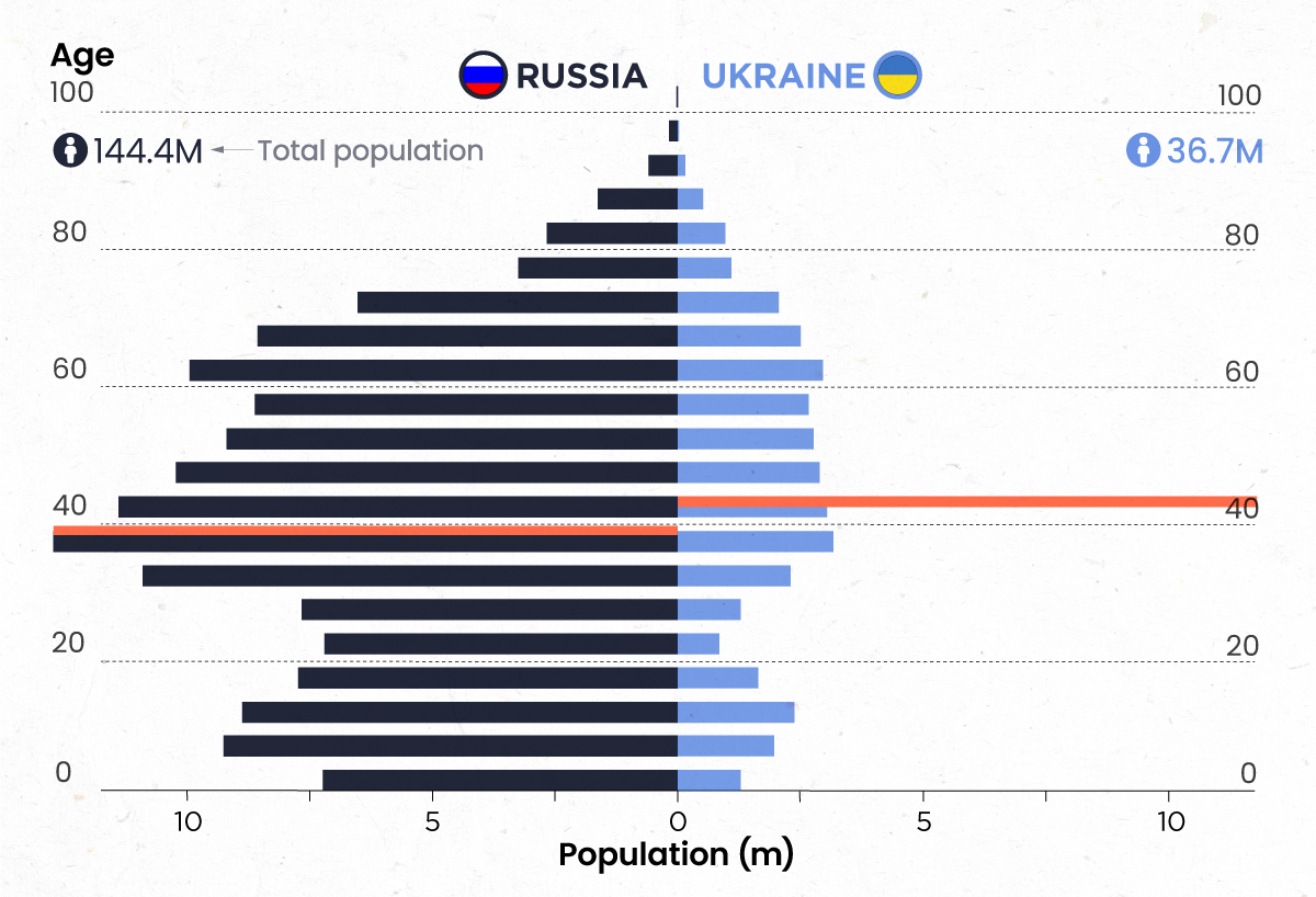 |
Interested in learning more about the various factors that affect demographics?
VC+ Members get an exclusive look comparing the G7 and BRICS nations, how war shapes population pyramids, and immigration’s role in demographics. Unlock this in-depth briefing and hundreds of other visual insights with our newly available VC+ Archive. |


Misc
Visualizing the Most Common Pets in the U.S.
Lions, tigers, and bears, oh my!—these animals do not feature on this list of popular American household pets.


Visualizing The Most Common Pets in the U.S.
This was originally posted on our Voronoi app. Download the app for free on iOS or Android and discover incredible data-driven charts from a variety of trusted sources.
In this graphic, we visualized the most common American household pets, based on 2023-2024 data from the American Pet Products Association (accessed via Forbes Advisor).
Figures represent the number of households that own each pet type, rather than the actual number of each animal. The “small animal” category includes hamsters, gerbils, rabbits, guinea pigs, chinchillas, mice, rats, and ferrets.
What is the Most Popular American Household Pet?
Based on this data, dogs—one of the first domesticated animals—are the most common pets in the United States. In fact, around 65 million households own a dog, and spend an average of $900 a year on their care.
| Rank | Species | Households |
|---|---|---|
| 1 | 🐶 Dog | 65M |
| 2 | 🐱 Cat | 47M |
| 3 | 🐟 Freshwater Fish | 11M |
| 4 | 🐰 Small Animals | 7M |
| 5 | 🐦 Bird | 6M |
| 6 | 🦎 Reptile | 6M |
| 7 | 🐴 Horse | 2M |
| 8 | 🐠 Saltwater Fish | 2M |
Note: Households can own multiple pets, and are counted for all relevant categories.
Cats rank second, at 47 million households, and these smaller felines are a little less expensive to own at $700/year according to Forbes estimates.
But aside from these two juggernauts, there are plenty of other common pet types found in households across the country.
Freshwater fish can be found in 11 million households, along with small animals—rabbits, hamsters, guinea pigs—in 7 million. Meanwhile, nearly 6 million homes have birds or reptiles.
Pet Ownership is on the Rise in America
Forbes found that 66% of all American households (numbering 87 million) own at least one pet, up from 56% in 1988. One third of these (29 million) own multiple pets.
A combination of factors is driving this increase: rising incomes, delayed childbirth, and of course the impact of the pandemic which nearly cleared out animal shelters across the globe.
America’s loneliness epidemic may also be a factor. Fledgling research has shown that single-individual households with pets recorded lower rates of loneliness during the pandemic than those without a pet.

-

 Sports1 week ago
The Highest Earning Athletes in Seven Professional Sports
-

 Countries2 weeks ago
Population Projections: The World’s 6 Largest Countries in 2075
-

 Markets2 weeks ago
The Top 10 States by Real GDP Growth in 2023
-

 Demographics2 weeks ago
The Smallest Gender Wage Gaps in OECD Countries
-

 United States2 weeks ago
Where U.S. Inflation Hit the Hardest in March 2024
-

 Green2 weeks ago
Top Countries By Forest Growth Since 2001
-

 United States2 weeks ago
Ranked: The Largest U.S. Corporations by Number of Employees
-

 Maps2 weeks ago
The Largest Earthquakes in the New York Area (1970-2024)