Best of
Our Top Infographics of 2019
This year, we published more than 300 posts on Visual Capitalist, getting well over 30 million views along the way.
Many of these graphics are visually stunning, but there’s only room for 19 posts on the annual list of our best work. Below, you’ll find the Top Infographics of 2019 list, which contains our most popular infographics, as well as a curation of staff favorites for the year.
New this year is our “Viewer’s Choice” award, which is given to the best visualization, as chosen by our loyal VC+ readership.
Below are the top posts of 2019. But first, a few quick notes:
- Images below are small preview images for each large infographic and article.
- To view any post in full, click the image or link in the text. All links open in a new tab.
- At the very end of the list, you can find our “Viewer’s Choice” award winner.
Wishing you the best in the new year!
– The Visual Capitalist Team
Our Top Infographics of 2019
If you like what you see on the following list, don’t forget to subscribe to our mailing list or connect via Facebook, Twitter, or LinkedIn to get our free content daily.
Let the countdown begin…
19. How Does Your Personality Type Affect Your Income?
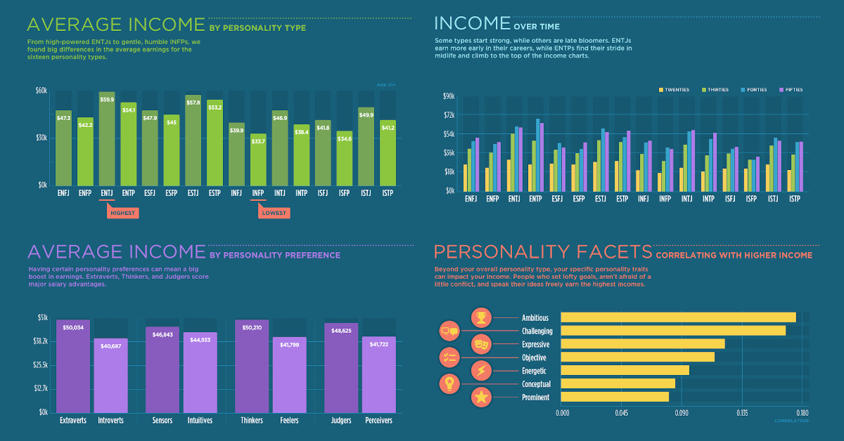
When it comes to making money, not all personality types play on an even playing field.
This recent post breaks down Myers-Briggs personality types by average earning potential, including the specific facets that tend to correlate positively with money over the long term.
18. The 20 Internet Giants That Rule the Web
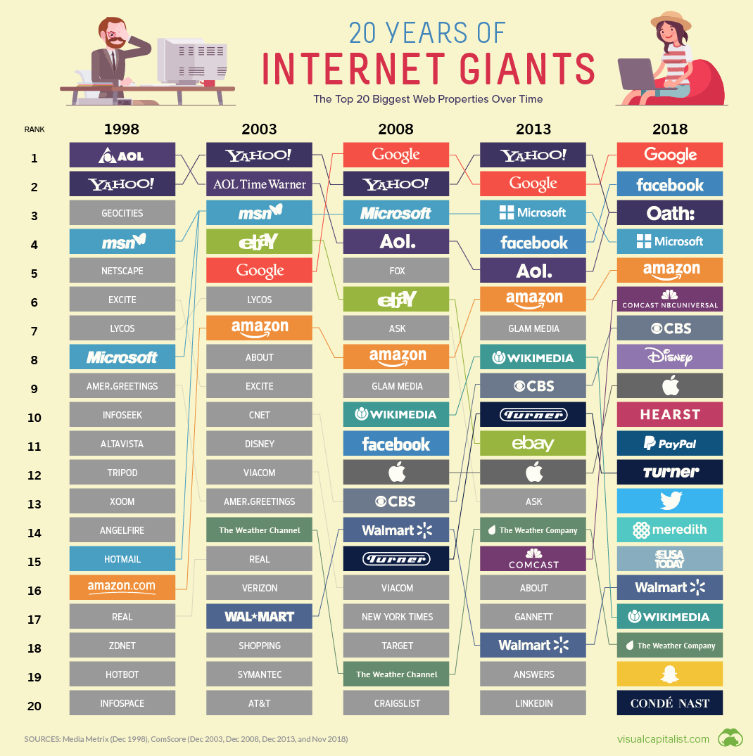
Digital media moves at a breakneck pace — and with almost no barriers to entry, it’s no surprise to see the pecking order turn over every other year.
Even so, it’s easy to forget that names like GeoCities, Lycos, and Ask Jeeves once dominated the internet landscape as we knew it. Our infographic from earlier this year balances the technological pace of change with nostalgia, to show how the web has changed over recent decades.
17. Where the World’s Banks Make the Most Money
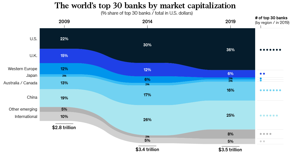
In 2018, the global banking industry raked in $1.3 trillion in after-tax profit.
In this infographic, we looked at where the money is in banking — as well as the upcoming geographic regions and segments that will fuel the future of banking.
16. A History of Revolution in U.S. Taxation
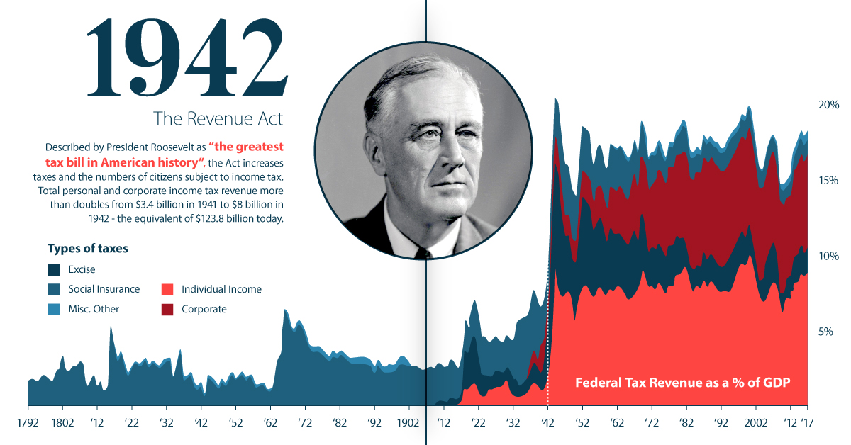
The American Revolution was born out of colonial dissent towards unfair taxation policies.
For this reason, it’s no surprise that the evolution of U.S. taxation itself has been inextricably linked to contentious debate and even moments of rebellion. Our infographic on the history of U.S. taxation helps paint a picture of this story.
15. The History of Esports
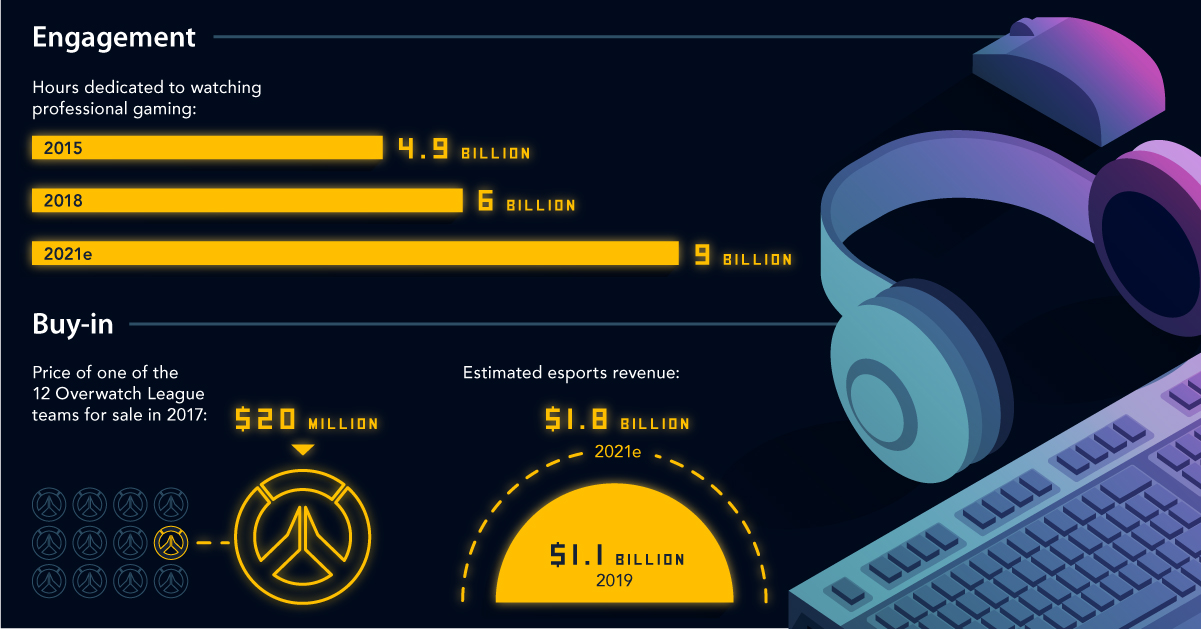
Esports is already filling stadiums — and soon it could be lining investors’ pockets as well.
Our recent infographic breaks down the history of this soon-to-be multi-billion dollar industry, while also showing you the five factors that will determine the pace of future growth in esports.
14. The Game of Life: Visualizing China’s Social Credit System

Imagine a world where over a billion citizens are scored on how “good” they are, based on a set of criteria put forward by the government.
What could possibly go wrong?
13. Visualizing Corruption Around the World
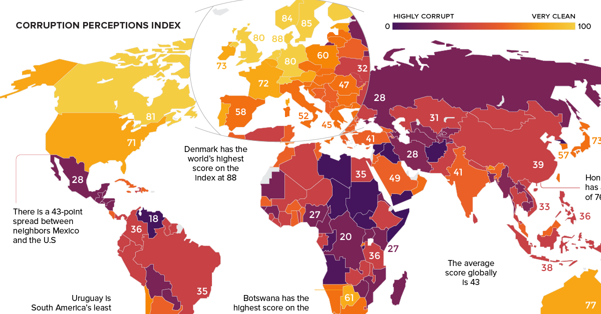
Which countries are the most corrupt?
This colorful map breaks down the Corruptions Perception Index — an attempted measure of the perceived level of public sector corruption in over 180 countries.
12. The Race to Invest in the Space Economy
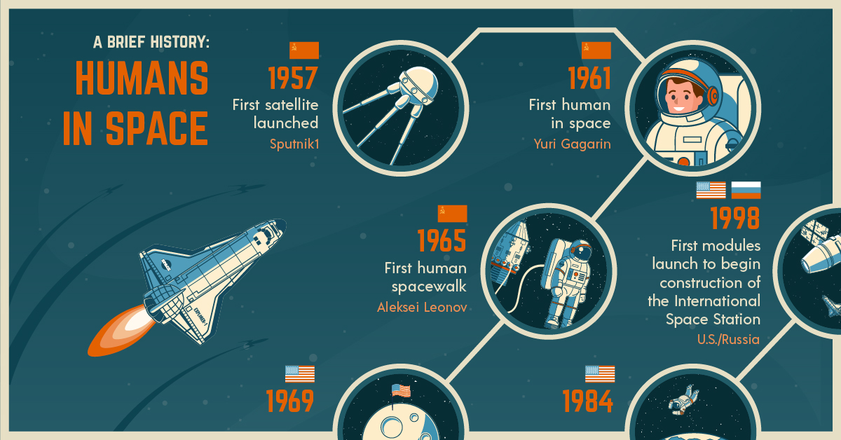
For decades, the space economy has been driven solely by government spending.
Of course, the government still plays an important role in the sector today, but the final frontier is also seemingly open for private business and sustained investment. In the near future, space tourism, resource extraction, and other segments could make space a trillion dollar industry.
11. Mapped: The World’s Biggest Oil Discoveries Since 1868
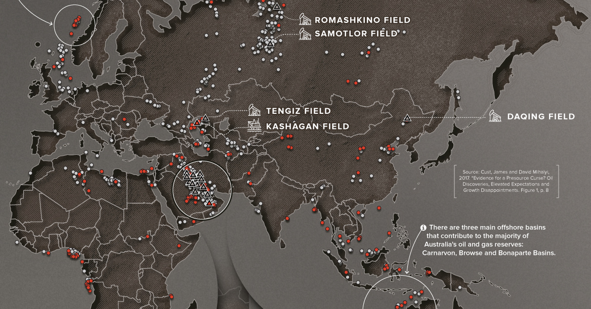
Historically, oil and gas discoveries have been an unparalleled source of wealth for many countries around the world.
This recent post maps out the biggest oil discoveries ever made, while also highlighting the flipside to the story: in a global economy where dependency on fossil fuels is expected to diminish, is any new discovery a blessing or a curse?
10. Walmart Nation: Mapping America’s Biggest Employers
Which company or organization is the largest employer in every state?
This animated map focuses in on employment statistics — but really, it gives perspective of the dominance of Walmart, the nation’s largest brick-and-mortar retailer and private employer.
9. Mapped: The Countries With the Highest Housing Bubble Risks
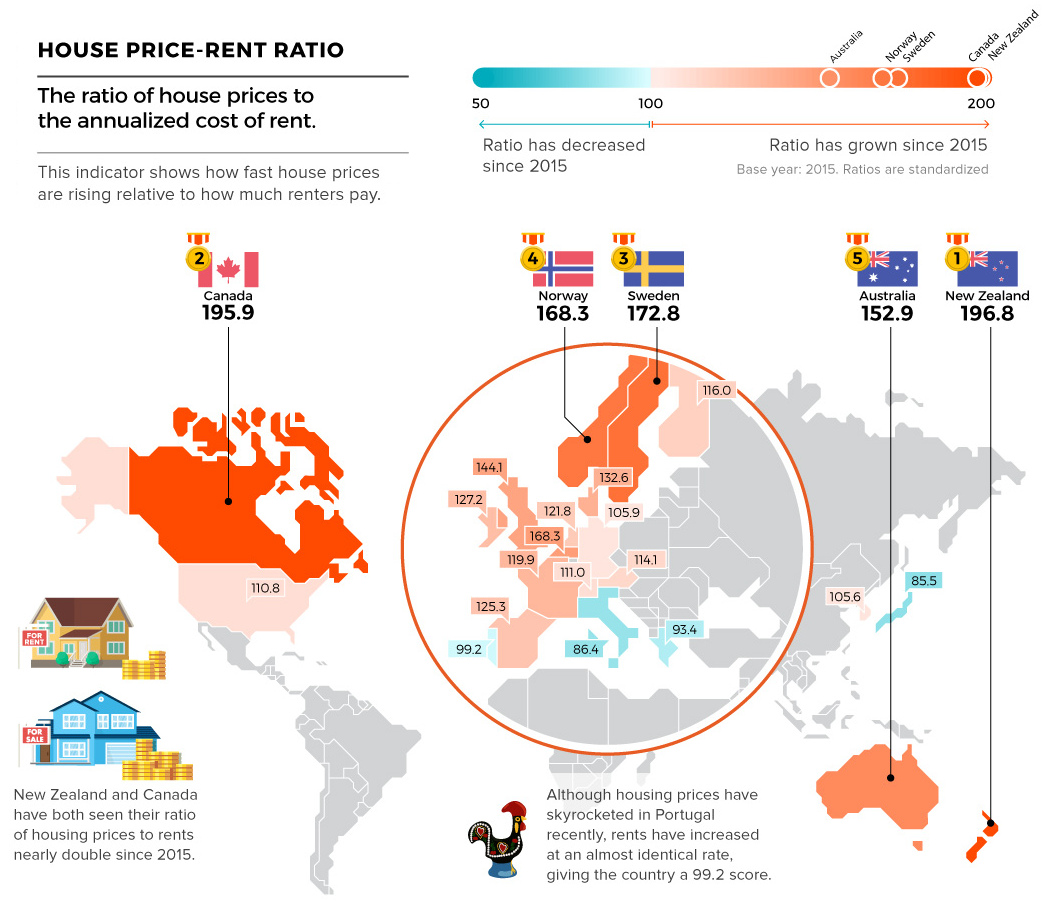
This series of maps highlights several metrics that are used to evaluate housing markets, including the price-to-rent ratio, price-to-income ratio, real house prices, and credit to households as a percentage of GDP.
See which countries have ratios out of whack, and what it could mean for housing markets.
8. All of the World’s Carbon Emissions in One Chart
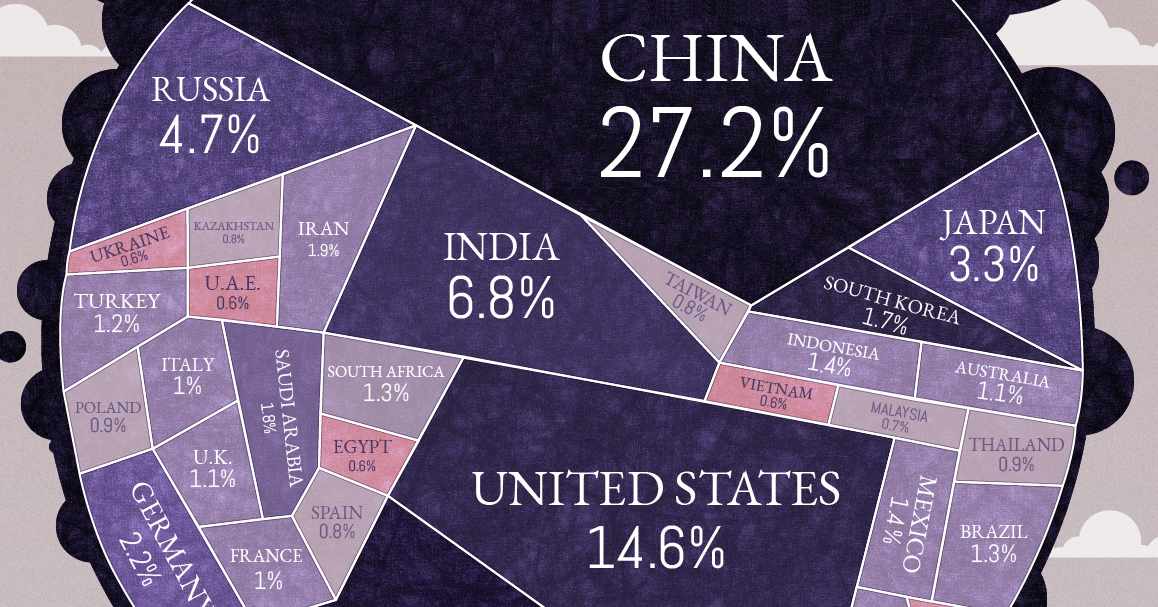
Only 15 countries account for over 72.2% of global carbon emissions.
See it all visualized — and also see the percentage of fossil fuel emissions that have occurred in your lifetime.
7. Visualizing the Happiest Country on Every Continent
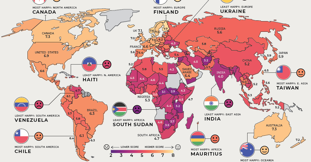
This series of maps provides a look at each individual continent, to identify the happiest (and unhappiest) country in each region.
6. 70 Years of China’s Economic Growth In One Chart
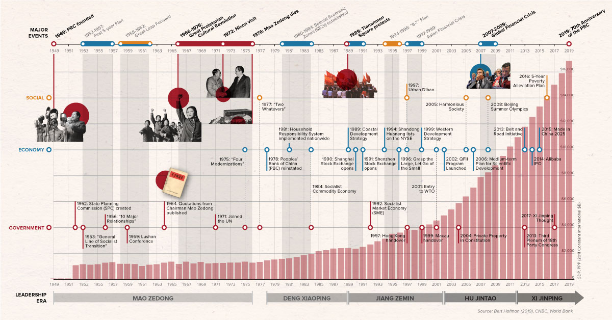
It’s been 70 years since the founding of the People’s Republic of China.
This nifty graphic timeline contains an impressive amount of history and facts about the country’s prolific rise and economic growth.
5. The Most Hyped Technology of Every Year From 2000-2018
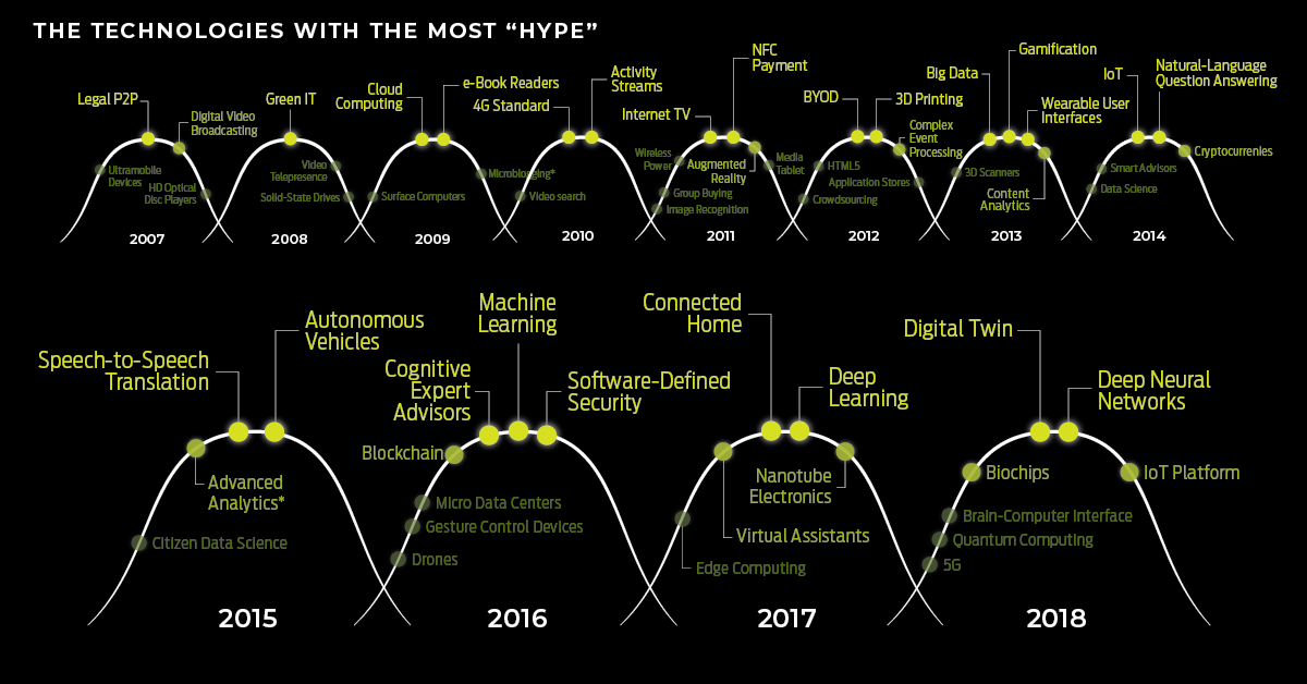
It’s not always easy to tell which new technologies will pan out, and which will fail to live up to society’s expectations.
But hindsight is 20/20 — so in this graphic, we look back at almost 20 years of Gartner’s hype cycle of emerging technologies, to see what amounted from many of the technological breakthroughs that have gained traction over the years.
4. Ranking the Top 100 Websites in the World
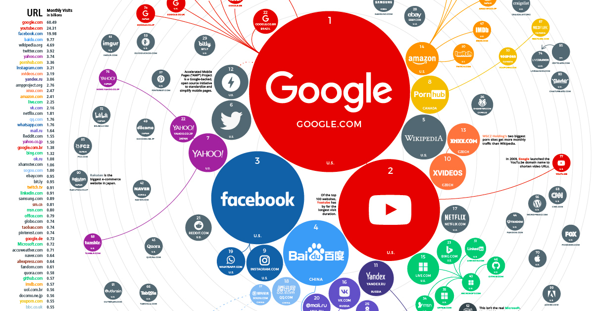
In this spectacular data visualization, we resize the world’s top 100 websites according to the amount of traffic they receive.
The end result provides a fascinating snapshot of global web traffic, and the impressive scale of the internet.
3. The Entire History of Tesla in 5 Minutes
What is the origin story behind Tesla, and how did it end up becoming the innovative car company it is today?
We condense the history of Tesla into about five minutes, while also providing an outline of the future vision of Elon Musk.
2. $69 Trillion of World Debt in One Infographic
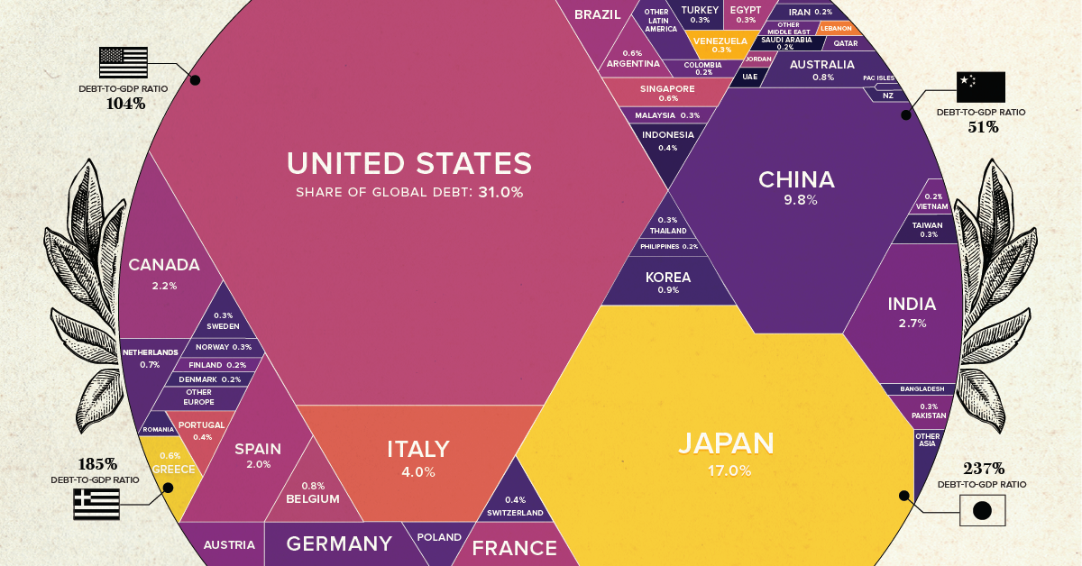
Did you know that government debt now adds up to $69 trillion globally?
The latest version of our famous world debt graphic breaks down the debt owed by each country as a proportion of world debt, as well as debt to GDP ratios.
1. How Tech Giants Make Their Billions
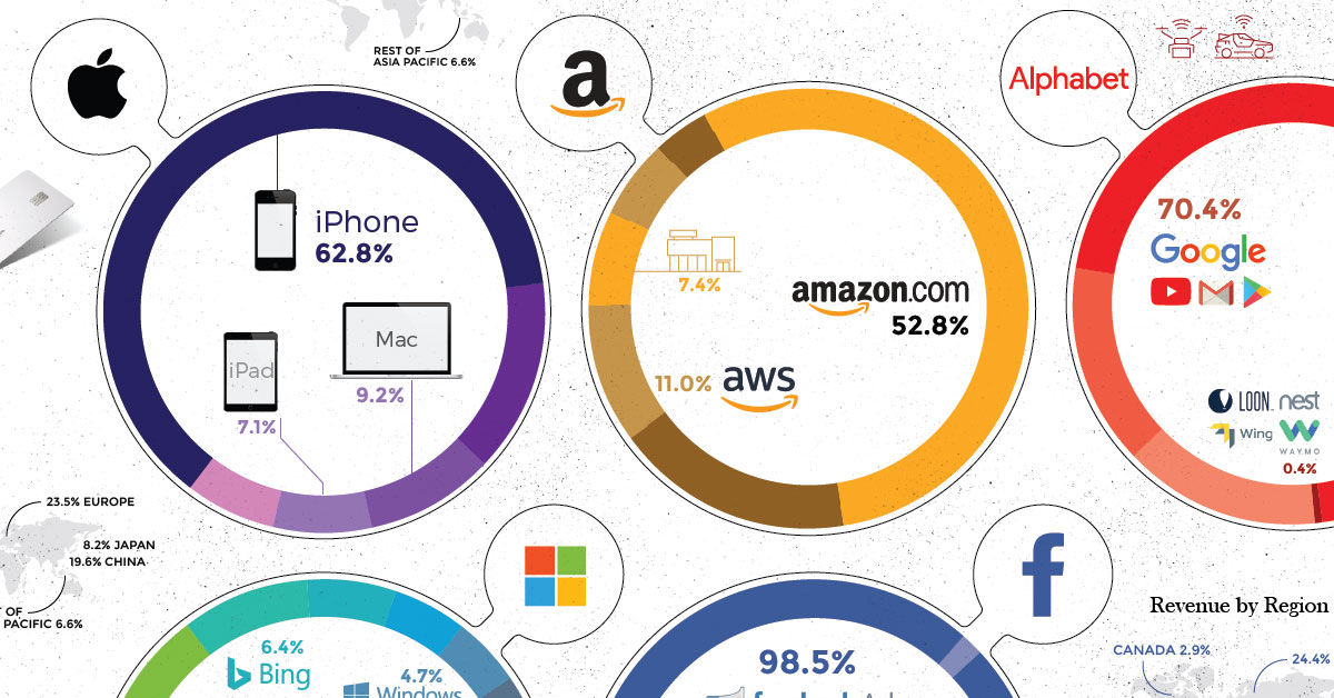
Tech giants are finding ways to play bigger roles in our digital lives, whether it’s through computers, smartphones, smart devices, or apps.
As names like Facebook, Amazon, and Google have become even more ubiquitous, they’ve also leveraged network effects, scale, and winner-take-most marketplaces to build up powerful businesses as well.
Our #1 pick of 2019 showcases the Big Five Tech Giants and their various revenue streams – which, when combined together, add up to over $802 billion per year.

Viewer’s Choice: The Largest Economies in 2030
Finally, it’s time for our “Viewer’s Choice” award.
We polled our VC+ members last week to get a tally for which visualization this year was their favorite, with this video on the largest projected economies in 2030 taking the cake.
Until next time, have a fantastic holiday season and a happy new year!


Best of
Best Visualizations of April on the Voronoi App
We round up the most popular, most discussed, and most liked visualizations of the month on Voronoi, our new data storytelling platform.
At the end of 2023, we publicly launched Voronoi, our free new data discovery app!
The initial response from both users and creators has been incredible. We now have millions of in-app views, and there are already more than 1,000 interesting visualizations to discover, many of which will never be published on Visual Capitalist.
For that reason, we’ve chosen to highlight some of the most popular visualizations and creators from April in this roundup. To see them and many others, make sure to download the app!
Let’s take a look at a popular creator worth highlighting, as well as the most viewed, most discussed, and most liked posts of the month.
POPULAR CREATOR
Our World in Data
Visual Capitalist isn’t the only creator on the Voronoi app.
Instead, it features incredible data-driven charts and stories from many of the world’s best data sources, like Our World in Data.
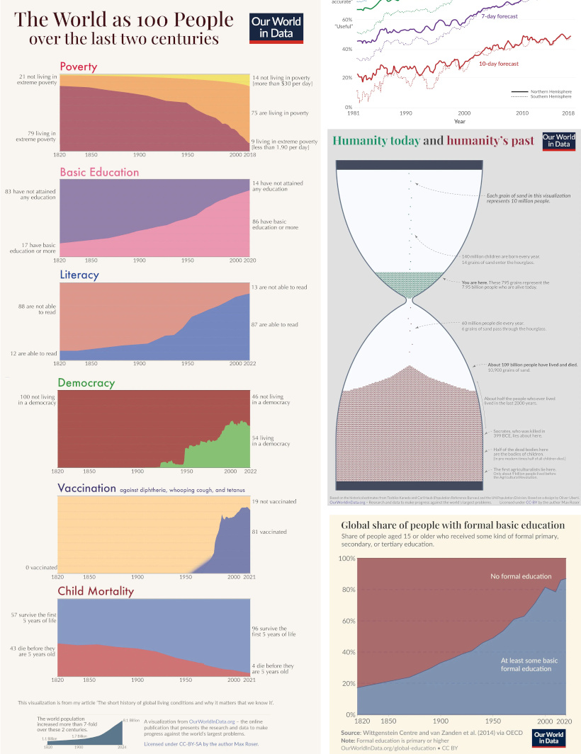
Our World in Data is one of the world’s most important public repositories of data online, covering a wide range of subjects on economics, demographics, history, health, and more.
On Voronoi, you can find a growing collection of visuals from Our World in Data, showing:
- Why weather forecasts are getting better over time
- Expected growth of the global population until the year 2100
- All of the humans that have ever lived, quantified
- Global poverty charted from 1977 until today
We highly recommend following Our World in Data on the app!
![]() View all of Our World in Data’s visuals on Voronoi today.
View all of Our World in Data’s visuals on Voronoi today.
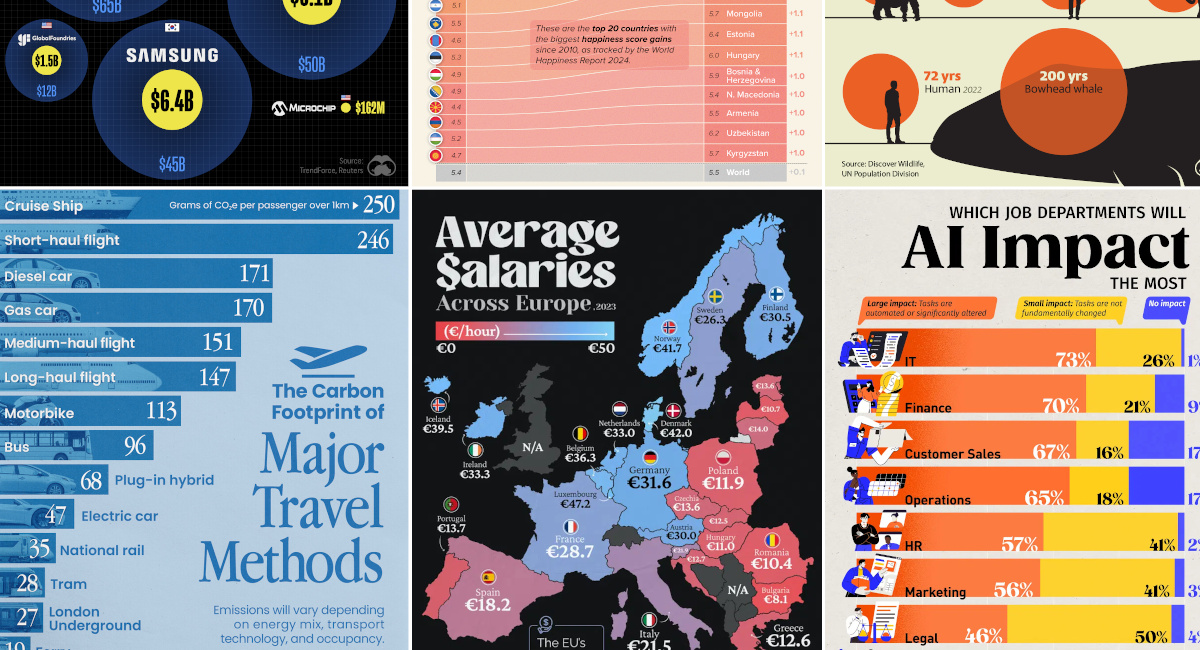
MOST VIEWED
Mapped: Average Salaries in Europe
Europe is economically diverse.
Yes, the cost of living can be cheaper or more expensive depending where you go, but so are average wages:
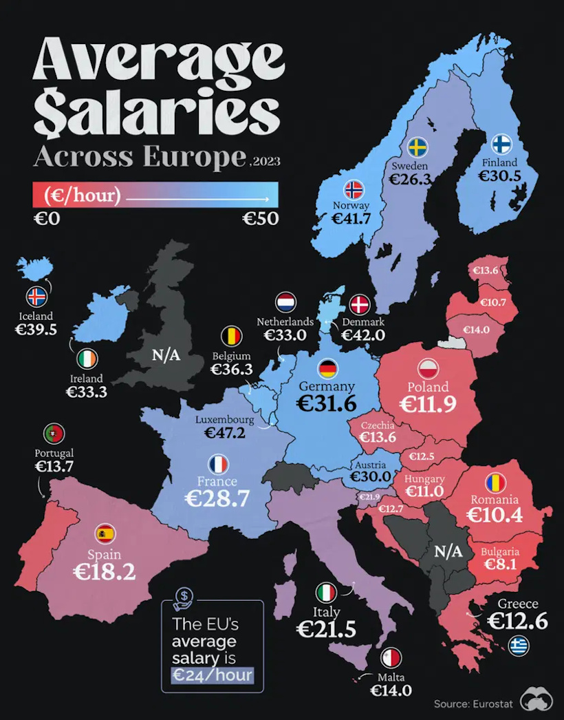
This visualization from Visual Capitalist resonated with our viewership this past month, garnering more views than any other visual published in April.
![]() Get the data behind this visual on Voronoi today.
Get the data behind this visual on Voronoi today.
MOST DISCUSSED
The Carbon Footprint of Travel
The most commented on visualization from Visual Capitalist showed the carbon footprints of many different common travel options.
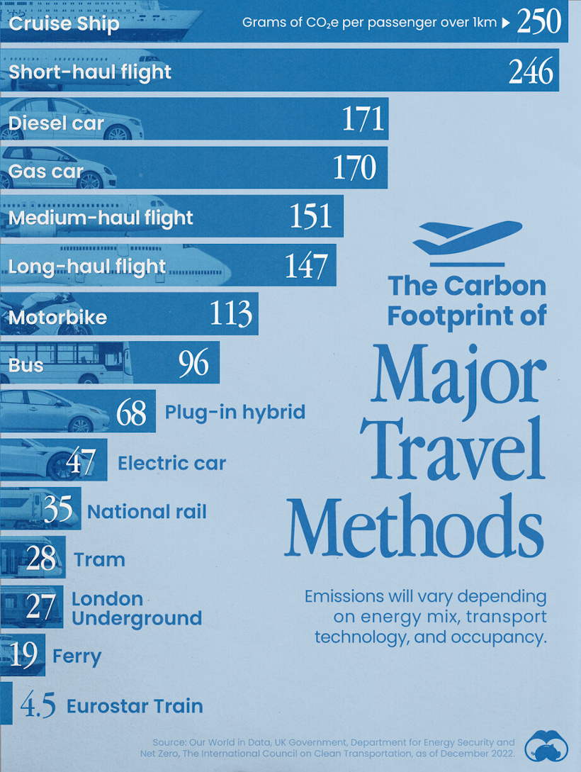
Interestingly, the most carbon-intensive form of transportation is cruise ships, and after that falls short-haul flights, gas-powered cars, and other options.
Commenting users wondered about ethanol-powered vehicles, which were not in the data set. They also asked how adding (or subtracting) passengers would affect the data.
![]() To join the conversation, download Voronoi today.
To join the conversation, download Voronoi today.
MOST LIKED
The Jobs Most Impacted by Artificial Intelligence
The most liked visual on Voronoi in April came from Visual Capitalist, showing the job departments that are most likely to be impacted by AI.
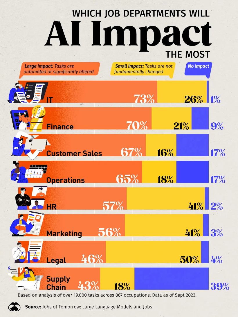
The data comes from an analysis of over 19,000 tasks across 867 occupations, and has IT and finance as the occupation areas most likely to be affected.
![]() Get the data behind this visual on Voronoi today.
Get the data behind this visual on Voronoi today.

-

 Culture7 days ago
The World’s Top Media Franchises by All-Time Revenue
-

 Science2 weeks ago
Visualizing the Average Lifespans of Mammals
-

 Brands2 weeks ago
How Tech Logos Have Evolved Over Time
-

 Energy2 weeks ago
Ranked: The Top 10 EV Battery Manufacturers in 2023
-

 Countries2 weeks ago
Countries With the Largest Happiness Gains Since 2010
-

 Economy2 weeks ago
VC+: Get Our Key Takeaways From the IMF’s World Economic Outlook
-

 Demographics2 weeks ago
The Countries That Have Become Sadder Since 2010
-

 Money1 week ago
Charted: Who Has Savings in This Economy?