Green
All the World’s Carbon Emissions in One Chart
Get this infographic as a poster (and save 15% by being a VC+ member)
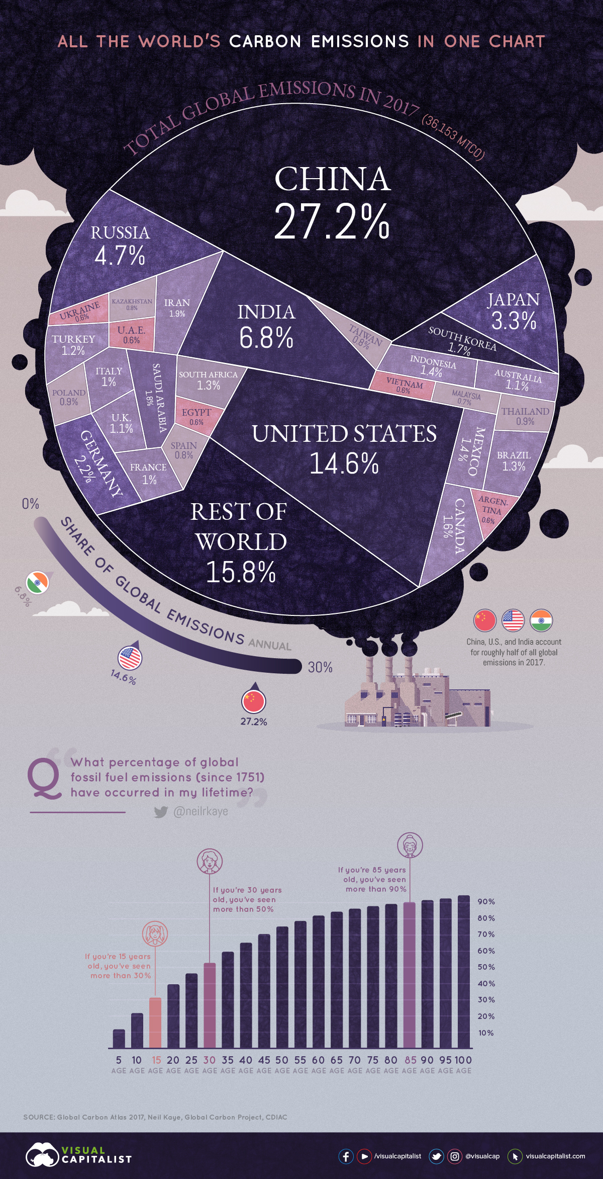


All the World’s Carbon Emissions in One Chart
Two degrees Celsius may not seem like much, but on our planet, it could be the difference between thriving life and a disastrous climate.
Over two centuries of burning fossil fuels have added up, and global decision-makers and business leaders are focusing in on carbon emissions as a key issue.
Emissions by Country
This week’s chart uses the most recent data from Global Carbon Atlas to demonstrate where most of the world’s CO₂ emissions come from, sorted by country.
| Rank | Country | Emissions in 2017 (MtCO₂) | % of Global Emissions |
|---|---|---|---|
| #1 | 🇨🇳 China | 9,839 | 27.2% |
| #2 | 🇺🇸 United States | 5,269 | 14.6% |
| #3 | 🇮🇳 India | 2,467 | 6.8% |
| #4 | 🇷🇺 Russia | 1,693 | 4.7% |
| #5 | 🇯🇵 Japan | 1,205 | 3.3% |
| #6 | 🇩🇪 Germany | 799 | 2.2% |
| #7 | 🇮🇷 Iran | 672 | 1.9% |
| #8 | 🇸🇦 Saudi Arabia | 635 | 1.8% |
| #9 | 🇰🇷 South Korea | 616 | 1.7% |
| #10 | 🇨🇦 Canada | 573 | 1.6% |
| #11 | 🇲🇽 Mexico | 490 | 1.4% |
| #12 | 🇮🇩 Indonesia | 487 | 1.3% |
| #13 | 🇧🇷 Brazil | 476 | 1.3% |
| #14 | 🇿🇦 South Africa | 456 | 1.3% |
| #15 | 🇹🇷 Turkey | 448 | 1.2% |
| 🌐 Top 15 | 26,125 | 72.2% | |
| 🌐 Rest of World | 10,028 | 27.7% |
In terms of absolute emissions, the heavy hitters are immediately obvious. Large economies such as China, the United States, and India alone account for almost half the world’s emissions. Zoom out a little further, and it’s even clearer that just a handful of countries are responsible for the majority of emissions.
Of course, absolute emissions don’t tell the full story. The world is home to over 7.5 billion people, but they aren’t distributed evenly across the globe. How do these carbon emissions shake out on a per capita basis?
Here are the 20 countries with the highest emissions per capita:
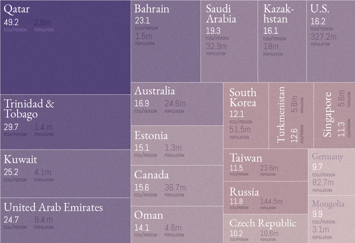
Source: Global Carbon Atlas. Note: We’ve only included places with a population above one million, which excludes islands and areas such as Curaçao, Brunei, Luxembourg, Iceland, Greenland, and Bermuda.
Out of the original 30 countries in the main visualization, six countries show up again as top CO₂ emitters when adjusted for population count: Saudi Arabia, the United States, Canada, South Korea, Russia, and Germany.
The CO₂ Conundrum
We know that rapid urbanization and industrialization have had an impact on carbon emissions entering the atmosphere, but at what rate?
Climate data scientist Neil Kaye answers the question from a different perspective, by mapping what percentage of emissions have been created during your lifetime since the Industrial Revolution:
| Your Age | % of Total Global Emissions |
|---|---|
| 15 years old | You've been alive for more than 30% of emissions |
| 30 years old | You've been alive for more than 50% of emissions |
| 85 years old | You've been alive for more than 90% of emissions |
Put another way, the running total of emissions is growing at an accelerating rate. This is best seen in the dramatic shortening between the time periods taken for 400 billion tonnes of CO₂ to enter the atmosphere:
- First period: 217 years (1751 to 1967)
- Second period: 23 years (1968 to 1990)
- Third period: 16 years (1991 to 2006)
- Fourth period: 11 years (2007 to 2018)
In order to be a decarbonised economy by 2050, we have to bend the (emissions) curve by 2020… Not only is it urgent and necessary, but actually we are very nicely on our way to achieving it.
— Christiana Figueres, Convenor of Mission 2020


Green
The Carbon Footprint of Major Travel Methods
Going on a cruise ship and flying domestically are the most carbon-intensive travel methods.
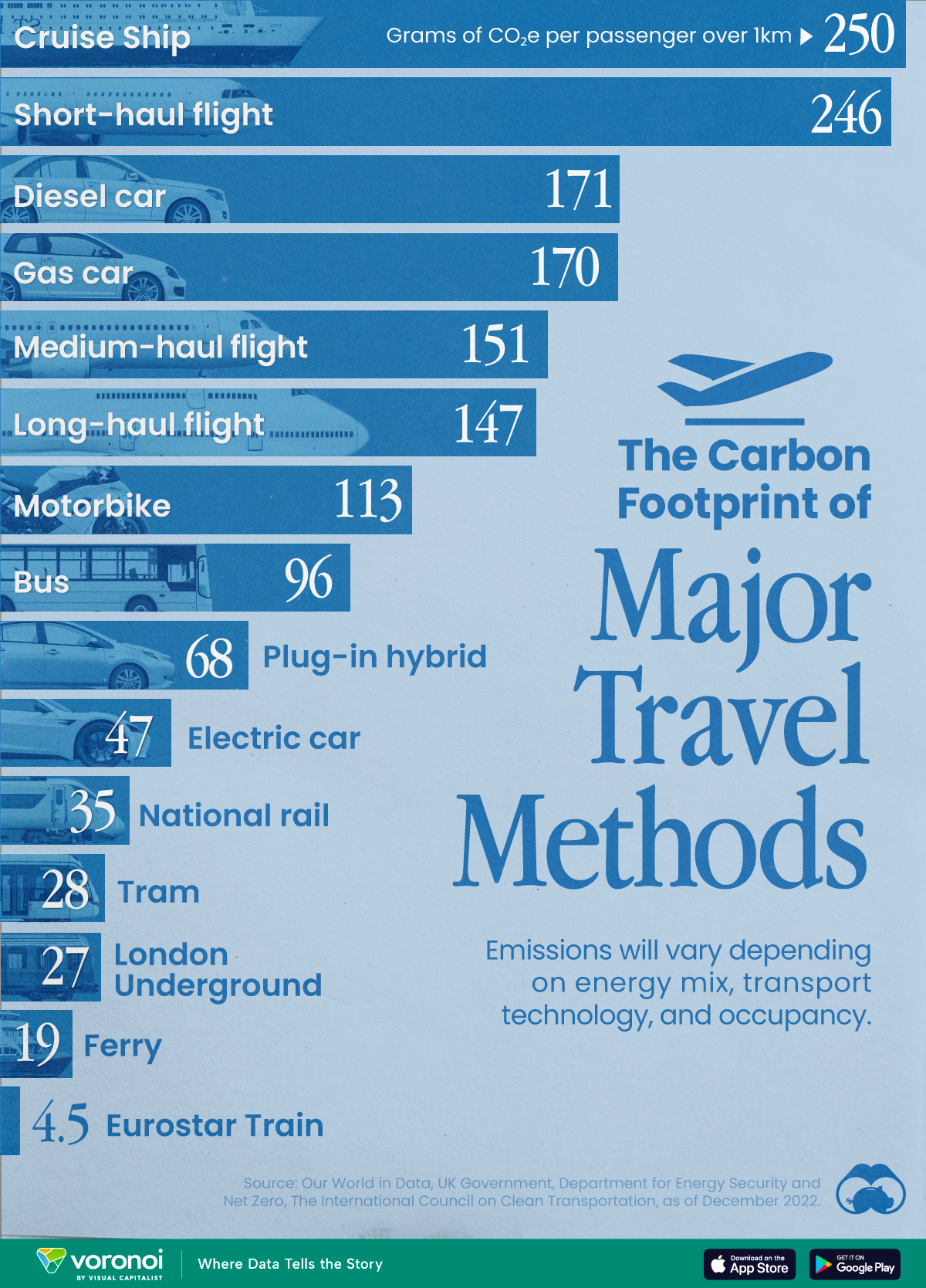

The Carbon Footprint of Major Travel Methods
This was originally posted on our Voronoi app. Download the app for free on iOS or Android and discover incredible data-driven charts from a variety of trusted sources.
Did you know that transport accounts for nearly one-quarter of global energy-related carbon dioxide (CO₂) emissions?
This graphic illustrates the carbon footprints of major travel methods measured in grams of carbon dioxide equivalent (CO₂e) emitted per person to travel one kilometer. This includes both CO₂ and other greenhouse gases.
Data is sourced from Our World in Data, the UK Government’s Department for Energy Security and Net Zero, and The International Council on Clean Transportation, as of December 2022.
These figures should be interpreted as approximations, rather than exact numbers. There are many variables at play that determine the actual carbon footprint in any individual case, including vehicle type or model, occupancy, energy mix, and even weather.
Cruise Ships are the Most Carbon-Intensive Travel Method
According to these estimates, taking a cruise ship, flying domestically, and driving alone are some of the most carbon-intensive travel methods.
Cruise ships typically use heavy fuel oil, which is high in carbon content. The average cruise ship weighs between 70,000 to 180,000 metric tons, meaning they require large engines to get moving.
These massive vessels must also generate power for onboard amenities such as lighting, air conditioning, and entertainment systems.
Short-haul flights are also considered carbon-intensive due to the significant amount of fuel consumed during initial takeoff and climbing altitude, relative to a lower amount of cruising.
| Transportation method | CO₂ equivalent emissions per passenger km |
|---|---|
| Cruise Ship | 250 |
| Short-haul flight (i.e. within a U.S. state or European country) | 246 |
| Diesel car | 171 |
| Gas car | 170 |
| Medium-haul flight (i.e. international travel within Europe, or between U.S. states) | 151 |
| Long-haul flight (over 3,700 km, about the distance from LA to NY) | 147 |
| Motorbike | 113 |
| Bus (average) | 96 |
| Plug-in hybrid | 68 |
| Electric car | 47 |
| National rail | 35 |
| Tram | 28 |
| London Underground | 27 |
| Ferry (foot passenger) | 19 |
| Eurostar (International rail) | 4.5 |
Are EVs Greener?
Many experts agree that EVs produce a lower carbon footprint over time versus traditional internal combustion engine (ICE) vehicles.
However, the batteries in electric vehicles charge on the power that comes straight off the electrical grid—which in many places may be powered by fossil fuels. For that reason, the carbon footprint of an EV will depend largely on the blend of electricity sources used for charging.
There are also questions about how energy-intensive it is to build EVs compared to a comparable ICE vehicle.

-

 Debt1 week ago
How Debt-to-GDP Ratios Have Changed Since 2000
-

 Markets2 weeks ago
Ranked: The World’s Top Flight Routes, by Revenue
-

 Countries2 weeks ago
Population Projections: The World’s 6 Largest Countries in 2075
-

 Markets2 weeks ago
The Top 10 States by Real GDP Growth in 2023
-

 Demographics2 weeks ago
The Smallest Gender Wage Gaps in OECD Countries
-

 United States2 weeks ago
Where U.S. Inflation Hit the Hardest in March 2024
-

 Green2 weeks ago
Top Countries By Forest Growth Since 2001
-

 United States2 weeks ago
Ranked: The Largest U.S. Corporations by Number of Employees