Markets
Visualizing Corruption Around the World
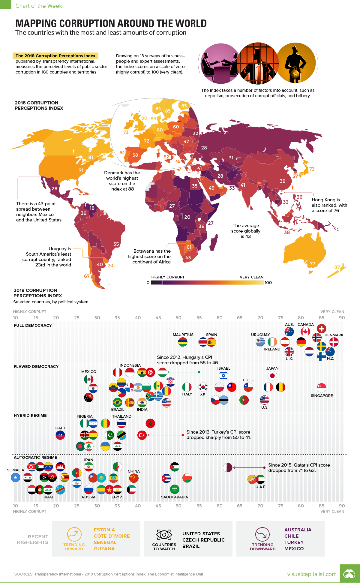
Visualizing Corruption Around the World
Growing levels of public sector corruption can stifle a country’s economic growth while also chipping away at political freedom.
Which parts of the world are perceived to be most corrupt – and further, how does this data differ between regions, and how has it trended over time?
The Corruption Perception Index (CPI)
Today’s chart pulls its numbers from the recent 2018 Corruption Perceptions Index report, which has been published by Transparency International annually since 1995. The report scores 180 countries, and is considered the world’s most widely-used barometer for corruption.
However, before we dive in to the data, it’s worth taking a quick look at the methodology behind the report:
Methodology:
- The CPI attempts to measure perceptions about corruption in a country, rather than corruption itself
- Specifically, it is focused on the public sector of countries, which includes governments and government-run institutions
- The CPI is a composite index, using the results from 13 separate reports and surveys to calculate an overall score
- Scores range from 0 (most corrupt) to 100 (most clean)
Finally, it’s also worth noting that in the chart, we’ve added in government types as rated by the Economist Intelligence Unit – they range from “Full Democracy” to “Autocratic Regime”.
The Most and Least Corrupt Places
What do experts and businesspeople see as the most and least corrupt global regions?
| Region | Average Score (CPI) |
|---|---|
| Western Europe & EU | 66 |
| Americas | 44 |
| Asia Pacific | 44 |
| Middle East & North Africa | 39 |
| Eastern Europe & Central Asia | 35 |
| Sub-Saharan Africa | 32 |
| Global | 43 |
Western Europe has the highest score on average, while Sub-Saharan Africa has the lowest (most corrupt) average score. The Americas ranks just above the global average score of 43, mainly because the average is skewed by the lower scores of many countries in Latin America (such as Venezuela) and the Caribbean (such as Haiti).
Now, let’s look at the top 10 countries overall:
| Rank | Country | Score (CPI) | Government type | Region |
|---|---|---|---|---|
| #1 | Denmark | 88 | Full democracy | Western Europe & EU |
| #2 | New Zealand | 87 | Full democracy | Asia Pacific |
| #3 | Finland | 85 | Full democracy | Western Europe & EU |
| #3 | Singapore | 85 | Flawed democracy | Asia Pacific |
| #3 | Sweden | 85 | Full democracy | Western Europe & EU |
| #3 | Switzerland | 85 | Full democracy | Western Europe & EU |
| #7 | Norway | 84 | Full democracy | Western Europe & EU |
| #8 | Netherlands | 82 | Full democracy | Western Europe & EU |
| #9 | Canada | 81 | Full democracy | Americas |
| #9 | Luxembourg | 81 | Full democracy | Western Europe & EU |
Here’s also a look at the world’s 20 most populous countries:
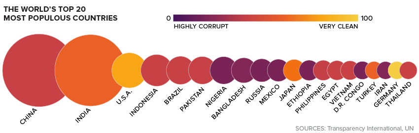
As the report notes, the relation between democracy and corruption appears to be quite clear: the more democratic a regime is, the less corrupt it is perceived to be. Using the Economist Intelligence Unit rankings, there are no “Hybrid” or “Autocratic” regimes that come anywhere near the top 10.
The closest may be the U.A.E. – which is classified as an Autocratic Regime – which has a CPI score of 70, good for 23rd place globally.
Trends Over Time
Over the last seven years, the report notes that there were a few specific countries that have consistently trended in one direction or another.
Hungary: The country has seen a -9 point change to its CPI score since 2012, dropping to 46 points in total. That’s just a notch above the global average.
Turkey: Turkey’s rating has deteriorated from 49 to 41 over the 2012-2018 time period.
Argentina: The South American nation has seen its score rise by eight points over the 2012-2018 time period.
Guyana: Guyana has gained nine points – a significant improvement over its original score of 28 at the start of that time period.
What will be the next country to jump up (or down) the list – and what factors will lead to this change in perception?
Note: The color-coding on the map has been updated to better reflect CPI scores. Ukraine was incorrectly classified as an Autocratic Regime.


Markets
The European Stock Market: Attractive Valuations Offer Opportunities
On average, the European stock market has valuations that are nearly 50% lower than U.S. valuations. But how can you access the market?
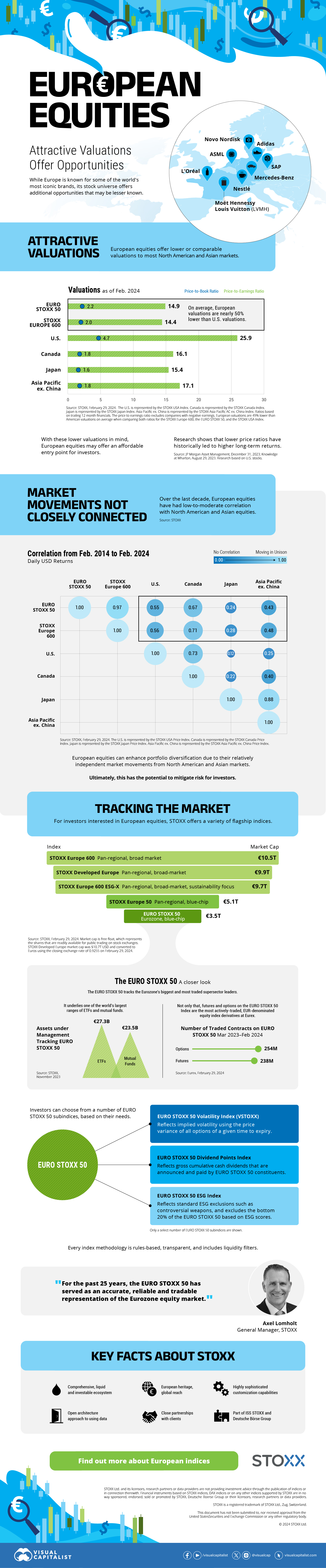
European Stock Market: Attractive Valuations Offer Opportunities
Europe is known for some established brands, from L’Oréal to Louis Vuitton. However, the European stock market offers additional opportunities that may be lesser known.
The above infographic, sponsored by STOXX, outlines why investors may want to consider European stocks.
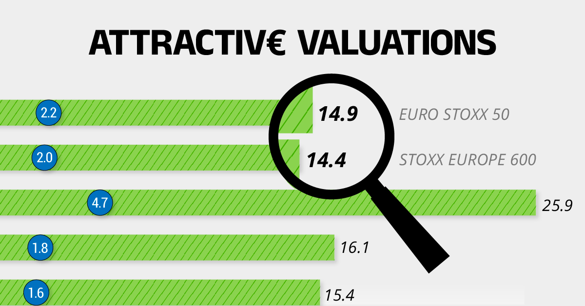
Attractive Valuations
Compared to most North American and Asian markets, European stocks offer lower or comparable valuations.
| Index | Price-to-Earnings Ratio | Price-to-Book Ratio |
|---|---|---|
| EURO STOXX 50 | 14.9 | 2.2 |
| STOXX Europe 600 | 14.4 | 2 |
| U.S. | 25.9 | 4.7 |
| Canada | 16.1 | 1.8 |
| Japan | 15.4 | 1.6 |
| Asia Pacific ex. China | 17.1 | 1.8 |
Data as of February 29, 2024. See graphic for full index names. Ratios based on trailing 12 month financials. The price to earnings ratio excludes companies with negative earnings.
On average, European valuations are nearly 50% lower than U.S. valuations, potentially offering an affordable entry point for investors.
Research also shows that lower price ratios have historically led to higher long-term returns.
Market Movements Not Closely Connected
Over the last decade, the European stock market had low-to-moderate correlation with North American and Asian equities.
The below chart shows correlations from February 2014 to February 2024. A value closer to zero indicates low correlation, while a value of one would indicate that two regions are moving in perfect unison.
| EURO STOXX 50 | STOXX EUROPE 600 | U.S. | Canada | Japan | Asia Pacific ex. China |
|
|---|---|---|---|---|---|---|
| EURO STOXX 50 | 1.00 | 0.97 | 0.55 | 0.67 | 0.24 | 0.43 |
| STOXX EUROPE 600 | 1.00 | 0.56 | 0.71 | 0.28 | 0.48 | |
| U.S. | 1.00 | 0.73 | 0.12 | 0.25 | ||
| Canada | 1.00 | 0.22 | 0.40 | |||
| Japan | 1.00 | 0.88 | ||||
| Asia Pacific ex. China | 1.00 |
Data is based on daily USD returns.
European equities had relatively independent market movements from North American and Asian markets. One contributing factor could be the differing sector weights in each market. For instance, technology makes up a quarter of the U.S. market, but health care and industrials dominate the broader European market.
Ultimately, European equities can enhance portfolio diversification and have the potential to mitigate risk for investors.
Tracking the Market
For investors interested in European equities, STOXX offers a variety of flagship indices:
| Index | Description | Market Cap |
|---|---|---|
| STOXX Europe 600 | Pan-regional, broad market | €10.5T |
| STOXX Developed Europe | Pan-regional, broad-market | €9.9T |
| STOXX Europe 600 ESG-X | Pan-regional, broad market, sustainability focus | €9.7T |
| STOXX Europe 50 | Pan-regional, blue-chip | €5.1T |
| EURO STOXX 50 | Eurozone, blue-chip | €3.5T |
Data is as of February 29, 2024. Market cap is free float, which represents the shares that are readily available for public trading on stock exchanges.
The EURO STOXX 50 tracks the Eurozone’s biggest and most traded companies. It also underlies one of the world’s largest ranges of ETFs and mutual funds. As of November 2023, there were €27.3 billion in ETFs and €23.5B in mutual fund assets under management tracking the index.
“For the past 25 years, the EURO STOXX 50 has served as an accurate, reliable and tradable representation of the Eurozone equity market.”
— Axel Lomholt, General Manager at STOXX
Partnering with STOXX to Track the European Stock Market
Are you interested in European equities? STOXX can be a valuable partner:
- Comprehensive, liquid and investable ecosystem
- European heritage, global reach
- Highly sophisticated customization capabilities
- Open architecture approach to using data
- Close partnerships with clients
- Part of ISS STOXX and Deutsche Börse Group
With a full suite of indices, STOXX can help you benchmark against the European stock market.
Learn how STOXX’s European indices offer liquid and effective market access.

-

 Economy2 days ago
Economic Growth Forecasts for G7 and BRICS Countries in 2024
The IMF has released its economic growth forecasts for 2024. How do the G7 and BRICS countries compare?
-

 Markets1 week ago
U.S. Debt Interest Payments Reach $1 Trillion
U.S. debt interest payments have surged past the $1 trillion dollar mark, amid high interest rates and an ever-expanding debt burden.
-

 United States2 weeks ago
Ranked: The Largest U.S. Corporations by Number of Employees
We visualized the top U.S. companies by employees, revealing the massive scale of retailers like Walmart, Target, and Home Depot.
-

 Markets2 weeks ago
The Top 10 States by Real GDP Growth in 2023
This graphic shows the states with the highest real GDP growth rate in 2023, largely propelled by the oil and gas boom.
-

 Markets2 weeks ago
Ranked: The World’s Top Flight Routes, by Revenue
In this graphic, we show the highest earning flight routes globally as air travel continued to rebound in 2023.
-

 Markets3 weeks ago
Ranked: The Most Valuable Housing Markets in America
The U.S. residential real estate market is worth a staggering $47.5 trillion. Here are the most valuable housing markets in the country.


-

 Education1 week ago
How Hard Is It to Get Into an Ivy League School?
-

 Technology2 weeks ago
Ranked: Semiconductor Companies by Industry Revenue Share
-
Markets2 weeks ago
Ranked: The World’s Top Flight Routes, by Revenue
-

 Demographics2 weeks ago
Population Projections: The World’s 6 Largest Countries in 2075
-
Markets2 weeks ago
The Top 10 States by Real GDP Growth in 2023
-

 Demographics2 weeks ago
The Smallest Gender Wage Gaps in OECD Countries
-

 Economy2 weeks ago
Where U.S. Inflation Hit the Hardest in March 2024
-

 Green2 weeks ago
Top Countries By Forest Growth Since 2001