Misc
Visual Capitalist’s Top 15 Infographics of 2015

Put down your turkey leftovers and the rum-infused eggnog – it’s time to recap our favorite posts on Visual Capitalist from 2015.
The following list includes a mix of infographics, data visualizations, and charts. Some of the posts listed here were among the most popular graphics on the entire site. Others that made the list are graphics that are diamonds in the rough.
If you are new to the site, it also may be worth checking out last year’s edition of this post that covered the best content from 2014.
Without further ado…
15. By this measure, the U.S. has the 2nd highest national debt
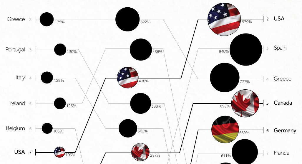
The standard measure for national debt compares a country’s debt with its economic output as measured by GDP.
In this data visualization, however, we showed that the world looks very different using a debt-to-revenue ratio instead. We visualize the national debt as compared to the amount of tax revenue coming into the central government’s coffers, which is arguably a better way to look at a country’s capacity to pay.
14. The Cybersecurity Boom

Over recent years, the world has been under siege from cyberattacks. Blue chip companies like J.P. Morgan Chase, Target, and Sony were hacked, and even the U.S. government was compromised with over 20 million records stolen. Cybersecurity companies are here to help us fight back, and that’s what makes the industry interesting for investors.
The market in cybersecurity is expected to be worth more than $170 billion by 2020.
13. Mapping Every Power Plant in the United States
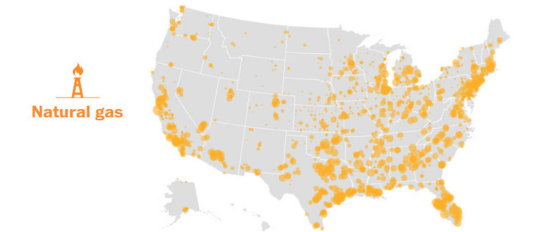
Every wonder how much power in the United States is generated by solar in comparison to nuclear plants? This post is for you.
In this data visualization, every power plant in the country is mapped and quantified. The end result is a crystal clear picture of how electricity is really generated.
12. The Jade series

Did you know that China’s cultural affinity for jade has existed for longer than Western civilization?
This highly illustrative three-part series examines this as well as the emerging nephrite jade market in British Columbia.
11. The U.S. Debt Ceiling Has Risen No Matter Who is in Office
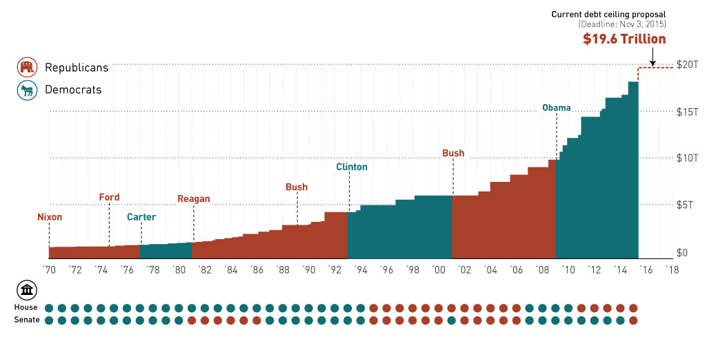
Around October, U.S. lawmakers reached an impasse on raising the debt ceiling. Republicans wanted to play hardball by linking a ceiling increase to conservative issues, but our chart shows that this kind of brinkmanship may have been inauthentic to start with.
The reality is clear: the debt ceiling has risen no matter who is in office.
10. The Race for Arctic Domination
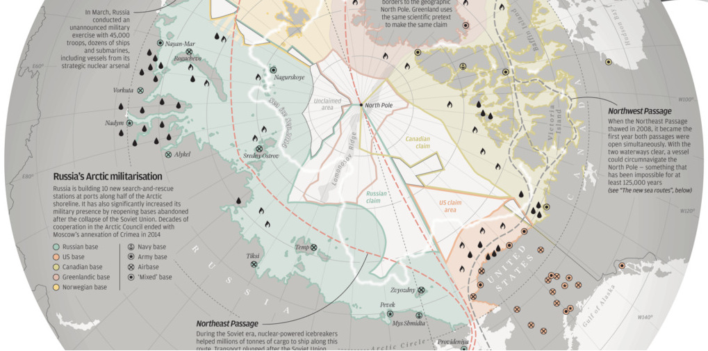
There’s a new “cold war”, but this time it is in the freezing Arctic. Over recent decades, ice has thawed in the Arctic and 2008 became the first year that both the Northeast Passage (North of Russia) and the Northwest Passage (North of Canada) were open to ships simultaneously.
This means it may be the first time that a vessel could theoretically circumnavigate the North Pole in 125,000 years. Not surprisingly, countries such as Russia, Canada, Norway, Denmark, and the United States have taken notice and are posturing accordingly.
9. Millennials on Investing, Debt, and Banking
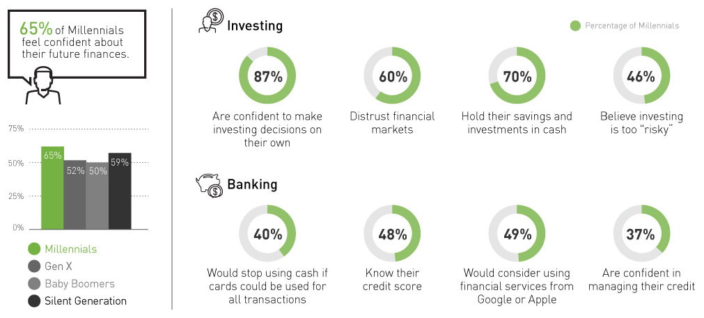
Polls show that 65% of millennials feel confident about their finances. This is higher than all other generations.
The problem? Their actual knowledge about investing, debt, and banking is questionable at best.
8. Most Americans Reached Peak Income More than 15 Years Ago
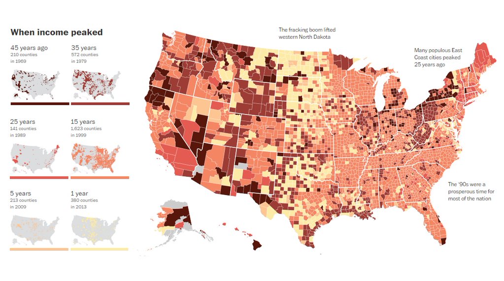
The majority of Americans are worse off than they were 15 years ago. That’s because Census data shows that 1,623 counties reached their highest income in 1999.
Even further, there are 782 counties that have their best days way behind them. Their incomes peaked 35 or more years ago.
7. Order From Chaos: How Big Data Will Change the World

We’ve all heard about “Big Data”, but what is it really? This infographic explains everything you need to know behind this new reality for business, and its implications for companies and investors.
6. Canada’s has the Most Overvalued Housing Market in the World
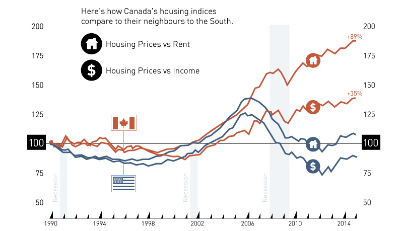
The Economist has determined that Canada’s property market is the most overvalued in the world in terms of rent prices (+89%), and the third most overvalued in terms of incomes (+35%).
In the post, we go over some of the arguments for and against Canada’s frothy market.
5. China Consumes Mind-Boggling Amounts of Raw Materials
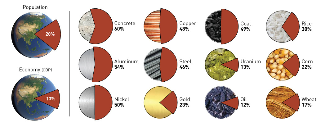
The 1.4 billion people living in China account for 13% of global GDP, but this chart shows that for commodity producers, the country means so much more. China consumes upwards of half of the world’s cement, aluminum, and nickel, along with huge amounts of other base metals, energy commodities, precious metals, and food.
4. $60 Trillion of World Debt in One Visualization
Two weeks before this post, we had published a chart showing the world economy in one visualization. In the corresponding comments section, a user asked us if we could put together a similar visualization but instead looking at world debt.
This visualization on national debt was the end result, and it ended up making the front page of Reddit, as well as being posted on Business Insider, The Huffington Post, The World Economic Forum, Zero Hedge, Daily Reckoning,
3. The Industrial Internet and How It’s Revolutionizing Mining
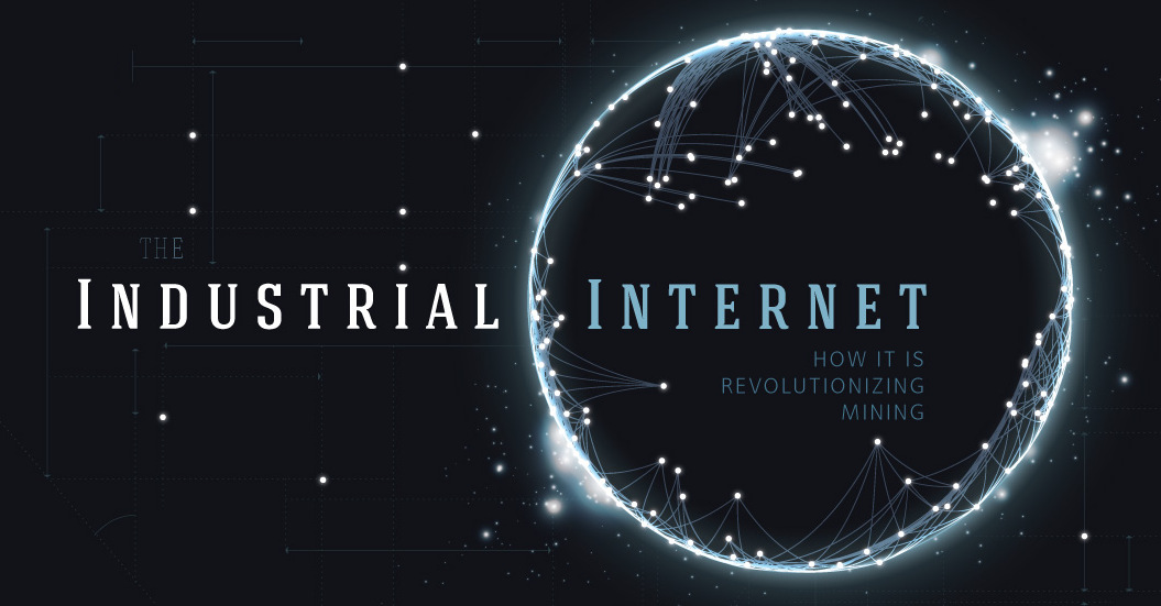
The industrial internet is the convergence of the global industrial sector with the internet of things. In this infographic we show how this new technology will change how the mining sector works.
2. Powering New York

This was one of our favorite posts of the year.
In this slideshow, we visualize what it takes to power NYC with every type of energy including gas, wind, solar, nuclear, and more.
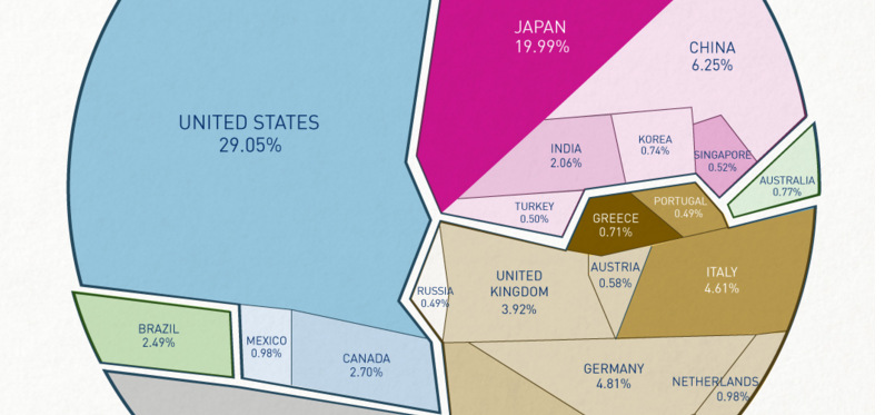
1. All the World’s Money and Markets in One Visualization
We created this year’s top post for The Money Project which we are doing in conjunction with Texas Precious Metals.
In the data visualization, we compare the world’s money and markets to help give perspective to global money supply.
The final result was one of our most viewed infographics of all time, receiving over 1,000,000 views in just a matter of weeks. It was featured on Marketwatch, Business Insider, Zero Hedge, Morningstar, as well as making the front page of Reddit.
What was your favorite post of the year? What would you like to see more of? Feel free to sound off in the comments section.


VC+
VC+: Get Our Key Takeaways From the IMF’s World Economic Outlook
A sneak preview of the exclusive VC+ Special Dispatch—your shortcut to understanding IMF’s World Economic Outlook report.

Have you read IMF’s latest World Economic Outlook yet? At a daunting 202 pages, we don’t blame you if it’s still on your to-do list.
But don’t worry, you don’t need to read the whole April release, because we’ve already done the hard work for you.
To save you time and effort, the Visual Capitalist team has compiled a visual analysis of everything you need to know from the report—and our VC+ Special Dispatch is available exclusively to VC+ members. All you need to do is log into the VC+ Archive.
If you’re not already subscribed to VC+, make sure you sign up now to access the full analysis of the IMF report, and more (we release similar deep dives every week).
For now, here’s what VC+ members get to see.
Your Shortcut to Understanding IMF’s World Economic Outlook
With long and short-term growth prospects declining for many countries around the world, this Special Dispatch offers a visual analysis of the key figures and takeaways from the IMF’s report including:
- The global decline in economic growth forecasts
- Real GDP growth and inflation forecasts for major nations in 2024
- When interest rate cuts will happen and interest rate forecasts
- How debt-to-GDP ratios have changed since 2000
- And much more!

Get the Full Breakdown in the Next VC+ Special Dispatch
VC+ members can access the full Special Dispatch by logging into the VC+ Archive, where you can also check out previous releases.
Make sure you join VC+ now to see exclusive charts and the full analysis of key takeaways from IMF’s World Economic Outlook.
Don’t miss out. Become a VC+ member today.
What You Get When You Become a VC+ Member
VC+ is Visual Capitalist’s premium subscription. As a member, you’ll get the following:
- Special Dispatches: Deep dive visual briefings on crucial reports and global trends
- Markets This Month: A snappy summary of the state of the markets and what to look out for
- The Trendline: Weekly curation of the best visualizations from across the globe
- Global Forecast Series: Our flagship annual report that covers everything you need to know related to the economy, markets, geopolitics, and the latest tech trends
- VC+ Archive: Hundreds of previously released VC+ briefings and reports that you’ve been missing out on, all in one dedicated hub
You can get all of the above, and more, by joining VC+ today.

-

 Energy1 week ago
The World’s Biggest Nuclear Energy Producers
-

 Money2 weeks ago
Which States Have the Highest Minimum Wage in America?
-

 Technology2 weeks ago
Ranked: Semiconductor Companies by Industry Revenue Share
-

 Markets2 weeks ago
Ranked: The World’s Top Flight Routes, by Revenue
-

 Countries2 weeks ago
Population Projections: The World’s 6 Largest Countries in 2075
-

 Markets2 weeks ago
The Top 10 States by Real GDP Growth in 2023
-

 Demographics2 weeks ago
The Smallest Gender Wage Gaps in OECD Countries
-

 United States2 weeks ago
Where U.S. Inflation Hit the Hardest in March 2024