Misc
The 14 Best Visual Capitalist Infographics of 2014

For the final post of 2014, we’ve decided to come up with a list of the best original infographics of 2014 that were posted on the site. We based the list on a variety of criteria including views, comments from our audience, social media shares, and our own subjective opinion.
Click on any link below to visit the full version of each infographic on the list.
Also, if you don’t already get our daily infographics and other visual content, make sure you connect with us here.
14. How 3D Printing is Shaping Business
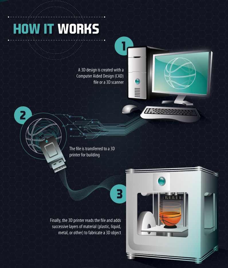
Our 3D Printing infographic showed how additive manufacturing technology works, as well as how it may impact industries in the future. While consumer electronics is currently the biggest market with 22% market share, as adoption increases, 3D printing is expected to set to change the business of medicine, defense, vehicle manufacturing, jewelry, and much more.
13. How to Test for Fake Gold or Silver

This summer, working with Silver.com, we showed how bullion buyers can test for fake gold or silver. In recent years there have been various concerning cases of bullion counterfeiting, and so investors should be aware of these methods to ensure their gold and silver are the real deal.
12. A New Vision of the Mining Company of the Future
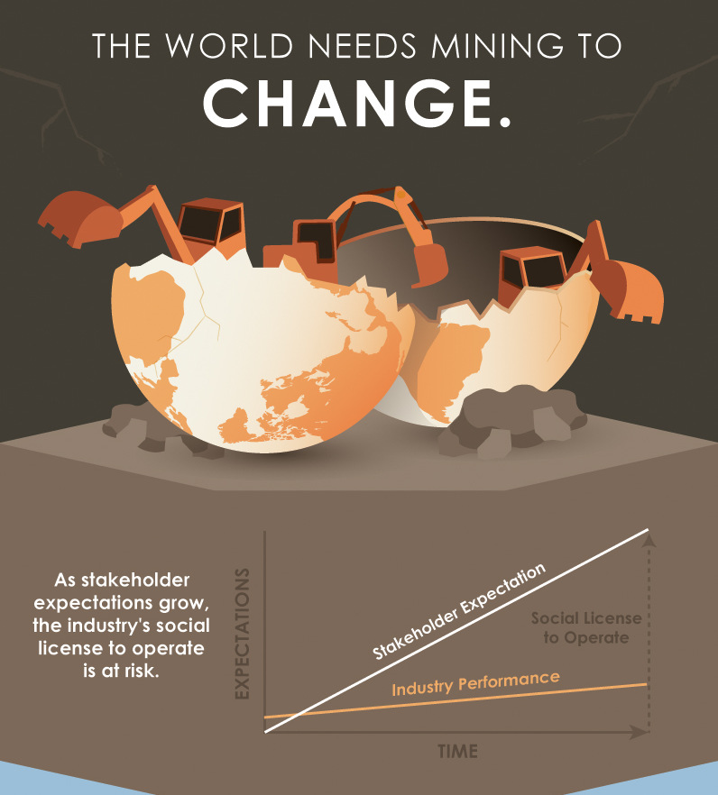
We presented a vision of the Mining Company of the Future in this infographic and accompanying video version. Mining companies today face a complexity of problems: spiraling costs, government intervention, deepening pits, lower ore grades, and declining productivity are just some of the issues. These graphics convey a framework developed by KIN Catalyst through years of conferences, consultation, and hard work.
11. Is Vancouver a Legitimate Tech Hub?
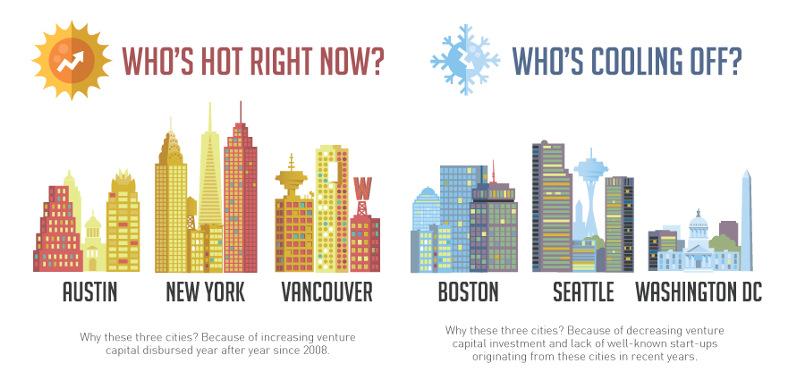
If you’re asking yourself if Vancouver is able to directly compare with Silicon Valley, the answer is a resolute “no”. To put things in perspective, Silicon Valley boasts at least 10x more tech employees, 20x more venture capital deals, and an unsurpassed track record of success. In fact, California alone grabbed a hefty 47% of all North American venture capital funding in 2013. However, the Canadian city is trending in the right direction and in this infographic we look at the evidence on both sides.
10. Peak Population
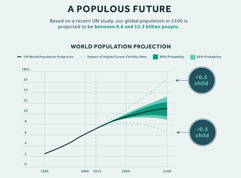
By 2100, our global population is to be between 9.6 and 12.3 billion. In the first part of our Peak Population Series we look at the crunch that a growing global population will put on natural resources.
9. Medical Marijuana in Canada
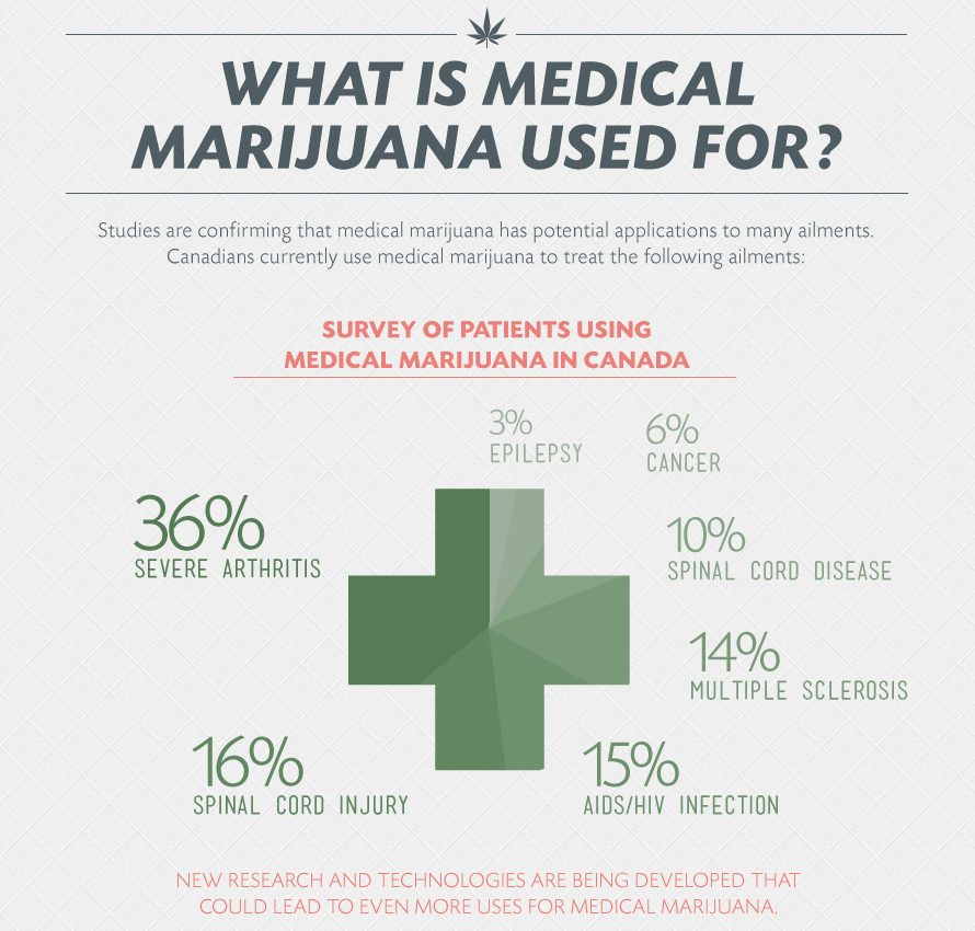
On April 1, 2014, Canadian legislation changed significantly around medical marijuana. In our Medical Marijuana in Canada infographic we look at the new regulations, the market for medical cannabis, and its uses and treatments.
8. Everything You Need to Know About the Swiss Gold Referendum
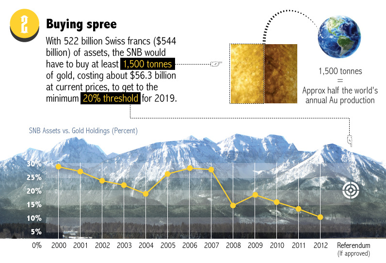
In November, Switzerland had a potential game-changing referendum on their central bank’s use of gold. The vote ended up being a firm “no”, but in this Swiss Referendum infographic we looked at the potential implications that a “yes” vote would have brought in Switzerland and the rest of the world.
7. The Definitive History of Bitcoin
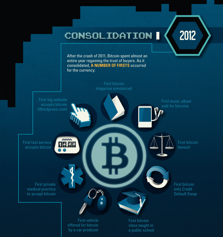
We put together an ambitious five year history of Bitcoin together all the way from its inception to the end of 2013. See the Definitive History of Bitcoin in all of its glory as every notable event is compiled in one place in beautiful detail.
6. The Many Phases of Silver (Silver Series)

In the first part of our new Silver Series presented by Silver.com we covered the many phases of silver: its uses as a monetary, health, and industrial metal.
5. The Narwhal Club: Home to Canada’s $1B Tech Startups

The Narwhal Club is Canada’s answer to Aileen Lee’s idea of a “Unicorn Club” for $1B+ valued startups in the United States. Working with Garibaldi Capital Advisors we compiled and curated a list of all tech startups in Canada worth over $1 Billion, including many companies that are on the verge of success.
4. Space Wars: The Private Sector Strikes Back
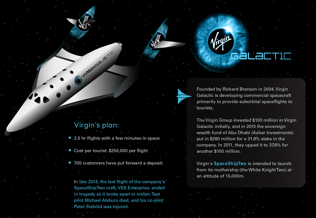
The space industry is rapidly changing, and there are about a dozen private companies that are helping to shape the future of space travel. From space tourism to dreams of harvesting asteroids, we cover the movers and shakers of Space’s Private Sector in this infographic.
3. Inside Tesla’s $5 Billion Gigafactory
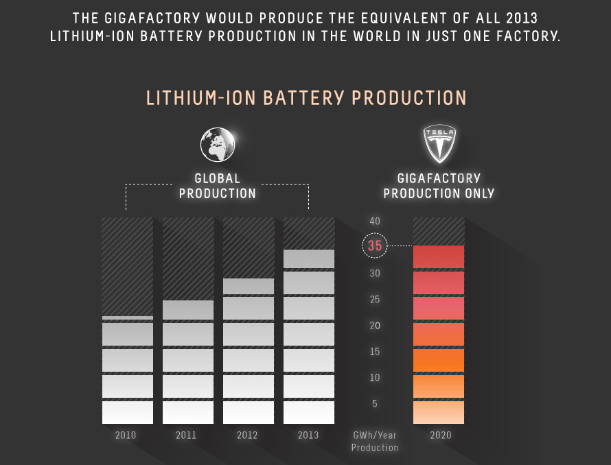
Recently, Tesla made the bold decision to build a $5 Billion factory to mass produce batteries with economies of scale. In this infographic on the Tesla Gigafactory, we look at the implications of this decision with regards to natural resources such as graphite, cobalt, and lithium.
2. A Year’s Extraction of Metal Shown Next to Landmarks and Cities
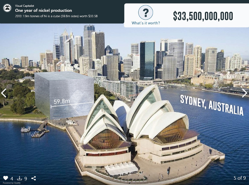
In this infographic slideshow, we asked ourselves how big a year’s extraction of various metals would be if they were put in a hypothetical cube. Some of the answers will surprise you.
1. The Gold Series
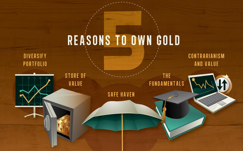
In our Gold Series, we covered everything on the yellow metal including its rich history, supply and geology, demand and uses, investment upside, and predictions for the future. Spanning five infographic parts, The Gold Series is a world class collection of informational and educational content on the fundamentals of gold investing. This series was viewed more than any other infographic this year.


Maps
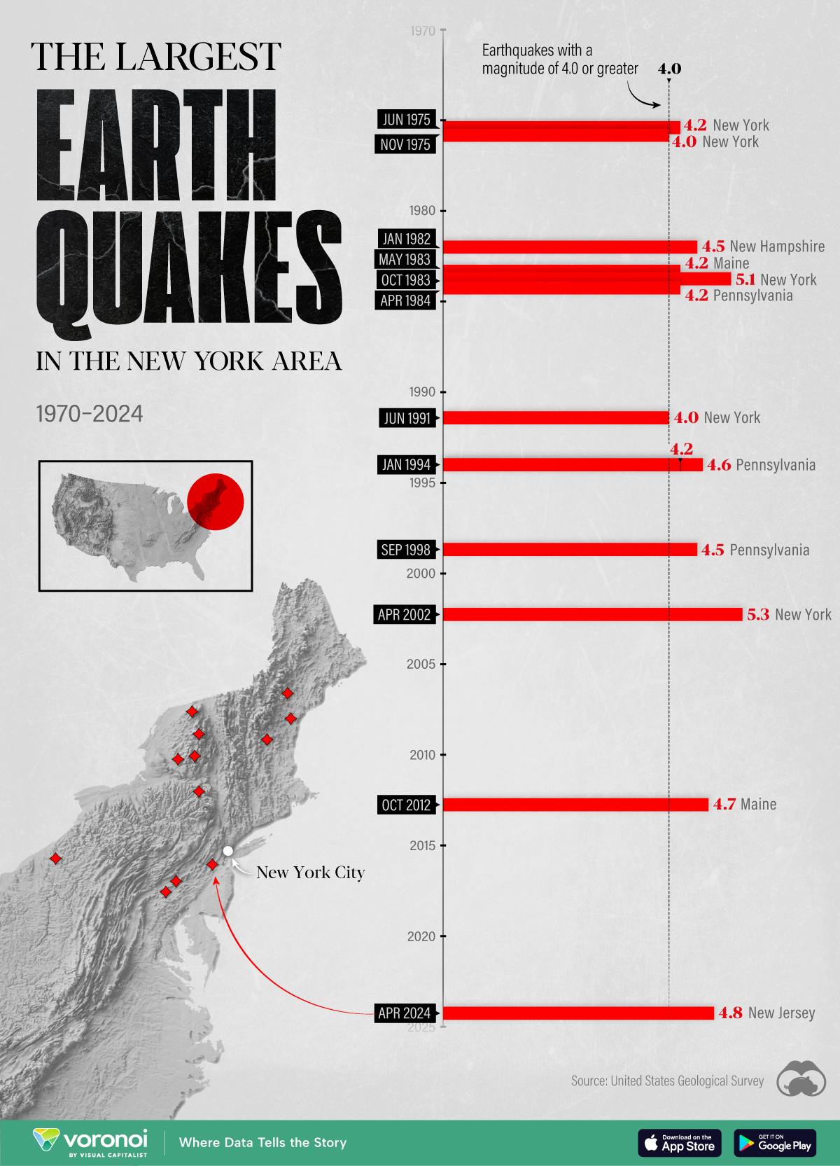
The Largest Earthquakes in the New York Area (1970-2024)
The earthquake that shook buildings across New York in April 2024 was the third-largest quake in the Northeast U.S. over the past 50 years.
The Largest Earthquakes in the New York Area
This was originally posted on our Voronoi app. Download the app for free on Apple or Android and discover incredible data-driven charts from a variety of trusted sources.
The 4.8 magnitude earthquake that shook buildings across New York on Friday, April 5th, 2024 was the third-largest quake in the U.S. Northeast area over the past 50 years.
In this map, we illustrate earthquakes with a magnitude of 4.0 or greater recorded in the Northeastern U.S. since 1970, according to the United States Geological Survey (USGS).
Shallow Quakes and Older Buildings
The earthquake that struck the U.S. Northeast in April 2024 was felt by millions of people from Washington, D.C., to north of Boston. It even caused a full ground stop at Newark Airport.
The quake, occurring just 5 km beneath the Earth’s surface, was considered shallow, which is what contributed to more intense shaking at the surface.
According to the USGS, rocks in the eastern U.S. are significantly older, denser, and harder than those on the western side, compressed by time. This makes them more efficient conduits for seismic energy. Additionally, buildings in the Northeast tend to be older and may not adhere to the latest earthquake codes.
Despite disrupting work and school life, the earthquake was considered minor, according to the Michigan Technological University magnitude scale:
| Magnitude | Earthquake Effects | Estimated Number Each Year |
|---|---|---|
| 2.5 or less | Usually not felt, but can be recorded by seismograph. | Millions |
| 2.5 to 5.4 | Often felt, but only causes minor damage. | 500,000 |
| 5.5 to 6.0 | Slight damage to buildings and other structures. | 350 |
| 6.1 to 6.9 | May cause a lot of damage in very populated areas. | 100 |
| 7.0 to 7.9 | Major earthquake. Serious damage. | 10-15 |
| 8.0 or greater | Great earthquake. Can totally destroy communities near the epicenter. | One every year or two |
The largest earthquake felt in the area over the past 50 years was a 5.3 magnitude quake that occurred in Au Sable Forks, New York, in 2002. It damaged houses and cracked roads in a remote corner of the Adirondack Mountains, but caused no injuries.
| Date | Magnitude | Location | State |
|---|---|---|---|
| April 20, 2002 | 5.3 | Au Sable Forks | New York |
| October 7, 1983 | 5.1 | Newcomb | New York |
| April 5, 2024 | 4.8 | Whitehouse Station | New Jersey |
| October 16, 2012 | 4.7 | Hollis Center | Maine |
| January 16, 1994 | 4.6 | Sinking Spring | Pennsylvania |
| January 19, 1982 | 4.5 | Sanbornton | New Hampshire |
| September 25, 1998 | 4.5 | Adamsville | Pennsylvania |
| June 9, 1975 | 4.2 | Altona | New York |
| May 29, 1983 | 4.2 | Peru | Maine |
| April 23, 1984 | 4.2 | Conestoga | Pennsylvania |
| January 16, 1994 | 4.2 | Sinking Spring | Pennsylvania |
| November 3, 1975 | 4 | Long Lake | New York |
| June 17, 1991 | 4 | Worcester | New York |
The largest earthquake in U.S. history, however, was the 1964 Good Friday quake in Alaska, measuring 9.2 magnitude and killing 131 people.

-

 Technology2 weeks ago
Ranked: The Most Popular Smartphone Brands in the U.S.
-

 Automotive1 week ago
Almost Every EV Stock is Down After Q1 2024
-

 Money1 week ago
Where Does One U.S. Tax Dollar Go?
-

 Green2 weeks ago
Ranked: Top Countries by Total Forest Loss Since 2001
-

 Real Estate2 weeks ago
Visualizing America’s Shortage of Affordable Homes
-

 Maps2 weeks ago
Mapped: Average Wages Across Europe
-

 Mining2 weeks ago
Charted: The Value Gap Between the Gold Price and Gold Miners
-

 Demographics2 weeks ago
Visualizing the Size of the Global Senior Population