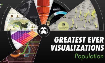
Best of
Our Top 22 Visualizations of 2022
The world was a complex and volatile place in 2022.
In our signature style—combining art, data, and storytelling—we helped millions of people make sense of unfolding events, from geopolitical flare-ups to stock market turmoil. Our growing team ranked, mapped, and visualized hundreds of new infographics on a multitude of topics.
This year we continued to refine classic concepts such as All the World’s Money, Global Happiness, World’s Richest People, and Prediction Consensus.
See what hundreds of experts are predicting for 2023 with our Global Forecast Series.
In this ninth edition of our yearly round-up, we’ve highlighted a small selection of our work, as well as pieces made by talented members of our Creator Program. The following visualizations were selected because they reached millions of people, sparked lively conversations, or pushed boundaries in design and data-driven reporting.
Now, let’s dive in to the top 22 visualizations of 2022.
Editor’s note: Click on any preview below to see the full-sized version of a visualization.
#22
The $100 Trillion Global Economy in One Chart
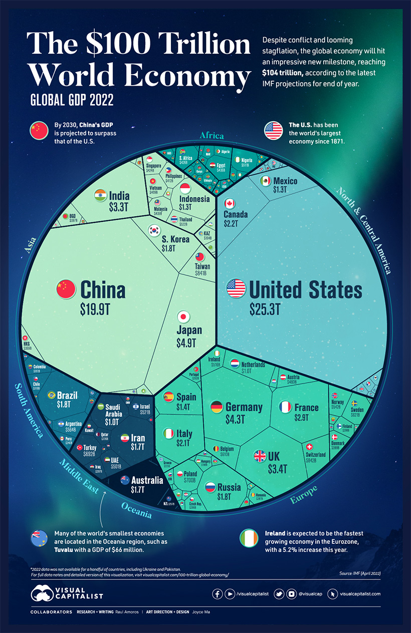
IMF projections from earlier this year suggested that we would hit a new milestone for global economic output: $104 trillion. This voronoi diagram carves up the global economy by country.
One more insight from this graphic. While China’s GDP growth has slowed in recent years, projections still indicate that the country will overtake the U.S. by 2030, dethroning the world’s economic leader.
#21 CREATOR PROGRAM
Visualizing Earth’s Seasons
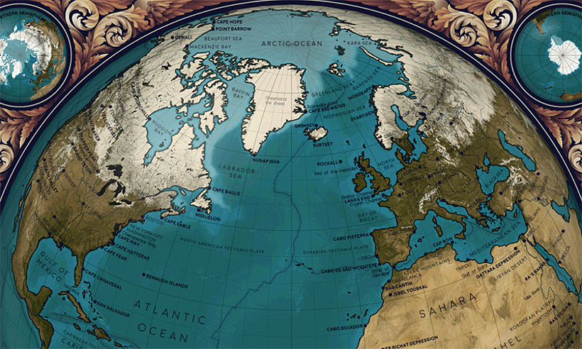
The Earth’s changing seasons radically affect the world in different ways. Some regions experience four distinct seasons, while others experience only two or as many as six.
Many people think the seasons are dictated by Earth’s proximity to the Sun, but this isn’t the case. It’s the Earth’s tilt, not its closeness to the Sun, that influences our seasons and causes massive changes in weather and ecology.
This animated map by Eleanor Lutz visualizes Earth’s seasons, showing how the temperature changes impact ice levels in the Arctic, as well as the growth and shifting of vegetation. It also highlights the cloud cover and sunlight each hemisphere receives throughout the year, with each frame in the animation representing a month of time.
#20
Map Explainer: Key Facts About Ukraine
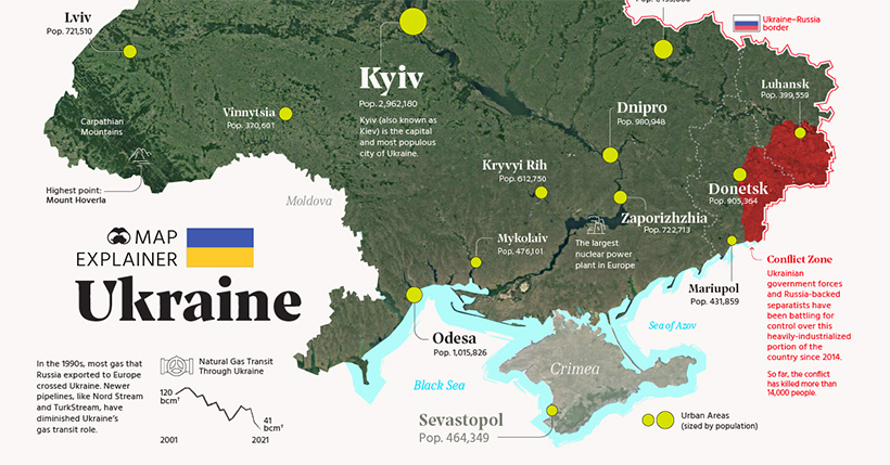
As columns of Russian tanks began snaking their way toward Kyiv in early 2022, the world’s eyes became fixated on Ukraine. While outlets like FT and NYT provided real-time invasion updates, we focused on geography, infrastructure, and points of interest using our Map Explainer format.
#19
Visualizing the World’s Largest Oil Producers
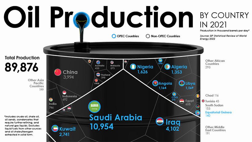
The conflict in Ukraine had broader implications on the global economy, and the world hit its first energy crisis of the 21st century. This infographic looks at where oil is actually produced around the world.
The OPEC countries are the largest oil producers collectively, with Saudi Arabia alone making up one-third of OPEC production.
#18
10 Years of Tinder

With its user-friendly interface and popular features like “swipe right” to indicate interest, Tinder has transformed the way people meet and date. When the dating app reached its 10th birthday this year, we leaned into a wacky design that reflects the twists and turns the company has taken on its journey from hackathon project to billion dollar business.
#17
The Salary You Need to Buy a Home in 50 U.S. Cities
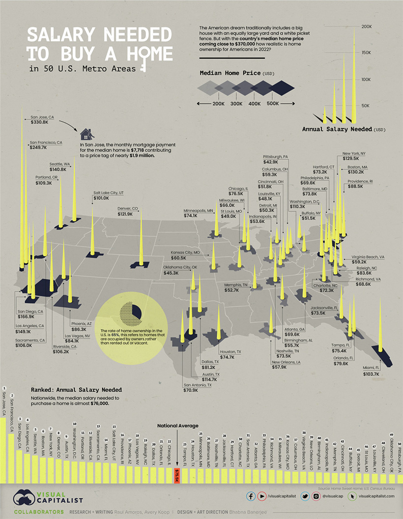
Where one lives has big implications on how realistic home ownership may seem. This graphic offers a broad view of affordability, mapping out the annual salary needed for home ownership in 50 different U.S. cities.
San Jose came out on top as the most expensive city, while Oklahoma City and Cleveland ranked as some of the most affordable.
#16
The Relationship Between Wealth and Happiness, by Country
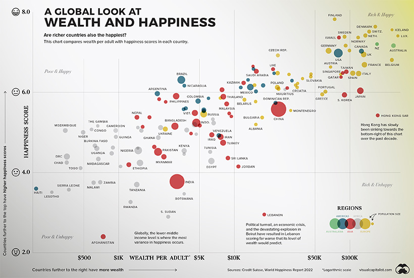
Throughout history, the pursuit of happiness has been a preoccupation of humankind. Of course, we humans are not just content with measuring our own happiness, but also our happiness in relation to the people around us—and even other people around the world.
We crunched the numbers and visualized the data to see if money really does buy happiness.
#15
Animation: The World’s Biggest Wind Turbines
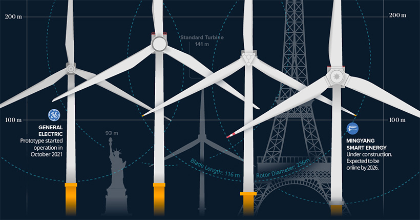
Over the past 20 years, wind turbines have grown in size, and are now generating much more energy per unit. Today, the tallest turbines can reach over 200 meters (650 ft) in height and cost more than $12 million to manufacture and install.
This animated infographic, produced by our Elements team, shows them side-by-side with iconic landmarks to help show the scale of modern wind energy infrastructure.
#14
33 Problems With Media in One Chart
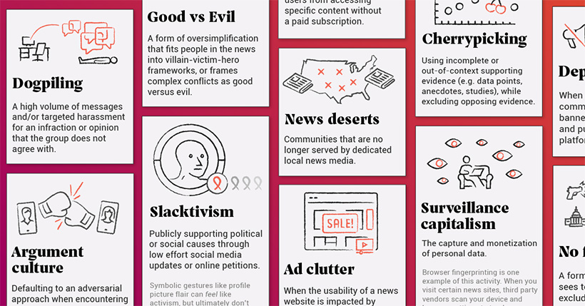
One of the hallmarks of democratic society is a healthy, free-flowing media ecosystem. Unfortunately, the modern news media ecosystem is under fire from a number of angles, from a shrinking pool of ad revenue to declining trust from readers.
Many of the problems identified in the infographic are easy to understand once they’re identified. However, in some cases, there is an interplay between these issues that is worth digging into. One thing is for certain, the topic generated a lively discussion on how to fix the problems that plague mainstream media.
#13 CREATOR PROGRAM
Visualizing S&P 500 Performance in 2022, by Sector
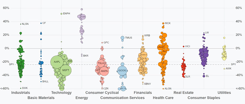
Tracking indices over the course of a year reveals a lot about market trends and sentiment. The S&P 500’s performance over the course of 2022 is a great example.
Throughout the year, inflation rates have remained high and interest rates have likewise been climbing around the world. Accompanied by the looming threat of a recession, some sectors have been hit harder than others.
This animation from Jan Varsava shows U.S. dividend-adjusted stock performance for each company in the S&P 500 index in 2022, from the start of the year through the end of September.
#12
Animated Map: Where to Find Water on Mars
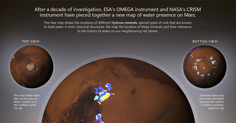
The European Space Agency has long been looking for water on Mars, and this year it looks like they’ve found it…in rocks!
Special rocks called hydrous minerals are believed to contain remnants of a large but now lost Martian ocean. The ESA released new data confirming the geographical locations of these rocks, suggesting places where water may still be present deep beneath the red planet’s surface.
#11
All the World’s Military Personnel
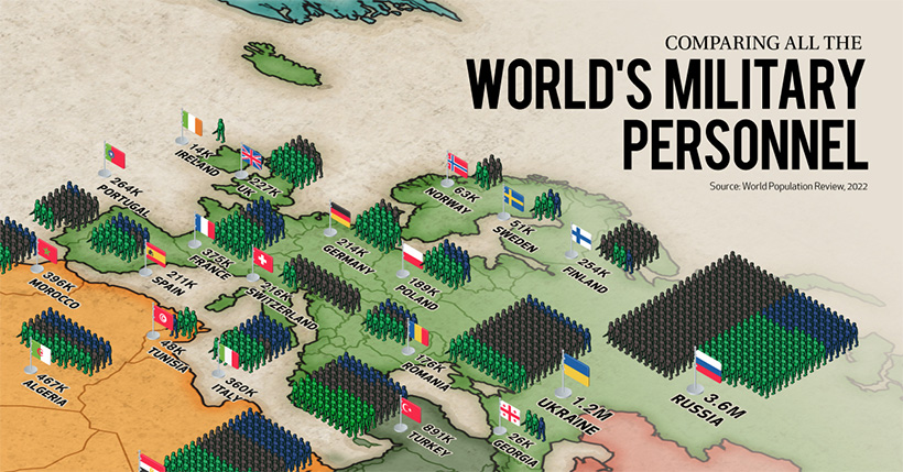
With conflicts in Ukraine, Iran, and other places making war and violence unfortunately prevalent in 2022, we assessed the military capabilities of countries worldwide.
This visual breaks down all the world’s active duty and reserve soldiers with each soldier icon representing 10,000 soldiers. Although China has the largest active military, Vietnam took the top spot as the country with the biggest military worldwide when including reserves and paramilitary numbers into the mix.
#10 CREATOR PROGRAM
The Yuxi Circle: The World’s Most Densely Populated Area
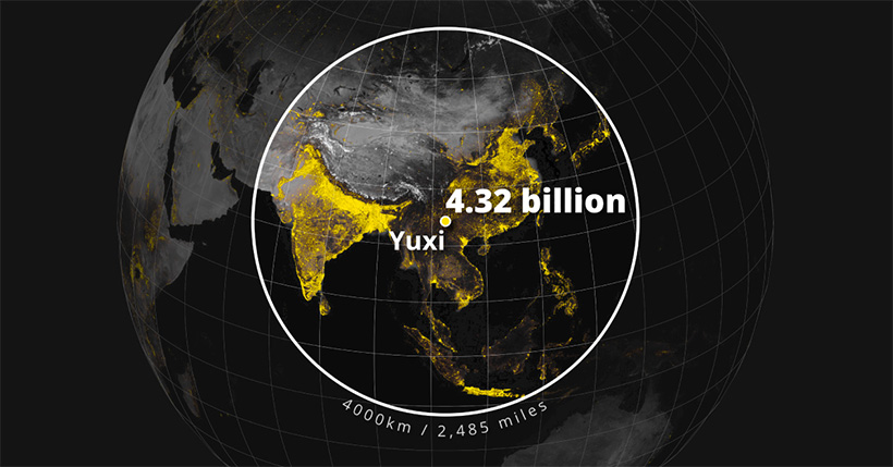
If you wanted to capture over 55% of the global population inside a circle with a 4,000 km (2,500 mi) radius, which city would you place at its epicenter?
Mapmaker Alasdair Rae went digging through population data, tracing circles around 1,500 cities worldwide to find out how many people lived within a 4,000 km radius. Out of all possible options, he discovered that the The Yuxi Circle, based on a city in the Yunnan province of China, was the world’s most densely populated area.
#9
A Lifetime’s Consumption of Fossil Fuels, Visualized
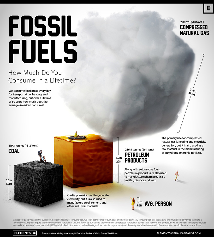
In this graphic, we visualized exactly how many fossil fuels are used in an average American’s 80-year lifetime, putting the coal, gas, and petroleum into scaled cubes and comparing them to the size of a human being.
The end result? It turns out that we use a lot of fossil fuels as individuals—over 119 tonnes of coal, 236 tonnes of petroleum products, and 2,007 cubic meters of compressed natural gas.
#8
Every Song With Over 1 Billion Spotify Streams
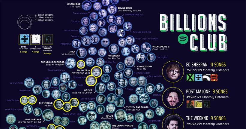
Spotify is the world’s most popular audio streaming service with over 450 million users across 183 markets. With that kind of scale, songs can rack up some serious streaming numbers.
In this ambitious data visualization, we looked at every song with more than one billion streams on the platform, and served the data up by decade and artist.
#7
A Decade of Elon Musk’s Tweets, Visualized
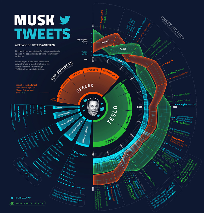
Even before Elon Musk’s purchase of Twitter, the entrepreneur was already a power user of the platform, using it to share news about his companies, chat with users about technology, and, of course, post dank memes.
To better understand Musk’s Twitter usage over the years, we decided to scrape his entire tweet history and visualize the results. The result is a unique radial timeline design that highlights key topics as well as the overall volume of tweets. Our article also features the highlights (and lowlights) of Musk’s growing body of microblogging work.
#6 CREATOR PROGRAM
Nature Timespiral: The Evolution of Earth from the Big Bang
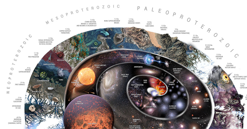
Not much is known about what came before the Big Bang, but we do know that it launched a sequence of events that gave rise to the universal laws of physics and the chemical elements that make up matter.
How the Earth came about, and life subsequently followed, is a wondrous story of time and change. Over the course of about 14 billion years, history has seen the creation of the universe, the expansion of the cosmos, and the spawning of galaxies, stars, planets, and eventually, life.
In this amazingly detailed visualization called the Nature Timespiral, Pablo Carlos Buddassi illustrates this journey, depicting the various eras that the Earth has gone through since the inception of the universe itself.
#5
All the Metals We Mined in 2021: Visualized
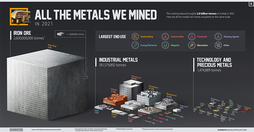
“If you can’t grow it, you have to mine it” is a famous saying that encapsulates the importance of minerals and metals in the modern world. The sheer volume of raw materials and metals that factor into our everyday life often goes overlooked.
This visualization takes these unsung heroes and puts them center stage. Of the 2.8 billion tonnes of metals mined in 2021, iron ore, which is used to make steel, made up 93%. Over on the other end, rare metals like rhenium are tiny by comparison.
#4 CREATOR PROGRAM
Countries Grouped by Their Largest Trading Partner (1960-2020)
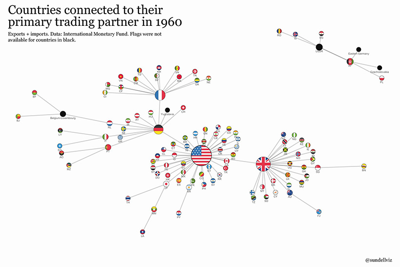
Which countries are the central nodes of the global trade network? The answer to this question has changed over time, with China becoming the latest nation to dominate global trade networks.
This series of “netgraphs”, by Anders Sundell, connects countries to their primary trading partner, using data that includes both imports and exports. It’s no secret that the U.S. has seen its trade dominance slip in recent decades, but seeing it visualized in this unique way really drives the point home.
#3
The Top 10 Largest Nuclear Explosions, Visualized
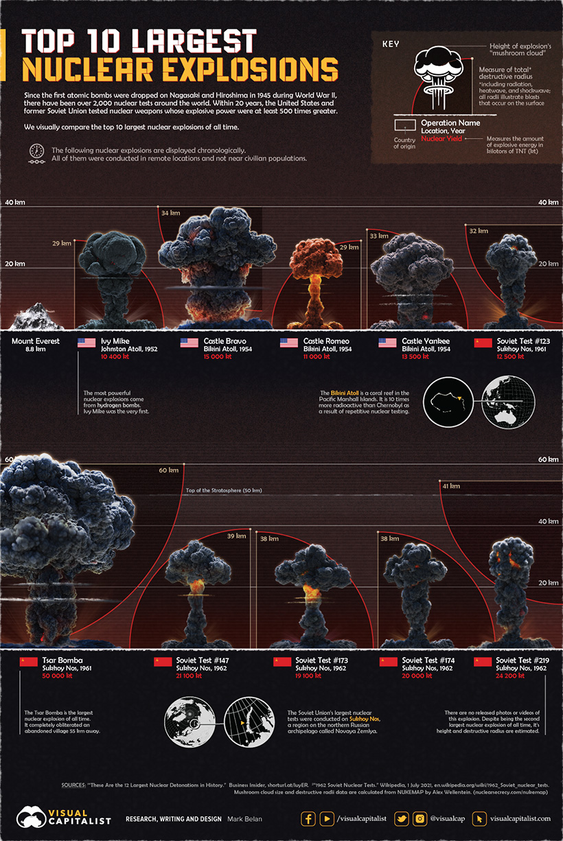
Threats of a nuclear war outbreak have been populating headlines this year ever since the beginning of the 2022 Russian invasion of Ukraine. We examined the top 10 largest nuclear explosions in history, charting their explosive yields, their height, and the size of their destructive radii into one graphic.
Though humans haven’t seen devastation from the likes of nuclear weaponry since Hiroshima and Nagasaki in 1945, the explosives that came after leave much to the imagination in the face of developing world events.
#2
FTX’s Leaked Balance Sheet
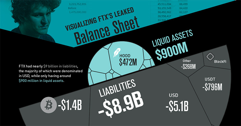
The high-profile collapse of crypto exchange FTX will stand as one of the biggest—and most lurid—financial stories of the year.
When FTX’s leaked balance sheet was published by the Financial Times, the large numbers it contained were tough to truly appreciate. We saw an opportunity to visualize the data to better understand the size of the company’s hole, and the breakdown between liquid and illiquid assets.
Graphic design aside, the results were not pretty.
#1
The World’s Population at 8 Billion
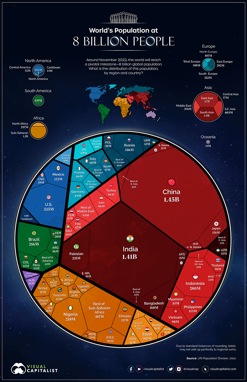
In mid-November of this year, the eight billionth human being entered the world, ushering in a new milestone for humanity. In this series of voronoi diagrams, we look at the current distribution of humanity, by country and by region.
In just 48 years, the world population has doubled in size, jumping from four to eight billion. Our team also dug deep into this topic in a full report and webinar for VC+ members.
According to projections, 2023 will bring another major population milestone. The world will soon have a new largest country, as India’s population will surpass China’s.
Like what you see in this roundup of the top visualizations of 2023? Join over 365,000 people on our free email list and get a new visualization in your mailbox every day.


Best of
Best Visualizations of March on the Voronoi App
We round up the most popular, most discussed, and most liked visualizations of the month on Voronoi, our new data storytelling platform.
At the end of 2023, we publicly launched Voronoi, our free new data discovery app!
The initial response from both users and creators has been incredible. We now have millions of in-app views, and there are already more than 700 interesting visualizations to discover, many of which will never be published on Visual Capitalist.
For that reason, we’ve chosen to highlight some of the most popular visualizations and creators from March in this roundup. To see them and many others, make sure to download the app!
Let’s take a look at a popular creator worth highlighting, as well as the most viewed, most discussed, and most liked posts of the month.
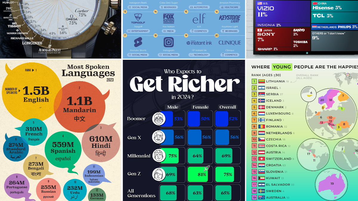
POPULAR CREATOR
Ehsan Soltani
Visual Capitalist isn’t the only creator on the Voronoi app.
Instead, it features incredible data-driven charts and stories from many of the world’s best creators, like Ehsan Soltani.
Ehsan is an economist, and one of the most prolific creators on Voronoi so far. He’s published 41 visualizations on wide-ranging subjects such as:
- The world’s biggest “money printer” economies
- Global commodity returns
- Corruption by country
- Inflation rates in advanced economies
For those interested in what’s happening with the global economy, Ehsan Soltani is definitely worth a follow!
![]() View all of Ehsan’s visuals on Voronoi today.
View all of Ehsan’s visuals on Voronoi today.
MOST VIEWED
The 12 Most Spoken Languages in 2023
Which languages are most commonly spoken around the world by native speakers?
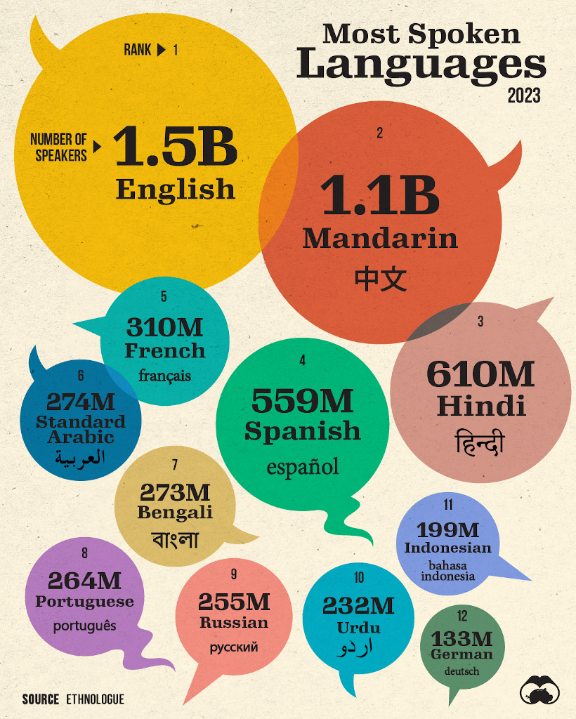
This visualization from Visual Capitalist was one of the most viewed by users, and it highlights the top languages spoken around the world.
Data here comes from the Ethnologue database, the most rigorous and comprehensive language database globally. It’s worth noting that it highlights languages spoken by native speakers only, so second languages are not counted here.
![]() Get the data behind this visual on Voronoi today.
Get the data behind this visual on Voronoi today.
MOST DISCUSSED
Where Young People are Happiest
The most commented on visualization from Visual Capitalist showed the countries with the happiest young people (under 30 years old).
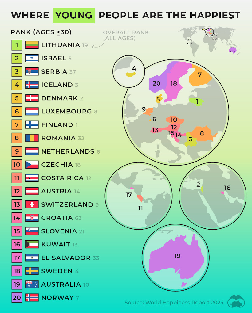
This comes from the World Happiness Report, which Visual Capitalist covers extensively every year.
In this year’s edition, one particularly interesting feature focused on happiness discrepancies between age groups. For example, in some countries, younger people were much happier than the average population—in others, older populations were far happier.
![]() To join the conversation, download Voronoi today.
To join the conversation, download Voronoi today.
MOST LIKED
The Fastest Growing Brands in the U.S.
The most liked visual on Voronoi in March came from Visual Capitalist, showing the brands that are growing the fastest in the United States.
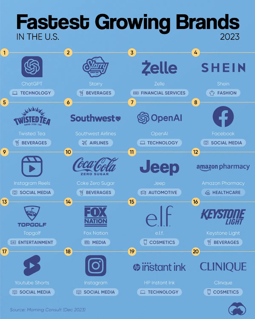
The data here comes from Morning Consult, and shows the share of customers that were considering purchasing a brand in October 1-24, 2023, and subtracted the share of those who said the same between Jan 1-31, 2023.
![]() Get the data behind this visual on Voronoi today.
Get the data behind this visual on Voronoi today.

-

 Mining1 week ago
Gold vs. S&P 500: Which Has Grown More Over Five Years?
-

 Markets2 weeks ago
Ranked: The Most Valuable Housing Markets in America
-

 Money2 weeks ago
Which States Have the Highest Minimum Wage in America?
-

 AI2 weeks ago
Ranked: Semiconductor Companies by Industry Revenue Share
-

 Markets2 weeks ago
Ranked: The World’s Top Flight Routes, by Revenue
-

 Countries2 weeks ago
Population Projections: The World’s 6 Largest Countries in 2075
-

 Markets2 weeks ago
The Top 10 States by Real GDP Growth in 2023
-

 Demographics2 weeks ago
The Smallest Gender Wage Gaps in OECD Countries