Misc
Animated Map: Visualizing Earth’s Seasons
Article/Editing:
Animated Map: Visualizing Earth’s Seasons
Why does Earth have seasons?
Many people think the seasons are dictated by Earth’s proximity to the Sun, but this isn’t the case. It’s the Earth’s tilt, not its closeness to the Sun, that influences our seasons.
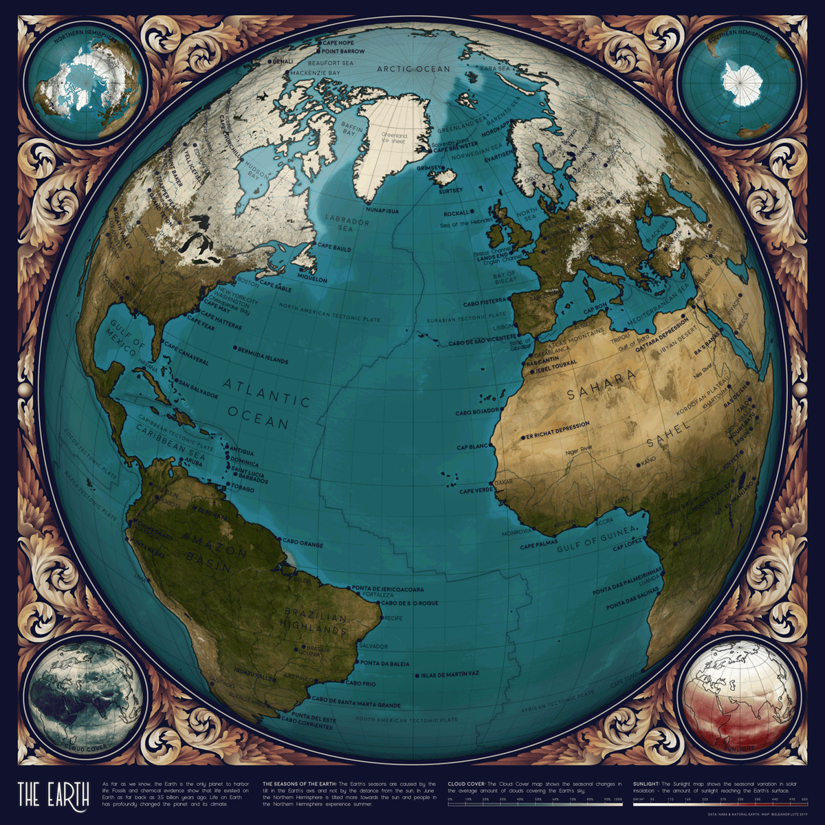
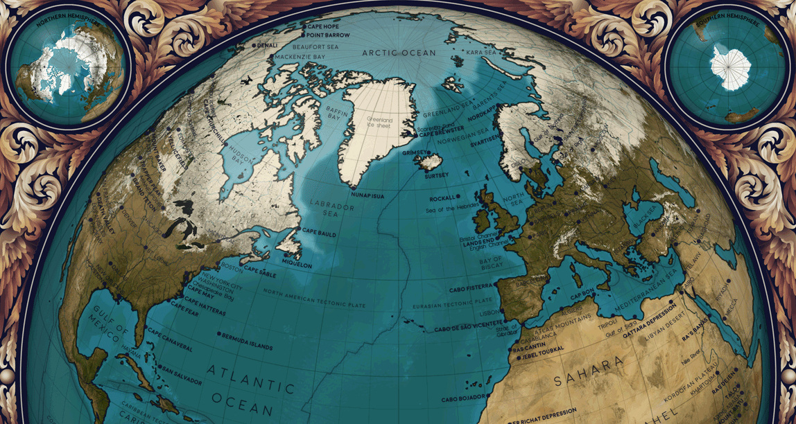
This animated map by Eleanor Lutz visualizes Earth’s seasons, showing how the temperature changes impact ice levels in the Arctic as well as vegetation more broadly. It also highlights the cloud cover and sunlight each hemisphere receives throughout the year, with each frame in the animation representing a month of time.
Why is Earth Tilted?
Unlike some of the planets that sit completely upright and rotate perpendicularly, Earth rotates on a 23.5-degree axis.
But why? A commonly accepted theory among the scientific community is the giant impact hypothesis. According to this theory, a celestial object called Theia collided with Earth many years ago, when the planet was still forming. This collision not only knocked Earth into its tilted position—some believe that the dust and debris from this impact ended up forming our moon.
Ever since, our planet has been rotating with a slight tilt (which itself is not fixed, as it “wobbles” in cycles), giving us our varying seasons throughout the year.
How Earth’s Tilt Influences our Seasons
As our planet orbits the Sun, it’s always leaning in the same direction. Because of its tilt, the different hemispheres receive varying amounts of sunlight at different times of the year.
In December, Earth is technically closer to the Sun than it is in June or July. However, because the Northern Hemisphere is tilted away from the Sun during December, that part of the planet experiences winter during that time.
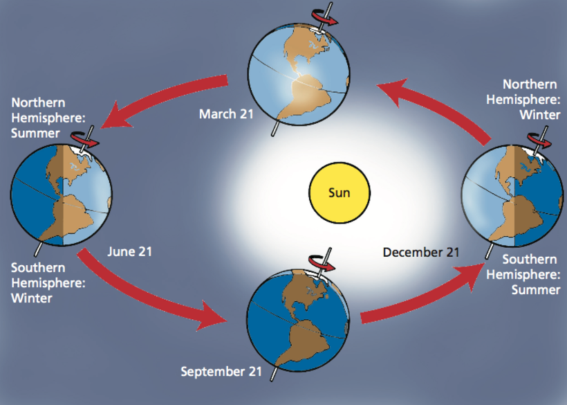
The graphic above by the Smithsonian Science Education Center (SSEC) visualizes Earth’s orbit throughout the year, showing when each hemisphere receives the most direct sunlight (and thus, experiences summer).
The Climate Change Impact
While our seasons have always varied, it’s worth noting that climate change has impacted our seasons, and changed how much Arctic ice we lose each summer.
In the past, millions of miles of ice remained frozen throughout the summer months. In the 1980s, there were 3.8 million square miles of ice in July—that’s roughly the same size as Australia.
Over the years, Arctic ice cover has steadily declined. In July 2020, the ice cover was only 2.8 million square miles—a million less than the amount four decades ago.
Some scientists are predicting that we could lose our summer sea ice entirely by 2035, which would have a devastating impact on the Artic’s wildlife and the indigenous people who live there.

This article was published as a part of Visual Capitalist's Creator Program, which features data-driven visuals from some of our favorite Creators around the world.


VC+
VC+: Get Our Key Takeaways From the IMF’s World Economic Outlook
A sneak preview of the exclusive VC+ Special Dispatch—your shortcut to understanding IMF’s World Economic Outlook report.

Have you read IMF’s latest World Economic Outlook yet? At a daunting 202 pages, we don’t blame you if it’s still on your to-do list.
But don’t worry, you don’t need to read the whole April release, because we’ve already done the hard work for you.
To save you time and effort, the Visual Capitalist team has compiled a visual analysis of everything you need to know from the report—and our upcoming VC+ Special Dispatch will be available exclusively to VC+ members on Thursday, April 25th.
If you’re not already subscribed to VC+, make sure you sign up now to receive the full analysis of the IMF report, and more (we release similar deep dives every week).
For now, here’s what VC+ members can expect to receive.
Your Shortcut to Understanding IMF’s World Economic Outlook
With long and short-term growth prospects declining for many countries around the world, this Special Dispatch offers a visual analysis of the key figures and takeaways from the IMF’s report including:
- The global decline in economic growth forecasts
- Real GDP growth and inflation forecasts for major nations in 2024
- When interest rate cuts will happen and interest rate forecasts
- How debt-to-GDP ratios have changed since 2000
- And much more!

Get the Full Breakdown in the Next VC+ Special Dispatch
VC+ members will receive the full Special Dispatch on Thursday, April 25th.
Make sure you join VC+ now to receive exclusive charts and the full analysis of key takeaways from IMF’s World Economic Outlook.
Don’t miss out. Become a VC+ member today.
What You Get When You Become a VC+ Member
VC+ is Visual Capitalist’s premium subscription. As a member, you’ll get the following:
- Special Dispatches: Deep dive visual briefings on crucial reports and global trends
- Markets This Month: A snappy summary of the state of the markets and what to look out for
- The Trendline: Weekly curation of the best visualizations from across the globe
- Global Forecast Series: Our flagship annual report that covers everything you need to know related to the economy, markets, geopolitics, and the latest tech trends
- VC+ Archive: Hundreds of previously released VC+ briefings and reports that you’ve been missing out on, all in one dedicated hub
You can get all of the above, and more, by joining VC+ today.

-

 Green1 week ago
Ranked: The Countries With the Most Air Pollution in 2023
-

 AI2 weeks ago
The Stock Performance of U.S. Chipmakers So Far in 2024
-

 Markets2 weeks ago
Charted: Big Four Market Share by S&P 500 Audits
-

 Real Estate2 weeks ago
Ranked: The Most Valuable Housing Markets in America
-

 Money2 weeks ago
Which States Have the Highest Minimum Wage in America?
-

 AI2 weeks ago
Ranked: Semiconductor Companies by Industry Revenue Share
-

 Travel2 weeks ago
Ranked: The World’s Top Flight Routes, by Revenue
-

 Countries2 weeks ago
Population Projections: The World’s 6 Largest Countries in 2075