This graphic illustrates the amount of U.S. currency in circulation globally, by denomination, based on data from the Federal Reserve.


click for more →


Scan with your phone's camera or QR code app to view
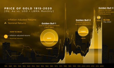

We break down gold's three major bull markets over the last century. This includes the current one, in which gold has hit 8-year highs.
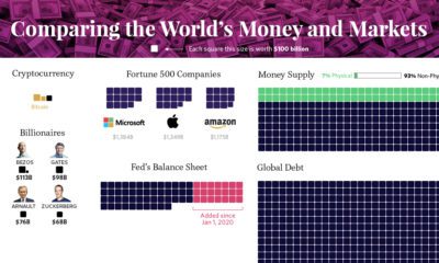

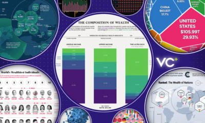
Our most famous visualization, updated for 2020 to show all global debt, wealth, money, and assets in one massive and mind-bending chart.
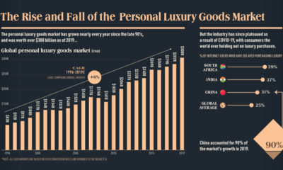

This infographic charts the rise and fall of the $308 billion global personal luxury market, and explores what the coming year holds for its growth
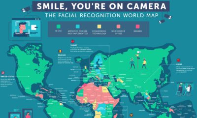

Mass surveillance is becoming the status quo. This map dives into the countries where facial recognition technology is in place, and how it's used.
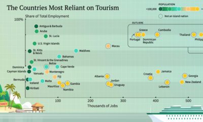

With international travel grinding to a halt, here are the economies that have the most to lose from a lack of tourism.
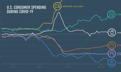

How has COVID-19 transformed consumer spending trends so far? We look at credit and debit card spending of 5 million U.S. consumers across 18 categories.
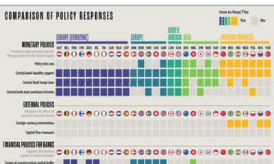

What policy tools are global central banks implementing to combat the economic effects of COVID-19? We compare the responses of 29 countries.
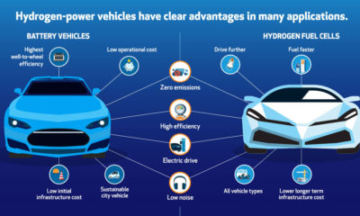

Here are six reasons why hydrogen and fuel cells can be a fit for helping with the transition to a lower-emission energy mix.
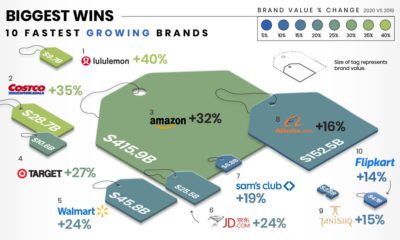

This infographic illustrates how the fastest growing and declining retail brands are attempting to stay relevant in the pandemic economy.
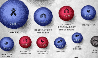

COVID-19 deaths can be hard to interpret without context. This graphic shows how many people die each day globally, by cause.
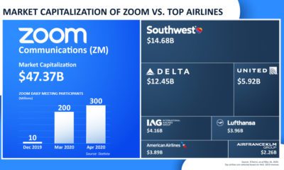

Zoom benefits from the COVID-19 virtual transition—but other industries aren't as lucky. The app is now more valuable than the world's seven largest airlines.
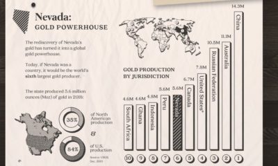

Nevada accounts for 84% of U.S. gold production today. Here's a look at the state's rich history, its prolific production, and what the future may hold.
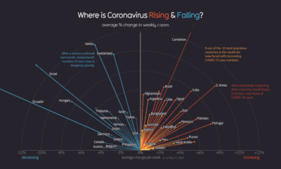

Globally, the curve of COVID-19 cases is flattening, but individual countries vary considerably as new pockets of the world deal with the pandemic.
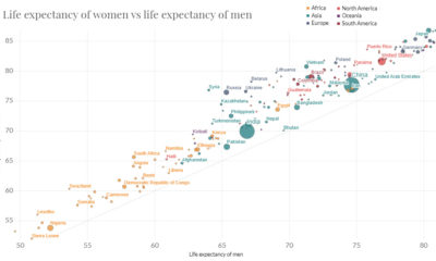

In just 65 years, global life expectancy has skyrocketed. See its ascent in this short animation, or dive into the interactive version for more data.
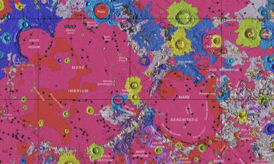

Behold the glory of the Unified Geologic Map of the Moon, which brings decades of data into one map, revealing the potential for exploration.
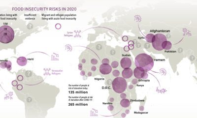

Over 135 million people face acute food insecurity worldwide—but COVID-19 could almost double these numbers. Which regions could be most affected?

This month on VC+: The Trendline, our best infographics on wealth, a new monthly special dispatch, and we reveal the first chapter from our new book.